There are many instances where the desire to imbue a black and white photograph with vibrant life arises. This article delves into the comprehensive process of colorizing photos within Adobe Photoshop, exploring various techniques to achieve realistic and artistic results. From fundamental settings to advanced adjustments, we will navigate the journey of transforming monochrome images into full-color masterpieces.
Preparing Your Grayscale Image for Color
Before embarking on the colorization process, a crucial initial step involves ensuring your grayscale image is correctly configured within Photoshop. If you are starting with a purely grayscale image, it is imperative to convert it to the RGB color mode. This is because the RGB color model is essential for the software to accurately receive and apply color information. Without this conversion, your attempts to add color will be futile.
To check or change the color mode, navigate to Image > Mode > RGB Color. This simple conversion unlocks the potential for color application, setting the stage for the creative work ahead.
Leveraging Photoshop's "Colorize" Neural Filter
One of the most accessible and powerful tools for colorizing photos in modern versions of Photoshop is the "Colorize" Neural Filter. This intelligent feature utilizes artificial intelligence to automatically analyze a black and white image and suggest plausible colors.
To access this tool, go to Filter > Neural Filters. Within the Neural Filters panel, locate and select the "Colorize" option. Photoshop will then process the image, and you will likely see an immediate transformation. A question frequently asked is about the effectiveness and accuracy of this automated process. Observe how remarkably easy it is to achieve a basic colorization.
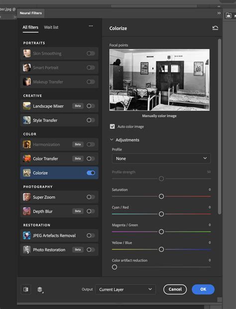
It's important to note that the "Colorize" filter often creates a new layer for its adjustments. This is a fundamental aspect of non-destructive editing in Photoshop, allowing for further refinement without altering the original image data. You might notice that the background also changed, as the AI attempts to colorize the entire image.
Refining Automated Colorization: Addressing Imperfections
While the "Colorize" Neural Filter is impressive, it's not always perfect. You may observe that not all the colors are precisely as you would like them to be, or that there are areas with less accurate color application. Common issues include gaps or unnatural color transitions, particularly in areas like the neck or between fingers.
When these imperfections arise, the solution lies in manual refinement. The "Colorize" filter typically generates a new layer, often labeled "Colorize" or similar. On this top layer, you can use various painting tools to correct specific areas. Select a brush tool (like the Brush Tool with a soft edge) and carefully paint over the areas that require adjustment. This allows you to precisely introduce the desired colors where the automatic process may have faltered.
Exploring Alternative Colorization Techniques
Beyond the AI-powered "Colorize" filter, Photoshop offers a suite of traditional methods for colorizing photographs, providing greater control and artistic freedom. These techniques often involve layering and blend modes, allowing for nuanced and sophisticated results.
The Gradient Map Approach
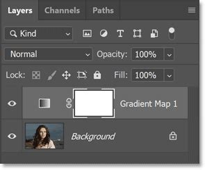
A powerful technique for creating stylized color effects, and one that is often responsible for the unique look of certain colorized images, is the Gradient Map. This adjustment layer allows you to map colors from a gradient onto the tonal values of your image.
To apply a Gradient Map, go to Layer > New Adjustment Layer > Gradient Map.... This will create a new adjustment layer above your image. If you are not satisfied with the initial result, you can open the Properties palette (Window > Properties). This palette will display the gradient currently in use and will allow you to edit it by clicking on the gradient preview. You can select from a wide range of presets or create your own custom gradients to achieve specific color palettes.
For a more subtle, duotone-like effect, consider using the "Multiply" blend mode for the image layer that is in front of the color layer. This can create a rich, integrated color appearance.
Duotone Effects with Solid Color Layers and Blend Modes
Another common and effective method for colorizing involves using solid color layers in conjunction with blend modes. This approach allows for a more deliberate and controlled application of color.
The process often begins with converting the original image to grayscale, as previously discussed. For maximum control over the results, the Channel Mixer can be a valuable tool in this initial grayscale conversion phase, allowing you to fine-tune the luminance values of each color channel.
Next, create a solid color layer (Layer > New Fill Layer > Solid Color...). Choose a color that you feel would be appropriate for your image, or experiment with different hues. For example, a user might have used RGB #01baff, which translates to HSV (196, 100, 100). Crucially, move this solid color layer below your grayscale image layer in the Layers panel.
Then, set the blend mode of the grayscale image layer to "Multiply." This blend mode will cause the colors from the layer below to show through the grayscale image, effectively coloring it. You've already got a nice Duotone effect, but there's way too much contrast for what we want. This is already pretty close to what we want.
Adjusting Hue and Saturation for Color Control
Once a base color has been applied through methods like the solid color layer and Multiply blend mode, you may find that the colors are too intense or not quite the right hue. The "Hue/Saturation" adjustment is an invaluable tool for fine-tuning these aspects.
To access this, navigate to Image > Adjustments > Hue/Saturation... or, for a non-destructive approach, create a Hue/Saturation adjustment layer. Within the Hue/Saturation dialog box, you can adjust the overall hue of the colors, shift them towards warmer or cooler tones, and most importantly, control their intensity by moving the Saturation slider. Desaturating the image by moving the slider for Saturation all the way to the left will remove color. Conversely, increasing saturation will make the colors more vibrant.
Using "Color Overlay" for Targeted Color Application
For applying a specific color to a particular area or to the entire image with a simple overlay effect, the "Color Overlay" layer style is a straightforward option.
In the Layers panel, click on the tiny "fx" icon at the bottom of the panel and choose "Color Overlay." This will open a dialog box where you can select the desired color and adjust its opacity and blend mode. This is particularly useful for adding a consistent color tint to an image or for quickly experimenting with different color schemes.
STOP Ruining Colors with Curves, Use This Instead! - Photoshop Trick
Advanced Refinements and Creative Exploration
The journey of colorizing a photograph often extends beyond the initial application of color. Achieving truly convincing and artistic results frequently involves a combination of techniques and a keen eye for detail.
Desaturation and Blending Modes
A technique that some users have explored involves desaturating the image and then placing it under a layer of solid color, subsequently lowering the opacity of that color layer. Experimentation with various blend modes, such as "Soft Light," "Overlay," or "Color," can also yield interesting and unique results. However, for some, these methods may not achieve the desired effect on their own.
Layer Masks for Precision
When working with any colorization technique, the judicious use of layer masks is paramount. Layer masks allow you to selectively reveal or hide parts of a layer. This is incredibly useful for fine-tuning where color is applied, ensuring that transitions are smooth and that specific elements of the image receive the intended coloration. For instance, if the "Colorize" filter has applied too much color to a person's skin, you can use a layer mask on the "Colorize" layer to reduce its opacity in that specific area.
Combining Techniques for Optimal Results
Often, the most successful colorizations are achieved by combining multiple methods. You might start with the "Colorize" Neural Filter for a quick base, then use a Gradient Map for a stylistic color tone, and finally employ manual painting with layer masks for precise adjustments. The key is to experiment and understand how each tool and blend mode interacts with your image.
Understanding the Fundamentals of Photography for Better Colorization
While Photoshop provides the tools, a basic understanding of photographic principles can significantly enhance your colorization efforts. Concepts such as ISO, Aperture, Shutter Speed, Exposure, and White Balance, which are all fundamental aspects of photography, influence how light and color are captured in the original black and white image.
- Exposure: The overall brightness of the image will affect how colors appear. An underexposed image might require brighter colors, while an overexposed image might need more muted tones.
- Contrast: The difference between the lightest and darkest areas of an image plays a crucial role. High contrast images might benefit from more saturated colors, while low contrast images might look better with softer, more subtle hues.
- Tonal Range: Understanding how the original black and white image was captured â its dynamic range â can inform your color choices.
Even though these elements are part of the original capture, being aware of them helps in making informed decisions when adding color. For example, if you know a particular area was originally very dark, you might choose to add deeper, richer colors there.
The Importance of Source Material
The quality of the original black and white photograph is a significant factor in the success of colorization. A sharp, well-exposed black and white image with good contrast and detail will always yield better results than a blurry, noisy, or poorly composed one.
When starting with a suitable photo, consider its inherent qualities. Does it have strong lines? Interesting textures? A compelling subject? These elements will be further enhanced by the addition of color.
Creative Applications and Artistic Interpretation
Colorization is not just about historical accuracy; it's also a powerful tool for artistic expression. You can use color to evoke specific moods or emotions. For instance, warm tones like reds, oranges, and yellows can create a feeling of warmth, energy, or nostalgia, while cool tones like blues, greens, and purples can evoke feelings of calmness, sadness, or mystery.
Consider the context of the image. If you are colorizing a portrait of a loved one, you might aim for naturalistic colors. If you are colorizing a landscape, you might choose colors that enhance its natural beauty or create a more dramatic effect.
The goal is not always to recreate the exact colors that were present when the photo was taken, but rather to create a visually appealing and emotionally resonant image. The "effect used on these images" that a user might inquire about is most probably a Gradient Map, as it allows for such artistic interpretation.
Conclusion: A Blend of Technology and Artistry
Colorizing photos in Photoshop is a rewarding process that blends technological capabilities with artistic sensibility. From the intuitive "Colorize" Neural Filter to the granular control offered by adjustment layers, blend modes, and manual painting, Photoshop provides a comprehensive toolkit for transforming monochrome images. By understanding the fundamental principles of color application, mastering Photoshop's tools, and embracing creative experimentation, you can breathe new life into your cherished black and white photographs, transforming them into vibrant and compelling works of art.