Highlighting text in a way that makes it stand out, especially on busy backgrounds, is a highly sought-after effect in digital design, particularly prevalent on social media platforms. While this functionality is often straightforward in applications like InDesign or Microsoft Word, achieving a similar result in Adobe Photoshop can, at times, present a unique set of challenges. However, a variety of methods exist to replicate this popular text style, ranging from simple manual layering to more sophisticated adjustment techniques. This article will explore these diverse approaches, offering insights into how to effectively highlight text and enhance your images with this impactful visual element.
The Challenge of Text Highlighting in Photoshop
The desire to make text pop and ensure its legibility against any backdrop is a common design goal. In many software programs, this is a built-in feature. However, Photoshop, a powerful raster graphics editor, doesn't always offer a one-click solution for dynamic text highlighting. One of the more rudimentary, yet effective, methods involves manually creating a shape for each line of text. This entails using the shape tool to draw a rectangle behind the text, duplicating this layer for each subsequent line, and meticulously repositioning and adjusting each rectangle to align perfectly with its corresponding text. While this approach guarantees precision, it is undeniably time-consuming and repetitive, especially for longer passages of text. Fortunately, there are more efficient and creative ways to achieve similar, and often superior, results, even as we anticipate potential future enhancements to Photoshop's text manipulation capabilities.
Leveraging Layer Styles for Simple Text Highlights
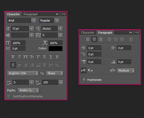
A more streamlined approach to creating a highlighted text effect in Photoshop involves utilizing the inherent features of text layers and layer styles. The process begins with the fundamental step of selecting the Text Tool (T) and inputting the desired text over your chosen image. Once the text is in place, the key lies in how you manipulate its layer. By selecting the black text layer and navigating to the Character Panel, you can locate and click on the “Underline” icon. While this might seem like a basic formatting option, its application in conjunction with other layer properties can initiate a more complex highlighting effect. This method, though seemingly straightforward, lays the groundwork for more advanced styling and can be a starting point for creating visually engaging text elements.
Advanced Techniques: Simulating Highlights and Shadows for Depth
Beyond simple text styling, Photoshop offers powerful tools for creating realistic lighting effects, which can be artfully applied to enhance images and even simulate a highlighted appearance on elements within them, not just text. This involves a more detailed process of understanding and manipulating light and shadow.
The journey often begins with a reference image. It is recommended to find a photograph where the subject is positioned similarly to your desired outcome and features a comparable light source. Opening both your reference image and your drawing or image you intend to work on side-by-side within Photoshop serves as an invaluable guide. This visual comparison is crucial for accurately determining which areas of your portrait or subject will receive shadows and which will be illuminated by highlights.
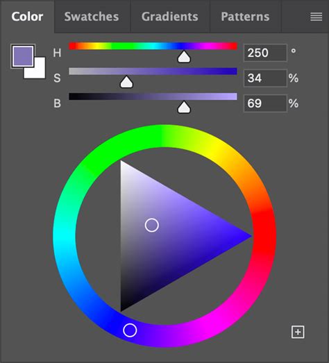
To effectively manage these lighting adjustments, it's essential to have your workspace organized. On the left side of your screen, you'll find the Photoshop toolbar, which houses all your essential tools. On the right, ensure that three key menus are open: Color, Adjustments, and Layers. If these menus are not visible, you can easily access them by going to "Window" in the top toolbar and selecting them. Within the Color menu, if your HSB (Hue, Saturation, Brightness) sliders are not immediately apparent, click on the upper right corner of the menu to reveal and select them.
A critical step in achieving realistic lighting is to separate different elements of your image into distinct layers. This means isolating the hair, skin, and clothing into their own individual layers. Once separated, it is highly beneficial to "pixel lock" each of these layers. Pixel locking prevents accidental modifications to the pixels within that layer, ensuring that your work remains organized and that unintended changes are avoided.
Starting with the skin layer, you can employ the Lasso Tool to meticulously select the areas where you want to apply shadows. Crucially, ensure that the "Add to Selection" mode is activated. This mode allows you to make multiple, contiguous selections, building up the area you intend to modify without losing previous selections.
To create a convincing shadow color, begin by color-picking the base skin color. Subsequently, utilize the HSB sliders within the Color panel. To deepen the shadow, increase the saturation and decrease the brightness of this base color.
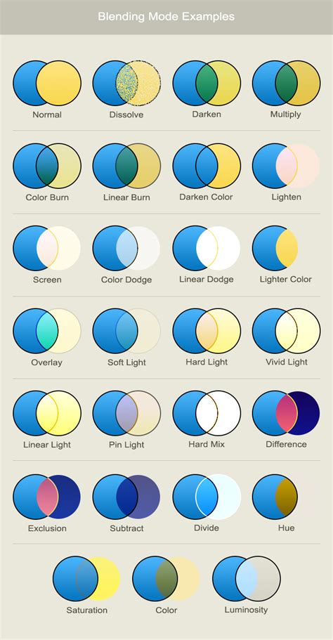
For applying these shadow tones, select a soft, round brush. Set the brush mode to "Multiply." This blending mode is excellent for darkening areas and simulating shadows naturally. Furthermore, adjust the brush opacity to approximately 50% by pressing the '5' key on your keyboard. At this stage, it is important to use a relatively large brush and to paint without excessive zooming. This technique helps to avoid overworking intricate details and ensures a smoother, more organic application of the shadow. Now, with your selections made and your brush settings configured, you can begin to fill in the previously selected areas with your shadow color.
Following this, return to your reference image and use the same soft brush to add rough shadows to the remaining areas of the skin. Continue to adjust the brush size as needed, adapting it to the specific contours and dimensions of the area you are working on.
Once the initial shadow application is complete, you will need to refine the transitions. Return to each layer and carefully blend out any harsh edges that may have been created by the precise selections made with the Lasso Tool. To achieve this, select a soft smudge tool and set its strength to around 40%. This tool will gently diffuse the edges, creating a more natural gradient between the shadowed and unshadowed areas.
The next phase involves adding highlights. This process mirrors the shadow application but focuses on illuminating specific areas. Go back to each corresponding layer and introduce highlights. To generate the highlight color, color-pick the original base color once more. Then, using the HSB sliders, increase the brightness.
When applying highlights, switch to a soft brush. Increase the brush size and set the brush mode to "Overlay." This blending mode is effective for adding luminous effects. Set the opacity to around fifty percent.
Occasionally, the generated highlight color might not appear as intended; for instance, hair highlights might exhibit an undesirable yellow or red tint. If such a situation arises, you can easily rectify it by using the HSB sliders to adjust the hue until you achieve a highlight color that is aesthetically pleasing and matches your vision.
The Shadow/Highlight Command: A Powerful Adjustment Tool
Photoshop's "Shadow/Highlight" command presents another potent method for image correction and enhancement, particularly useful for addressing images suffering from strong backlighting that results in silhouetted subjects, or for correcting subjects that appear "washed out" due to being too close to a camera flash. This adjustment can also be employed to subtly brighten specific shadow areas within an otherwise well-lit image.
It's important to understand that the Shadow/Highlight command operates intelligently. It doesn't simply apply a blanket lightening or darkening effect across the entire image. Instead, it analyzes the surrounding pixels, working with a "local neighborhood" to adjust brightness specifically within the shadow or highlight regions. This sophisticated approach is why there are distinct controls for both shadows and highlights.
However, a critical consideration when using the Shadow/Highlight command is its destructive nature. This adjustment applies changes directly to the image pixels, and in doing so, it can discard original image information. For photographers and designers who prioritize non-destructive editing workflows, it is strongly recommended to utilize adjustment layers or the Camera Raw filter. These methods allow for flexibility, enabling you to revisit and modify your edits at any time without permanently altering the underlying image data.
Within the Shadow/Highlight dialog box, several key parameters allow for fine-tuning:
Shadows/Highlights Sliders: These are the primary controls for adjusting the brightness of shadow and highlight areas. Moving the "Shadows" slider to the right will lighten the darker regions, while moving the "Highlights" slider to the right will brighten the lighter regions. Conversely, moving them to the left will darken shadows and reduce highlight brightness, respectively.
Amount: This slider controls the intensity of the darkening effect for highlights.
Tonal Width: This crucial parameter dictates the range of tones in the shadows or highlights that are modified. Smaller values restrict the adjustments to the very darkest regions for shadow correction and the very brightest regions for highlight correction. Conversely, larger values broaden the range of tones that are affected, extending the adjustments further into the midtones. For example, at 100%, the shadow tonal width slider will have the most significant impact on the shadows, with partial effects on the midtones, but minimal to no effect on the brightest highlights. The optimal Tonal Width varies significantly from image to image. Setting this value too high can sometimes introduce undesirable halos around dark or light edges. The default setting for Tonal Width is typically 50%, which often provides a good starting point. If you find that you are trying to lighten a dark subject but the midtones or lighter regions are being affected too much, try reducing the Shadow Tonal Width toward zero, which will ensure that only the darkest regions are lightened.
Radius: This setting determines the size of the local neighborhood that Photoshop analyzes when applying the Shadow/Highlight adjustment. The optimal local neighborhood size is highly dependent on the specific image content and the scale of the elements you are trying to adjust. Experimentation is key to finding the most effective radius for your image. For instance, if you are trying to adjust the lighting on a car body, a radius roughly the size of the car body might be appropriate. This allows Photoshop to consider the surrounding pixels within a relevant area to make intelligent adjustments.
Color/Black and White: This option allows you to adjust the color saturation within the shadow and highlight areas.
Show More Options: Clicking this button reveals additional controls for more advanced adjustments.
Adjusts the brightness in a grayscale image: This specific slider is only available when working with grayscale images and allows for direct brightness adjustments.
Adjusts the contrast in the midtones: This slider provides control over the contrast within the image's midtone range.
Contrast: This general contrast control affects the overall contrast of the image.
Clip: This option, when enabled, forces pixels that fall outside the displayable range to be rendered as pure black or pure white, preventing detail loss in extreme highlights or shadows.
Photoshop Shadow Highlights Adjustments as Smart Filters/Smart Objects with Jan Kabili
Gradient Overlays and Bevel Effects for Stylized Text
Another sophisticated technique for creating visually striking text effects, akin to those seen on polished car bodies in high-quality stock photography, involves the strategic use of gradient overlays and bevel effects. While the example illustration mentioned might have been hand-rendered, the underlying principle often relies on these digital tools.
To achieve this, you can start by applying a "Bevel and Emboss" layer style to your text layer. This effect adds depth and dimension by simulating the appearance of raised or indented edges, mimicking how light would interact with a three-dimensional object. This can give your text a sculpted look.
Following the application of the Bevel and Emboss effect, you can then add a "Gradient Overlay" to the same layer. A gradient overlay allows you to fill your text with a smooth transition of colors. By carefully selecting the colors and the angle of the gradient, you can create a sense of illumination and form, further enhancing the three-dimensional appearance. The combination of a bevel effect and a gradient overlay can produce a highly professional and eye-catching text style, making it appear as if it has been physically sculpted and lit.
For instance, if you were to create a quick sample, applying a bevel and emboss to the text layer would give it a raised appearance. Then, adding a gradient fill with carefully chosen colors could simulate highlights and shadows across the surface of the text, making it appear more realistic and polished. This method is particularly effective for creating that glossy, almost metallic look often associated with high-end automotive imagery.
Creative Masking and Blending for Targeted Highlights
For more nuanced and targeted highlighting effects, Photoshop's masking and blending modes offer a highly flexible approach. This method allows you to precisely control where and how your highlights appear.
The process begins by identifying the specific area of your image or text that you wish to highlight. You can achieve this by using selection tools like the Lasso Tool or Marquee Tool to create a mask. Once you have a defined area, create a new layer above your target layer.
On this new layer, you can fill the masked area with either white or black. The magic then happens when you start experimenting with the blending options for this new layer. For example, filling the masked area with white and setting the blending mode to "Soft Light" can create a subtle, luminous highlight effect. This is particularly useful for areas like the front bumper of a car, where reflections and light catches are common. By adjusting the opacity and experimenting with different blending modes (such as Overlay, Screen, or Soft Light), you can achieve a wide range of highlight intensities and appearances.
This technique is incredibly versatile, allowing you to simulate various lighting conditions and material properties. Whether you're aiming for a soft, diffused glow or a sharp, reflective shine, the combination of masking and blending modes provides granular control over the final outcome.
By understanding and applying these diverse techniques, from the simple act of underlining to the intricate manipulation of light and shadow through layer styles, adjustments, and masking, you can effectively highlight text and enhance your images within Photoshop, achieving professional and visually compelling results.