Photoshop offers a vast canvas for creative expression, allowing users to imbue text with an infinite variety of effects and aesthetics. Among these possibilities, the creation of "transparent" text, often referred to as a "punched-out" or "see-through" effect, is a sought-after technique. This guide delves into the methods for achieving this visually engaging element, enabling text to reveal the imagery beneath it.
It's important to understand from the outset that there isn't a direct "transparent" color option within Photoshop's standard color palette. This lack of an immediate, self-evident setting for transparency in text can be a point of confusion for newcomers. However, the desire to implement such an effect is common, whether it's to overlay a label onto a textured background, such as a jar of honey, or to use an image as a literal texture for your font.
Method 1: The Knockout Effect with Blending Options
One of the most effective and versatile ways to create transparent text in Photoshop involves leveraging the "Knockout" feature within the Layer Styles. This method allows the text layer to essentially "cut a hole" through a layer beneath it, revealing the content of that lower layer.
Setting the Stage: Background and Overlay
To begin, open the image you intend to use as your background. For illustrative purposes, consider a scenic photograph, perhaps a beautiful beach from Australia's North Stradbroke Island.

Next, to provide a surface for the text to interact with, you can create a panel overlay. This is achieved using the Shape Tool. Add a new layer on top of your background and apply any shape and color you desire. A common choice for this overlay is a solid-colored rectangle, often black or white, depending on the desired contrast.
Introducing the Text
Now, it's time to add your text layer. The choice of font plays a significant role in the visual impact of this effect. Thick, blocky fonts in large sizes will naturally create a more prominent "window" for viewing what lies behind. The initial color of the text is largely irrelevant, as it will soon be rendered transparent.
Applying the Knockout
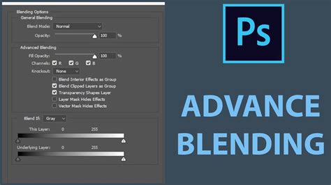
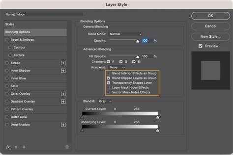
The core of this technique lies within the Blending Options of the text layer. Right-click on the text layer in the Layers panel and select "Blending Options."
Instead of choosing a standard effect from the list on the right, navigate to the "Advanced Blending" section on the left. Within this section, locate the "Knockout" drop-down menu. Change its setting from "None" to "Shallow."
This action instructs Photoshop to make the text layer "knock out" or become transparent in relation to the layers below it. The result is that the image or color behind the text will now be visible through the characters.
Refining the Overlay (Optional)
While a panel overlay is a common approach, it's not strictly necessary. The knockout effect will work with any layer positioned beneath the text layer. If you are working with an image that already has areas of sufficient contrast or visual interest, you might choose to forgo the explicit overlay.
Method 2: Transparency Through Fill Reduction and Layer Styles
Another approach to achieving transparency in text involves manipulating the "Fill" property of the text layer and then applying specific Layer Styles. This method offers a different flavor of transparency, often resulting in a more stylized appearance.
Preparing the Text Layer
Begin by creating your text layer using the Type Tool (T) and inputting your desired text. As before, the initial color is not critical.
Adjusting Fill and Adding Styles
The key step here is to reduce the "Fill" of the text layer to 0%. This is done within the Layers panel. By setting the Fill to 0%, the actual color of the text disappears, but its underlying structure, defined by layer styles, remains visible.
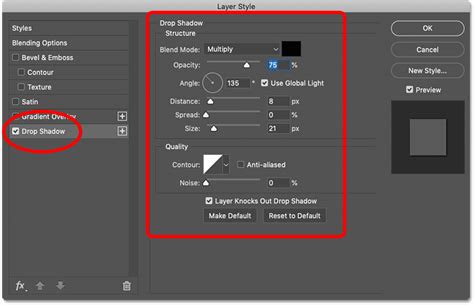
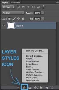
Once the fill is set to zero, you can begin adding layer styles to define the appearance of the transparent text. Click on the "fx" icon at the bottom of the Layers panel, which is typically the second icon from the left, and choose "Blending Options."
From here, you have several options to create the see-through effect:
Stroke: Select and check the "Stroke" effect. For a clear outline that defines the text's shape, set the Size to a suitable pixel value (e.g., 15 px), the Position to "Outside," and choose a color for the stroke (e.g., white, #ffffff). This white outline will become the visible element, framing the transparent interior.

Bevel and Emboss: To add depth and a raised appearance, select "Bevel and Emboss." Adjust the settings within this option to achieve the desired embossed look. This effect can make the edges of your transparent text appear to have dimension, even though the fill is absent.

Outer Glow: Adding an "Outer Glow" can create a luminous effect around the text, further enhancing its visibility against the background. Adjust the color, size, and spread of the glow to your preference.
Drop Shadow: A "Drop Shadow" can provide a sense of depth and separation from the background, making the text appear to float slightly.
By combining these layer styles with a 0% fill, you can create text that appears transparent while still maintaining a distinct and visually appealing form.
Method 3: Advanced Blending for Knockout with a Solid Color Background
This method is a variation of the knockout effect but specifically focuses on creating transparent text within a solid color block, which then allows the image behind the block to show through. This is particularly useful when you need to place text on an image but want to ensure readability without cluttering the entire composition.
Setting Up the Solid Color Layer
Start by opening your desired background image. Above this image layer, create a new layer. This new layer will serve as the solid color block for your text. Access the Shape Tool (U) and ensure that the "Fill" setting is set to a solid color (e.g., white) and that the "Stroke" is set to "None." Draw a rectangle on this new layer, covering the area where you intend to place your text.
Adding and Positioning the Text
Next, select the Type Tool (T) and create your text layer. Type your desired text. It's crucial to place this text layer in the middle of the solid color rectangle you created.
Implementing the Knockout
Now, you'll apply the knockout effect specifically to this text layer. Right-click on the text layer in the Layers panel and choose "Blending Options." In the Layer Style dialog box, under "Advanced Blending," change the "Knockout" setting from "None" to "Shallow."

This action will make the text transparent, allowing the solid color of the layer beneath it to show through.
Adjusting the Solid Color Area
Often, the solid color block might be larger than necessary. You can resize this area. Select the solid color layer. If you need to resize it precisely, you might need to convert it to a Smart Object or rasterize it, then use Free Transform (Cmd + T / Ctrl + T). When resizing, ensure you adjust the width and height handles to frame your text appropriately.
Fine-Tuning Opacity and Visibility
To further refine the appearance, you can adjust the opacity of the solid color layer. Increasing its opacity will make the text area more solid and the text easier to read. Conversely, decreasing the opacity will allow the background image to blend more subtly with the text area, creating a softer effect.

Grouping Layers for Complex Compositions
In scenarios where your background image is not on the default "Background" layer, or if you have multiple layers that need to interact with the transparent text, it's beneficial to group your layers. Select the text layer and the solid color layer (or any other layers that should be affected by the knockout) by holding down the Shift key. Then, right-click and choose "Group Layers" (or use the Cmd + G / Ctrl + G shortcut). This organizational step ensures that the knockout effect is applied correctly within the intended layer hierarchy.
Method 4: Reducing Fill to Zero and Applying Layer Styles
This method focuses on making the text itself transparent by reducing its fill to zero and then using layer styles to provide definition and form. This is a concise approach for achieving a see-through effect without necessarily creating a knockout hole.
Initial Text Creation
Begin by creating your text layer using the Text Tool. Select your desired font and type your text.
Manipulating the Fill Opacity
Navigate to the Layers panel. Locate the "Fill" opacity setting for your text layer and reduce it to 0%. At this point, the text itself will become invisible.
Adding Stylistic Elements
To make the text visible again and to define its transparent appearance, you'll add layer styles. Click the "fx" icon at the bottom of the Layers panel and select "Blending Options."
- Stroke: A common choice is to add a "Stroke." Set the Size, Position (e.g., Outside), and Color of the stroke to define the edges of your text. A white stroke on a darker background, or vice-versa, can effectively outline the transparent characters.
- Bevel and Emboss: Applying "Bevel and Emboss" can give the text a subtle three-dimensional quality, making the edges appear slightly raised or indented.
- Outer Glow: An "Outer Glow" can add a halo effect, enhancing the text's visibility and creating a unique aesthetic.
- Drop Shadow: A "Drop Shadow" can further separate the text from the background, adding depth.
By combining these layer styles with the 0% fill, you create text that appears to be made of outlines and effects, allowing the background to show through the actual character shapes.

This technique is particularly useful for creating watermarks or subtle branding elements where the text needs to be present but not overpower the main image. The ability to see through the text ensures that the underlying photograph or graphic remains the focal point.
Method 5: Using the "Knockout" Drop-down in Layer Styles (Detailed Breakdown)
This method focuses specifically on the "Knockout" feature within Photoshop's Layer Styles, which is a powerful tool for creating transparent text effects. It's a direct way to achieve the "punched-out" look.
The Foundation: Background and Text
First, open the image you wish to use as your background. This could be anything from a landscape to a product shot. Then, create your text layer using the Type Tool. Choose a font that suits your design. As mentioned previously, thicker fonts will yield more prominent transparent areas.
Accessing Advanced Blending Options
The key to this technique lies within the Layer Styles. Right-click on your text layer in the Layers panel and select "Blending Options." This will open the Layer Style dialog box.
The "Knockout" Setting
Within the Layer Style dialog box, pay close attention to the "Advanced Blending" section. Here, you will find a crucial drop-down menu labeled "Knockout." By default, this is set to "None."
To make your text transparent, change this setting from "None" to "Shallow."
Understanding the "Shallow" Knockout
When "Shallow" is selected, Photoshop interprets the text layer as an object that should "cut through" the layers beneath it. This means that where the text characters are, the opacity of the layers directly below them will be reduced, allowing the content of those lower layers to be visible.
Layer Order is Crucial
It's essential to understand that the "Knockout" effect operates on the layers beneath the text layer. Therefore, ensure that the layer you want to see through your text is positioned directly below the text layer in the Layers panel. If you have multiple layers, the knockout will affect the layer immediately below.
Practical Application: Text on a Solid Color Layer
A very common application of the "Shallow" knockout is when you have a solid color layer beneath your text. For instance, you might create a new layer, fill it with white, and then place your text on top of it. Applying the "Shallow" knockout to the text layer will make the text transparent, revealing the white background.

Resizing and Positioning
After applying the knockout, you may need to adjust the size and position of your text or the layer beneath it. Use Photoshop's Free Transform tool (Cmd + T / Ctrl + T) to resize and reposition elements as needed. For instance, you might want to resize the solid color block to perfectly frame your transparent text.
Method 6: Transparency Through Opacity Reduction
While not creating a "punched-out" effect in the same way as the knockout methods, reducing the opacity of a text layer can also achieve a form of transparency, making the text appear faded or semi-see-through. This is a simpler method for achieving a subtle transparency.
Creating the Text
Start by creating your text layer with the Type Tool and choosing your desired font and color.
Adjusting Layer Opacity
In the Layers panel, you will see an "Opacity" slider. This slider controls the overall transparency of the entire layer, including any layer styles that might be applied.

By dragging this slider downwards, you can reduce the opacity of the text layer. As the opacity decreases, the text will become more transparent, allowing the background image to show through it more clearly.
Combining with Other Effects
This method can be combined with other layer styles, such as strokes or subtle glows, to create a transparent text effect that is still defined and visible. For example, you could reduce the opacity of the text layer and then add a white stroke to give it a clear outline.
When to Use Opacity Reduction
This technique is ideal when you want the text to be a subtle overlay, such as a watermark or a decorative element that doesn't need to create a distinct "hole" in the background. It's a quick way to soften the appearance of text and integrate it more seamlessly with the underlying image.

Considerations for Effective Transparent Text
Regardless of the method employed, several factors contribute to the successful creation and application of transparent text in Photoshop:
- Font Choice: As repeatedly emphasized, font selection is critical. Bold, sans-serif fonts generally perform best for knockout effects, as they provide larger, more defined areas for transparency. Thin or overly decorative fonts may result in fragmented or illegible transparent text.
- Contrast: Ensure sufficient contrast between the text (or its defining elements, like strokes) and the background that shows through. This contrast is what makes the text readable and visually impactful.
- Purpose: Consider the purpose of your transparent text. Is it for branding, a watermark, a design element, or to convey information? The intended use will influence the method and style you choose.
- Readability: The primary goal of text is to communicate. Even with transparency, ensure that your text remains legible. Overly complex backgrounds showing through thin text can lead to comprehension issues.
- Layer Management: Keeping your Photoshop document organized with clearly named layers is crucial, especially when working with multiple transparency effects or complex compositions.

By mastering these techniques, you can add a sophisticated and visually engaging layer of transparency to your text in Photoshop, opening up new creative possibilities for your designs and images. Whether you're a real estate photographer looking to add subtle marketing text or a graphic designer aiming for a unique aesthetic, understanding how to make text see-through is an invaluable skill.