Word spacing is a fundamental yet often overlooked aspect of typography that profoundly impacts the readability and aesthetic appeal of any document. While InDesign offers several methods to control the space between words, understanding these tools can elevate your design from functional to exceptional. This article delves into the various techniques for adjusting word spacing, from precise manual interventions to systematic style-based modifications, ensuring your text flows harmoniously and engages your readers effectively.
The Nuances of Word Spacing: Why It Matters
Most individuals tend to take word spacing for granted, assuming the default settings provided by a font designer are optimal. However, this is not always the case. The predetermined spacing within a font is a starting point, but real-world application, especially with varying text sizes and alignments, often necessitates adjustments.
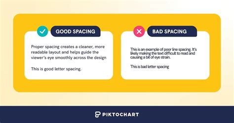
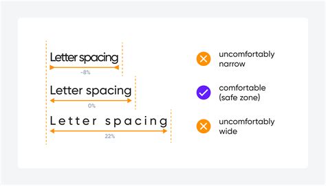
Appropriate word spacing is crucial because it directly affects readability. If the spacing is too narrow, words can begin to merge, creating a dense and difficult-to-read block of text. Conversely, excessively wide spacing can lead to text appearing "sprinkled" with large gaps, which is not only visually distracting but also disrupts the natural rhythm of reading. A common rule of thumb suggests that word spacing should approximate the width of a lowercase 'n' or 'o' in the specific font being used. This principle ensures that the spacing remains in proportion to the overall design of the typeface.
While a typeface's default word spacing is a predetermined value that differs from font to font, most design software, including InDesign, allows for modification. This capability is particularly useful when dealing with commercial fonts that might have too much inherent space between words, leading to visual hesitations that diminish readability.
It's important to note that in modern digital typesetting, there is never a need for double spaces between sentences, a practice that originated from typewriter days. InDesign's advanced typesetting engine handles inter-sentence spacing automatically and appropriately.
Direct Manipulation: Keyboard Shortcuts for Word Spacing
Adobe InDesign offers direct keyboard shortcuts for making immediate, albeit small, adjustments to word spacing. These shortcuts are essentially "macros" that target and modify the kerning of space characters within selected text.
- To close word spacing by 20 units: Press
Command-Option-Delete(on Mac) orCtrl-Alt-Backspace(on Windows). This command is effective when more than one word is selected. - To open word spacing by 20 units: Press
Command-Option-\(backslash on Mac) orCtrl-Alt-\(backslash on Windows).
It's worth noting that the Command-Option-\ shortcut on Mac OS X can sometimes be overridden by other system features, such as "Smooth Text," preventing it from functioning within InDesign. If this occurs, alternative methods will be necessary.
Create CLEANER Index Menus by PERFECTING Your Text Spacing! | Design Tutorial | Adobe InDesign
Adjusting Word Spacing for Entire Paragraphs: The Power of Justification Settings
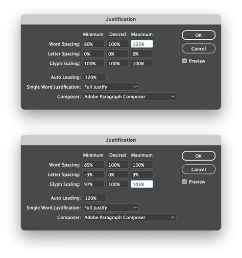
A more robust and controlled method for managing word spacing, especially for an entire paragraph, lies within InDesign's Justification settings. This feature allows for precise control over the "desired" word spacing, as well as the maximum and minimum values, which is particularly useful for justified text.
To access these settings:
- Place your cursor anywhere within the paragraph you wish to adjust.
- Navigate to
Type > Paragraphor use the keyboard shortcutCommand-Option-Shift-J(Mac) /Ctrl-Alt-Shift-J(Windows). - In the Paragraph panel or the Control panel (in paragraph mode), locate the "Justification" settings.
- Within the Justification dialog box, you will find a row specifically for "Word Spacing." The middle field, labeled "Desired," is where you can input a percentage value. This percentage is relative to the font's default spacing. For example, setting it to 100% maintains the default, while 120% increases it by 20%.
If you intend to significantly increase word spacing (e.g., to 200%), it is crucial to also adjust the "Maximum" word spacing value accordingly. This prevents InDesign from defaulting to its maximum allowable spacing, which might be too restrictive.
When working with these settings, always ensure the "Preview" checkbox is selected. This allows you to see the immediate impact of your adjustments as you make them, facilitating a more intuitive workflow.
Modifying Justification in Paragraph Styles
For consistent word spacing across multiple paragraphs or an entire document, applying Justification settings through Paragraph Styles is highly recommended. By defining the "Desired" word spacing within a paragraph style, any text formatted with that style will automatically adopt the specified spacing. This is a cornerstone of efficient and error-free InDesign workflows, ensuring uniformity and making global changes straightforward.
To edit justification within a paragraph style:
- Open the Paragraph Styles panel (
Window > Styles > Paragraph Styles). - Right-click on the desired paragraph style and choose "Edit Style."
- Navigate to the "Justification" section in the style's options.
- Adjust the "Word Spacing" values as needed.
- Click "OK" to apply the changes to all text using that style.
This approach is far superior to manual overrides, as it centralizes formatting control and makes future edits significantly easier.
Word Spacing for Display Type: A Different Approach
The perception of word spacing changes as type size increases. While the actual ratio between characters and spaces remains constant, larger type often makes the existing word spacing appear more open. Therefore, word spacing for headline or display type typically needs to be slightly reduced compared to body text.
Consider a typeface originally designed for body text when used at large display sizes. The default word spaces can appear disproportionately large, detracting from the design. In such cases, reducing the word spacing-perhaps to 85% or 90% of its default value via the Justification settings-can significantly improve the visual balance.
For the most precise control over word spacing in display type, especially when dealing with specific letter combinations that create awkward gaps (like "AV" or "To"), the kerning feature is indispensable. Kerning allows you to manually adjust the space between individual pairs of characters, offering a level of granular control that justification alone cannot provide.
Understanding Text Frames and Their Role
In InDesign, text resides within containers known as text frames. These can be either "frame grids," which display grids for precise character em-box and spacing, or "plain text frames" for standard text flow. The way text frames are configured, sized, and threaded together directly influences how text, and consequently word spacing, is laid out on the page.
Text frames can be created using the Type tool for horizontal text or the Vertical Type tool for vertical text. Multiple frames can be linked, or "threaded," allowing text to flow seamlessly from one frame to another, regardless of how many frames constitute a single "story." Text frames can also accommodate multiple columns, and these column layouts can be based on, yet independent of, the page's overall column guides.
Resizing text frames can be done using the Selection tool by dragging the frame handles. Holding Ctrl (Windows) or Command (Mac) while dragging these handles while the Type tool is selected will scale the text within the frame along with the frame itself. Double-clicking a frame handle can quickly fit the frame to its content, a useful shortcut for optimizing layout.
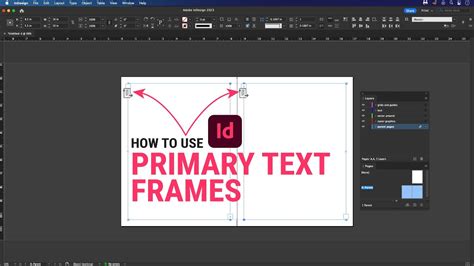
The "Primary Text Frame" option, available when creating a new document, places a page-sized text frame on the document's parent page. This acts as a master frame, and text typed into it on document pages can automatically trigger the addition of new pages via "Smart Text Reflow" as you continue typing.
Beyond Word Spacing: Related Typographic Controls
While this article focuses on word spacing, it's important to acknowledge related typographic features that contribute to overall text flow and appearance:
- Space Between Paragraphs: Controlled by "Space Before" and "Space After" values in the Justification settings, this dictates the vertical separation between paragraphs, which is distinct from inter-word spacing.
- Paragraph Rules: InDesign allows for rules (lines) to be placed above or below paragraphs, offering further control over the visual structure. The width of these rules is often determined by the column width.
- Keep Options: These settings prevent undesirable line breaks and ensure that paragraphs or lines remain together, avoiding issues like "widows" (a single line of a paragraph at the end of a page) and "orphans" (a single line of a paragraph at the beginning of a page).
- Paragraph Borders and Shading: These features allow for the creation of visual containers around paragraphs, enhancing their distinctiveness.
- Baseline Grid: Aligning text across columns and pages using a baseline grid ensures that the baselines of text lines are consistently spaced, contributing to a harmonious and organized appearance.
By mastering the techniques for adjusting word spacing, from subtle keyboard shortcuts to comprehensive style-based controls, designers can ensure their text is not only legible but also aesthetically pleasing, achieving a professional and polished final product.