Underlining text in Adobe InDesign, while seemingly a straightforward typographical element, is a feature rich with nuance and potential for both effective emphasis and stylistic missteps. Historically rooted in manual typesetting and the limitations of early word processors, underlining has evolved into a tool that, when wielded with understanding, can enhance readability and draw attention to key information. However, its overuse or improper application can betray a lack of design sophistication. This article delves into the various methods of applying underlines within InDesign, exploring their functionalities, customization options, and the aesthetic considerations that guide their judicious use in professional document design.
Unraveling the Mystery of Persistent Underlines
For new users or those transitioning from older software, encountering unexpectedly underlined text can be a perplexing experience. This often stems from the application of Paragraph Styles, a powerful feature in InDesign that allows for consistent formatting across entire documents. When a paragraph style is applied to text, any formatting defined within that style will affect the text. If an underline is set within a paragraph style, it will appear on all text formatted with that style. The presence of a plus sign (+) next to a style name in the Paragraph Styles panel, such as "Ty Ford 1+" as observed in user discussions, is a clear indicator that the original style has been modified. This modification could include the addition of an underline. To rectify this, one must access the Paragraph Style Options by double-clicking the style and then navigate to the specific settings that control underlining, often found within the "Rule Above" or "Rule Below" sections, or directly in the "Underline" options. It's crucial to turn off these rules or underlines within the style definition if they are not intentionally desired.
The Nuance of Paragraph Rules vs. Underlines
It is important to distinguish between paragraph rules and the direct underline feature. Paragraph rules are graphical lines that can be positioned above or below a paragraph, offering a degree of control over their thickness, offset from the text, and color. While they can visually mimic an underline, they are distinct features. If paragraph rules are turned on and contributing to an unwanted underline effect, they can be deactivated by unchecking either the "rule above" or "rule below" option. However, the core underline feature is a more direct application to the text itself, affecting the characters rather than creating a separate rule. Both methods, if applied through a paragraph style, need to be addressed within the style's settings.
Mastering the Underline Feature in InDesign
Adobe InDesign offers a robust set of tools for applying and customizing underlines, far surpassing the basic functionality found in simpler word processing applications. The primary method for applying an underline involves selecting the desired text with the Type Tool (T).
Direct Application and Underline Options
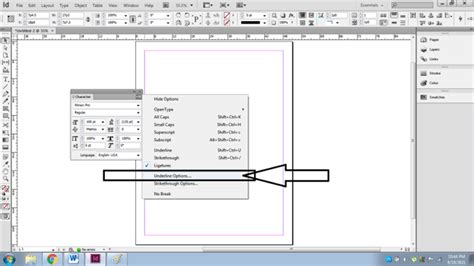
Once text is selected, the Underline feature can be activated directly from the Character panel or the Control panel. For more granular control, the Underline Options dialog box is indispensable. This box can be accessed by holding down the Alt/Opt key on the keyboard while clicking the Underline button in the Control panel, or by navigating through the Character panel menu.
Within the Underline Options, a wealth of customization awaits:
- Weight: This setting determines the thickness of the underline line. Users can select from a range of predefined weights or enter a custom value.
- Offset: The offset controls the distance of the underline from the baseline of the text. A negative offset will move the line closer to the text, while a positive offset will push it further away.
- Color and Tint: The underline can be assigned any color from the document's swatches, and its intensity can be adjusted using the tint slider.
- Dashed Underlines: For a more stylized effect, users can opt for dashed underlines. Options for the appearance of the area between dashes, dots, or lines allow for further refinement.
Baseline Shift and its Role
While not directly an underlining feature, Baseline Shift plays a role in character positioning and can be confused with underline adjustments. Baseline Shift allows a selected character to be moved up or down relative to the baseline of the surrounding text. This is particularly useful for superscript and subscript formatting, but it can also be used to subtly adjust the vertical position of underlined text if the standard offset options are not sufficient.
Beyond the Basic Underline: Alternatives and Best Practices
It's important to acknowledge that in professional design circles, the underline is often viewed with caution. Historically, it was a proofreader's mark to indicate that text should be italicized. During the era of typewriters, when italics were not easily achievable, underlining became the primary method for emphasis. However, in professionally typeset documents, italics, changes in font weight (bolding), or the use of color are generally preferred for emphasis. Underlines can sometimes be perceived as less sophisticated or even as a sign of inexperience in design.
The Case for Customization
Despite these reservations, InDesign's advanced customization options for underlines offer a path to more aesthetically pleasing and contextually appropriate uses. By carefully adjusting the weight, offset, and color, an underline can be transformed from a stark, utilitarian line into a subtle design element. For instance, a very thin, slightly offset underline in a muted color might serve to highlight a specific term without being overly distracting.
Considering the Audience and Context
A crucial aspect of any design choice, including underlining, is to consider the intended audience and the overall context of the document. What might be acceptable in a technical manual or a draft document might be considered unprofessional in a marketing brochure or a high-end publication. The common misconception is that underlining is solely for emphasis, but its application can be more nuanced. For example, in certain web contexts, underlines are strongly associated with hyperlinks, so their use in print might be confusing or lead to unintended associations.
InDesign Tutorial: Formatting Text, Intermediate
The "Why" Behind the Underline
The decision to underline text should always be deliberate. Is it to draw attention to a key term? To denote a specific type of information, like a quote or a definition? Or is it simply a carryover from older, less flexible formatting methods? Understanding the purpose is the first step to determining if an underline is the most effective tool for the job. If the goal is simply emphasis, exploring options like bolding, italicizing, or using a contrasting color might yield a more refined result.
Advanced Text Formatting in InDesign
Beyond underlining, InDesign offers a suite of powerful tools for manipulating text appearance, each with its own set of applications and implications.
Case Manipulation
The Change Case command is invaluable for automatically altering the capitalization of selected text. Options include Uppercase, Lowercase, Sentence case, Title Case, and the ability to toggle case. This command is particularly useful for ensuring consistency, especially when dealing with text that may have been entered with inconsistent capitalization. It's important to note that using Change Case is often preferable to manually typing in all caps, as it allows for easier reversion and maintains a clear distinction in the text's formatting attributes.
OpenType Features
For users working with OpenType fonts, InDesign unlocks a world of typographic enhancements. Features such as Ligatures can be activated to create more elegant typography by combining certain character pairs (like "fi" or "fl") into a single glyph designed by the font creator. Small Caps and OpenType All Small Caps provide an alternative to traditional all-caps formatting, offering a visually lighter and often more refined appearance for acronyms or emphasized words.
Language Settings and Their Impact
InDesign's ability to recognize and apply different language settings is crucial for accurate spelling and hyphenation. By selecting text and choosing the appropriate language from the Character panel menu or by setting a default language for the document, users ensure that the correct dictionaries are used for spell-checking and automatic hyphenation. This is particularly important when working with multilingual documents or text that includes proper nouns or foreign terms that might otherwise be flagged as errors. For instance, a word like "Glockenspiel" would be recognized with standard syllable breaks in English, but its hyphenation might differ in Traditional German.
Conclusion: A Tool to Be Used Wisely
Underlining text in Adobe InDesign is a feature with a rich history and a diverse range of applications. From correcting unexpected formatting to applying custom emphasis, understanding its mechanics is key to effective document design. While the direct underline feature and paragraph rules offer significant control, it is the thoughtful application of these tools, guided by an awareness of design principles and audience expectations, that truly elevates a document. By mastering the options available in InDesign, designers can leverage underlining not just as a basic emphasis tool, but as a nuanced element of typographic expression. The ability to customize weight, offset, and color, combined with an understanding of when and why to use it, ensures that underlining can serve its purpose effectively without compromising the overall aesthetic of the design.