Adjusting color is a very powerful component in editing. When you import an image as a RAW file, it appears a bit flat. Lightroom is your tool to bring out the color and bring the image to life! Undeniably, the quality of your exposure has the greatest impact on color. However, beyond that, color is largely impacted by several areas, including White Balance, Camera Calibration and Color Profile, HSL Panel, Color Curves, and Split Toning. While you don’t need to adjust each of these for every image you take, it’s important to understand the role that each plays in the potential outcome of your image. Today, let’s spend a little more time talking about Color Curves and the impact they have on your editing.
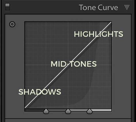
First, let’s back up. Color Curves are located within the Tone Curve in Lightroom. The Tone Curve is arguably one of the most powerful tools in Lightroom. The bottom of the Tone Curve is the Tone axis: the line starts with Shadows on the left and ends with Highlights on the right. In the middle, you have Midtones, which are then further split into darker midtones, called Darks, and brighter midtones, called Lights. The left axis represents how bright or dark the specific tonal regions are. The further up the left axis you go, the brighter the tones get. Within the Tone Curve, you can select RGB (all the colors) or you can select the tone curve for each specific color: Red, Green, and Blue. Adjusting the RGB curve really gives the image a lot of depth, and as such, it’s often the best place to start within the Tone Curve.
To adjust the Tone Curve, you can either use the region sliders or you can drag on the Tone Curve itself to pull it into the desired shape. To do this, you must first click the box in the lower right corner of the Tone Curve so that the sliders go away. For example, I like images with deep blacks and strong whites, so I prefer to deepen my shadows and brighten the lights a bit. To do this, I almost always create a version of the classic "S" curve, by dragging the lower third down a bit and raising the upper third just slightly.
Understanding the Tone Curve Graph
The Tone Curve is a visual way of adjusting the lightness of tones (and colors) in your image. It matches up with your image’s histogram. Basically, think of a Tone Curve as a graph that charts the tones of an image in terms of input and output. Every part of your image starts off at its current tone, from black to white, and this is the X-axis of the Tone Curve along the bottom edge of the graph. The left axis represents how bright or dark the specific tonal regions are; the further up the left axis you go, the brighter the tones get.
To actually put a Tone Curve to use, you need to create points along that straight line and move them away from their default. Usually, this means you are creating a point somewhere on the curve and dragging it upward to lighten, or downward to darken, that tone. You can create as many points along the curve as you want, to brighten or darken the highlights and/or shadows as you desire. The concept of a Tone Curve is very simple once you realize what you’re looking at. In Lightroom, as with many photo editing apps these days, you have the added benefit of seeing your histogram overlaid on your Tone Curve.
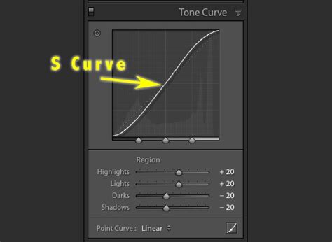
To create an "S-curve" Tone Curve, simply create at least two points: one in the highlights and one in the shadows. If you drag the black point towards the right, along the bottom of the graph, you will turn dark tones into pure black. If you drag the black point up, along the left edge of the histogram, then you’ll turn whatever was pure black into something slightly lighter, or even grey if you go up towards the middle. This is useful if you want to create a faded, vintage look; however, don’t overdo it! If you drag the black point away from both edges, up into the graph’s X and Y axis at the same time, then you will effectively be performing both functions at once - you will clip some blacks while at the same time turning them into a flat, faded-looking dark tone.
Dragging the white point leftward across the top of the histogram will clip your highlights to pure white. Dragging the white point down along the right edge will turn white into a light grey tone. And dragging the white point both downward and to the left will perform both dramatic adjustments at the same time.
Parametric vs. Point Curve: Choosing Your Approach
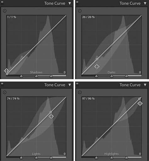
If you’d like to adjust the tones in your image using the visualization of a Tone Curve, but you still enjoy the convenience of sliders, you can switch from the Point Curve to the Parametric Curve in Lightroom. This brings up four sliders with the same names as the four main tonal sliders in the Basic section of the Develop Module. However, they operate independently from both the Basic sliders and the main Tone Curve itself. Highlights and Lights correspond to the brighter portions of the shot, while Shadows and Darks correspond to the darker portions of the shot. As you adjust the sliders, you’ll see your image change, and you’ll see the Tone Curve change, too. Note that you can also click and drag the Parametric Curve directly.
When just starting out, I’d recommend working with the slider-based Parametric Curve. Then drag on the sliders to adjust the image. For full control of adjusting contrast in an image with the Tone Curve in Lightroom, you need to open the Point Curve. Simply click on the white circle above the Tone Curve to open the Point Curve option, then the up/down arrows next to "Point curve". Then click on the graph line. Then click on the relevant portion of your image. Drag upward or downward to lighten or darken the corresponding tones. This can be a great way to add extra precision to your workflow, plus it offers plenty of hands-on fun!
The Power of Color Curves
Last but not least, you can use curves to manipulate not just luminance tones altogether, but also individual colors. Only then should you delve into RGB curves, for either achieving very specific, tricky corrections, or of course for totally creative looks. Considering how omnipotent a Tone Curve in Lightroom might be, why not use it for 100% of your tonal management? This is what the Shadows and Highlights sliders are really good at in Lightroom’s Develop Module. Usually, if you try to do too much “recovery” with curves, you’ll wind up with other portions of your image looking extremely flat and downright weird in many cases.
The color curves in Lightroom allow you to fine-tune the color for specific regions of your image. For example, you can adjust the blues in your shadows or the reds in your midtones. You adjust color curves the same way you adjust the Tone Curve. Use the Targeted Adjustment Tool to select an area of the image. A dot will then appear on the Tone Curve in that spot. You can then either use the up/down keys or drag the dot to where you want it. Note: It helps to also pay attention to your RGB numbers on your top histogram to make sure you have them where you want them.
When deciding what direction to adjust your Color Curve, remember:
- Red is the opposite of cyan.
- Green is the opposite of magenta.
- Blue is the opposite of yellow.
How to Master the Tone Curve in Adobe Lightroom (2025)
With the Red Curve, for instance, you can drag the line upward to add more red to select parts of the image - and you can drag the line downward to add more cyan. With the Green Curve, you can drag the line upward to add more green or drag the line downward to add more magenta. Note that the adjustments will be applied to the tonal areas of the image corresponding to the Tone Curve. If you drag the Red Curve up from the middle, it’ll redden the image midtones while leaving the highlights and shadows relatively untouched. And if you drop the right-hand portion of the Blue Curve, it’ll make the highlights yellow but leave the midtones and shadows alone.
Color Curves can be especially helpful when correcting skin tones. You can certainly adjust skin tones with a White Balance adjustment, but if this doesn’t get you the look you’re going for, the Color Curves may offer a more accurate result. With Color Curves, you can adjust the color for a limited part of the tonal range versus the global adjustment you get with the temperature slider.
Practical Applications and Creative Possibilities
By selectively adding colors to your image, you can enhance image cohesiveness and even create different moods, but this will depend on the existing colors in the frame. I do recommend that you add different colors to different tonal regions of the image (you can get great results with complementary color pairs!). At the end of the day, however, it’s all about experimentation. So spend some time playing around with the different Tone Curve options.
For example, I like images with deep blacks and strong whites so I prefer to deepen my shadows and brighten the lights a bit. To do this, I almost always create a version of the classic "S" curve. The entirety of my editing process was done solely by making curve adjustments; not a single slider was used.
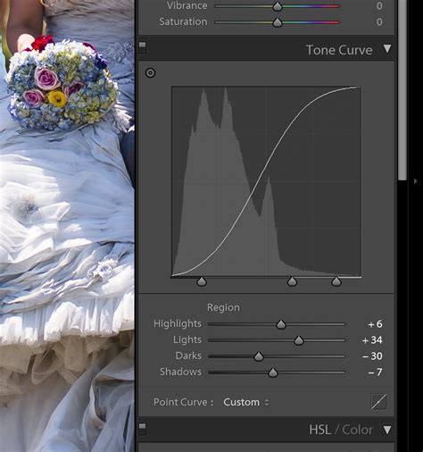
The final aspect of setting a custom Tone Curve in Lightroom is the color curves. Because black and whites in film aren’t as stark as in digital photography, the starting point for a cinematic look is to fade the blacks and the whites. An easy way to introduce complementary colors to photos in post-production is to use the color channels. Each channel can be adjusted for its complementary color. Whatever you do, make sure that your adjustments are small so that your photo doesn’t look over-processed. As you can see from the before and after images below, it was a subtle adjustment but was highly effective at making the background whiter.
Workflow Integration and Presets
Adjusting color curves can take a lot of time. So when you find a color recipe that works for you, it can be helpful to save it as a preset. You can then use this as a starting point for your images and fine-tune the curve as each individual image necessitates. To do this, click on the "+" button at the top of your Presets Panel on the left column of Lightroom. While you can certainly create regular presets that include Tone Curve adjustments, Lightroom actually offers a way to make presets that only affect the Tone Curve. Just make an adjustment to the Tone Curve, then - when you create an effect you like - click on the dropdown box, select "Save," and name your preset!
It’s really easy to apply your Tone Curve settings to multiple photos at once using Lightroom batch editing. As soon as you understand how the Tone Curve works, you’ll see that it’s not difficult and it offers so many great opportunities for different edits. To develop your own photo editing style in Lightroom, you need to get to know the Tone Curve tool.
The Tone Curve is an essential part of every edit. I adjust the RGB curve with every single image as I believe this is the best way to add depth through processing. Adjusting the Color Curves may not always be necessary, but it’s important to remember that it’s another area you can use to fine-tune and add impact to your image. And of course, there’s no right or wrong way to edit color. Each session has its own unique feel, and accordingly, its own unique color edit.
Embracing the Tone Curve
If the Lightroom Tone Curve has ever felt confusing, intimidating, or like something only “real pros” understand - you’re not alone. The Lightroom Tone Curve is one of the most powerful features of Lightroom Classic. You can do so much with the Tone Curve, and it forms the basis of most Lightroom presets. The Tone Curve is a tool in Lightroom used for adjusting tones to make images brighter or darker, and to adjust colors. Tones in photos, from shadows, to darks, midtones, lights, and highlights, are adjusted using the RGB curve. The Tone Curve tool is a panel on the right of the Develop Module.
You can also use the Tone Curve to make your photos feel more like film or more like they were taken with a vintage camera. Mistake: Everything looks crunchy → Your curve is too aggressive. Need pop? Film look? Washed highlights? Stylized color? Preset too strong?
The Tone Curve might seem complex, but it’s actually pretty simple. Use the Targeted Adjustment Tool (little circle icon) and click directly on your photo. Then add points to the line, drag it up and down, and see what happens!
So open up Lightroom. Practice with the Tone Curve. How do you plan to use the Tone Curve to enhance your photos?