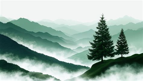
Hunter green is a lush color that embodies growth and new beginnings. This cool-toned shade is positioned between blue and green on the color wheel, evoking feelings of peace and balance. It is a deep, muted green that brings to mind evergreen needles and shaded woodland foliage. The term "hunter green" was coined in early 19th-century England, with hunters of this time using the hue on their garments because its deep, earthy tones provided camouflage with the surrounding trees. This association with nature and the outdoors grew throughout the 20th century, with similar camouflage colors sometimes used in military uniforms and later becoming popular in athletic gear and equipment. Today, hunter green is used in various situations, including fashion and home design, while maintaining its strong link to nature.
Defining Hunter Green: Color Codes and Values
To ensure consistency across various digital platforms and devices, hunter green is defined by specific color codes and values. While variations exist, a commonly used hex code for hunter green is #355E3B. In a digital context, this translates to RGB values of 53, 94, 59 for screen display, representing the intensity of red, green, and blue light. For professional printing applications, the CMYK coordinates are 44% cyan, 0% magenta, 37% yellow, and 63% black. These CMYK values mark the composition proportions of primary colors, indicating the mix of Cyan, Magenta, Blue, and Black pigments needed to achieve the color. In practice, there can be more than one way to mix pigments for hunter green using a four-color process, as CMYK colors do not have a strict cross-reference chart with named shade variations. Some CMYK colors are named by various manufacturers, and most CMYK color names that are commonly used are designated by the general public.
In a RGB color space, hex #355e3b is composed of 20.8% red, 36.9% green, and 23.1% blue. Whereas in a CMYK color space, it is composed of 43.6% cyan, 0% magenta, 37.2% yellow, and 63.1% black. It has a hue angle of 128.8 degrees, a saturation of 27.9%, and a lightness of 28.8%. The hexadecimal color #355e3b has RGB values of R:53, G:94, B:59 and CMYK values of C:0.44, M:0, Y:0.37, K:0.63. The hexadecimal color #355e3b could be obtained by blending #6abc76 with #000000.
Understanding different color models is crucial for designers. HEX is the most common way to specify hunter green for web and digital work. RGB expresses the same shade as red, green, and blue light values. CMYK approximates how hunter green is mixed with ink for print. HSL (Hue, Saturation, Lightness) describes these aspects, making it easier to create lighter or darker variations. Web-safe colors are legacy-safe approximations for older palettes and strict constraints.
The Psychology and Symbolism of Hunter Green
Hunter green is often tied to nature, durability, and a calm sense of authority. Because it is darker and more muted than many greens, it often reads as classic and dependable in everyday visuals. In color psychology, hunter green is known to promote feelings of well-being, similar to spending time outdoors in a lush forest. Its association with nature makes it symbolic of growth and prosperity, which is why it might be used in logos for environmental groups or brands that promote healthy living. This symbolism is why it might be used in logos for environmental groups or brands that promote healthy living. Professional designers turn to it when projects demand sophistication without showiness. Materials finished in this hue convey prestige that lasts; leather goods, luxury packaging, and high-end textiles adopt it to signal quality transcending trends.
In UI design, hunter green can be used as a background color to create a sense of calm for users. However, using hunter green strategically is important, as too much can make a design feel heavy or overwhelming. Accessibility considerations play a crucial role in UX and UI design color choices. Figma offers plugins in the Community to make sure your designs meet Web Content Accessibility Guidelines.
Variations and Palettes: Composing with Hunter Green
Hunter green isn't just one "forest" color-it spans near-black pines, deeper UI-friendly greens, and airy tints for backgrounds. Common variations include light, medium, and deep versions, each maintaining characteristic sophistication at different intensities.
- Midnight Pine (#1C3320): A very dark green with a near-black depth and a subtle cool undertone.
- Dark Hunter Green (#244128): A deeper, slightly cooler take that keeps the same muted character.
- Classic Hunter Green (#355E3B): The recognizable hunter green balance of depth, neutrality, and natural feel.
- Soft Evergreen (#4F7A55): A lighter evergreen that reads friendlier while staying earthy.
- Sage Tint (#A8C0AD): A pale, desaturated tint that feels airy and calm rather than heavy.
For variations within the same earthy spectrum as hunter green, consider:
- Dark green (#06402B): Leans even deeper and smokier than hunter green.
- Forest green (#2E6F40): A close cousin to hunter green but slightly brighter.
- Emerald green (#00674F): A jewel-toned green that exudes luxury and vibrancy.
- Green (#008000): A pure green that’s brighter and warmer than hunter green.
A shade is achieved by adding black to any pure hue, while a tint is created by mixing white to any pure color. A tone is produced by adding gray to any pure hue.
Complementary Colors and Harmonious Pairings
To complement hunter green, consider pairing it with colors that enhance its natural richness and sophistication.
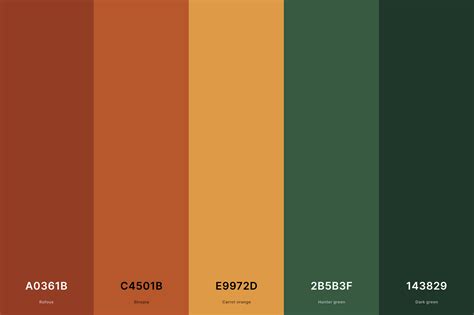
- Burnt orange (#BE5103): Creates a bold contrast next to hunter green, reminiscent of autumn foliage.
- Blood red (#780606): Adds a touch of sophistication and unexpected energy to hunter green.
- Nude (#F7D9BC): Grounds hunter green and creates a sense of balance.
- Rosewater (#FFD6D1): A delicate pink that adds a touch of femininity to hunter green.
- Warm neutrals like cream or tan: Balance hunter green's intensity and soften its effect.
- Gold accents: Elevate the combination into something truly distinguished.
- Deeper accents like plum or indigo: Provide contrast and visual interest.
Colors to Avoid or Use with Caution
While hunter green offers versatility, some color combinations can create a harsh or unbalanced effect.
- Neon pink (#FF13F0): Creates a harsh contrast that can overwhelm the sophistication of hunter green.
- Blue (#0000FF): Next to hunter green, it can result in a cold and sterile feeling, lacking natural harmony.
- Purple (#9D00FF): Competes with the depth of hunter green, creating a distracting effect.
- Bright yellow (#FFED29): Sits awkwardly next to hunter green’s richness, making the combination feel unbalanced.
- Chartreuse (#CCFF00): A highly saturated yellow tone that can be too busy with hunter green.
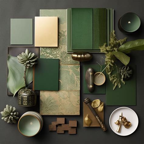
Applications of Hunter Green in Design
Hunter green is a practical choice when you want an earthy, refined tone that still feels modern. Its deep, muted look feels natural, dependable, and quietly sophisticated. Whether you're building a brand palette, designing a UI, or planning packaging, #355E3B gives you a grounded base that plays nicely with warm neutrals, metals, and controlled accent hues like plum or indigo.
Nature-Inspired Aesthetics and Brand Identity
Hunter green’s earthy tones evoke growth and freshness, making it ideal for brands like Whole Foods and John Deere to promote healthy living and outdoor activities. Its natural depth works beautifully in luxury packaging, corporate identities, and premium product presentations. Enterprises select this tone for corporate identities when projecting reliability without rigidity matters. Financial institutions favor its professional gravitas.
How To Use Color Psychology In Marketing And Branding (Choose Your Brand Colors)
Communicating Luxury and Sophistication
Hunter green’s richness can convey a sense of affluence and prosperity. Consider using it for branding elements in financial services or high-end products. Professional designers turn to it when projects demand sophistication without showiness. Materials finished in this hue convey prestige that lasts. Leather goods, luxury packaging, and high-end textiles adopt it to signal quality transcending trends.
Subtle Accents and UI Design
Small touches of hunter green can add depth and sophistication to your design. Try using it for borders, icons, or text to complement a neutral color palette. In UI design, hunter green can be used as a structural tone, especially when paired with very light text and clear hierarchy. It can work well in UI as a background or structural tone, especially when paired with very light text and clear hierarchy.
Global Considerations and Color Perception
It is important to keep in mind that color and its meaning can change from culture to culture-and at any given time. If you are designing for a global audience, research color considerations for your specific regions. While hunter green is often associated with nature and stability in Western cultures, its perception might differ elsewhere.
Below, you can see how #355e3b is perceived by people affected by a color vision deficiency. Understanding these perceptions is crucial for creating inclusive designs.
Tools for Design with Hunter Green
When incorporating hunter green into your photography projects, tools like Media.io's AI Image tools can help you achieve more refined results. Media.io is an online AI studio that empowers creators with advanced image generation and enhancement tools. Want to generate hunter green color photos or posters? These AI-powered tools can assist in creating visually appealing content.
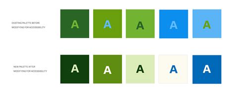
The combination of #2C5F34 (Hunter Green) with #FFFFFF (White) provides a contrast ratio of 7.52:1, which passes the WCAG AA standard for large text and normal text. This means that text in this color combination is highly readable. However, a contrast ratio of 2.79:1 for #2C5F34 on a #FFFFFF background for large text is also provided, which would not pass WCAG AA for normal text. This highlights the importance of careful color pairing for readability and accessibility.