Inkscape stands as a powerful, free, and open-source vector graphics editor, offering a professional-level platform for logo design. The misconception that professional design necessitates expensive software is dispelled by the reality that creativity, cleverness, and a solid understanding of design principles are paramount. This article delves into the comprehensive process of logo design, leveraging Inkscape's capabilities, from the initial client brief to the final presentation of a polished, professional logo.
The Foundation of Effective Logo Design: Theory and Process
The creation of a compelling logo extends beyond mere aesthetics; it involves a deep dive into design theory and a structured creative process. This is not solely about manipulating shapes in software but understanding the underlying principles that make a logo resonate with its intended audience and effectively represent a brand.
Understanding the Client and the Brief
The journey begins with the client brief. This document is the cornerstone of the entire design process, providing essential insights into the client's business, target audience, brand values, and specific requirements for the logo. A thorough understanding of the brief ensures that the design direction is aligned with the client's objectives. This involves asking critical questions, clarifying ambiguities, and establishing clear communication channels from the outset. Clients care about results, and a good logo, delivered by a flexible, professional designer, is a tangible result they value.
Ideation and Sketching: The Birthplace of Concepts
Following the analysis of the client brief, the next crucial phase is ideation and conceptualization. This is where creativity takes flight. Brainstorming sessions, mind mapping, and extensive research into the client's industry and competitors are vital. The goal is to generate a wide array of potential ideas, exploring different visual metaphors, symbols, and typographic approaches.
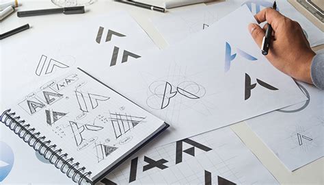
The transition from abstract ideas to tangible concepts is facilitated through sketching. This is a rapid, low-fidelity process where initial thoughts are translated onto paper. Sketching allows for quick iteration and exploration of numerous design directions without the constraints of digital tools. It's about getting ideas out of your head and onto a surface to be evaluated. Even experienced users can benefit from this foundational step, as it allows for a free flow of ideas before committing to digital rendering. You don’t necessarily have to use stars; a variety of shapes and forms can be explored.
From Sketch to Digital Canvas: Leveraging Inkscape
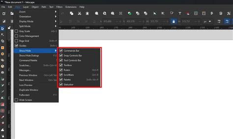
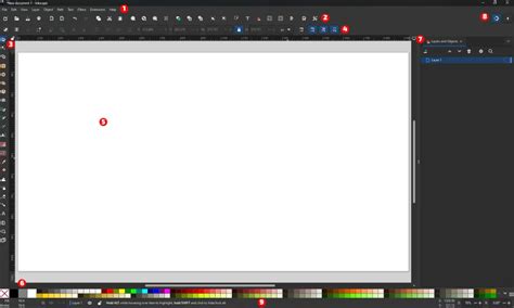
Once a promising concept or a few strong contenders emerge from the sketching phase, the process moves to the digital realm, with Inkscape serving as the primary tool. Inkscape's vector-based nature is ideal for logo design, as it allows for scalable graphics that maintain their quality at any size, from a business card to a billboard.
Creating Geometric Foundations
Many professional-level logos are built upon precise geometric foundations. In Inkscape, this can be achieved through the meticulous use of alignment tools and geometric primitives.
A demonstration of this can be seen in the creation of a complex logo, such as the Woolmark logo by Franco Grignani. This process often involves constructing a grid for the document. By navigating to View > Page Grid, a visual framework is established, aiding in precise placement and scaling of elements.
The creation of an equilateral triangle, for instance, is accomplished using the Stars and Polygons tool, setting its corners to "3". This triangle can then be precisely aligned to a grid intersection. Holding down the SHIFT and CTRL keys while enlarging the triangle ensures it scales proportionally and its height aligns with an even number of grid squares, facilitating further precise construction. Locating the center of the triangle, based on its height, is crucial for subsequent steps.
Utilizing Circular Grids and Interpolation
Circular elements are fundamental in many logo designs. Inkscape's Circles tool allows for the creation of perfect circles by holding SHIFT and CTRL while dragging. Duplicating circles (CTRL + D or Edit > Duplicate) and strategically positioning them is a common technique.
A powerful feature for generating complex patterns from circles is interpolation. By selecting "Duplicate endpaths" in the interpolation dialog and setting the interpolation steps (e.g., to 8), Inkscape can fill the space between two circles with a series of intermediate circles. This creates a smooth progression and can be used to generate intricate patterns, such as those forming crescents.
The interpolated circles are often grouped, forming multiple objects. Ungrouping them (CTRL + U or Object > Ungroup) allows for individual manipulation. These interpolated circles can then be used to construct shapes like crescents by applying the Path > Difference operation. Repeating this process for all relevant crescents on a side refines the design.
Refining Shapes with the Erase Tool
For precise detailing and the removal of unwanted elements, the Erase tool is invaluable. By carefully passing the tool just along the contour of an overlapping shape, protruding tips of crescents, for example, can be cleanly removed, resulting in a more polished and cohesive design.
Color Theory and Application in Logo Design
The choice of colors for a logo is as significant as its form. Color evokes emotions, communicates brand personality, and influences perception. Understanding color theory, including color harmonies, contrasts, and the psychological impact of different hues, is essential.
The ability to bring the opacity of elements all the way up to 100% in Inkscape ensures that the final colors are vibrant and impactful. The selection of a color palette should be informed by the client's brand identity, target audience, and the message the logo aims to convey. Whether it's a bold, energetic palette or a subtle, sophisticated one, the colors must align with the overall brand strategy.
Practical Application: A Simple Logo Tutorial
For those new to Inkscape or logo design, a guided approach is beneficial. A tutorial demonstrating the creation of a simple logo provides a practical entry point. The font "Kirsty" is an example of a typeface that can be used, and it's readily downloadable.
The fundamental steps often involve creating a series of perfectly round, overlapping circles. While stars can be used, the emphasis is on precise geometric construction. The ability to manipulate these shapes, combine them, and apply transformations allows for the creation of unique and memorable designs.
More experienced users might grasp the process by observing the visual steps, but for beginners, following a detailed tutorial, perhaps presented in video format, is highly recommended. This ensures that all the nuances and practical tips are absorbed.
Advanced Techniques and Professionalism
Beyond simple designs, Inkscape empowers the creation of complex logos. Advanced techniques often involve the strategic use of layers, grids, and boolean operations. The creation of four distinct layers-Triangle, Level 1, Level 2, and Level 3-provides a structured approach to building intricate designs, allowing for easier management and modification of different design elements.
The ability to work with grids and precise alignments, as demonstrated in recreating logos like Woolmark, showcases the professional capabilities of Inkscape. This meticulous approach ensures that the final design is not only visually appealing but also structurally sound and scalable.
The E-book Companion: "Studylogo"
Complementing practical design work, theoretical knowledge is crucial. The e-book "Studylogo" offers a comprehensive 70-page exploration of logo design theory. It delves deeper into the subject matter than a typical course might, providing a robust overview and reinforcing the principles discussed. This resource is invaluable for anyone looking to build a strong theoretical foundation in logo design.
Presentation and Client Satisfaction
The final stage of the logo design process is the presentation of the finished design to the client. This is an opportunity to showcase not only the visual output but also the rationale behind the design choices. Explaining how the logo aligns with the client's brief, brand values, and target audience builds confidence and demonstrates a professional, client-centric approach.
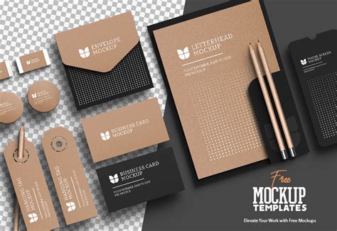
Clients value clear communication and a designer who understands their needs. Presenting the logo in various mockups-on business cards, websites, merchandise-helps the client visualize its application and potential impact. This thoroughness, combined with a well-crafted logo, leads to client satisfaction and strengthens the professional relationship.
Ruben Ramirez, who teaches digital media in college and founded Self-Made Designer, emphasizes sharing knowledge of graphic design. This ethos of education and empowerment is central to mastering logo design, whether through practical application in tools like Inkscape or through dedicated study of design principles. The goal is to equip designers with the skills and understanding to create impactful and effective visual identities.
The principles of design extend to modern visual creation, including AI-generated visuals. Understanding essential design principles ensures that even AI-assisted outputs look professional, balanced, and brand-ready, further underscoring the enduring importance of foundational design knowledge.