When embarking on any design project destined for the physical world - think business cards, flyers, or extensive marketing campaigns - a fundamental understanding of the CMYK color model becomes paramount. This system is not merely a technical detail; it is the very bedrock of all print design. For designers, grasping the nuances of CMYK is indispensable, serving as the guarantor of color fidelity and the architect of high-quality resolution in printed materials. This guide delves into the intricacies of the CMYK color model, illuminating its role, its distinctions from other color systems, and its critical importance in bringing digital concepts into tangible forms.
Decoding the CMYK Color Model: The Foundation of Print
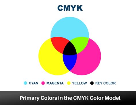
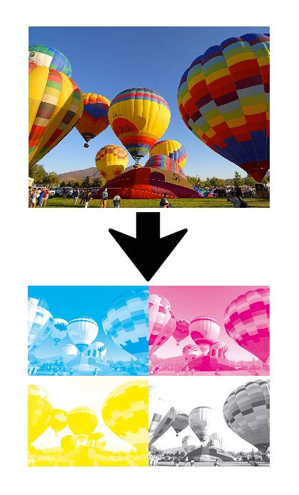
At its core, the CMYK color model is a sophisticated system employed in the printing industry to generate a vast spectrum of colors. This is achieved through the precise combination of four distinct inks: Cyan (C), a vibrant bluish-green; Magenta (M), a rich purplish-red; Yellow (Y), a bright, unmistakable yellow; and Key (K), which represents black. The inclusion of "K" for black is a deliberate choice, stemming from historical printing practices. In traditional printing, the black ink plate was often referred to as the "key plate." This plate was crucial for imparting the sharpest details and defining the darkest regions within an image. Consequently, the term "key" became inextricably linked with black in the printing lexicon, also serving to prevent any potential confusion with the color blue or other related terms.
These four inks, C, M, Y, and K, each perform a unique and vital function in the printing process. Designers meticulously layer varying percentages of cyan, magenta, and yellow to construct an expansive palette of colors. Black ink is then strategically employed to infuse depth and contrast, elevating the visual impact of printed materials.
Consider the creation of a bright orange hue. By setting the values to C = 0, M = 50, Y = 100, and K = 0, a vivid orange is produced. For a standard, regular black - often termed "true black" - only the key (black) color is applied at its full intensity, meaning C = 0, M = 0, Y = 0, K = 100. However, to achieve a more profound and impactful black, a combination of cyan, magenta, and yellow is layered with the key black ink. This sophisticated blend, known as "rich black," is particularly effective for rendering large areas of solid black in print. A commonly used recipe for rich black is C = 60, M = 60, Y = 60, K = 100. This technique ensures that areas intended to be black possess a depth and intensity that a single black ink alone cannot replicate.
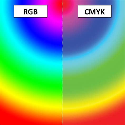
Navigating the Spectrum: RGB vs. CMYK
The fundamental difference between CMYK and RGB lies in their intended applications and their underlying mechanisms for color creation. While CMYK reigns supreme in the realm of printed materials, the RGB color model is the standard for screens and all digital content. RGB, which stands for Red, Green, and Blue, operates on an additive principle: colors are created by adding light. Conversely, CMYK operates on a subtractive principle: colors are produced by subtracting light.
In the RGB model, combining red, green, and blue light in various intensities generates a vast array of vibrant hues, making it exceptionally well-suited for displays on screens, monitors, and mobile devices. The more light that is added, the brighter the resulting color, culminating in pure white when all three primary colors are at their maximum intensity.
CMYK, on the other hand, utilizes inks that absorb certain wavelengths of light and reflect others. When light strikes a CMYK-printed surface, the inks absorb specific portions of the light spectrum. The colors we perceive are the wavelengths that are reflected back to our eyes. Cyan ink absorbs red light, magenta absorbs green light, and yellow absorbs blue light. When all three primary CMYK inks are combined at full intensity, they theoretically absorb all light, resulting in black. However, in practice, this combination often produces a muddy brown, which is why a dedicated black ink (Key) is essential for achieving true black and deeper contrasts.
This inherent difference means that colors achievable on a screen (RGB) often cannot be replicated precisely in print (CMYK), and vice versa. RGB colors tend to be more luminous and saturated because they are generated by emitted light, whereas CMYK colors are limited by the pigments of the inks and the reflective properties of the substrate.
The Indispensable Role of CMYK in Printing
The importance of CMYK in the printing industry cannot be overstated. It is the cornerstone of color consistency across a multitude of printed materials, from the smallest business card to the largest billboard. The subtractive nature of the CMYK model, when applied with precision, ensures uniform results, regardless of the material being printed on - be it paper, fabric, or any other substrate. This uniformity is critical for safeguarding the integrity of a brand's visual identity and guaranteeing that printed outputs accurately reflect the original digital design. Without CMYK, achieving predictable and consistent color reproduction in print would be a significantly more challenging, if not impossible, endeavor.
The technology behind printing presses is calibrated to work with CMYK inks. Each color separation (Cyan, Magenta, Yellow, and Black) is applied to the printing plate, and the precise dot patterns and percentages of each ink determine the final color on the page. This meticulous process allows for the creation of millions of colors by varying the density and overlap of these four base inks.
Furthermore, understanding CMYK is crucial for managing expectations. Designers must be aware that the vibrant, luminous colors seen on an RGB display might appear muted or altered when translated to print. This awareness guides the design process, prompting designers to make necessary adjustments to ensure the printed outcome aligns as closely as possible with the intended aesthetic.
Several file formats are particularly well-suited to support CMYK colors, ensuring that the color information is preserved throughout the design and production workflow:
- Portable Document Formats (PDFs): PDFs are a universally accepted standard for print-ready files. They are highly versatile and work seamlessly with a wide array of design and pre-press software, making them an ideal choice for CMYK files.
- Adobe Illustrator (AI) files: As a vector graphics editor, Adobe Illustrator is a primary tool for many designers, especially for logo and illustration work. AI files natively support the CMYK color mode, which is essential for creating graphics intended for print.
- Encapsulated PostScript (EPS): EPS files are another vector-based format that is widely used in the printing industry. They offer excellent support for CMYK color mode and are often used for logos, illustrations, and other graphic elements that require scalability without loss of quality.
When to Embrace CMYK: The Print Design Imperative
The decision to utilize the CMYK color model is fundamentally dictated by the intended final output of your design. You should unequivocally employ CMYK colors for any design project that is slated for physical printing. This encompasses a broad spectrum of applications, including but not limited to:
- Business Cards: Professional collateral requires precise color representation.
- Posters and Billboards: Large-format prints demand accurate color to capture attention effectively.
- Stationery: Letterheads, envelopes, and other branded paper goods need consistent color.
- Swag (T-shirts, Mugs, Pens): Promotional items are a tangible extension of a brand's identity, requiring accurate color reproduction.
- Flyers and Brochures: Marketing collateral that communicates essential information relies on clear and consistent visuals.
- Product Packaging: The visual appeal of packaging directly influences consumer purchasing decisions.
- Menus: Restaurants and cafes depend on appealing and accurate food and drink representations.
- Banners: Both physical and large-format digital banners intended for printing benefit from CMYK.
For brands that maintain a dual presence in both the print and web design spheres, the ability to ensure that colors translate correctly between these mediums is not just beneficial, it is essential. Platforms such as Figma have become indispensable tools for UI design, excelling in creating vibrant digital experiences. However, to bridge the gap to print, specialized plugins, like Print for Figma, are invaluable. These tools facilitate the conversion of projects and marketing materials from their native digital formats to CMYK, ensuring that the intended colors are accurately represented in the final printed products. This seamless transition is key to maintaining a cohesive brand image across all touchpoints.
Mastering Color Profiles RGB, CMYK, and Pantone for Perfect Printing
The Art of Transition: Converting RGB to CMYK
While RGB colors may appear stunning on digital screens, their rendition can undergo significant alterations when translated into print. Before bringing your meticulously crafted digital designs to life on paper, the crucial step of converting them to CMYK is imperative. This conversion process is not always a simple one-to-one mapping.
Transitioning from RGB to CMYK can involve subtle, yet important, adjustments. Certain hues that appear dazzlingly vibrant on an RGB display might exhibit a more subdued or altered appearance when rendered in CMYK. This is due to the inherent limitations of the CMYK gamut - the range of colors that can be reproduced using CMYK inks. Colors that fall outside the CMYK gamut, often highly saturated blues, greens, and some reds, will inevitably shift. It is therefore vital to fine-tune these colors post-conversion to preserve the vibrancy and accuracy of your original design as much as possible. This often involves selecting alternative, printable shades or adjusting the saturation and brightness levels.
The conversion process can be managed within most graphic design software. When converting, it's advisable to use a specific CMYK color profile that is relevant to your intended printing process or your print provider's specifications. Different printing methods and paper types can influence the final color outcome, so choosing the right profile is a key step in achieving predictable results.
Harmonizing Hues: Maintaining Color Consistency with Figma
In the dynamic world of design, color consistency is not merely a desirable trait; it is a critical component of professional presentation and brand integrity. Fortunately, modern design tools are making it easier than ever to maintain this crucial aspect of visual communication. Figma, a popular platform for UI and UX design, offers robust features that, when understood and applied correctly, can greatly assist in achieving color harmony, even when bridging the gap to print.
While Figma primarily operates in the RGB color space due to its digital-native focus, its capabilities extend to managing color in ways that facilitate CMYK conversion. Designers can establish a consistent color palette within Figma, defining specific hex codes or RGB values that represent their brand colors. These defined colors serve as a reliable reference point. When it comes time to prepare designs for print, these established palettes can be systematically converted to their CMYK equivalents.
The key to maintaining consistency lies in a proactive approach:
- Define Your Brand Palette: Establish a core set of brand colors with precise RGB values in Figma.
- Understand Gamut Limitations: Be aware that some of your RGB brand colors might not be perfectly reproducible in CMYK. Research or test these colors for their CMYK equivalents early in the design process.
- Utilize Color Management Tools: Employ plugins like Print for Figma or similar tools that can provide a preview of how your RGB colors will translate to CMYK. These tools often allow for adjustments within the CMYK space directly inside Figma.
- Communicate with Your Printer: Your print service provider is an invaluable resource. They can offer specific CMYK profiles or guidance on achieving the best color match for their printing process.
- Test Prints: Whenever possible, order a small test print or proof to verify color accuracy before committing to a large print run. This allows for final adjustments if the colors are not as expected.
By understanding the fundamental differences between RGB and CMYK, embracing the necessity of CMYK for all print-related projects, and utilizing the right tools and workflows for conversion and consistency, designers can effectively navigate the complex landscape of color reproduction, ensuring their creations make a powerful and accurate impact in both the digital and physical realms.