The name Kodachrome evokes a powerful sense of nostalgia, a golden era of photography where colors were rendered with unparalleled vibrancy and depth. For decades, it wasn't merely a film stock; it was the benchmark, the standard by which stunning imagery, particularly the iconic photographs gracing the pages of National Geographic from the 1970s and 80s, was defined. Even today, the desire to recapture that distinct "Kodachrome look" persists, driving photographers to seek out presets and emulate its magic in their digital workflows. But what exactly is this elusive aesthetic, and can it truly be replicated with a few clicks in Lightroom?
Understanding the Kodachrome Phenomenon
Introduced by Kodak in 1935, Kodachrome was a pioneering success in color film technology, remaining in production for nearly 75 years. Unlike most modern chromogenic films (such as Kodak Portra or Fuji 400H) where dye couplers are integrated into the film emulsion and activated by a standard C-41 process, Kodachrome employed a unique, complex K-14 development process. This subtractive method involved adding dyes in three separate layers during development, effectively building the color into the image. This intricate process meant that Kodachrome film could not be processed at a local drugstore; it required specialized Kodak laboratories.
The result of this unique process was a film stock with several defining characteristics:
- Rich, Vibrant Saturation: Kodachrome colors were deep and bold, possessing a unique character that avoided the oversaturated digital look. Its legendary reds, in particular, were deep, rich, and imbued with a distinctive quality.
- High Contrast and Deep Blacks: The film offered beautiful, punchy contrast, with an excellent D-max, the measure of its deepest black.
- Incredible Sharpness and Fine Grain: By adding dyes during processing, the emulsion layers could be thinner, leading to fantastic sharpness and exceptionally fine, pleasing grain.
- Archival Longevity: Kodachrome dyes were remarkably stable, making Kodachrome slides famous for their longevity, often lasting 100 years or more without fading. Images from the 1950s could retain their original vibrancy.
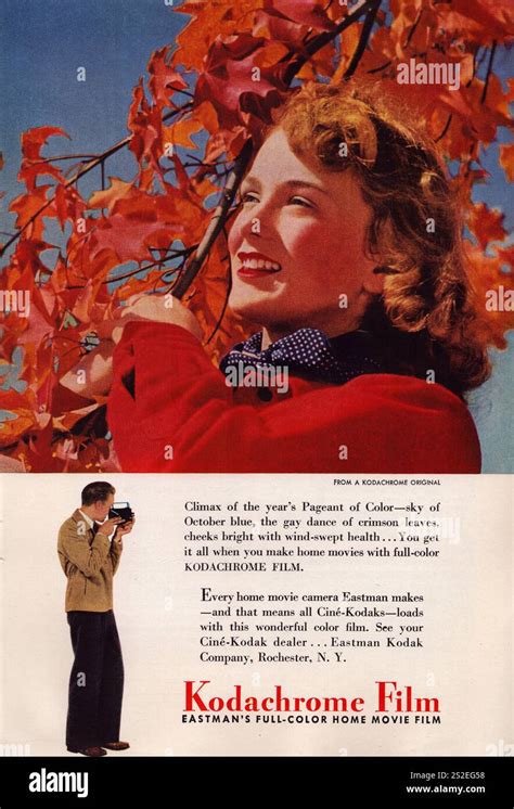
The iconic "Afghan Girl" photograph by Steve McCurry, which graced the cover of National Geographic, is perhaps the most famous example, shot on Kodachrome 64. The penetrating green of her eyes, the deep, rustic red of her shawl, and the sharp detail in her face, all seen by millions, cemented the "Kodachrome look" in our collective consciousness.
The decline in film photography in the early 2000s, driven by advancements in digital technology, led to the discontinuation of Kodachrome in 2009. Despite its absence, its legacy endures, representing a "golden age" of photography characterized by sharpness, vibrancy, and lasting quality, intrinsically linked to some of the most important photographs ever taken.
The Challenge of Digital Replication: Presets vs. Reality
The question arises: why can't we simply adjust a few sliders in Lightroom to perfectly replicate the Kodachrome aesthetic? The fundamental difference lies in the underlying technology. Kodachrome's subtractive, layered chemical process is diametrically opposed to the additive nature of digital sensors. Attempting to make one behave like the other is akin to trying to make a bicycle perform like a helicopter - you can approximate, but a perfect match is elusive.
This is where many photographers encounter the "preset trap." A generic "Kodachrome Lightroom preset" applies the same set of slider adjustments to every photo, ignoring crucial variables. This leads to unsatisfactory results because:
- Lighting is Everything: A preset is a static recipe of settings. It cannot adapt to the nuances of different lighting conditions.
- Digital Sensors Vary: The way different camera sensors (Canon, Sony, Nikon, etc.) interpret color differs significantly.
- Kodachrome Itself Varied: There wasn't a single Kodachrome. Kodachrome 25 offered extreme sharpness and lower light sensitivity, Kodachrome 64 was the versatile workhorse, and Kodachrome 200 provided more grain for lower light situations. A one-size-fits-all preset fails to account for these variations.
Frustration often arises when photographers blame the preset or their camera, when in reality, the limitations stem from the inherent differences between analog film and digital capture, and the static nature of presets.
Understanding Lightroom Tools: Presets, Profiles, and LUTs
To better understand the limitations and possibilities, it's essential to differentiate between Lightroom's tools:
- Presets: These are saved sets of slider positions in the Develop module. When applied, they adjust sliders for Exposure, Contrast, HSL, and Tone Curve. You can see precisely what has been changed. Presets are relative adjustments.
- Profiles: A more powerful tool, a profile offers a new base interpretation of your RAW data. It fundamentally changes how Lightroom renders color before any slider adjustments are made. Examples include "Adobe Color," "Adobe Standard," and "Adobe Vivid."
- LUTs (Look-Up Tables): Commonly used in video, LUTs are rigid maps that dictate precise RGB value conversions. They are less flexible for still photography compared to Lightroom's native tools.
Recreating Kodachrome isn't simply about "adding contrast" or "boosting reds." Its unique look stemmed from a chemical process with no direct digital equivalent. Static presets often fall short because they cannot account for the variables of different lighting, cameras, or the film's inherent variations.
Navigating the World of Film Emulation Presets
Despite the inherent challenges, many photographers still seek presets as a starting point. The market offers a wide range of options:
Free Presets
- Functional Description: These are typically simple presets.
- The Challenge: Quality is highly variable. Many are merely an S-curve with boosted saturation, often crushing blacks, blowing out highlights, and rendering skin tones unnaturally.
Paid Preset Packs (Systems)
- Functional Description: These are more sophisticated, often consisting of a pack of Lightroom Profiles (for base rendering) and accompanying presets for adjustments like push/pull processing, white balance variations, or grain levels.
- The Challenge: Can be expensive. You're still limited by the creator's interpretation of the film. Widespread use can lead to a "sameness" in industry aesthetics, making it harder to stand out.
Evaluating a Kodachrome Emulation Preset
Whether free or paid, how can you determine if a Kodachrome emulation is effective?
- Check the Reds: Are they rich, deep, and distinct, or merely "loud" and oversaturated? A poor preset often just cranks the Red Saturation slider, leading to color clipping.
- Look at Skin Tones: Does the preset render skin naturally? Kodachrome had a specific, slightly warm, and defined rendering of skin.
- Analyze the Grain: Is the grain tasteful and well-structured, mimicking real film (like K-64)? Or is it overly prominent and digital-looking?
- Examine the Shadows: Are the shadows dark and contrasty while retaining some detail, or are they completely crushed to pure black?
- Look for Halation (The Pro Move): This subtle effect, a faint red or orange glow around very bright highlights (like a window or bright sky), is characteristic of some high-contrast film stocks. Its presence can indicate a more faithful emulation.
The market for Kodachrome presets is vast. Free options are a gamble, while paid systems offer a better starting point but still share the core limitation of being static "recipes."
Building Your Own Kodachrome Look in Lightroom
For those seeking complete control, building a custom look from scratch is the most rewarding path. This process teaches you why a particular aesthetic works and provides complete mastery over every element.
- Start with a Good Photo: A preset cannot salvage a poorly exposed, out-of-focus, or badly composed image.
- Camera Calibration Panel: Before touching other sliders, navigate to the Camera Calibration panel.
- Red Primary: Increase Saturation to around +15 to +25 for popping reds.
- Green Primary: Increase Saturation to around +10.
- Blue Primary: Increase Saturation to +10. Shift the Hue slightly left (towards aqua), perhaps -5 to -10, for skies.
- Basic Panel Adjustments:
- Contrast: Apply a healthy boost.
- Highlights: Pull these down to retain highlight detail, a hallmark of film.
- Shadows: Adjust to your preference.
- Blacks: Lower the blacks to achieve deep, rich D-max.
- Presence: Add a touch of Vibrance (+10), avoiding the broad Saturation slider.
- HSL/Color Panel Refinements:
- Reds: Boost Saturation by +10 or +15.
- Greens: Boost Saturation by +10.
- Blues: Boost Saturation by +15 for deep skies.
- Tone Curve for "Faded" Look (Optional): For a matte or faded aesthetic, lift the very bottom-left point (the black point) straight up.
How To Make Your Colors Feel Right (Lightroom Tutorial)
While building your own preset provides immense power and understanding, you'll quickly encounter the same challenge: it works brilliantly for that specific photo but requires re-tweaking for the next. This brings us to the core issue for professional photographers: time. Re-editing every photo, even from a film base, remains incredibly time-consuming.
The AI Revolution: Beyond Static Presets
This is where the limitations of static tools become apparent. What if your "Kodachrome preset" could be intelligent? This is precisely the problem that AI editing tools, such as Imagen, aim to solve. Imagen moves beyond static presets by offering AI-powered solutions that learn and adapt.
Imagen's AI Profiles: A Smarter Approach
Imagen addresses the "preset problem" by offering several types of AI Profiles:
- Personal AI Profile: This is the flagship feature. You upload a significant portion of your edited Lightroom Classic catalog (a minimum of 3,000 photos). If you've spent a year perfecting a "Koda-Look" for your wedding photography, you feed that catalog to Imagen. Its AI analyzes your edits - exposure, white balance, tone curves, HSL, and more - to learn your unique style.
- Lite Personal AI Profile: For those without a massive catalog, this option allows profile creation using just one of your existing presets (like the one you just built!) combined with a short style survey. The AI uses your preset as a creative base and handles technical corrections like exposure and white balance.
- Talent AI Profiles: If you're still developing your style, Imagen offers a marketplace of profiles created by world-class photographers. This is akin to purchasing a commercial preset pack, but with a crucial difference: it's not a static preset but the AI "brain" of that photographer.
The Imagen Workflow: Efficiency and Evolution
Consider a professional wedding photographer's workflow with Imagen:
- Culling: Use Imagen's AI-powered culling feature to group, rate, and identify blurry shots or closed eyes.
- AI Editing: Open the Imagen desktop app and select your "Koda-Look" Personal AI Profile.
- Process: In approximately 10-15 minutes, Imagen edits all 3,000 photos from the wedding.
- Lightroom Refinement: Open Lightroom. The entire wedding is edited with correct exposure and white balance. Final tweaks and artistic touches can then be applied by the photographer, making up the crucial 5% of the edit.
This AI-driven approach dramatically reduces editing time, completing 95% of the work in minutes.
The Evolving Profile: Learning and Adaptation
The most remarkable aspect of Imagen is its ability to evolve. After making final 5% tweaks in Lightroom, you can upload these refined edits back to Imagen. The AI re-analyzes your changes, learning your preferences. If you decide to warm up your Kodachrome look next month, you make those changes, upload the final edits, and your Personal AI Profile learns and adapts.
Beyond Kodachrome: Exploring Other Film Emulations
The hunt for the perfect Kodachrome emulation is often a gateway to exploring the vast and beautiful world of film. Other iconic stocks offer distinct aesthetics:
- Fujifilm Pro 400H (Discontinued): A favorite for wedding photographers, known for its light, airy feel, low contrast, and beautiful minty-green and aqua tones.
- Kodak Portra 400: The modern king of color-negative film, celebrated for its warm, golden, and flattering skin tones.
- Ilford HP5 Plus: A classic black-and-white stock, offering a gritty, contrasty, and flexible look.
- Agfa Vista (Consumer): A more affordable consumer-grade film with a distinct character.
With tools like Imagen, it's even possible to create separate Personal AI Profiles for each of these film looks, ensuring consistency and stylistic depth across your work.
Common Pitfalls to Avoid in Film Emulation
As photographers delve into film emulation, several common mistakes can undermine their efforts:
- Pitfall 1: Overdoing the Grain: While grain adds texture, excessive grain looks like digital noise and softens images.
- Pitfall 2: Crushing Blacks Always: Not all film stocks have extremely deep blacks. Portra, for instance, is known for its open shadows.
- Pitfall 3: The "Faded" Look: Lifting the black point can mimic old prints but often results in washed-out, weak images.
- Pitfall 4: Ignoring White Balance: An incorrect starting white balance will ruin any film look. A photo shot in tungsten light (orange) will look muddy if a "sunny day" preset is applied. AI tools like Imagen are far more effective at handling this.
- Pitfall 5: Inconsistency: Using multiple disparate film presets within a single client gallery appears amateurish. The goal is a cohesive story, which a single, well-trained Imagen AI Profile can achieve.
The Future of Editing: Intelligent Assistants, Not Static Presets
The pursuit of the perfect Kodachrome Lightroom preset is a valuable journey, teaching us about color theory, photographic history, and our own artistic desires. We are often chasing a feeling. While static presets are a good starting point, for a working professional, the ultimate solution lies in moving beyond them.
The future of editing is not about a "one-click" preset but a "one-click" intelligent assistant that understands your unique style. Imagen's AI Profiles (Personal, Lite, and Talent) liberate photographers from the most time-consuming aspects of editing, allowing for greater creativity and efficiency. The quest for Kodachrome is just the beginning; embracing intelligent tools allows us to recreate and evolve those timeless aesthetics in ways that were previously unimaginable.
tags: #kodachrome #lightroom #preset