Typography is a powerful visual language, and the subtle nuances of spacing between characters, words, and lines can dramatically impact the readability, aesthetic appeal, and overall professionalism of your designs. In Adobe InDesign, understanding and effectively utilizing tools like tracking, kerning, and word spacing is crucial for any designer aiming to elevate their typesetting from functional to exceptional. This guide delves into these core concepts, providing practical insights and actionable techniques for manipulating spacing in InDesign.
Understanding Tracking: The Art of Letter-Spacing
Tracking, in the realm of typography, refers to the adjustment of space between all characters within a selected block of text. It’s a typographer’s term for letter-spacing, and its primary function is to influence the visual density, or "color," of a word, phrase, or paragraph. By increasing tracking, designers can often improve the readability of text, especially in situations where the default spacing might feel too tight. Conversely, reducing tracking can make text appear more condensed.
The tracking option in InDesign is visually represented by an ‘A V’ symbol with an arrow situated below it. This tool is conveniently located alongside other frequently used text formatting options within the Controls panel or the more comprehensive Character panel. While applying tracking can sometimes serve as a quick fix for issues related to line spacing, its true potential is unlocked when combined with kerning. This synergy is what truly elevates typography to a professional standard.
It is important to remember that tracking affects the spacing between all characters uniformly. This means it does not account for specific spacing requirements between particular letter pairs. This is where kerning comes into play. Tracking is a broader adjustment, while kerning focuses on the finer details of individual character relationships.
Tracking works hand-in-hand with leading, which is the space between lines of text. When attempting to fine-tune the appearance of text, designers might encounter situations where applying negative tracking (reducing the space between letters) makes paragraphs appear unpleasantly squashed. If this occurs, and the text still suffers from issues like widows (a single word on the last line of a paragraph) or orphans (a single word on the first line of a new paragraph), a technique called optical margin alignment can be employed. This feature attempts to shift outlying elements, such as serifs and apostrophes, to the outside of text frames, effectively creating a little more breathing room and improving the overall visual flow.
The Nuances of Kerning: Refining Specific Letter Pairs
Kerning is the meticulous process of adding or subtracting space between specific pairs of characters. Unlike tracking, which applies a uniform adjustment across a block of text, kerning targets the awkward gaps that can naturally occur between certain letter combinations. These "kern pairs" are often included with most fonts, and their presence is designed to address the inherent spacing challenges presented by the unique shapes of different glyphs.
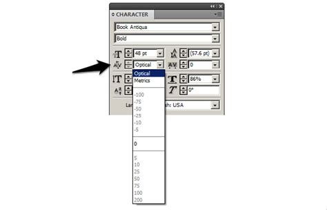
InDesign employs two primary methods for kerning: metrics kerning and optical kerning.
Metrics Kerning: This is the default setting in InDesign. It utilizes the kerning information that is built into the font file itself. Most professional fonts include a comprehensive set of predefined kern pairs that automatically adjust the spacing between specific letter combinations when you import or type text. This is often referred to as "Metrics" or "Metrics - Roman Only" in the Kerning menu. The "Roman Only" option specifically applies kerning based on the shapes of Roman characters, which is the most common use case. However, it's worth noting that metrics kerning is designed on the basis of Roman character forms and may not always be optimal for all glyph sets or languages. For this reason, sometimes choosing '0' in the Kerning menu is necessary to turn off pair kerning if the default metrics are not producing the desired results.
Optical Kerning: This method adjusts the spacing between adjacent characters based purely on their shapes, regardless of the font's built-in metrics. Optical kerning is optimized for use with Roman glyphs and can be particularly effective in situations where the default metrics don't quite look right, or when mixing different typefaces. It intelligently analyzes the contours of the characters and creates visually pleasing spacing.
The spacing of specific pairs of letters is crucial. For instance, combinations like LA, P., To, Tr, Ta, Tu, Te, Ty, Wa, WA, We, Wo, Ya, and Yo are common examples where kerning can make a significant difference. Without proper kerning, these pairs can appear too far apart or too close, disrupting the visual rhythm of the text.
You can apply kerning, tracking, or both to selected text in InDesign. The values for kerning adjustments are relative to the current type size and can be adjusted directly in the Character panel or the Control panel. If you wish to reset kerning and tracking for selected text, you can use keyboard shortcuts: Alt+Ctrl+\ (Windows) or Option+Command+\ (Mac OS). For resetting specific kerning values, you can use Alt+Ctrl+Shift+\ (Windows) or Option+Command+Shift+\ (Mac OS).
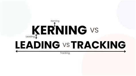
InDesign Quick Tip: Tracking vs. Kerning
Word Spacing: The Unsung Hero of Readability
Word spacing is a typographic detail that is often taken for granted. Many individuals assume that the default word spacing of any given font is perfectly adequate, as it was determined by the type designer. However, this is not always the case. The word spacing for text settings is critically important because it directly affects readability.
Appropriate word spacing should strike a delicate balance. It should not be so narrow that the words begin to run into each other, creating a dense, illegible block of text. Nor should it be so large that the text appears sprinkled with oversized spaces between words. Such excessive spacing can be distracting, even unconsciously, and interrupt the natural rhythm of reading.
A useful rule of thumb for setting word spacing in body text is that it should approximate the width of the lowercase 'n' or 'o' of each particular font. This principle is rooted in the idea that word spacing should be in proportion to the overall width of any given type design. When word spacing is too narrow, words can merge, hindering comprehension. Conversely, when it's too wide, the text can feel disjointed and difficult to follow.
While it is true that the word spacing of a typeface is a predetermined value for each font and differs from font to font, most design software, including InDesign, allows you to modify it. You might need to do this if some commercial fonts have excessive space between words, leading to visual hesitations that reduce readability.
A crucial point to remember is that there is never a need for double spaces between sentences when setting type on a computer, as was the standard practice with typewriters. InDesign's sophisticated typesetting capabilities render this outdated convention unnecessary.
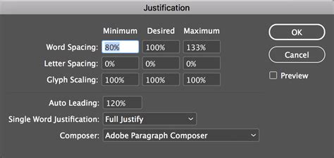
The ability to change the word spacing of any selected text is a somewhat hidden, yet incredibly useful, feature within InDesign. Although this is typically managed through the "Justification" settings, you can actually use these options to adjust word spacing for text with any alignment, not just justified.
To access these settings:
- Place your cursor within the text you wish to modify.
- Navigate to
Type > Paragraph. - From the panel menu in the top right corner of the Paragraph panel, choose
Justification. - Within the Justification dialog box, locate the "Word Spacing" row. In the middle field labeled "Desired," enter a value. This value is a percentage of the normal, or built-in, word spacing of the selected font. For instance, setting it to 100% maintains the default, while 85% would reduce it.
You can also incorporate these word spacing adjustments into paragraph styles. This ensures consistent word spacing throughout your document wherever that particular style is applied. A valuable bonus tip: whenever you edit word spacing, be sure to select the "Preview" checkbox. This allows you to see the immediate effects of your changes as you make them, facilitating a more intuitive adjustment process.
Adjusting Spacing for Different Text Sizes
As type gets larger, the space between words can appear more open, even though the actual ratio remains the same. This visual perception is a critical factor to consider when designing for different contexts. Therefore, the word spacing for headline or display type should generally be slightly less than what you would use for body text.
This is particularly true when using a typeface that is primarily intended for text settings but is being employed for larger display sizes. When a text typeface is used to set display sizes, the word spaces can appear disproportionately large. The appearance can be improved, albeit subtly, by reducing the word spacing via the Justification settings. For example, reducing it to 85% can create a more balanced and aesthetically pleasing result.
In headlines, inconsistent word spacing can occur due to the larger volumes of white space around certain letter combinations, such as "A" and "T," or "F" and "T." The most precise way to address such issues in display type is often to utilize the kerning feature, fine-tuning the space between these specific problematic pairs.
Advanced Spacing Controls in InDesign
Beyond tracking, kerning, and word spacing adjustments within the Justification panel, InDesign offers more granular control over white space. These options are available under the Type > Insert White Space menu.
Here, you'll find various widths of space characters:
- Em Space: This is the widest of the white space characters. Its size is directly determined by the current type size. If your type is set at 12 points, an em space will be 12 points wide. If the type size is 24 points, the em space will be 24 points wide, and so on.
- En Space: This space is half the width of an em space. So, at 12-point type, an en space would be 6 points wide.
- Word Space: This refers to the default space between words as determined by the font and any tracking applied.
These specialized spaces can be useful in specific design scenarios. For instance, when working with em dashes, some designers prefer to add a thin space on either side of the dash for better visual separation. While these characters offer precise control, their application is often more specialized and less common than the general adjustments provided by tracking, kerning, and justification settings.
By mastering these spacing controls in InDesign, designers can imbue their typography with clarity, elegance, and a professional polish that resonates with readers and enhances the overall impact of their visual communication.