The digital photography landscape is constantly evolving, with tools like Adobe Lightroom becoming indispensable for both amateur enthusiasts and seasoned professionals. Among the most powerful features of Lightroom are its presets - saved sets of editing parameters that can dramatically transform an image with a single click. This article delves into the world of Lightroom presets, focusing specifically on achieving bright and airy aesthetics, and provides a comprehensive tutorial on how to create, use, and optimize them. Whether you're a beginner looking to quickly enhance your photos or an experienced photographer seeking to refine your workflow, understanding presets is key to unlocking your creative potential.
The Power of Presets: Instant Style and Consistency
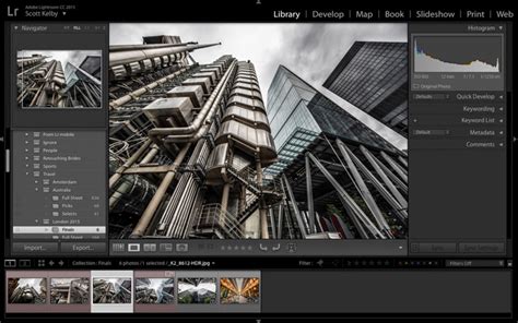
For photographers, whether they've had a camera around their neck for as long as they can remember or rely on the lens in their pocket, the ability to apply quick and consistent changes is paramount. One of our favorite ways to make filters for our own photos is by creating presets in the Adobe Lightroom app. We use these saved settings day in and day out to apply quick and consistent changes that achieve the ideal edit. This is especially useful when preparing images for printing, framing, or creating photo albums, as it ensures a cohesive look across a collection.
Lightroom presets are essentially snapshots of editing adjustments - from exposure and contrast to color balance and sharpening. When applied to a new image, these settings are replicated, offering a starting point or a complete look that aligns with a desired aesthetic. This functionality is a game-changer, saving countless hours of manual editing and ensuring a consistent brand or personal style across a portfolio.
Exploring Diverse Preset Applications
Lightroom presets are not one-size-fits-all; their effectiveness often depends on the subject matter and lighting conditions of the original photograph. Here, we're sharing some of the tried and true favorites we've counted on over the years - and breaking down the types of images where each preset really shines.
Preset 01: Enhancing Cityscapes with Contrast
Whether it's a busy metropolis or a lush seaside villa, cityscapes introduce an endless array of competing elements that can make for a busy photo. Preset 01 creates visual distinction by adding contrast to keep the scene from blending together, allowing each building to "pop" without disrupting the cohesion of the overall image. This preset is particularly effective in complex urban environments where defining individual structures and elements is crucial for a clear and impactful photograph.
Preset 02: Revitalizing Muted Landscapes
We've all been there: face-to-face with a jaw-dropping landscape that makes us take pause and pull out our cameras. Oftentimes, when we look back at the photos we took, the rich colorscape of the natural setting tends to look a little muted. Well, mountain lakes, lush coastal cliffs, and wildflower fields rejoice! Preset 02 is designed to bring back the vibrancy and depth of natural scenes, ensuring that the breathtaking colors you witnessed are faithfully reproduced in your images.
Preset 03: The Versatile Black and White Master
Looking for one black and white preset to rule them all? Preset 03 is great for most types of shots, making it a versatile tool to keep in your back pocket for a variety of edits. High contrast makes for a crisp, clean image, while increased exposure brings out the brighter side of black and white. This preset offers a classic, timeless look that can elevate portraits, still life, and even some landscape photography.
Preset 04: A Soothing Touch for Busy Scenes
Portside walks on overcast days, bustling settings with overstimulating colors… these are the scenes that beg for a softer touch. Enter Preset 04: thoughtfully tuned to create or emphasize calm when the moment calls for it. The settings here walk a thin line, desaturating colors and turning down warmth to bring out the gentler side of the image - without going so far as to make the photo feel washed out. This preset is ideal for images where a sense of tranquility and understated beauty is desired.
Preset 05: Warming Up Coastal and Hillside Landscapes
Bring out the warmth of coastal cliffs and sprawling hillscapes with Preset 05. Amongst other tweaks, this preset turns up the temperature within the image, offsetting the white balance to give landscapes a subtle glow. Increased contrast brings crisp detail to natural features, complementing the added warmth to create a dimensional effect in understated topographies. This preset is perfect for capturing the inviting atmosphere of sun-drenched natural environments.
Preset 06: Timeless Black and White Portraits
A preset for the Ansel Adams in all of us, Preset 06 was made for those portraits that simply belong in black and white. The grainy effect gives images timeless appeal, making the moment stand still. Lower contrast helps mute the colors in tandem, giving the photo a soft feeling that captures the joy in photos of children, couples, and beyond. This preset adds a classic, artistic touch to portraiture, evoking a sense of nostalgia and emotional depth.
Preset 07: Emulating the Golden Hour Glow
Bask in that sunkissed glow with a preset made to emulate and amplify the golden hour. Preset 07 creates warmth in photos, stretching those golden rays to all four corners of the image and extending an illuminated invitation to interact with the scene. Perfect for sunset snaps, these settings interact playfully with light and silhouettes, speaking to the simple and carefree moments we seek as we navigate the chaos of the day-to-day.
Preset 08: Preserving Tonal Differentiation
"The tones! The tones!" In monochromatic settings like desert rock formations or bustling cities, the subtle differentiation of tones gives the scene its natural beauty. Unedited photos tend to lose that differentiation, robbing the image of the visual element we most hoped to capture. Preset 08 is designed to meticulously preserve and enhance these subtle tonal variations, ensuring that the nuanced beauty of the scene is fully realized.
Preset 09: Invigorating Blues for Bright Days
The very mention of "blues" might make you think calm, cool, and maybe even dark. We're turning that on its head by bringing blue and bright together for invigorating yet gentle images. All it takes is a slight shift of blues, leaning into the cyan and bumping up exposure. This preset does just that, so you can bring out the best in bluebird days and beyond. It’s perfect for capturing the crispness and clarity of bright, clear skies and water.
Preset 10: Adding Depth to Nature's Majesty
From purple mountain majesties to spring blooms, nothing captures the magic of mother nature quite like the human eye - but some small edits are all it takes to do her justice. Preset 10 starts by creating higher contrast to add depth and dimension to those features that stop us in our tracks. Meanwhile, these settings pull up shadows and exposure to create seamless highlights that offset the contrast, smoothing out and brightening the scene while keeping the increase in definition intact. This preset is ideal for highlighting the intricate details and grand scale of natural wonders.
Make Your Own PRESETS in LIGHTROOM | how to save a preset in Lightroom
Implementing Lightroom Presets on Mobile and Desktop
The versatility of Lightroom presets extends across platforms, making them accessible whether you're editing on your phone or your computer.
For Lightroom Mobile Users
To use Lightroom presets on your phone, you'll need to download the free Lightroom Mobile app for Apple or Android. The process typically involves downloading the DNG file(s) for any preset(s) you'd like to use onto your phone. Once downloaded, add the file to your Lightroom library. It should now appear as a photo with a DNG icon next to it. You can then give your preset a name, making it easier to find and use by describing the colors or effects it creates.
To apply a preset, open the photo you'd like to edit and tap the "Presets" tab in the bottom menu. Select "User Presets" from the bottom of the menu and tap the preset you'd like to apply.
Detailed Mobile Installation Steps:
- Click the download link: This will typically be a Dropbox or Google Drive link provided by the preset creator.
- Fill in the password (if required): Some creators may password-protect their files.
- Export to Lightroom: Once the DNG file is downloaded, open it within the Lightroom Mobile app.
- Copy Settings or Create Preset:
- Tap the three dots icon in the top right of the screen.
- Select "Copy Settings" and paste them into your desired photo.
- Alternatively, you can select "Create Preset," which will allow you to save the preset in the preset editing option of the app for future use on other images. This preset will be in DNG format and supports Lightroom CC, Lightroom Classic CC, and Lightroom Mobile.
For Lightroom Classic Users
Lightroom Presets are a great way to quickly add style and charm to your photos. If you’re a fan of PHLEARN (we’re a fan of you!), you’re going to love their Lightroom Presets. Designed by creative minds and professional image makers, their exclusive looks are made to give your photos a unique feel in just a few clicks. Their presets are as versatile as they are easy to use!
Our Preset Packs are designed to work with Lightroom Mobile and any version of Lightroom Classic. If you’re a long-time user of Lightroom Classic like us, you’ll love the power and flexibility of Lightroom for Desktop & Mobile. This is just a small part of our extensive library of Photoshop Actions, Lightroom Presets, and custom LUTs. Lightroom Classic is one of the most powerful tools for the modern photographer and now learning how to use it has never been easier. The Beginner’s Guide to Lightroom Classic is the most comprehensive, easy-to-follow tutorial out there.
Installation for Lightroom Classic (Desktop):
When you purchase presets, they often come in a .xmp file format for desktop versions of Lightroom. Installation usually involves:
- Locating the Presets Folder: In Lightroom Classic, go to
Edit > Preferences(Windows) orLightroom Classic > Preferences(Mac). - Presets Tab: Navigate to the "Presets" tab.
- Show Lightroom Presets Folder: Click on "Show Lightroom Presets Folder."
- Importing: Drag and drop the .xmp preset files into the "Develop Presets" folder.
- Restart Lightroom: Close and reopen Lightroom Classic for the presets to appear in your Presets panel.
Achieving the "Bright and Airy" Aesthetic: Secrets and Techniques
The "bright and airy" look is a highly sought-after aesthetic, characterized by soft, diffused light, muted colors, and a clean, uncluttered feel. While presets can provide a quick route to this style, understanding the underlying principles allows for greater control and customization.
Secret #1: Softening with Clarity
One of Lightroom’s best-kept secrets, when used correctly, is the Clarity slider. Bringing down the Clarity softens the overall image and, crucially, can soften the blur in your photo. This is particularly beneficial when shooting with a wide aperture (low f-number), where the subject's eyes might be tack-sharp while the skin is slightly out of focus. Softening the skin tones creates a creamy, smooth appearance without sacrificing the sharp focus on the eyes, which is where the viewer's attention naturally rests.
- Tip: When using a preset that achieves a bright and airy effect, you might need to bring down Clarity to around -4. If you need further softening, adjust gradually. Be cautious: bringing Clarity down too much can make an image appear hazy or "fairy dust"-like. It's often necessary to add some contrast back to maintain balance.
Secret #2: The Subtle Art of Split Toning
Split toning involves applying different color tints to the highlights and shadows of an image. When used judiciously, it can add depth and a sophisticated color palette. The key is subtlety; overdoing split toning can make an image look artificial.
- Example Settings:
- Highlights: Hue 43, Saturation 4
- Shadows: Hue 211, Saturation 14
These settings create a gentle, pleasing color shift that enhances the mood without being overtly noticeable.
Secret #3: The Necessity of Shadows
A common misconception with bright and airy editing is the need to eliminate all shadows. However, shadows are essential for creating depth and visual interest. They define the parameters of an image and guide the viewer's eye. Instead of removing shadows entirely, the goal is to lift them appropriately to avoid a muddy or overly dark appearance.
- Tip: When working towards a bright and airy look, aim to lift shadows to a range of +10 to +35. This preserves detail and dimension without sacrificing the overall brightness.
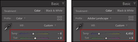
Secret #4: Mastering White Balance
Even with perfect settings, an off-kilter white balance can ruin a bright and airy image. The Temperature and Tint sliders in the Basic settings panel are crucial.
- Temperature: Moving left cools the image (blueish tones); moving right warms it (yellowish/reddish tones).
- Tint: Moving left adds a green tint; moving right adds a pink tint.
A good rule of thumb: the more warmth you add, the more pink you might need to balance it, and vice versa.
Beyond the Basics: Customizing and Enhancing Presets
While presets offer a fantastic starting point, every photo is unique, and some adjustments are often necessary to achieve the perfect balance.
Fine-Tuning After Preset Application
It's normal that adjustments will be needed after applying a preset, as every photo has different lighting conditions.
- Exposure: If your image is too bright after applying a preset, decrease the exposure in the
Light > Exposurepanel. - Color Adjustments: For presets that virtually eliminate a specific color (e.g., yellow at -65 for a bright and clear effect), you can increase the saturation of that color if a yellow object is present and appears faded. This is done in the
Color > Color Mix > Yellowpanel. - Vibrance: Turn up the vibrance (e.g., +10 or +20) for brighter tones in the
Color > Vibrancepanel.
Vibrance vs. Saturation: A Key Distinction
Vibrance and Saturation both affect color intensity, but they do so differently. Vibrance enhances color more intelligently, focusing on muted tones and protecting skin tones from becoming oversaturated or unnatural. This allows you to boost the color of backgrounds and environments without negatively impacting the skin tones of people in your photos. Saturation, on the other hand, boosts all colors equally, which can quickly lead to artificial-looking results, especially with skin tones.
Specific Preset Pack Examples and Their Uses
- Neutral Airy Lightroom Presets: Give your images a bright, clean feel with soft light and muted colors for candy-coated charm.
- Family Lightroom Presets: Perfect for special people and moments, offering a look that's soft and friendly for portraits.
- Minimal Blogger Lightroom Presets: Create beautiful looks instantly, ideal for those who want less time editing and more time creating content.
- Film Noir Pack: For a more dramatic, moody vibe.
- Black & White Presets: Stunning options for artistic, subdued monochrome images.
- Vibrant Color Lightroom Presets: Help colors pop in any photo by ramping up vibrance, adding brightness, and adjusting hues. These are built to enhance colors while reducing shadows and protecting skin tones.
- Summer-Inspired Presets: Inspired by bright summer colors, these presets enhance teals, pinks, yellows, and reds, transforming colors like blue into teal or red into soft peach.
Understanding Preset Licenses and Usage
When acquiring Lightroom presets, it's important to understand the terms of use. Typically, presets are licensed for personal or professional use by the single, individual purchaser. This license does not extend to companies or partnerships and may not be resold, loaned, or gifted to another individual or party. Redistribution, selling, or copying of the preset files in any way is prohibited.
The Broader Impact of Lightroom Presets
The adoption of Lightroom presets has significantly democratized high-quality photo editing. They empower individuals to achieve professional-looking results without requiring deep technical knowledge of every editing slider. This accessibility fosters creativity and allows more people to bring their visual visions to life. As exemplified by testimonials, programs like PHLEARN have been instrumental in this process, offering clear and concise tutorials that build confidence and inspire users.
The ability to quickly apply a consistent style can be particularly beneficial for content creators, bloggers, and small businesses aiming to establish a strong visual brand identity. With presets, the focus can shift from the technicalities of editing to the creative process of capturing compelling images and sharing stories.
Conclusion: Elevating Your Photography Workflow
Lightroom presets are more than just a shortcut; they are powerful tools that can streamline your editing process, enhance your creative vision, and ensure consistency across your work. By understanding how to use them effectively, how to customize them to your specific needs, and how to apply them across different platforms, you can significantly elevate the quality and impact of your photographs. Whether you're aiming for the serene beauty of a bright and airy aesthetic or the dramatic impact of a film noir look, there's a preset, or a combination of techniques, waiting to help you achieve your desired results. The journey from capturing an image to presenting a polished final product has never been more accessible or more exciting.