Lightroom is an indispensable tool for photographers seeking to organize and refine their images. However, for many, the journey into editing can feel less like a precise craft and more like a series of educated guesses. This guide is designed for every photographer who has found themselves arbitrarily manipulating adjustment sliders in Lightroom, questioning if there's a more systematic method to achieving desired results. While there's no single "correct" way to edit, Adobe has thoughtfully organized the Develop Module's sliders with a specific workflow in mind, guiding users through a logical progression of adjustments.
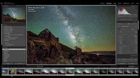
To access the Lightroom Develop module, simply press the hotkey "D." Ensure the right-hand panel is visible. At the very top of this panel, you'll find the histogram, exposure information, a tool panel, and then the "Basic" panel.
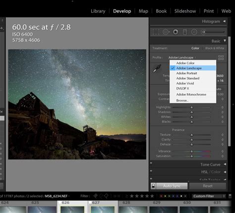
Establishing the Foundation: Profile and White Balance
The "Profile" setting acts as the foundational processing for your image. While "Adobe Color" is the default and a perfectly viable option, profiles like "Adobe Landscape" or "Adobe Portrait" can be particularly beneficial for images fitting those respective categories. Experimenting with these can reveal subtle yet significant improvements to your base image.
Following the profile selection, you arrive at the core adjustment sliders. The "Temp" (Temperature) slider occupies the prime position as the very first slider in the Develop Module for a crucial reason. You should almost always adjust your color temperature before making any other adjustments. While it doesn't need to be perfect at this initial stage, you will almost certainly revisit it once you've completed your "tonal management."
Tonal Management: Mastering Exposure and Contrast
The "Tone" section of the Basic Panel follows, featuring Exposure and Contrast, followed by Highlights, Shadows, Whites, and Blacks. The logic here is straightforward: how can you accurately adjust your Highlights, Shadows, or Whites/Blacks if your overall Exposure is significantly off? You don't necessarily need to fine-tune your Contrast immediately; it's often best to work your way down through these sliders.
The "heavy lifting" of recovering detail in highlights and shadows is typically best accomplished with the Highlights and Shadows sliders. Subsequently, fine-tuning to preserve any remaining clipped highlights or truly dark shadows can be achieved using the Whites and Blacks sliders. Once you feel you've established a good overall balance within these tonal adjustments, it's time to work your way back up. Consider if any overall Contrast is needed or if further fine-tuning of Temp or Tint is required.

Enhancing Detail and Presence: Texture, Clarity, and Dehaze
With your overall colors and tones dialed in, you can then very carefully engage with the "Presence" section of the Basic Panel.
Texture affects the finest, smallest details within your image. It functions similarly to sharpening but on a slightly larger scale, often imperceptible without zooming to 100%. For portraiture or subjects that benefit from a softer appearance, reducing Texture (e.g., to -10 or -15) can be very effective.
Clarity operates on a scale slightly larger than Texture. It's sometimes referred to as "Micro-Contrast" because it increases or decreases contrast on a more localized scale than the main Contrast slider.
Dehaze, the most powerful (and potentially dangerous!) of the Presence sliders, is primarily intended for images suffering from actual haze, such as foggy, flat scenes, or those affected by smog, smoke, or sunlit flare. In these specific conditions, Dehaze can miraculously clear up the image's tones. However, overuse can lead to an unnatural, poorly executed HDR look. Dehaze can also be applied to ordinary images, where it can function much like the "magic" slider in Instagram's editing tools, seemingly adding a touch of nearly every other slider and often yielding pleasing results. Nevertheless, exercise caution, especially if your image already possesses strong contrast.
It's important to note that Texture, Clarity, and Dehaze are all algorithmic adjustments. This means their effect on each image is unique and dependent on the specific tones and colors present in that particular photograph.
Color Refinement: Vibrance and Saturation
The "Vibrance" and "Saturation" sliders are also exceptionally potent, and at first glance, they appear to produce very similar results. However, they operate differently and are best used with a nuanced understanding.
Saturation boosts or diminishes the intensity of all colors in the image equally. This can lead to overly artificial-looking results if pushed too far, especially with reds and blues.
Vibrance, on the other hand, is more intelligent. It selectively increases the intensity of less saturated colors while leaving already saturated colors relatively untouched. This makes it a safer choice for boosting color without risking unnatural-looking skin tones or overly vibrant blues and greens. It's generally recommended to use Vibrance for overall color enhancement and Saturation more sparingly, perhaps for specific color adjustments in the HSL/Color panel.

The Art of the Edit: Developing Your Personal Style
The question of "what style should you pursue?" is deeply personal. Experimentation is key. Try different approaches, explore various slider combinations, and discover what resonates with you. One of the most effective strategies for defining your personal editing style is to understand what you don't like. By identifying what constitutes "too much" and then dialing back from that point, you can establish clear boundaries and refine your aesthetic. If you adopt this approach to your overall editing process, the remaining tools and panels within the Lightroom Develop Module will become significantly easier to manage.
Navigating the Develop Module Interface
The Develop module is structured with two sets of panels and a toolbar designed for viewing and editing your photos.
- Left-Hand Panels: These panels provide tools for previewing, saving, and selecting changes. They include the Navigator, Presets, Snapshots, History, and Collections panels.
- Right-Hand Panels: These panels house the tools and controls for making global and local adjustments to your photos.
- Center Area: This is your primary viewing and working space for the image.
- Toolbar (Below Center Area): This toolbar offers various functions, such as toggling between before-and-after views and enabling soft proofing.
Advanced Tools for Precision Editing
Beyond the Basic panel, the Develop module offers a suite of powerful tools for more granular control:
- Tone Curve Panel: This panel provides fine-tuning capabilities for your tonal adjustments. It offers additional control with a "Refine Sat" option and allows for both parametric and point editing modes, giving you precise command over tonal ranges. It's particularly useful for creating faded effects or enhancing contrast with S-curves.
STOP USING S-CURVES, do THIS instead: (Lightroom tone curves)
- HSL/Color Panel: This panel is crucial for making specific color adjustments. You can fine-tune the Hue, Saturation, and Luminance of individual colors. The Target Adjustment tool within this panel allows you to directly modify tones on the image by clicking and dragging on specific color areas.
- Color Grading Panel: This panel is used for creating special effects or colorizing monochrome photos, allowing for creative color treatments.
- Detail Panel: Here, you can reduce noise and adjust the sharpness of your image. Within the Sharpening section, holding the Option (Mac) or Alt (Win) key while dragging the Detail and Masking sliders will display a black and white preview of the mask, showing where sharpening is being applied. This is invaluable for controlling sharpening and preventing artifacts.
- Lens Corrections Panel: This panel is essential for correcting perspective distortions and chromatic aberrations caused by camera lenses, ensuring your images appear natural and professional.
- Effects Panel: This panel allows for the application of finishing touches such as vignetting and film grain, which can be used to add subtle texture or draw the viewer's eye to key areas of the photograph.
- Calibration Panel: This panel offers the deepest level of color control by allowing you to alter the primary RGB channels, affecting every pixel in the image. It's ideal for setting the overall mood or correcting extreme color casts.
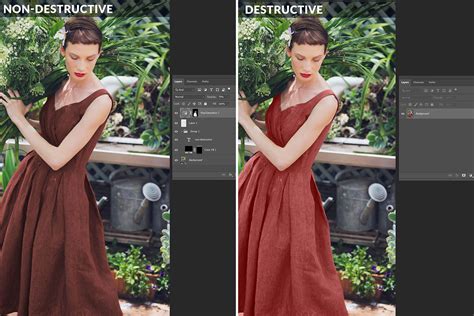
Non-Destructive Editing and Workflow Management
A fundamental principle of Lightroom Classic is its non-destructive editing workflow. All adjustments you make are stored as a set of instructions applied to your photo in memory. Your original file, whether it's a RAW, JPEG, or TIFF, remains unaltered. These edits are only rendered when you export or print your photos, ensuring the integrity of your original files.
Key workflow management features include:
- History Panel: This panel meticulously tracks every adjustment you make, allowing you to revert to any previous state of your edit. When the History panel becomes lengthy, you can save specific states as "Snapshots" to preserve them before clearing the history.
- Snapshots Panel: Snapshots allow you to save the current state of your photo with all its edits at any given time. This is incredibly useful for comparing different editing directions or for saving a specific look before making significant changes.
- Presets: Presets are a powerful way to save a group of settings and apply them to other photos. You can create your own presets or import them, and they remain accessible in the Presets panel until you delete them. When creating or updating a preset, you can opt to enable the "Amount" slider, which provides an overall intensity control for the applied preset.
- Reference View: This feature provides a dedicated 2-Up view, allowing you to place a static Reference photo alongside your Active (editable) photo. This is invaluable when you aim to match the look of one image to another. While in Reference View, you can edit your Active photo using most Develop tools, except the Crop tool.
- Copy and Paste Settings: You can easily copy the develop settings from one photo and paste them onto others. You can choose to copy all settings or select specific adjustments to apply.
- Synchronize Settings (Sync/Auto Sync): This feature allows you to apply edits from one photo to multiple selected photos simultaneously. Auto Sync is particularly efficient, applying changes in real-time as you make them to the active image.
- Match Total Exposures: This command helps to create more consistent exposure across a series of photos that may have varying exposure values.
- Soft Proofing: This capability allows you to preview how your onscreen photos will appear when printed and optimize them for specific output devices. By selecting the Soft Proofing box in the toolbar, you can replace the Histogram panel with the Soft Proofing panel, where you can select different printer profiles and rendering intents to simulate the final print. If your edits fall outside the printable color space of a chosen profile, Lightroom Classic will highlight these areas, allowing you to make adjustments. You can also "Create Proof Copy" to work on a virtual copy of your image to ensure the original remains untouched.
Understanding Process Versions
Lightroom Classic utilizes Camera Raw technology for its image adjustments. The "Process Version" setting dictates the underlying algorithms used for rendering. Process Version 5 offers improvements to negative dehaze and image quality for high-ISO RAW files. Images first edited in Lightroom 4 and later use Process Version 2012, which introduced new tone controls and tone-mapping algorithms optimized for high-contrast images. PV2012 enables adjustments to Exposure, Contrast, Highlights, Shadows, Whites, and Blacks within the Basic panel. Images edited in Lightroom 3 defaulted to PV2010.
By systematically learning to adjust tone, color, and details within the Lightroom Develop module, you gain profound control over your creative process, ensuring each image not only looks good but also aligns perfectly with your artistic vision. The structured approach outlined here transforms the potentially overwhelming array of sliders into a powerful and intuitive toolkit for image enhancement.