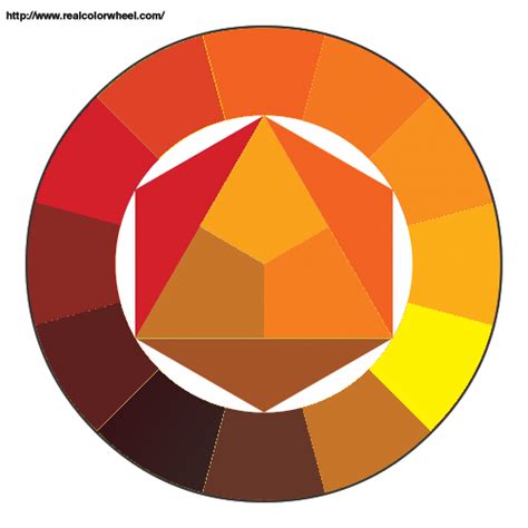
Orange, the color of the delightful citrus fruit, is a vibrant secondary hue born from the harmonious blend of red and yellow. Its presence on the color wheel sits between these two primary colors, creating a spectrum of possibilities that range from the cheerful optimism of yellow to the passionate warmth of red. The specific shade of orange can be finely tuned by adjusting the proportions of its constituent colors, as well as by the addition of white to create tints or black to deepen its tones. For digital design, the standard hex code for orange is #FFA500, a universally recognized identifier.
Orange is intrinsically linked with feelings of freshness, youthfulness, and creativity. It encapsulates the warmth of red and the unbridled optimism of yellow, acting as a powerful communicator of activity, energy, and a spirit of socialization. This color not only looks and feels fresh and healthy but also possesses the remarkable ability to stimulate appetite, making it a popular choice in culinary branding and design. Its high visibility also makes it an effective tool for capturing attention and signaling safety, a characteristic leveraged in everything from traffic cones to high-visibility clothing.
Understanding Orange in Color Spaces
To effectively utilize orange in design, understanding its representation across different color models is crucial.
RGB Color Space
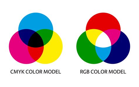
In the RGB (Red, Green, Blue) color space, which is fundamental to digital displays, the hex code #FFA500 translates to a composition of 100% red, 64.7% green, and 0% blue. This breakdown highlights the dominance of red, balanced by a significant amount of green, with no blue component.
CMYK Color Space
For print projects, the CMYK (Cyan, Magenta, Yellow, Key/Black) color model is paramount. Here, the hex code #FFA500 is represented by 0% cyan, 35% magenta, 100% yellow, and 0% black. This CMYK breakdown reveals that yellow is the primary driver of this specific orange hue in print, with a moderate contribution from magenta.
The nuances of color reproduction can be challenging. For instance, red can sometimes appear orange or rusty in print, indicating an imbalance in magenta and yellow levels. To achieve a vibrant red, one might need to adjust these values. Similarly, mixing cyan and yellow in equal, dense parts creates green; careful calibration is needed for desired vibrancy. Yellow itself requires attention when darkening, as it can easily shift towards a sage or mustard tone. Blue is notoriously difficult to reproduce accurately in CMYK, with even and balanced mixtures like 100-50-0-0 suggested for better results. Regal purple tones are generally CMYK friendly. Pink colors in CMYK printing rely heavily on magenta; high magenta levels with low yellow, cyan, and black yield standout pinks. Metallic finishes like gold and silver are not achievable in standard CMYK printing, though flat or non-metallic representations are possible.
The Psychology and Symbolism of Orange
Orange is more than just a visual sensation; it carries significant psychological weight and cultural symbolism. Color psychologists often associate orange with emotions and attitudes that inspire action and optimism. It is a color that encourages creativity, self-expression, and a sense of playfulness. Its vibrant energy captures the spirit of enthusiasm and can symbolize friendship, happiness, and even prosperity.
Across diverse cultures, orange holds varied meanings. In Greek mythology, gods adorned in orange often represented immortality. In Eastern religions, such as Hinduism and Buddhism, orange is revered as a sacred color, signifying renunciation and spiritual awakening.
In User Interface (UI) design, orange is frequently employed to prompt action, particularly through Call to Action (CTA) buttons. It is also used to convey warnings or alerts, and to emphasize critical information due to its high visibility. Its vibrant energy lends a friendly and creative impression, making it a popular choice for brands that wish to project similar identities, such as Dunkin' Donuts or Reese's.
The very name "orange" has a rich etymological history. It derives from the Old Persian word "nārang," referring to the bitter orange fruit. The English word "orange" itself appeared in the 12th century, likely stemming from the French word "orenge."
Historically, this intense color was favored by artists like Vincent van Gogh, whose paintings often feature striking representations of orange. During the 20th century, orange experienced another surge in popularity, primarily used for theatrical stage decorations and costume embellishments. As orange dyes became more commercially available, the color became associated with affordability and joyfulness.
The Psychology of Color "Orange"
Orange in Design and User Experience
Orange's inherent qualities make it a valuable tool in various design contexts, particularly in UX/UI.
Using Orange in Designs
- Indicate important or clickable areas: Orange is ideal for elements that need to feel dynamic and engaging, such as hover effects or other interactive components.
- Highlight calls to action: When paired with a neutral background, orange can make text or buttons pop, drawing the user's attention to desired actions.
- Guide viewers with accents: Used for accents in icons or illustrations, orange can add a pop of color and effectively guide the viewer's eye.
- Indicate progress with visual cues: Orange can be used to signify positive progress or the completion of tasks, forms, or processes within a user interface.
When making color choices for UX/UI design, accessibility considerations are paramount. Tools and plugins are available to ensure designs meet Web Content Accessibility Guidelines, crucial for users with visual impairments.
Color Harmonies and Combinations with Orange
Orange pairs exceptionally well with colors that either enhance its vibrancy or provide a calming contrast.
Harmonious Combinations
- Nearby Colors: Orange looks particularly good with colors adjacent to it on the color wheel, such as red and yellow.
- Complementary Color: Its direct complementary color, blue, creates a strong and pleasing contrast. Violet also pairs well with orange.
- Navy Blue (#000080): This deep blue provides a sophisticated contrast to orange's vibrancy.
- Charcoal (#4A4A4A): A versatile and mature neutral, charcoal offers a grounding element to orange's energetic nature.
- Cream (#FDFBD4): Cream creates a natural warmth and softness when paired with orange, offering a gentler aesthetic.
- Black (#000000): Black provides a bold and dramatic statement, making orange appear even more intense.
- Teal and Purple: Brighter accents like teal or purple can create bold color palettes with orange, adding pops of energy and leaning into the playfulness of orange.
Potential Clashes
While orange is generally versatile, certain color combinations can be jarring or lead to a design that appears flat:
- Neon Green (#2CFF05): This pairing can create an extreme visual contrast that may be overwhelming.
- Brown (#895129): When paired with orange, brown can sometimes make a design look flat due to insufficient contrast, preventing either color from truly standing out.
- Fuchsia (#FE3894): Orange and fuchsia can create an intense look where the colors appear at odds with each other.
- Emerald Green (#00674F): This combination creates a strong contrast that can be jarring, presenting two opposing energies simultaneously.
Exploring the Spectrum of Orange Hues
The versatility of orange is evident in its myriad of variations, each with its own character and application. These variations can be broadly categorized into shades, tints, and tones, each offering a distinct feel.
Related Hues
- Red Orange: A bold and stimulating color, red-orange is orange infused with the fiery intensity of red, making it bolder and more dramatic.
- Burnt Orange: An ever-popular color, burnt orange is a go-to choice for clothing, branding, and interior decorating, offering a rich, earthy tone.
- Yellow Orange: This hue capitalizes on the cheerful essence of orange with a lighter touch, often referred to as yellow-orange.
Specific Orange Shades and Their Origins
The world of orange is vast, encompassing countless specific shades named after natural phenomena, objects, and cultural references.
- International Orange: A deep, medium orange hue used by the aerospace industry to differentiate objects from their backgrounds.
- Princeton Orange: First referred to by this name in 1928, it is one of the official colors of Princeton University.
- Orioles Orange: A medium orange hue with red tones, reminiscent of the color of an oriole's belly.
- Alloy Orange: A shade of brownish orange, named by Crayola in their 2001 release of metallic crayons.
- Fulvous: A reddish-yellow orange with brown hues, somewhat similar in color to tawny.
- Flame: A shade of orange that is bright, warm, and vibrant.
- Chinese Orange: A medium shade of orange with light coral tones.
- Jasper Orange: A dusty orange, or a mix between a tan and a pale orange.
- Royal Orange: A light, peachy orange hue.
- Coral: A color that can be placed in either the pink or orange family. Dark Coral is another pinkish orange hue.
- Cadmium Orange: A rich, earthy orange tone named after the chemical component cadmium.
- Dark Pastel Red: Can be classified as both a red and orange hue.
- University of Tennessee Orange: As the name suggests, this shade is used in the University of Tennessee’s logo.
- Orange Peel: A shade of orange that is more golden in hue.
- Vivid Tangelo: A slightly brighter, more vibrant version of the color tangelo.
- Bittersweet: A shade of reddish orange rich in tones of cyan and magenta.
- Persian Orange: A light shade of tannish orange, similar to a pale terracotta.
- Apricot Orange: Resembles the color of an apricot's exterior.
- Bronze: A sturdy alloy with a distinctive orange-brown color.
- Buff: In Victorian England, this referred to a specific shade of orange-brown.
- Bumblebee Orange: A shade that deserves recognition alongside the typical yellow and black of bumblebees.
- Butterscotch: A rich, sweet orange-brown color.
- Chocolate Orange: More of a nod to the shade of milk chocolate than a specific treat.
- Cider Orange: Evokes the warm, autumnal mood of a hot mug of cider.
- Copper Orange: Fresh copper has a brilliant orange-gold glow.
- Desert Sand Orange: Reflects the color of sun-bleached desert sands.
- Dragon Fire Orange: A shade that wouldn't look out of place in a medieval fantasy.
- Dull Orange: Despite its name, this shade is still quite bright.
- Giants Orange: Refers to the New York Giants professional baseball team's color.
- Ginger Orange: A strong burst of color reminiscent of gingerbread houses.
- Golden Gate Bridge Orange: The distinctive reddish-orange hue of the Golden Gate Bridge.
- Goldenrod Orange: Similar to the color of goldenrod flowers.
- Goldfish Orange: A close match to the color of goldfish.
- Honey Orange: Named after the sweet substance, it's similar to amber but with more yellow.
- Hunyadi Orange: The color found on the Hunyadi coat of arms.
- Koi Orange: Similar in shade to goldfish, reflecting the color of koi fish.
- Light Orange: A straightforward description of a paler orange.
- Light Copper Orange: A paler version of copper orange.
- Pumpkin Orange: A shade that strongly resembles the color of pumpkins, often associated with Halloween.
- Dark Topaz Orange: A deep, gemstone-inspired orange hue.
- Mahogany: A deep, rich orange-brown color associated with the wood of the same name.
- Marigold Orange: The color of the small, golden-orange marigold flowers.
- Melon Orange: Provides a distinctly summery feel, reminiscent of melon fruits.
- Mimosa Orange: Named after either the flower or the popular brunch drink.
- Neon Orange: The bright, electric shade typically found in neon signs.
- Ochre Orange: Similar to burnt orange, with a vibrant base muted by darker notes.
- Orange Spice Orange: A variation on the spice-inspired orange theme.
- Outrageous Orange: A color that lives up to its name with its boldness.
- Pantone Orange: A quintessential, "typically" orange shade.
- Peach Orange: A softer, pink-tinged orange, reminiscent of a peach's fuzzy exterior.
- Pepper Orange: Named after the orange bell pepper.
- Fox Orange: Inspired by the color of foxes, known for their cleverness and presence in human cultures.
- Rumba Orange: Named after the style of dance.
- Safety Orange: The highly visible color used for traffic cones and safety vests.
- Safflower Orange: Named after the flowering plant used to make saffron.
- Salamander Orange: Reflecting the color of salamanders.
- Salmon Orange: Named for the bright pink flesh of salmon.
- Squash Orange: A variation within the pumpkin orange family, with more distinct characteristics.
- Sunrise Orange: Named for the soft, brilliant streaks of light in the morning sky.
- Sunset Orange: A bright, energetic color with more "fire" than sunrise orange.
- Syracuse Orange: One of the official colors of Syracuse University.
- Tawny Orange: A warm, energetic shade with a high level of red undertones.
- Tiger Orange: A bright, energetic shade matching the appearance of tigers.
- Tiger's Eye Orange: Reflects the orange-brown blend found in tiger's eyes and faces.
- Topaz Orange: A slightly more fiery version of dark topaz orange.
- Tree Sap Orange: Linked to the color of tree sap when it first emerges from the bark.
- Web Orange: Named after the World Wide Web.
- Wheat Orange: An incredibly pale shade capturing the energy of an open field of grain.
- Xanthous Orange: A color often seen in the coats of Golden Retrievers.
- Yam Orange: Gets its distinctive color from carotene, rich in vitamin K.
- Mecca Orange: An energetic, vibrant red-orange with an exotic feel, from Pantone’s Textile Cotton selection.
- Lava Orange: An especially bright, almost electric orange with unique depth.
- Dutch Orange: A versatile, medium orange shade with a high amount of yellow, commanding attention and used in advertising and logos. Also known as Holland Orange or Netherlands Orange.
- Amber Orange: Possesses a golden quality with a distinct orange glow, bright but not neon.
- Aesthetic Orange: A pleasant, peachy shade perfect for projects needing a quieter, paler color.
- Hot Orange: Possibly the most electric of all orange shades, containing both green and red for depth and brightness.
- Glossy Orange: A balanced color that performs well when printed on glossy paper, with yellow CMYK values more than twice its magenta.
- Pure Orange: The standard for all other orange shades, with yellow CMYK values exactly twice that of its magenta.
- Rustic Orange: Close to the color of weathered wood, it's more muted with a higher K value and lower yellow value.
- Baby Orange: A soft, delicate, and noticeably paler shade of orange.
- Irish Orange: Indicated in Irish official documents as the official orange used on the Irish flag.
- Marmalade Orange: Slightly deeper than Irish Orange, with more magenta, yellow, and black.
- Vintage Orange: A revival color, close to a neutral, suitable for home decor and as a background for darker text.
- Rust: A deep orange, fairly close to red, resembling rusted metal.
- Saffron Orange: Named after the spice, it’s the exact color of orange seen in the Indian flag.
- Atomic Tangerine: A gentle, rosy orange close to pink, named by Crayola.
- Red Orange: Redder than burnt orange, with a rust-like quality.
Color Palettes and Harmonies
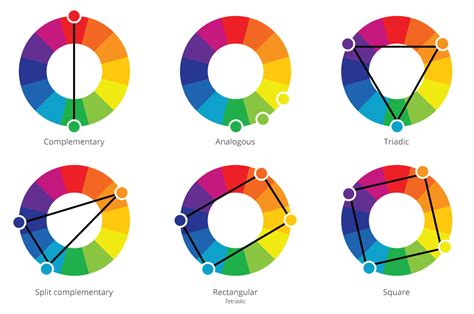
The exploration of orange extends to various color harmonies:
- Complementary: Directly opposite on the color wheel (e.g., orange and blue).
- Split Complementary: Uses the two colors adjacent to the complementary color.
- Triadic: Three colors evenly spaced on the color wheel.
- Tetradic: Four colors forming a rectangle on the color wheel.
- Analogous: Colors that are next to each other on the color wheel.
- Monochromatic: Different shades, tints, and tones of a single color.
Custom palettes can be created, such as "Citrus Infusion," "Celestial Citrine," and "Phoenix Rising," offering designers inspiration for their next project.
Accessibility and Color Perception
When designing, especially for digital interfaces, it's crucial to consider accessibility. Color simulations for conditions like Protanopia, Deuteranopia, Tritanopia, and Achromatopsia help designers understand how their choices might be perceived by users with different forms of color vision deficiency. A contrast checker is also vital; for instance, #FFA500 on a #FFFFFF background fails contrast requirements for both large and normal text, while on a #000000 background, it passes.
The meaning of color can also shift across cultures and over time. Designers aiming for a global audience must research color considerations specific to their target regions to avoid unintended interpretations.
In conclusion, orange is a dynamic and multifaceted color with a rich history, diverse symbolism, and practical applications across art, design, and communication. From its precise CMYK and RGB codes to its psychological impact and cultural significance, orange offers a powerful palette for creative expression.