Halftones are a foundational technique in the printing industry, enabling the reproduction of continuous-tone images - like photographs - using a limited palette of inks. This seemingly simple method is, in fact, a clever optical illusion, a testament to how printers have overcome the limitations of mechanical processes to create rich, detailed visuals. For screen printers, in particular, halftones are indispensable for achieving the intricate details and tonal variations that bring designs to life on garments. But what exactly are halftones, and how do they achieve this visual magic?
The Illusion of Continuous Tone
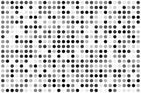
At its core, a halftone is a mathematical dot pattern. It's a method of representing the grayscale value of a color by using dots of varying sizes or spacing, all based on an underlying grid. When viewed from a normal distance, the human eye blends these dots together, creating the perception of smooth gradients and continuous tones, much like the original image. As the Getty Center notes, "A representation of a continuous-tone image is in fact an optical illusion based on the limited optical resolution of the human eye." This principle is what allows printers, historically limited to printing solid areas of ink, to simulate an infinite range of colors and shades.
From Photographs to Dots: The Halftone Process
The translation of a photograph into a halftone pattern is a sophisticated process that has evolved significantly over time. Early printers faced the challenge of reproducing photographic realism on presses that could only lay down solid ink. This led to the development of techniques that broke down images into discrete points.
Historically, before the advent of digitized images, specialized photographic techniques were employed. One such method was "screening," where a coarse-woven fabric screen was placed in front of a camera's plate during exposure. This screen would interrupt and diffract the incoming light, breaking it into a pattern of dots. Other techniques involved using screens with parallel bars, or plates with etched crossing lines, to achieve similar dot patterns.
The development of halftone printing methods for lithography followed a distinct path. In the 1860s, companies like A. Hoen & Co. were instrumental in this evolution. The invention of the relief halftone process by Georg Meisenbach in Germany in 1882, based on earlier ideas from A. J. and J. W. Swan, proved to be a significant commercial success. Meisenbach's "autotype" process used single-lined screens that were rotated during exposure to create cross-lined effects, a crucial step in achieving more nuanced tonal reproduction.
The Role of RIP Software and Digital Halftoning
In modern printing, particularly in screen printing where designs often feature one to three flat colors or spot colors, the need for halftones arises when a design incorporates shading, drop shadows, or realistic-looking effects. These elements, which deviate from solid color areas, require the tonal translation that halftones provide. Halftones are crucial for enhancing a design's detail and depth.
The creation of halftones today is largely facilitated by Raster Image Processing (RIP) software. A RIP is essentially a device or software that converts vector graphics and raster images into a format that a printer can understand and execute, including the intricate dot patterns of halftones. While programs like Adobe® Photoshop can create halftones, it can be a more involved process. RIP software is generally considered the easiest and most efficient way to generate these patterns. When the software recognizes that a spot color value is not at its full 100%, it understands this as a tonal value and applies a halftone effect.
Digital halftoning, as opposed to traditional photographic methods, uses a bitmap where each monochrome picture element or pixel can be either on or off (ink or no ink). To emulate the photographic halftone cell, digital halftoning cells contain groups of monochrome pixels within a similarly sized area. This method relies on algorithms to determine which pixels should be black or white, with some yielding superior results to others. Modern digital halftoning often employs sophisticated dithering algorithms, and even advanced techniques like machine learning and generative adversarial networks are being explored for more precise inverse halftoning and detail recovery.
Screenprinting Tee Shirts: Do I Need RIP Software & All Black Ink Systems?
Key Parameters in Halftone Creation
Several critical parameters influence the final halftone output, affecting the detail, clarity, and overall appearance of the printed image. Understanding these elements is key to achieving successful halftone prints.
Lines Per Inch (LPI)
Lines Per Inch, or LPI, refers to the number of lines of dots that intersect within a square inch. A lower LPI indicates larger dots and less detail, while a higher LPI signifies smaller dots and greater detail. The choice of LPI is often dictated by the mesh count of the screen used in screen printing. A general rule of thumb for determining optimal LPI is to divide the mesh count by 5. For example, a 160 mesh screen would yield approximately 32 LPI (160 / 5). For finer detail, especially in a controlled darkroom environment, dividing the mesh count by 4 can provide a higher LPI, such as 40 LPI for a 160 mesh screen (160 / 4). It's important to remember that LPI and resolution are intrinsically linked. The detail achievable on the printed shirt cannot exceed the detail present in the original image at 2.5 times the LPI.
Dots Per Inch (DPI) and Pixels Per Inch (PPI)
Dots Per Inch, or DPI, is a measure of image resolution, often used interchangeably with Pixels Per Inch, or PPI. Higher resolution images contain more information and can therefore support more detailed halftone patterns, leading to smoother gradients and a more accurate reproduction of the original. Conversely, lower resolution images may result in coarser halftone patterns and less detail in the final print.
Screen Angle
The angle of the halftone dots refers to the rotation of the dot grid. Dots placed at right angles (0°, 90°, 180°, 270°) can align with the mesh threads, leading to undesirable patterns. Angles that bisect the mesh, such as 45°, are generally preferred because they minimize the interference with the mesh threads. A common recommendation for optimal results is to use angles around 22.5° or 45° to ensure the dots miss as many mesh threads as possible. When printing with multiple colors (like CMYK), the angles of the individual color halftones are critical. If the angles are too close, they can interfere with each other, creating distracting visual artifacts known as moiré patterns. Historically, common angles for CMYK printing have been 45° for black, 75° for yellow, 15° for magenta, and 105° for cyan. However, advancements in RIP software and printing techniques have shown that using a single angle, such as 22.5° or 45°, for all colors can also yield excellent results without moiré. The specific angle choice can depend on the artwork, mesh count, fabric, and tension.
Dot Shape and Size
While the round dot shape is the most popular and versatile, halftones can be created with various dot shapes, including elliptical and square. The size of the dots is directly related to the ink coverage. In AM (Amplitude Modulated) halftoning, color depth is achieved by varying the dot size. Smaller dots represent lighter tones (highlights), while larger dots represent darker tones (shadows). For instance, dots with 10% coverage might be considered "one dot," while those with 50% coverage form the midtones, and 70-90% coverage signifies shadows. The Radius setting in software like Photoshop affects both the size of the halftone dots and the spacing between them, influencing the gradient and blur of the image.
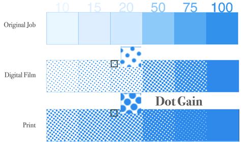
Understanding and Mitigating Dot Gain
A common challenge encountered in halftone printing is "dot gain." This phenomenon occurs when the ink spreads beyond the intended dot size as it's transferred to the substrate, particularly under the pressure of the squeegee during screen printing. Dot gain can cause image areas to appear darker and less detailed than intended, especially in shadow areas. Screen printers often account for a typical dot gain percentage, commonly around 30%, by adjusting the original artwork or the halftone settings. For example, if a 70% gray is desired, the printer might create a 40% dot in the artwork, anticipating that it will gain 30% during printing to appear as 70%. Understanding and compensating for dot gain is crucial for accurately reproducing the intended tonal range.
Halftones in Different Printing Contexts
While deeply entrenched in screen printing, halftones are a universal printing technique. They were developed in the 20th century for presses utilizing only cyan, magenta, yellow, and black (CMYK) inks. By strategically placing fields of tiny dots in these four colors, printers could create the illusion of a much wider spectrum of colors and shades. This forms the basis of process color printing, where full-color images are reproduced by layering these halftone dots.
In modern printing, two primary types of halftone dots are utilized: Amplitude Modulated (AM) dots and Frequency Modulated (FM) dots. AM dots, as described earlier, vary in size but maintain a fixed spacing. FM screening, also known as stochastic screening, uses dots of a consistent size but varies their frequency or spacing. This can sometimes offer finer detail and smoother gradients, particularly in shadow areas, and can be less prone to moiré patterns.
The Evolution and Future of Halftones
The digital age has revolutionized halftone creation, offering unprecedented control and flexibility. Graphic design software allows for precise adjustments to dot size, spacing, and angle, enabling custom halftone effects. Beyond traditional print, halftones are even used in digital screens to achieve a retro or textured aesthetic, though the effect is purely visual in this context.
Inverse halftoning, or descreening, is another important aspect that has gained traction. This process aims to reconstruct high-quality continuous-tone images from their halftone versions, which is particularly useful when scanned images are being re-edited or reprinted. Various algorithms, including low-pass filtering, wavelet decomposition, and even machine learning, are employed for this purpose.
Despite the advancements, the fundamental principle of the halftone remains a cornerstone of printing. It's a technique that continues to be refined, offering designers and printers a powerful tool to translate the richness of the visual world onto a physical medium. The more one works with halftones, the deeper the understanding and appreciation for this intricate and visually compelling printing method.