Halftone designs have been a cornerstone of visual communication for centuries, offering a unique way to translate continuous-tone images into a format suitable for printing processes like screen printing. Whether you're aiming to replicate the vintage charm of comic book tees, or to transfer a beloved photograph onto apparel, understanding and implementing effective halftone settings in Photoshop is crucial for achieving professional, impactful results. This article delves into the intricacies of halftone creation for screen printing, guiding you through the essential settings, Photoshop techniques, and best practices to elevate your merchandise and artwork.
The Essence of Halftones: Creating the Illusion of Depth
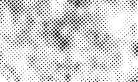
At its core, a halftone is a design style that utilizes a series of small dots, varying in size and spacing, to create the illusion of different shades, shadows, and gradients. This visual trickery is what allows us to reproduce the subtle details and depth of photographs and complex artwork using the relatively limited capabilities of printing techniques like screen printing. By strategically arranging these dots, fine details are imitated, transforming a flat image into something that appears to possess a full spectrum of tones. The dots are the building blocks, and their careful manipulation is what tricks our brain into perceiving a complete, detailed image.
The historical significance of halftones cannot be overstated. Their rise in popularity during the 1800s was instrumental in enabling the reproduction of photographic images in publications like newspapers and magazines, a feat previously impossible without expensive and time-consuming manual engraving processes. This innovation democratized image reproduction and laid the groundwork for the sophisticated printing techniques we use today.
Understanding the Core Halftone Settings
To effectively create halftones in Photoshop for screen printing, a grasp of several key settings is paramount. These parameters dictate the appearance, detail, and printability of your final design.
Lines Per Inch (LPI)
Lines Per Inch, or LPI, refers to the density of the halftone dots within a given area. It essentially defines how many lines of dots are packed into a single inch. A lower LPI, such as 32, results in larger, more distinct dots. This can be beneficial for simpler designs or when printing on substrates that are less forgiving of fine detail. However, it may sacrifice some of the finer nuances of an image. Conversely, a higher LPI, like 65, produces smaller, more numerous dots, allowing for greater detail and smoother transitions. This requires more precise printing equipment and finer mesh screens.
A common guideline for determining the optimal LPI is to relate it to your screen's mesh count. For standard prints, a good starting point is to set the LPI to one-fifth of the mesh count. For more detailed work, you can push this to one-fourth of the mesh count. For instance, if you are using a 160 mesh screen, a standard print might utilize 32 LPI (160 / 5), while a more detailed approach could aim for 40 LPI (160 / 4). For photorealistic images that demand exceptional detail, an LPI of 55-65 is often recommended, provided your screen mesh count (typically 230-280 mesh) can support it.
Dots Per Inch (DPI)
DPI, or Dots Per Inch, is a measure of the resolution of your digital image. For halftones, it's crucial that your DPI is sufficiently high to support the chosen LPI. A general rule of thumb is to set your image DPI to approximately 2.5 times the LPI. This ensures that there are enough pixels in your digital file to accurately represent the density of dots required by the LPI setting without overwhelming the printing process. For example, if you're aiming for an LPI of 120, your image should ideally be at least 300 DPI. Always start with a high-resolution image, at least 300 DPI, to maintain clarity throughout the conversion process.
Angle
The angle at which halftone dots are oriented is critical for avoiding undesirable visual artifacts, most notably moiré patterns. Moiré is a distracting interference pattern that can occur when sequential halftone dot patterns are overprinted, especially when the angles are too close or aligned. In four-color printing (Cyan, Magenta, Yellow, and Black - CMYK), these moiré patterns are a primary concern.
Ideally, screen angles should be set 30 degrees apart to minimize moiré. However, since angles repeat every 90 degrees, it's only possible to achieve this perfect 30-degree separation for three of the four colors (e.g., 0, 30, 60 degrees). The fourth color must be placed at an angle that creates a slight moiré, typically a 15-degree interval. To hide this unavoidable disturbance, the color yellow is often assigned this angle. Yellow is inherently less visible to the human eye, making any subtle line of yellow dots created by the halftone pattern less noticeable. In some printing environments, a dark blue glass is used by press operators to enhance the contrast of yellow halftones, demonstrating how its visibility can be a factor.
For single-color prints, angles that align with the mesh threads (0°, 90°, 180°, 270°) should be avoided as they can lead to printing issues. Similarly, a 45-degree angle can sometimes result in a loss of detail. Experts often recommend angles of 22.5° or 25° for single-color applications. These angles help to minimize interference with the mesh threads and "knuckles" (the points where threads intersect), leading to a cleaner, more precise print.
Dot Shape
The shape of the halftone dots can influence the overall aesthetic of the print. While round dots are the most common and versatile choice, offering predictable results and ease of printing, other shapes can be employed for specific artistic effects. Elliptical or square dots, for instance, might be used depending on the design's requirements or the capabilities of the RIP (Raster Image Processor) software. For most screen printing applications, a round dot shape serves as a reliable default.
Dot Gain
Dot gain is an inherent characteristic of the printing process where the dots in the halftone pattern slightly increase in size during printing. This expansion is often caused by ink spread, which is influenced by factors like squeegee pressure and the absorbency of the substrate. A typical dot gain can be around 30%, and if not accounted for, it can lead to oversaturation and darker-than-intended areas in the final print.
To compensate for dot gain, adjustments can be made within Photoshop. This often involves reducing the overall density of the image or specifically tweaking the midtone values using adjustment layers like Curves or Levels. By slightly darkening the midtones in your digital file, you can preemptively counteract the ink spread that will occur during printing, ensuring the final printed image closely matches your intended design.
Creating Halftone Designs in Photoshop: A Step-by-Step Guide
Photoshop offers a robust set of tools for creating effective halftones suitable for screen printing. Here's a breakdown of the process:
1. Preparing Your Image
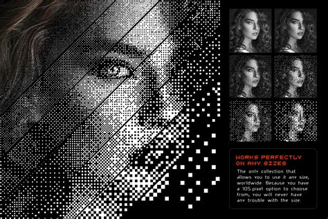
Begin with a high-resolution image. The quality of your original artwork is paramount, as any imperfections or low resolution will be amplified in the halftone conversion. Aim for an image resolution of at least 300 DPI. Since screen printing often involves working with spot colors, it's generally advisable to convert your image to grayscale. Navigate to Image > Mode > Grayscale. This removes color information, focusing the halftone process on the tonal values of the image.
2. Applying the Halftone Effect
Once your image is in grayscale, you can apply the halftone effect. Go to Image > Mode > Bitmap. In the resulting dialog box, you'll be prompted to set the output resolution. This should match your desired DPI (e.g., 300 DPI). Next, you'll select the Method. For standard halftone creation, choose "Halftone Screen."
This will open another dialog box where you can define the halftone settings:
- Frequency: This corresponds to your LPI. Enter your desired value (e.g., 45-65 LPI).
- Angle: Set the angle for your dots (e.g., 22.5° for single color, or specific angles for CMYK if simulating process colors, though this article focuses on single-color screen printing halftones).
- Shape: Select your preferred dot shape (e.g., "Round").
After confirming these settings, your image will be converted into a bitmap, displaying the halftone pattern.
3. Adjusting for Dot Gain
Before finalizing, it's crucial to account for dot gain. Return to your grayscale image before converting to Bitmap mode. Use adjustment tools like Image > Adjustments > Curves or Image > Adjustments > Levels to subtly reduce the midtone density. This pre-compensation will help ensure that the printed dots do not appear too dark due to ink spread. When making these adjustments, consider how the artwork will appear from a distance; clarity at a few feet away is a good indicator of successful contrast and detail retention.
4. Saving for Output
For screen printing, it's best to save your halftone image in a format that preserves quality and is compatible with RIP software. A TIFF file is generally recommended. Ensure that you disable any compression options. A descriptive file name, such as "Halftone40LPI160Mesh.tiff," can be very helpful for tracking your settings.
Master Halftone Effects for DTF Printing | Photoshop Guide
Best Practices for Screen Printing Halftones
Beyond the technical steps in Photoshop, several practical considerations will contribute to successful halftone prints:
- High-Quality Source Images: This cannot be stressed enough. Low-resolution or poor-quality source images will inevitably lead to disappointing halftone results.
- Matching Settings to Equipment: Understand your screen printing setup. The mesh count of your screens is a primary factor in determining the achievable LPI. For detailed halftones, mesh counts between 230 and 280 are often used.
- Test Prints: Always conduct test prints before committing to a full production run. This allows you to verify that your chosen LPI, angle, and dot shape are producing the desired effect on your specific substrate with your chosen ink.
- Ink and Substrate Considerations: Different types of inks (e.g., plastisol vs. water-based) and substrates (e.g., cotton vs. polyester) can interact differently with the halftone pattern, affecting ink spread and final appearance.
- Emulsion Quality: The quality and application of the emulsion on your screen can significantly impact the clarity and detail of the final halftone print. Inconsistent emulsion can lead to distorted or muddy halftones.
- RIP Software: While Photoshop is excellent for creating halftones, specialized RIP (Raster Image Processor) software can offer even greater precision and automation, particularly for complex multi-color halftone separations.
The Significance of Halftones in Screen Printing
Halftoning is not merely a technical requirement; it's a creative tool that unlocks a new dimension of possibility in screen printing. It allows printers to reproduce photographic images, gradients, and intricate illustrations that would otherwise be impossible with flat, solid colors. By mastering the art of halftoning, you can transform a simple design into a visually rich artwork, adding depth, texture, and a level of detail that captivates the viewer. It's a skill that empowers screen printers to achieve professional, high-quality results, making single-color designs appear as if they possess multiple shades and tones, breathing life into every print.