Creating a distressed or weathered look for your designs in Photoshop is a popular technique, especially for t-shirt graphics, posters, and digital art that aims for a vintage or grunge aesthetic. This tutorial will guide you through the process of effectively applying distressed textures to your artwork, ensuring a realistic and impactful result. We will explore various methods, from subtractive techniques using layer masks to leveraging high-resolution photographic textures, all aimed at achieving that perfectly imperfect, worn-down appearance.
Understanding the "Distressed" Aesthetic
The core of the distressed aesthetic lies in simulating the effects of time and wear on an object or design. This can manifest as fading, cracking, scuffing, or general unevenness. Crucially, it's about creating an effect that feels organic and not uniform. As one forum member aptly put it, "I could easily overlay a pattern/texture but I don't want it to be uniform." This highlights the need for techniques that introduce irregularity and depth, rather than a simple repeating pattern.
The desired effect is that the design elements will look as if they are worn down in certain spots, allowing the underlying material, such as a t-shirt fabric, to show through. This isn't about simply coloring over your design with a texture; it's about selectively revealing or obscuring parts of the design itself to mimic natural degradation.
Method 1: Subtracting Texture Using Layer Masks
One of the most effective ways to achieve a "subtractive" distressed look, where the texture appears to eat away at your design, is by using layer masks. This method allows for precise control over where the distressing appears.
The initial requirement was to "subtract the texture from the design so there are like holes in it basically not just distressed ontop of it with color." This implies using the distressed texture as a blueprint to remove parts of the original artwork.
Step-by-Step Application:
Prepare Your Layers: Ensure your design is on its own layer (let's call this the "Design Layer"). Place your distressed texture file (which should ideally be a grayscale image with varying shades of black and white, or a high-contrast black and white image) on a new layer directly above your Design Layer. If your texture has a background, you'll need to remove it.
Darken the Distressed Texture: Often, distressed textures are scanned or photographed and may have a range of grays. To make them more effective as a mask, you'll want to increase their contrast. With the distressed texture layer active, press
Ctrl+L(orCmd+Lon Mac) to open the Levels adjustment. Move the black slider (the leftmost slider) to the right. This will darken the dark areas and make the white areas stand out more, creating a sharper distinction between what will be "kept" and what will be "removed." You're aiming to get a strong black and white representation of your texture.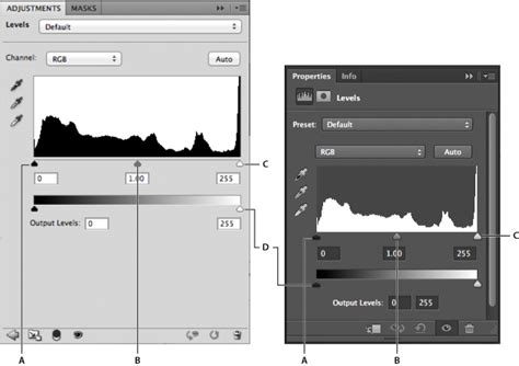
Create a Layer Mask: Hold down
Alt(orOptionon Mac) and click on the Layer Mask icon at the bottom of the Layers palette. This will create an inverted layer mask, meaning the texture layer itself will become completely invisible, and you will see a black mask thumbnail next to your texture layer's thumbnail.Reveal the Texture Through the Mask: Now, with the distressed texture layer still selected, and the black mask thumbnail visible, paint with white on this mask using a brush. Wherever you paint white on the mask, the distressed texture will become visible. If you want the texture to show through your design, you'll need to position this layer above your Design Layer.
Applying the Mask to Your Design: The key to "subtracting" the texture is to use it to mask your design.
- Select your distressed texture layer.
- Go to
Image > Adjustments > Levels(orCtrl+L). - Adjust the input levels so that the white areas of your texture become pure white and the dark areas become pure black. This is crucial for creating a clean mask.
- Make sure the distressed texture layer is directly above your Design Layer.
- With the distressed texture layer active,
Ctrl+A(orCmd+A) to select the entire layer. Ctrl+C(orCmd+C) to copy the distressed texture.- Now, select your Design Layer.
- Click the "Add Layer Mask" icon at the bottom of the Layers palette.
- Ensure the mask thumbnail is selected (it will have a border around it).
Ctrl+V(orCmd+V) to paste the distressed texture onto the layer mask.
The white areas of your copied texture will reveal your design, and the black areas will mask it out, creating the "holes" and worn effect. If the effect is too strong or too weak, you can adjust the Levels of the mask itself by clicking on the mask thumbnail and then using
Ctrl+Lagain. You can also invert the mask by selecting it and pressingCtrl+I(orCmd+I) if you want the texture to be the other way around.Photoshop Layer Masks Explained in 7 Minutes!
Method 2: Using Photographic Textures for Organic Distress
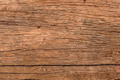
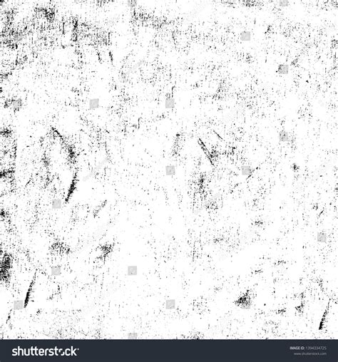
The forum discussion emphasizes that many authentic distressed textures are derived from real-world sources. "Most of these types of textures (and 90% of what you see on dribble these days) are mostly organic in origin. In other words, they are textures from the real world… ink on paper, fabric, rust, photocopier, etc." This suggests that using high-resolution photographs of such materials can yield highly realistic results.
Finding and Preparing Photographic Textures:
- Source Material: Look for concrete, crumbling plaster, rusted metal, old paper, fabric weaves, or even the texture of a photocopier's toner. A simple cardboard box can provide a fantastic texture.
- Photography: A mobile phone camera is often sufficient. Focus on capturing the texture clearly, ensuring good lighting that highlights the surface irregularities.
- Digital Preparation:
- Import into Photoshop: Open your chosen texture photo in Photoshop.
- Desaturate: Go to
Image > Adjustments > Desaturate(Ctrl+Shift+UorCmd+Shift+U) to convert it to grayscale. This is essential for using it as a mask. - Adjust Contrast: Use
Levels(Ctrl+L) orCurves(Ctrl+M) to adjust the light and dark areas. You want to achieve a good range of tones that will effectively mask your design. Higher contrast generally leads to a more pronounced distressed effect. - Isolate Texture: If the photo has a lot of background or elements you don't want, use selection tools (like the Marquee tool or Lasso tool) to isolate the textural part, then copy and paste it onto a new document or layer.
Advanced Blending and Layer Styles
For those who prefer working with Photoshop's built-in features, Layer Styles can be a powerful tool, especially when combined with advanced blending options.
"If you apply layer styles-pattern overlay or texture-just click Advanced blending - layer mask hides effects (it's in Layer styles) and then apply the mask, where are you want."
This refers to the "Layer Style" dialog box, accessible by double-clicking a layer or going to Layer > Layer Style. Within the "Pattern Overlay" or "Texture" options, you can select a distressed texture. The crucial part is the "Advanced Blending" section, where you can find options like "Blend If" sliders or specific masking controls that allow you to integrate the texture more seamlessly.
Furthermore, the "Layer mask hides effects" option within Layer Styles allows you to apply a layer mask directly to the effect of the layer style, rather than the entire layer. This offers granular control over where your distressed texture is visible.
Refining the Effect
Once you've applied a distressed texture, consider these refinements:
- Gaussian Blur: "Applying Gaussian Blur rounds off the sharp edges of the Texture and gives better results." Sometimes, the edges of a texture mask can be too harsh. Applying a very subtle Gaussian Blur to the layer mask (select the mask thumbnail, then
Filter > Blur > Gaussian Blur) can soften these edges for a more natural transition. - Underlying T-Shirt Texture: For t-shirt designs, it's essential to consider the material it's printed on. You can add a subtle texture of fabric beneath your distressed design to enhance the realism. This could be a photo of a t-shirt weave, desaturated and set to a low opacity with a blending mode like "Multiply" or "Overlay."
Avoiding Common Misconceptions
A key point of discussion was the distinction between simply overlaying a texture and truly distressing a design. "I want the design to have a weathered distressed look… I do not want it to be uniform." This means avoiding techniques that simply place a repeating texture on top of the design without altering the design's edges or internal structure. The goal is to make the design itself appear to be breaking down.
Another misconception can be the belief that only complex, pre-made grunge brushes can achieve this effect. As demonstrated, even simple photographic textures, when prepared and masked correctly, can yield superior and more organic results. The power lies in understanding how to use the texture as a tool to manipulate your existing artwork.
Conclusion
Achieving a convincing distressed texture in Photoshop is a multi-faceted process that involves understanding the desired aesthetic and employing the right tools. Whether you're using layer masks to subtract from your design, leveraging high-resolution photographic textures, or fine-tuning with advanced blending options, the key is to create an effect that feels authentic and organic. By experimenting with different textures and techniques, you can transform your clean designs into pieces with a compelling history and a visually rich, weathered appearance. Remember that the best textures often come from the real world, so don't hesitate to explore and capture your own unique sources of inspiration.
tags: #photoshop #distressed #texture