Often overlooked, numerals are a special part of many typefaces, playing a crucial role in conveying information clearly and effectively. While the alphabet may capture more immediate attention, the style, form, and arrangement of numbers significantly impact a design's overall aesthetic and readability. Designers often face challenges when working with numerals due to their inherent curves and the presence of ample white space, which can make them more difficult to integrate harmoniously into a design than letters. Understanding the nuances of number fonts and their various styles is therefore essential for creating impactful and polished visual communications, whether for headlines, infographics, lists, or even house numbers.
Understanding Number Fonts: More Than Just Digits
A "number font" is a style dedicated to the numerical characters, ranging from 0 to 9. These can manifest as Roman numerals or old-style figures with varying heights, adding a unique character to typography. Usually, a well-made, comprehensive font will include numbers and other symbols in its design. When it comes to acquiring fonts, it's worth checking how many symbols, letters, and numbers are included, as some typefaces may be incomplete, missing crucial characters. This is especially important for designers working with diverse content or requiring specific numeral styles. The goal is to find fonts where the numbers are not an afterthought but an integral, well-crafted part of the typeface.
Types of Numerals: Lining vs. Old-Style Figures
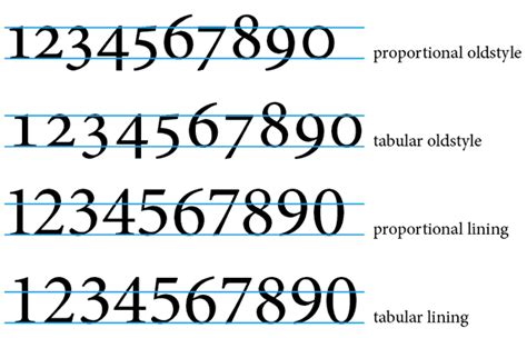
There are subtle but significant differences in how numbers can be displayed, with two primary categories being lining numerals and old-style figures.
Lining Numerals: These numerals are uniform in height, typically aligning with the baseline and ascenders of the uppercase letters. They are often monospaced, meaning each digit occupies the same horizontal width, which can be beneficial for tabular data or when precise alignment is critical. Lining figures are generally more common in sans-serif and geometric typefaces and are excellent for display purposes where boldness and uniformity are desired.
Old-Style Figures (OSF): In contrast, old-style figures, also known as text figures, have varying heights and often possess ascenders and descenders, similar to lowercase letters. For instance, the digit '3' might have a descender, while '8' might have an ascender. This varying baseline and height create a more organic, flowing appearance, making them ideal for setting numbers within large blocks of text. Their purpose is to blend in rather than distract, helping to maintain the visual rhythm of the text and avoid disrupting the reading flow.
Spacing and Readability: The Foundation of Effective Number Typography
Beyond the form of the numerals themselves, their spacing plays a pivotal role in legibility and aesthetic appeal. Designers often grapple with the challenge of ensuring numbers are both visually appealing and functionally clear.
Proportional vs. Tabular Spacing
Just as letters vary in width according to their shape, numbers are also proportional.
Proportional Spacing: This method assigns a variable width to each numeral based on its design. A '1' might be narrow, while an '8' might be wider. Proportional spacing allows numerals to blend more effectively with surrounding letters, creating a more natural and cohesive typographic flow. This is particularly beneficial in body text and when numbers are integrated within sentences.
Tabular Spacing (Monospacing): In tabular spacing, all numerals share the same fixed width. This ensures that columns of numbers align perfectly, which is crucial for tables, financial reports, and data-heavy layouts. While it can sometimes create slightly more visual separation between digits, its organizational benefit is undeniable. Typewriters commonly used monospaced fonts, and this principle extends to text editors and coding environments where precise alignment is paramount. For example, fonts like Roboto Mono are specifically designed with tabular figures, ensuring that digits like '1' and 'i' are easily distinguishable, as are '0' and 'o', preventing confusion in code or data.
Curating the Best Number Fonts for Impactful Designs
Selecting the right typeface for numbers can significantly elevate a design, transforming them from mere data points into compelling visual elements. This selection process often involves considering the intended use, desired aesthetic, and the overall context of the design.
Free Number Fonts for Awesome Designs
The availability of high-quality free fonts has democratized design, offering professionals and hobbyists alike a vast array of options for crafting stunning visuals. Here are some exceptional free fonts that excel in their numerical representation:
Poppins: A geometric sans-serif, Poppins is incredibly versatile. Its uniform letterform width and rounded shapes make it suitable for both small and large numbers, blending seamlessly into various design contexts. Its balanced proportions and simplicity, coupled with a wide range of weights, offer designers ample flexibility for creating engaging typographic hierarchies.
Montserrat: Inspired by early 20th-century urban typography, Montserrat is another popular geometric sans-serif. Its extensive character set and multiple styles make it perfect for both display and body text. The clean lines and contemporary feel bring elegance to digital and print media, solidifying its place as a top choice for numbers.
Bungee: Designed for vibrant, eye-catching headlines and signage, Bungee is a display font with a bold and playful character. Its unique style and energetic feel add dynamism and fun, making it ideal for designs aiming for a memorable impact.
Rubik: This slightly rounded sans-serif offers a warm and friendly feel, maintaining excellent readability across different sizes. It's particularly effective for user interfaces and digital applications, integrating seamlessly into modern and playful designs. Its wide range of weights and styles provides flexibility for dynamic typographic compositions.
Archivo: A grotesque sans-serif family designed for high performance in both print and digital environments, Archivo is excellent for display and long texts. Its robust structure and clean lines make it a reliable choice for conveying information with clarity and precision, and its balanced proportions contribute to a polished, professional look.
Crimson Text: This Google Font embodies simplicity and elegance, reminiscent of classic internet fonts. With classic shapes and clean lines, its readability is excellent for both large and small sizes, allowing for consistent use throughout a product without compromising legibility.
Lato: Created by Łukasz Dziedzic, Lato is a font that balances personality with practicality. It is casual yet elegant, full of life yet discreet, making it suitable for displaying virtually any number in any size.
Roboto Condensed: A highly practical number font, Roboto Condensed features mostly geometric forms with open curves that lend a casual feel. It delivers excellent readability and makes the most of available space, making it a wonderful option for small numbers, long content, forms, or displaying prices.
Varela Round: A prime example of a rounded typeface that maintains good user experience even at small sizes. While its readability is strong in smaller contexts, it might not deliver the same "wow-factor" in larger displays, limiting its use for prominently featured numbers.
Bitter: This serif typeface boasts significant personality. Slightly thicker than many regular fonts, this characteristic enhances readability and adds color to designs. It's a strong contender for numbers within paragraphs or at smaller sizes.
Fjalla One: Fjalla One is a simple yet unique font that delivers a distinct experience. It's practical for numbers accompanying other content or for larger, central figures, minding both visual appeal and usability.
Oswald: A classic and popular font, Oswald is massively practical due to its extensive family of weights, ranging from 200 to 700. It’s suitable for both subtle numbers that blend in and attention-grabbing figures that stand out.
Nanum Gothic: This typeface offers great readability, especially for small numbers within text. However, it is less effective for highlighted or larger-sized numbers on screen.
DM Serif: A powerful typeface with high contrast, DM Serif is perfect for highlighting numbers or making them the primary focus. Its impact can be dominant, suggesting limited use on a single page to respect visual hierarchy. Its sister font, DM Serif Text, offers similar lines but is optimized for small sizes and content-heavy pages.
Lora: A serif number font focused on balance and readability, Lora features classic, simple, and beautiful shapes. It provides a great reading experience regardless of the displayed number's size.
JetBrains Mono: This font carries an air of digital typography, making it excellent for reading small figures. It pairs well with understated fonts like Open Sans, Montserrat, and Lato.
Open Sans: A common humanist typeface with upright stress on numbers and an overall neutral appearance. Its extensive variety of weights and compatibility with Roboto, Lato, and Montserrat make it a versatile choice.
Raleway: An elegant font suitable for blocks of text or titles. Raleway offers alternative geometric sans-serif styles, ensuring high legibility for displaying figures.
Noto Sans: Part of Google's extensive Noto font family, designed to cover every Unicode symbol. It's particularly useful for projects requiring multi-language support, ensuring consistent and readable numbers across diverse content.
Roboto Mono: Using a tabular number font like Roboto Mono ensures figures are perfectly contrasted and work well when mixed with text without causing confusion.
Roboto Slab: A great way to introduce benign, friendly, and open curves into UI design.
Cormorant Garamond: A throwback to the lead typeface era, excellent for specialized uses like titles or headlines.
Playfair Display: A deeply aesthetic and traditional number font, ideal for decorative purposes where form trumps function, such as encrusted numerals. It pairs well with functional fonts like Raleway, Montserrat, and Open Sans.
(Unnamed Font): Due to its intended nature, this font is excellent for displaying figures with a high degree of legibility at a small size. It pairs well with Roboto, Open Sans, Montserrat, and Lato.
Bebas Neue: When it comes to making numbers stand out, Bebas Neue is a top contender, yet it's also a wonderful choice for small numbers.
Paid Number Fonts for Exceptional Designs
For those seeking premium options with unique characteristics or extensive professional features, several paid fonts offer exceptional typographic solutions for numbers.
Proxima Nova: This typeface masterfully bridges the gap between styles like Futura and Akzidenz Grotesk, offering a modern and versatile sans-serif.
Gotham: A highly versatile sans-serif typeface renowned for its excellent readability and strong, modern feel.
Avenir: Avenir combines the best aspects of geometric and humanist sans-serif designs, providing a balanced and highly functional typeface.
Museo Sans: Known for its geometric precision and readability, Museo Sans is a robust choice for various applications.
DIN Next: This font updates the classic DIN typeface for contemporary use, maintaining its clarity and technical feel.
FF Din: Characterized by smooth curves and well-balanced verticals, FF Din offers easy readability for numbers and ample customization options.
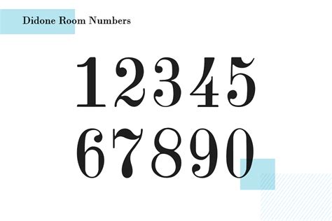
Didone Room: This number font is designed with big, powerful numbers in mind, making it unsuitable for displaying many figures at once but ideal for prominent, impactful numerals.
BoldPrice: Created for "wow-factor" and prioritizing creativity, BoldPrice is a great option for casual, friendly designs focused on personality. It does not offer letters.
Klinic Slab: A serif font with a contemporary feel, Klinic Slab adds flair to products. Designers can choose between classic lining and non-lining numbers.
Neue Helvetica: A classic updated with a contemporary style, Neue Helvetica retains the strengths of its predecessor while offering a fresh aesthetic.
Brandon Grotesque: This font is perfect for highlighting crucial numbers in a design. With 12 styles, it's versatile and shines for big, dominating number displays.
Optima: An old-school sans-serif font from 1958, Optima makes a big impact in large displays while maintaining readability in smaller sizes, supported by its 12 styles.
Futura PT: A sober and serious font, Futura PT's simplicity and clean lines ensure good readability, especially for many numbers in a small size. It also adds value in larger displays.
GT America: Merging American and Swiss design features, GT America is a versatile typeface that is both classic and modern, delivering a professional appearance on print and digital platforms.
Graphik: A highly adaptable geometric sans-serif font that excels in a variety of design contexts.
Avenir Next Pro: Developed as an alternative to Futura, Avenir Next Pro works marvels as a sans-serif number font. Its numbers use proportional spacing and are designed for both serious and casual situations, pairing well with most serif fonts.
FF Mark: (Information truncated in source material, but implies a professional-grade font with numerical design considerations.)
Unique Number Styles and Display Options
Beyond standard numeral sets, many typefaces offer distinctive styles or are designed exclusively for numbers, catering to specific aesthetic needs.
Specialized Number Fonts
Some typefaces are directed solely towards digits, offering unique treatments that might not be found in broader font families. These can range from highly decorative to functionally specific.
- Mono45 Headline: The slashed '0' in Mono45 Headline is a distinctive feature that proved irresistible for its unique character.
- Atrament: This font features both old-style figures and lining figures, offering versatility in how numbers are presented.
- Lust: Lust presents a number of different weights, with a unifying characteristic of high contrast and wide counters across all weights, making its numerals striking.
- Blenny: Blenny is designed to dominate other elements in a design, and its numbers are no exception, offering a bold and commanding presence.
- Essonnes Headline: This typeface showcases graceful lines, making it a great choice for dressed-up invitations where elegance is key.
- FF Carina: Its numerals are striking on their own due to an unusual "wobble" in the counter, giving them a unique personality.
- Oxtail: Oxtail is a strong contender for practical applications like house numbers, suggesting robustness and legibility.
- Variex: Exploring the numbers of a typeface like Variex can be a neat exercise, especially when encountering a unique '8' like the one it features.
- Blackcurrant: This font has a dynamic, almost lava-lamp-like quality that might suit a number '9' particularly well.
- Source Code Pro: A runner-up for its choice of 'zero', indicating a well-crafted and distinct numeral.
Fonts Designed for Specific Numerical Applications
The provided information highlights several fonts specifically crafted for or exceptionally suited to numerical displays:
- Didone Room: Made with big and powerful numbers in mind, this font is best for designs where numbers are the primary focus and not used in large quantities.
- BoldPrice: This font prioritizes creativity and a "wow-factor" for numbers, ideal for casual and personality-driven designs.
- Pumpkin: Inspired by hand-painted room numbers in an Austrian hotel, this font offers creatively designed digits, currency symbols, and punctuation. It's perfect for a hand-written menu look.
- Valencia: Featuring an art-deco inspired design, Valencia is suitable for luxury and high-end branding. It includes a set of matching numerals.
- Vaporfuturism: This trendy and colorful font allows for neonized text designs with a full set of letters and corresponding numbers.
- Rogtrilla: A unique font style suitable for creative and professional applications, including numbers and multilingual support.
- Rosterine: This condensed font adds vintage nostalgia, ideal for logotypes and packaging.
- Gardena Holmes: Combines classic serif with a handwritten script style, offering ligatures, numbers, and symbols.
- Blackest: A unique and out-of-the-box free font perfect for branding purposes, including a creative set of numbers.
- Barokah: Features characters with an unusual design, including numbers that share this distinctive style.
- Devasia: A font family in multiple weights, perfect for designing titles for posters and flyers, with a beautiful vintage design.
- Airbag: A creative display font with unique number digits and popular currency symbols.
- System Glitch: A display font that lives up to its name, offering a glitchy aesthetic.
- Scourge Typeface: Arguably the most distinct number font, it packs additional strokes in many of its digits.
- Whitefield: A handcrafted serif with thick, wide, hand-drawn characters, appearing both playful and elegant.
- Drugsther: Simple with soft curves, offering a fantastic visual solution for designs that don't need excessive drama.
- Futuristic Numerical Font Set: Features numbers and letters that mimic airport flight information display systems.
- Old Ranger: Blends modern and vintage elements, with numerals consistent with the letter design.
- Karma: A creative font with a futuristic design.
- Leaner: A modern font with an elegant design, including all-uppercase letters and numbers.
- 9BAR: A unique font with bold, blocky characters and decorative elements, including a matching set of numbers.
- Stencil Font (Unnamed): A unique stencil font with a creative, blocky character design.
- Script Font (Unnamed): A script font with a creative design to make projects stand out.
- Noirside: Features a vintage film-noir design.
- Stasis: A futuristic design font suitable for unique creations, available for free for personal projects.
- Blue Captain: A fun and quirky typeface with creative number digits.
- Joy In Night: A Halloween-themed font for unique greeting cards, banners, and posters.
- Zephyr: A modern and elegant design, ideal for business and professional graphics.
- Lumber: Another modern typeface with a professional, thin, and elegant design.
- Summer Day: A creative and fun design specifically for crafting unique kid's related designs.
- Grind: A unique bold font available in 4 different designs, including halftone and timber styles.
- Highbridge: A modern serif font with a bold and elegant design.
- Palm Tree: Features a vintage-modern design to make projects stand out.
- Fujimaru: A creative brush font with a Japanese-themed design.
- Avriella: While it has uppercase and lowercase letters, its unique set of number digits makes it special.
- Robinson: A font family with 18 styles, including rough, outline, and shadow, featuring an exclusive and unique set of numbers rescued from an 1838 Type Specimen Book.
- Oregon: A clean, simple vintage sans-serif with smooth edges, perfect for vintage logo designs and headers.
- Parliament: An elegant slab-serif typeface in regular and outline styles.
- Zennadoo: A creative "all caps" font hand-drawn to perfection.
Avoiding Common Pitfalls in Number Typography
Designers can sometimes make the mistake of adding decorative edges to numbers in sans-serif fonts, which can detract from professionalism and readability. It's crucial to ensure that the chosen font's numerals are well-integrated into its overall design philosophy. Furthermore, ensuring a font will work well on mobile devices is essential for maintaining design consistency across platforms.
Font Completeness and Compatibility
When selecting a font, it's vital to check its completeness. Does it include all the necessary numbers, symbols, and punctuation? Missing characters can lead to design compromises or the need to source alternative fonts, disrupting the visual harmony. Compatibility across different devices and software is also a key consideration to ensure the design renders as intended.
Designing with Numbers: Practical Considerations
The inherent nature of numerals-with their curves and white space-demands careful consideration. In infographic design, headlines, and lists, numbers are indispensable for conveying information clearly. This necessitates choosing the right font and displaying the numbers in a way that enhances, rather than hinders, comprehension. Designers must balance aesthetic appeal with functional clarity, ensuring that numbers are not only visually pleasing but also easily understood by the target audience.
The journey of selecting and implementing Photoshop fonts for numbers is one that requires attention to detail, an understanding of typographic principles, and a keen eye for aesthetic harmony. From the subtle differences between lining and old-style figures to the impact of spacing and the vast array of available typefaces, mastering number typography is key to creating designs that are both beautiful and effectively communicative.