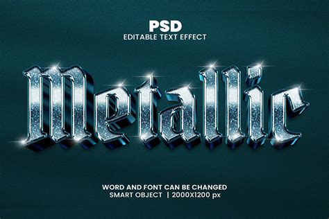
Metallic text effects are a staple in modern digital design, lending a polished, futuristic, and often luxurious feel to a variety of projects. From the gritty realism of game interfaces and movie posters to the sleek sophistication of tech branding and advertising, the ability to convincingly render metallic text is an invaluable skill. This tutorial will guide you through the intricate process of creating compelling metallic text in Adobe Photoshop, demystifying the techniques that elevate a design from ordinary to extraordinary. We will explore the foundational principles of light interaction with metallic surfaces, the strategic application of layer styles, and advanced methods for achieving realistic depth and texture.
Preparing Your Workspace and Assets
Before diving into the creative process, adequate preparation is essential for achieving professional-grade results. The effectiveness of a metallic text effect often hinges on the quality of the base materials and the canvas setup. This type of effect is typically applied in technology-themed posters, game interface designs, or futuristic visual works; therefore, attention to detail is crucial.
Essential Materials
Regarding material preparation, we need two high-quality image materials: one as the text background and another as lighting material. It is important to clarify that a dark-colored background is suggested for highlighting the metallic texture. For lighting, it’s recommended to use a transparent PNG file with a blue halo, which can simulate atmospheric light sources or specialized lighting equipment.
Canvas and Resolution Settings
When creating a new file, it’s advisable to set the canvas size at 1000×650 pixels. This size meets most display needs without affecting operational smoothness due to large files. Keep the resolution at 72 pixels/inch unless printing output is required, in which case a higher resolution (e.g., 300 pixels/inch) would be necessary. For this tutorial, we will begin with a document size of 1200 pixels wide by 600 pixels high, with a resolution of 72 pixels/inch. Set the Background Contents option to White for now, even though we'll be changing it in the next step.
Laying the Foundation: Text Creation and Initial Styling
The choice of font and its initial appearance play a significant role in how well the metallic effect will manifest. A carefully selected font can dramatically enhance the perception of depth and form, while precise initial coloring provides a neutral base for subsequent effects.
Font Selection and Placement
When using the text tool, inputting your desired text, such as "DREAM" or "STEEL," font selection becomes critical. Through multiple tests and comparisons, we found that bold sans-serif fonts best showcase metallic textures; Arial Black, Impact, or similar styles are recommended. For best results with this effect, use a font with thick letters. Once you've chosen a font, click inside the document and add your text. This places the Free Transform box and handles around the text. To resize the text, hold down your Shift key and drag out any of the four corner handles (the little squares). Keeping the Shift key held down as you drag constrains the aspect ratio of the text so you don't distort the overall shape of it. To move the text, click anywhere inside the bounding box and simply drag it around with your mouse. The initial color setting for text suggests using medium gray (#808080), which facilitates subsequent layering of various effects. The text position should be centered slightly above so there’s enough space for added lighting effects later on.
Creating the Base Metallic Texture
To create the metal texture itself and apply it to the text, we'll be using a couple of layer styles, some filters, layer blend modes, and a clipping mask. Press the letter D on your keyboard to quickly reset Photoshop's Foreground and Background colors to their defaults if needed, which will set your Foreground color to black. Select the Paint Bucket Tool and fill the background layer with black. As soon as you select Color, Photoshop will pop open the Color Picker so you can choose the color you want to fill the layer with. Choose a light gray. Click OK when you're done to exit out of the Color Picker, then click OK to exit out of the Fill dialog box.
Next, we introduce noise to create the initial texture. Go to the Filter menu, choose Noise, then choose Add Noise. When the Add Noise dialog box appears, add lots of noise to the image by setting the Amount to around 150%. Use the Uniform distribution and make sure "Monochromatic" is checked. Click OK when you're done to exit out of the dialog box. We're going to use all this noise to create the first part of our metal texture.
Back in Step 1, I mentioned you should make your document a bit larger than you need. The reason is because the Motion Blur filter has trouble blurring pixels around the edges of a document, which we can see clearly now in our own document. Let's crop away those unwanted areas. With the Crop Tool selected, click in the top left corner of the good texture area, then keep your mouse button held down and drag to the bottom right corner of the good texture area. Press Enter (Win) / Return (Mac) to have Photoshop crop away the unwanted edges.
How to Depixelate a Images in Photoshop
Sculpting the Metal: Bevels, Embossing, and Gradients
Bevels and embossing are core effects for achieving metallic textures, as they simulate the way light interacts with three-dimensional surfaces. Coupled with gradient overlays, these techniques allow for the creation of depth, shine, and intricate surface details.
Mastering Bevel and Emboss
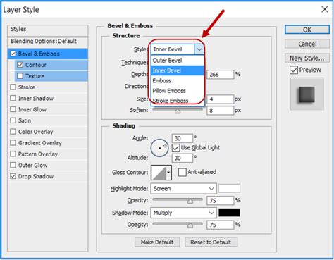
Double-click your text layer to open Layer Style settings. Check Bevel and Emboss. For a strong metallic look, change the Technique to Chisel Hard, then increase the Size to around 7 px. This opens the Contour Editor. Click OK to exit out of the Contour Editor. Don't close out of the Layer Style dialog box yet.
The Gloss Contour controls how light transitions across the beveled surface. A linear contour (the default) produces boring, predictable gradients. Metal doesn't work that way. For chrome, you want a complex curve with multiple peaks and valleys. Try the preset "Ring Double" as a starting point, then customize from there. Check "Anti-aliased" next to the contour. Spend time here. Adjust the points. Watch how the effect changes in real-time.
This adds surface detail to your metal. Brushed steel has directional grain. Cast iron has roughness. Pattern: Choose something subtle. Fine noise or light grain works. Scale: Usually 25-50%. Depth: Low, around 1-10%. Without texture, metal looks CG-perfect in a bad way. Real metal has surface imperfections.
The Power of Gradient Overlays
Dual Gradient Overlay System: The first gradient overlay adopts a symmetrical style, pivotal for reflecting environmental surface characteristics. Featuring endpoints colored gradients transitioning from pinkish-white (#ffeced) deepening grey hues (#937e7d)-contrasting warmth/coolness amplifying metallization appearance thus achieved! Angle zero-degree ensures direct overhead illumination occurs seamlessly throughout process completion.
Thereafter, move onto the second linear styled overlay, angled ninety-degrees, producing vertical gradations. Particularly note the right endpoint being fully transparent, allowing semi-transparent greyscale topside finishes, preserving weightiness yet not obscuring the lower effect altogether, leading to rich textured surfaces visible dynamically.
Back in the main Layer Style dialog box, click directly on the words Gradient Overlay in the left column of the Layer Style dialog box. The middle column of the dialog box will change to show options for the Gradient Overlay. Click OK to close out of the Gradient Editor.
Incorporating Satin and Inner Shadows for Realism
Check Satin. Satin creates internal shading that mimics environmental reflections. Here's the important part: click the Contour dropdown. "Cone" creates that classic chrome reflection stripe. "Cove Deep" works for more subtle metal.
Add an Inner Shadow. Distance and Size: Experiment. Here's the trick: click the small "+" icon to add another Inner Shadow instance. And another. Each one creates a different reflection band. Real chrome has multiple reflections from multiple angles. One Inner Shadow looks flat. Each Inner Shadow can have its own Contour curve too. Use custom curves that stay flat then spike suddenly. Add noise to the glow (50-100%) if you want to break up the smoothness and add grain.
Advanced Texturing: Noise, Blurring, and Color Manipulation
Beyond the core layer styles, advanced techniques involving filters, blend modes, and strategic adjustments can dramatically enhance the realism and complexity of the metallic texture. These steps focus on refining the surface, adding subtle imperfections, and controlling the overall color palette.
Refining the Texture with Noise and Blur
Let's add some random highlights and shadows to the metal effect. For that, we'll use Photoshop's Clouds filter, along with the Overlay blend mode we've already set the layer to. Create a new layer on top of all layers, call it "Clouds," and change its Blend Mode to Overlay. Go to Filter > Render > Clouds. The clouds need to be smoothed out a little so they look more like highlights and shadows. We'll do that by blurring them. Go to Filter > Blur > Gaussian Blur and set the Radius to around 20-30 pixels.
Shadow Effect Processing
Careful consideration must accompany shadow parameters chosen wherein mixing modes settle upon multiply format, utilizing a deep brown-grey tone (#726161). Reducing opacities down to twenty-six percent ensures sufficient depth exists without appearing overly jarring. Distances kept at nine pixels, sizing eight pixels, combinations generate naturally soft transitions across shadow formations, consistently aligning respective sources accordingly, matching ninety-degree angles, uniformly integrating holistic visuals comprehensively wrapped up neatly within design choices made collectively through creative explorations undertaken herein below.
Adjusting Blend Modes and Opacity
Back in the main Layer Style dialog box, change the Blend Mode to Overlay, then lower the Opacity to around 70%. Click OK to exit out of the Layer Style dialog box.
Click on Layer 1 in the Layers panel to select it. This tells Photoshop to pop open the New Layer dialog box where we can set some options before the new layer is added. Click inside the checkbox to the left of where it says Use Previous Layer to Create Clipping Mask to select the option, then change the Mode (short for Blend Mode) to Overlay. Click OK when you're done to close out of the dialog box. A new blank layer named "Layer 2," set to the Overlay blend mode, will appear above Layer 1 in the Layers panel.
Grungy Details and Imperfections
Let's grunge up our metal effect by adding some dirt and scratches to it. Go up to the Filter menu, choose Noise, then choose Add Noise. The Add Noise dialog box will appear with the same settings we used previously. No need to change them, so just click OK to exit out of the dialog box.
The Median filter is designed to remove noise from an image. Click inside the Radius input box and use the Up arrow on your keyboard to slowly increase its value while keeping an eye on your image in the document window. As you increase the Radius value, the noise will begin to disappear, leaving "clumps" of it behind to create our dirt and scratches effect. A value of around 9 pixels should work. If the dirt and scratches effect looks too dark, lower the opacity of the layer. You'll find the Opacity option in the top right corner of the Layers panel.
Final Touches: Lighting, Color Adjustments, and Refinements
The final stages of creating a metallic text effect involve integrating prepared lighting assets, making subtle color adjustments, and performing any last-minute refinements to ensure a cohesive and impactful result.
Incorporating Lighting Effects
Completing foundational textual aspects, elevating technological feels, lies within incorporating prepared luminous assets. Copy them atop designated word layers, manipulating sizes/positions freely advisedly, placing primary luminescence atop left-edge areas, imitating radiant impacts perceived naturally produced illuminating dynamics, visually compelling indeed! This involves copying your prepared transparent PNG with a blue halo and placing it strategically over your text. Adjust its size, position, and blend mode (often Screen or Overlay) to simulate realistic light flares or reflections.
Color Mapping and Enhancement
Choose the gradient below from the CSP True Sky Gradients.grd file, and then change the Gradient Map layer's Blend Mode to Vivid Light and its Opacity to 30%. Congratulations! Then we used a stock image texture to add some detailing to the metal text, and to make it look less flat and more interesting. Finally, we added some adjustment layers to enhance the lighting and coloring of the final result.
Maintaining Editability
One of the nice things about creating this metal effect the way we have is that the text remains completely editable, and we can even change the font we're using if we don't like the one we started with! To change the font, simply select the Type Tool from the Tools panel, click on the text layer in the Layers panel to select it, then choose a different font from the Options Bar (you may need to resize the text again using Free Transform).
Understanding the Principles of Realistic Metal
The key to creating believable metallic effects lies in understanding how light interacts with different metal surfaces. Most tutorials skip this entirely, telling you to slap a gradient on, add some bevel, and call it done. However, true metallic realism hinges on several core principles:
Hard Highlight Transitions
Light doesn't fade gently across chrome. Real metal surfaces exhibit sharp, defined transitions between highlights and shadows. This is primarily controlled by the "Gloss Contour" setting in Photoshop's Bevel and Emboss layer style. Experimenting with complex curves, rather than the default linear contour, is crucial for mimicking these sharp transitions.
Environmental Reflection
Metal picks up color from its surroundings. A polished chrome surface will reflect the colors of the objects and environment around it. This can be simulated using various techniques, including applying textures with subtle color variations, using gradient maps, or incorporating external image elements that mimic reflections. The Satin and Inner Shadow layer styles also play a significant role in creating these simulated environmental reflections.
Contrast Extremes
The interplay between deep darks and bright highlights is essential for conveying the reflectivity of metal. There should be significant contrast, with deep darks right next to bright highlights, creating a sense of depth and form. If your darkest darks aren't dark enough, the metal looks washed out.
How to Depixelate a Images in Photoshop
Avoiding Common Pitfalls and Misconceptions
Many metallic text effects fall short due to common errors and misunderstandings of how metals behave visually. Being aware of these can help you avoid them:
Overly Soft Bevels
The "Smooth" technique in Bevel and Emboss can round off edges too much, making the metal look like plastic rather than hard material. Metal has edges, and these should be clearly defined.
Simplistic Gradients
Two-color gradients often look flat and artificial, resembling plastic more than polished metal. Realistic metal requires more complex gradient transitions that account for light falloff and surface curvature.
Insufficient Contrast
Highlights that are too dim or shadows that are not dark enough will make the metal look dull and lifeless. Don't be afraid of near-white highlights and deep black shadows to make the metal pop.
Incorrect Contours
The default linear contour in Bevel and Emboss produces predictable, boring results. Experiment with preset and custom contours to simulate the intricate ways light reflects off metallic surfaces.
Exploring Different Metal Types
Not all metal is chrome. Different metals have distinct visual characteristics:
- Chrome: High reflectivity, bright, sharp highlights, and strong contrast.
- Steel: Can range from brushed to polished. Brushed steel has directional grain and slightly softer reflections. Industrial steel might have a duller finish with more visible imperfections.
- Gold/Bronze: Warmer tones, more saturated colors, and often slightly less sharp reflections than chrome. Gold is brighter and more saturated, while bronze is darker with more brown tones.
- Aluminum: Often has a matte or brushed finish with subtle, diffused reflections.
Understanding these differences allows for greater versatility in creating a wide range of metallic effects. For instance, to achieve a gold effect, you would adjust the gradient colors to oranges and browns and potentially modify the bevel settings to be less sharp.
Streamlining Your Workflow with Layer Styles and Presets
While building metallic effects from scratch is excellent for learning the underlying principles, it can be time-consuming for production work. For efficiency, consider using pre-built layer styles.
Leveraging Photoshop Layer Styles
When you're doing actual client work, building these manually can be very time-consuming. The process of getting the contour curves right alone can eat 15 minutes of tweaking. For learning, it's worth doing. For production, the math doesn't always work out. If a client wants to see gold instead of chrome, you're rebuilding most of it. This is exactly why pre-built layer styles are beneficial for client work. All that contour tweaking and shadow stacking is already done.
Utilizing MetalFX and Collections
There are various Photoshop add-ons and styles available that streamline this process. MetalFX, for example, covers core variations like chrome, steel, and dark metals, offering ten styles that handle most situations. Metal Collection Vol. 1 goes deeper, with fifty styles covering everything from polished chrome to weathered iron to industrial steel. Both are fully editable after applying, meaning you're not locked into anything.
Applying a style isn't the end. Double-click the layer to open the Layer Style dialog. Everything is adjustable. You can change gradient colors to shift from chrome to copper, adjust bevel depth for more or less dimension, or scale the effects. Go to Layer > Layer Style > Scale Effects and drag the slider until proportions feel right, especially when applying styles built for large text to smaller text.
Metallic text isn't hard once you understand the principles: hard highlight transitions, environmental awareness, and contrast extremes. Build one from scratch to understand the mechanics, and then leverage layer styles and presets for efficiency in your professional projects. The result is a sophisticated and eye-catching element that significantly enhances the visual appeal of any design.