A CMYK printer test page serves as a specialized diagnostic tool, meticulously evaluating a printer's capacity to accurately reproduce the four foundational printing colors: Cyan, Magenta, Yellow, and Black (Key). This test is not merely a formality; it is a crucial step in identifying and rectifying a spectrum of printing imperfections. These can range from subtle color separation issues and noticeable color shifts to critical ink alignment problems, all of which can significantly degrade the overall quality of your printed output. For professionals in the printing industry, CMYK testing is an indispensable practice. It provides a clear, visual representation of how effectively a printer handles the complex process of four-color separation. Furthermore, it is instrumental in pinpointing any existing color bias or tinting issues that might be present, and it critically ensures the proper registration, or alignment, between the different ink colors. By undertaking this thorough assessment, you can proactively avoid the significant financial drain of costly misprints, prevent the wasteful expenditure of valuable ink, and, most importantly, guarantee that your final printed pieces precisely match your original design expectations.
The consistent and accurate reproduction of color is paramount in virtually every printing endeavor, whether it be for marketing materials, photographic prints, or intricate graphic designs. A CMYK test page acts as a vigilant guardian of this color fidelity. By regularly employing this diagnostic tool, you can maintain a high standard of consistent and accurate color reproduction across all your printing projects. This not only translates into professional-grade results that impress clients and stakeholders but also offers tangible savings in terms of both time and financial resources, by minimizing the need for reprints and reducing ink consumption. The objective is to achieve prints that are not just visually appealing but also technically sound, reflecting the true intent of the original digital design.
The Mechanics of a CMYK Test Page: A Step-by-Step Guide to Evaluation
Understanding how to effectively use a CMYK test page is key to unlocking its full diagnostic potential. The process is straightforward but requires careful observation and attention to detail.
Printing the Test Page: Setting the Stage for Accurate Assessment
The initial step involves printing the CMYK test page itself. It is strongly recommended to initiate this process by clicking the designated "Print This Test Page" button. For optimal results, ensure that you print on high-quality paper. The choice of paper can significantly influence color perception and ink absorption, so selecting a stock that is representative of your typical printing needs is advisable. Crucially, before initiating the print, configure your printer settings to its highest available resolution. Printing at maximum resolution is fundamental for achieving the most accurate color reproduction of cyan, magenta, yellow, and black inks. Lower resolutions can introduce artifacts and obscure subtle color variations, thereby compromising the integrity of the test.
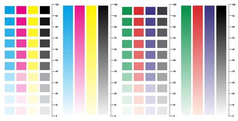
Examining Primary Colors and Solid Blocks: The Foundation of Color Purity
Once the test page has been printed, the critical evaluation phase begins. Start by meticulously examining each of the solid CMYK color blocks. The objective here is to ensure that each color appears pure, vibrant, and free from any unwanted color shifts or tinting. A pure cyan should look like a rich blue, magenta a deep red-purple, yellow a bright, clear yellow, and black a deep, true black, without any hint of other colors bleeding into them. Simultaneously, inspect these solid blocks for consistent coverage. Look for any signs of streaking, banding, or gaps within the solid areas. Such imperfections can indicate issues with the print heads, ink flow, or the printer's ability to lay down ink uniformly.
Verifying CMYK Gradients and Color Scales: The Nuances of Color Transition
Beyond solid blocks, the test page typically includes gradients and color scales for each of the CMYK inks, often progressing in percentage increments from 10% to 100%. This is where you assess the printer's ability to handle subtle color transitions and tonal variations. Carefully check that all percentage steps within each gradient are clearly visible and distinct from one another. A smooth gradient should exhibit a seamless transition from light to dark without any noticeable banding - abrupt, distinct lines where the color appears to jump rather than blend smoothly. Any sudden color jumps or a lack of distinction between adjacent percentage steps can signal problems with the printer's color calibration or its ability to accurately mix and lay down varying ink densities.
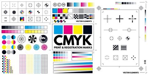
Inspecting Registration Marks and Alignment: The Precision of Layering
A key element of the CMYK test page includes registration marks, often found in the corners or along the edges of the page. These marks are designed to help assess the alignment of the different color layers. Examine these marks with a magnifying glass if necessary. The goal is to ensure that the cyan, magenta, yellow, and black components of the registration mark are perfectly superimposed, forming a single, sharp outline. If these marks appear misaligned, with one color layer offset from the others, it is a clear indication of registration issues. This can lead to blurry images, halos around text, and a general lack of crispness in your printed output, especially noticeable in areas where multiple colors meet.
Assessing Text and Fine Detail: The Ultimate Test of Clarity
Finally, turn your attention to the text elements and percentage labels present on the test page. These elements serve as a crucial test of the printer's ability to render sharp, clear details. Examine the text for any signs of fuzziness, bleeding, or broken lines. The percentage labels should be perfectly legible, with sharp edges and no smudging. This assessment is particularly important for professional printing where fine details, small fonts, and intricate graphics are common. The clarity of text and fine details is often the most telling indicator of a printer's overall health and its ability to produce high-quality, professional results.
The Importance of CMYK Testing in Professional Printing Workflows
The significance of CMYK testing extends far beyond basic troubleshooting; it is an integral component of a robust professional printing workflow. In environments where color accuracy is paramount, such as graphic design studios, advertising agencies, and professional print shops, the CMYK test page acts as a critical quality control measure. It provides a tangible benchmark against which printer performance can be measured and maintained.
Detecting Color Separation Issues: The Foundation of Accurate Color
Color separation is the process by which a full-color image is broken down into its constituent CMYK components. When this separation is inaccurate, the resulting print will inevitably deviate from the original design. A CMYK test page is highly effective at revealing these inaccuracies. For instance, a pure red in your design is created by combining magenta and yellow inks. If the separation is flawed, the test page might show a muddy brown or an orange instead of a vibrant red, indicating an imbalance in the magenta and yellow ink contributions. By identifying these separation errors early, designers and printers can adjust their software settings or printer profiles to ensure that the separation process accurately reflects the desired color values. This proactive approach prevents the propagation of errors throughout a print run.
Identifying Color Bias and Tinting: The Subtlety of Hue Shifts
Color bias, or tinting, refers to an unwanted cast of a particular color that affects the entire image or specific color areas. This can occur due to various factors, including aged ink, incorrect printer profiles, or environmental conditions. A CMYK test page, with its solid blocks of primary colors and detailed gradients, makes these subtle hue shifts glaringly obvious. For example, if the cyan ink has a slight green tint, the blue areas of the test page might appear slightly greenish, and the black might have a bluish cast. Similarly, a yellow ink that has shifted towards orange can alter the appearance of skin tones and other colors that rely on yellow for their composition. The test page allows for the precise identification of these biases, enabling corrective actions such as recalibrating the printer, replacing ink cartridges, or adjusting color curves in the printing software.
Ensuring Proper Registration Between Ink Colors: The Sharpness of Overlap
Registration refers to the precise alignment of the cyan, magenta, yellow, and black ink dots when they are printed on top of each other to create the final image. Misregistration is a common issue that can manifest as blurry images, halos around text, and a loss of fine detail, particularly in areas where different colors meet. The registration marks on a CMYK test page are specifically designed to highlight even the slightest misalignments. When viewed closely, these marks should appear as a single, sharp outline. If they are fuzzy or if you can discern separate outlines for each color, it indicates a registration problem. This might stem from mechanical issues with the printer, such as misaligned rollers or print heads, or from software-related calibration errors. Correcting registration issues is vital for achieving crisp, professional-looking prints.
What is the difference between RGB and CMYK?
The Economic and Professional Implications: Saving Time and Money
The financial and professional consequences of ignoring color accuracy can be substantial. Misprints due to color inaccuracies or registration errors can lead to significant waste of expensive paper and ink. In commercial printing, where large volumes are often produced, even a small percentage of misprints can translate into thousands of dollars in lost revenue and material costs. Furthermore, consistently delivering prints that do not match client expectations erodes trust and damages professional reputation. A CMYK test page, by enabling the early detection and correction of these issues, acts as a powerful preventative measure. It ensures that print jobs are accurate the first time, saving time that would otherwise be spent on troubleshooting and reprinting, and ultimately contributing to greater profitability and client satisfaction. The ability to consistently deliver accurate color reproduction is a hallmark of a professional printing operation.
Beyond the Basics: Advanced Considerations for CMYK Color Management
While the standard CMYK test page provides a robust foundation for assessing printer performance, advanced users and professionals may delve deeper into color management to achieve even greater precision. This involves understanding the interplay between different color spaces, printer profiles, and the specific characteristics of the inks and paper being used.
Understanding Color Spaces: RGB vs. CMYK
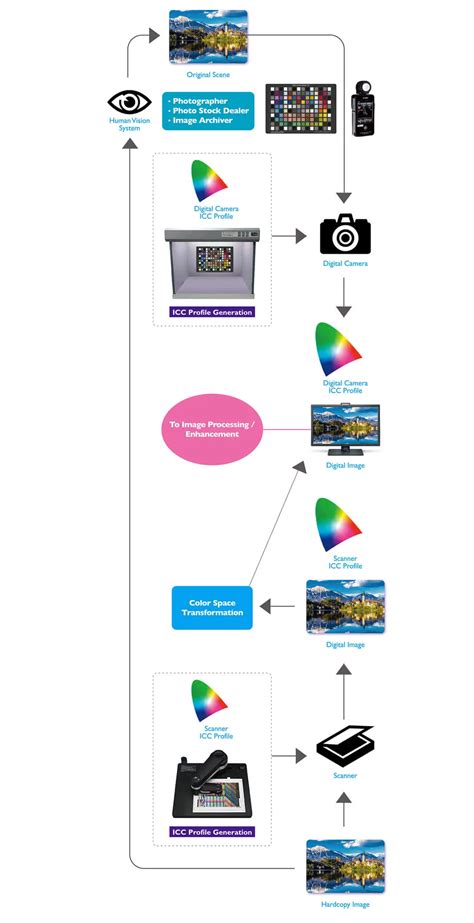
It is essential to recognize the fundamental difference between the RGB (Red, Green, Blue) color space and the CMYK color space. RGB is an additive color model used for displays, such as computer monitors and televisions, where colors are created by emitting light. CMYK, conversely, is a subtractive color model used in printing, where colors are created by absorbing light reflected from a surface. When a design is created in RGB and then converted to CMYK for printing, a conversion process occurs. This conversion is not always perfect, as the range of colors (gamut) that can be displayed on a screen is often larger than the range of colors that can be reproduced by a printer. A CMYK test page helps to reveal how effectively a printer can represent the colors within its achievable gamut, and how well the conversion from RGB to CMYK has been handled by the software and printer driver.
The Role of Printer Profiles (ICC Profiles)
Printer profiles, also known as ICC (International Color Consortium) profiles, are data files that describe the color characteristics of a specific printer, ink, and paper combination. They act as a translator, ensuring that the colors you see on your screen are as close as possible to the colors that will be printed. A custom-built ICC profile, created using a colorimeter or spectrophotometer, can significantly improve color accuracy compared to generic profiles. When using a CMYK test page, if you suspect color inaccuracies, verifying that the correct ICC profile is being used in your printing software is a critical step. If the test page reveals consistent color deviations, it may be an indication that the current ICC profile is outdated, inaccurate, or simply not optimized for the specific media being used.
Ink and Paper Interactions: The Unseen Variables
The interaction between ink and paper is a complex yet crucial aspect of color reproduction. Different paper types absorb ink differently, affecting the final appearance of colors. Glossy papers tend to produce more vibrant colors with sharper detail because they absorb less ink and reflect more light. Matte papers, on the other hand, absorb more ink, which can lead to softer colors and a potential loss of detail. The coating on a paper also plays a role; coated papers prevent ink from spreading too much, leading to finer dots and sharper images. When evaluating a CMYK test page, it is important to consider the paper type. A test printed on glossy paper will likely look different from the same test printed on uncoated matte paper. For consistent results, it is best to perform CMYK tests on the same type of paper you intend to use for your final project. Understanding these interactions helps in predicting and controlling the final print outcome.
Calibration and Maintenance: Proactive Steps for Color Consistency
Regular calibration and maintenance are essential for ensuring that a printer consistently produces accurate colors. Calibration involves adjusting the printer's internal settings to ensure that its output is as close as possible to a known standard. This process often involves printing a calibration chart and then using software to measure the printed colors and make necessary adjustments. Maintenance, such as running cleaning cycles for the print heads, can prevent clogged nozzles that lead to streaking and color inconsistencies. A CMYK test page can serve as a trigger for these maintenance routines. If the test reveals any anomalies, it is a sign that the printer may require calibration or a cleaning cycle to restore optimal performance and color accuracy. Proactive maintenance, informed by regular testing, is key to long-term color consistency.
The Role of Viewing Conditions: The Observer's Environment
It is also important to acknowledge that the perceived color of a print can be influenced by the viewing environment. Lighting conditions, such as daylight, fluorescent light, or incandescent light, can significantly alter how colors appear. Color-accurate viewing booths, which provide standardized lighting (typically D50 or D65), are often used in professional settings to ensure that color judgments are made under consistent and neutral conditions. While a CMYK test page cannot directly control viewing conditions, understanding their impact is crucial when evaluating print quality. If prints appear different under various lighting, it highlights the importance of standardizing viewing conditions when making critical color assessments.