When embarking on the digital art journey with Procreate, newcomers often find themselves navigating a landscape of technical terms, from DPI and canvas dimensions to the intricacies of layers and color profiles. This guide aims to demystify these concepts, providing a clear understanding of how Procreate handles color and how to make informed choices for your creative projects, whether intended for screen or print.
Understanding Resolution and Canvas Size
For digital art, resolution is typically measured in Dots Per Inch (DPI). A DPI of 300 is widely considered "high resolution," ensuring that your artwork retains clarity and detail when printed. When creating a new canvas in Procreate, it's crucial to consider the intended final use of your artwork. If you anticipate printing your piece, it's advisable to set your canvas dimensions to a physical size that closely matches your desired print size. For instance, common US print sizes like 11" x 14" are excellent starting points. If you're creating seamless patterns, a 12-inch square canvas is often a practical choice.
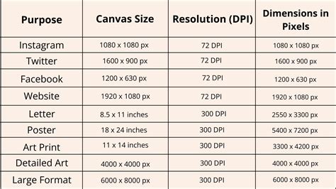
It's also beneficial to create your canvas slightly larger than your immediate needs if possible. This offers more flexibility for scaling and manipulation without significant loss of quality. Procreate is a raster program, meaning it works with pixels. Shrinking artwork too much or upscaling it significantly beyond its original size can lead to pixelation, compromising the sharpness of your image.
The Evolving World of Layers in Procreate
Layers are a fundamental concept in digital art, acting as transparent sheets stacked upon one another. Each layer can hold different elements of your artwork, allowing for non-destructive editing and greater creative control. Imagine a stack of clear glass with paint on each sheet. If a prominent blue dot on an upper layer overlaps a smaller red dot on a lower layer, the blue dot will obscure the red one. However, if the red dot is moved or the blue layer is hidden, the red dot becomes visible.
The arrangement of these layers dictates what appears in front of or behind other elements. You can reorder layers by simply dragging them into your desired position. In a complex illustration, layers can become quite intricate. Artists often group related layers together, such as all the elements of a character or background. The order of these layer groups is then managed to ensure correct visual stacking.
The number of layers available in Procreate is dynamically determined by the canvas dimensions, DPI, and the amount of RAM (Random Access Memory) on your iPad, not its storage capacity. While Procreate is slated for an update that aims to alleviate layer limitations, understanding these current constraints is important for optimizing your workflow. Despite the power of layers, it's also possible to create art on a single layer, mimicking a traditional painting approach. Experimentation with both methods will reveal what works best for your artistic process.
Demystifying Procreate's Color Profiles
Color profiles are essential for ensuring your artwork appears consistently across different devices and in print. Screens and printers interpret and display color in fundamentally different ways, making color profiles the bridge between them.
Procreate offers several color profile options, each suited for different applications:
Display P3: This is Procreate's default profile. Display P3 is an RGB color space that offers a wider gamut of colors, meaning it can display more vibrant and saturated hues. It is optimized for viewing on Apple devices, which generally support this wider color range. However, artwork created in Display P3 may appear slightly oversaturated or different on devices that do not support this profile.
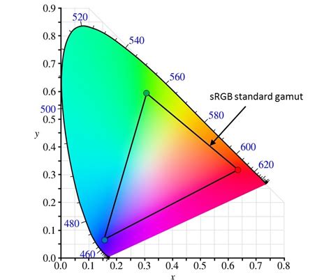
sRGB: This is another RGB color space, and it's a widely adopted standard for the internet and many other applications. sRGB has a smaller color gamut compared to Display P3, meaning it displays fewer highly saturated colors. This profile is commonly used for artwork intended for web viewing and is also a practical choice for print. The advantage of sRGB is its broad compatibility. If you are transferring your work between different applications or platforms, using sRGB can help maintain color consistency.
CMYK: This color profile is specifically designed for print. CMYK stands for Cyan, Magenta, Yellow, and Key (Black), the four inks used in most color printing processes. Unlike RGB, which is additive (colors are created by adding light), CMYK is subtractive (colors are created by subtracting light absorbed by ink). Artwork intended for professional printing, such as brochures, magazines, or large-format prints, should ideally be created or converted to a CMYK profile.
Key Considerations for Color Profiles:
- Consistency Across Applications: If you frequently move your artwork between Procreate and other design software, such as Affinity Designer, it's crucial to use matching color profiles in both applications. Mismatched profiles can lead to noticeable color shifts when transferring files.
- Client and Publisher Requirements: When working with clients or publishers, always discuss their preferred color profiles. They may have specific requirements based on their printing processes or brand guidelines.
- Immutability: Once you've set a color profile for a piece of art in Procreate, you cannot change it later. To switch profiles, you would need to create a new canvas with the desired profile and re-import or recreate your artwork. Changing a color profile can also dramatically affect your Time-lapse recording.
- Default Settings: If you're unsure about which color profile to choose, leaving it on the default setting (Display P3) is often a safe bet for general digital use, especially if your primary viewing platform is an Apple device. However, for broader compatibility or print intentions, sRGB is a robust and reliable choice.
What Is The Difference Between RGB and CMYK? Color Models and Print
Experimenting with Brushes and Apple Pencil
Procreate offers a vast array of brushes that can be used for painting, smudging, and erasing. Experimenting with these different brush types is highly recommended. Observe how they behave at various sizes, how they blend colors when smudging, and their overall aesthetic impact. You also have the ability to adjust existing brushes or even create entirely new ones, opening up a universe of unique artistic tools.
The Apple Pencil is a critical component of the Procreate experience due to its pressure sensitivity. This feature allows for dynamic stroke variation: heavier pressure results in thicker, darker, or wider lines, while lighter pressure produces finer, fainter strokes. Mastering the nuances of pressure sensitivity can add a significant level of expressiveness to your digital artwork.
Embracing the Creative Journey
Procreate is a powerful tool that can reintroduce or enhance the joy of art creation. Understanding its foundational elements, from canvas settings and layers to color profiles and brush dynamics, empowers you to create with confidence and achieve the results you envision, whether for digital display or tangible print. Continuous learning and experimentation are key to unlocking the full potential of this versatile application.