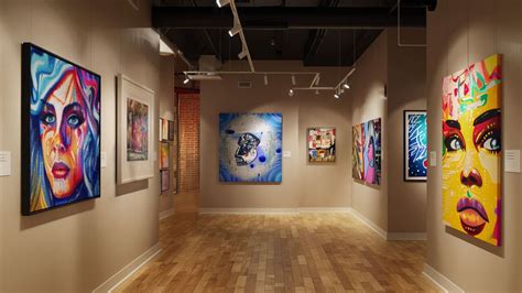
The use of color is an essential element in painting. Artists have been using color since the beginning of art history to communicate messages and evoke emotions from their audience. Painting with the Procreate app is one of my favorite ways to create a digital painting. It’s easy to pick up the Procreate brush and get right down to doing what you are there to do: paint! Are you brand new to painting digitally using Procreate? Before you get started, you may want to check out these tips I’ve put together to familiarize yourself with using the Procreate app before you actually start painting. This tutorial will guide you through the fundamental aspects of digital art creation within Procreate, from initial setup to the final touches, ensuring a comprehensive understanding for artists of all levels.
Setting Up Your Digital Canvas for Success
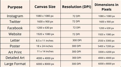
When starting out, you will want to create a new Art Canvas and make sure you are using a DPI of at least 300. I also call this the “resolution” of the artwork. This DPI (or resolution) is important because it affects a few things. If you find that as you make art, you like to use a lot of layers, then you need to pay attention to the DPI and your canvas size. It’s my recommendation that you keep your DPI to at least 300. If you set the resolution too low, and then try to make a large print, you may be less than satisfied with the results. So, always make sure you are setting up your art canvas with the optimized DPI for the output intent. If you’re looking to make a high resolution JPEG, then stick with a minimum of 300 DPI. Understanding canvas settings is the bedrock of digital art. A high DPI ensures that your artwork retains its clarity and detail, especially when intended for printing or for projects that require a significant level of polish. This foundational step prevents common issues like pixelation or blurriness in the final output, allowing your digital creations to shine as brightly as traditional mediums.
Harnessing the Power of Layers in Digital Painting
Painting digitally means working in ways that are not possible using traditional art methods. When you use layers, you are able to draw or paint on individual layers that you can then change the positions of. This can allow you to create your art in several stages without having to worry about painting around or over other objects. Layers are a fundamental concept in digital art, offering unparalleled flexibility. They act like transparent sheets stacked upon each other, allowing artists to isolate elements of their work. This means you can paint a character on one layer, the background on another, and special effects on a third, all without interference. If you decide to change the color of the sky, you can do so by only editing the background layer, leaving your character untouched. This non-destructive workflow is a cornerstone of digital art, enabling complex compositions and iterative design processes with ease. It empowers artists to experiment, revise, and refine their work without the fear of ruining previous efforts, making the creative process more fluid and forgiving.
Precision and Control with the Selection Tool
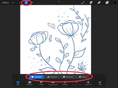
The selection tool in Procreate is another important element of creating art digitally. Making a selection has never been easier because of the way Procreate’s selection tool works. What this means is I can use the selection tool as precisely as I would a pencil or pen. This allows me to select and move or transform specific parts of my artwork. The selection tool in Procreate is a powerful instrument for isolating and manipulating specific areas of your artwork. It functions much like a digital lasso or marquee, enabling you to draw around objects or areas you wish to edit. Once an area is selected, you can move it, resize it, rotate it, or apply various adjustments without affecting the rest of your canvas. This level of granular control is invaluable for refining details, correcting mistakes, or repositioning elements within your composition. Its precision allows for intricate edits, mirroring the accuracy one might achieve with traditional drawing tools, but with the added benefit of digital reversibility and manipulation.
Exploring Color with the Gradient Map Tool
The Gradient Map tool in Procreate applies colors based on values. With Gradient Maps, you will find you can quickly try different color schemes for your painting. The gradient map feature works best when taking a monochromatic painting. I find the gradient map feature in Procreate lets me try out several color variations in my painting. The Gradient Map is a fascinating tool that reinterprets the tonal values of your artwork and applies color based on a chosen gradient. This is particularly effective when working with a grayscale or monochromatic base. By selecting different gradients, you can rapidly experiment with a wide array of color palettes, transforming the mood and feel of your piece in moments. It’s an excellent way to explore color harmonies and discover unexpected combinations that might not have occurred through traditional color mixing. This tool is a shortcut to visual experimentation, allowing for quick iteration on color concepts before committing to more labor-intensive methods.
Effortless Color Adjustments with Hue, Saturation, and Brightness
One of the easiest ways to make color adjustments to your digital painting is by using the hue, saturation, and brightness controls. The Hue, Saturation, and Brightness (HSB) sliders are fundamental controls for manipulating color in digital art. Hue refers to the pure color itself (e.g., red, blue, green). Saturation determines the intensity or purity of the color, ranging from a vibrant hue to a muted gray. Brightness controls the lightness or darkness of the color. These three parameters provide a comprehensive yet accessible way to fine-tune the color scheme of your artwork. Whether you need to subtly shift the overall tone, enhance the vibrancy of specific elements, or adjust the mood by darkening or lightening areas, these controls offer a direct and intuitive method for achieving your desired color effects. They are essential for achieving color harmony and ensuring your artwork communicates the intended emotional impact.
Something strange you should know about color | QUICK ESSENTIALS
Discovering Your Signature Brush in Procreate
When you first start using the Procreate app, it’s natural to explore all the brushes in the Brush Library. And you should, after all, how will you discover which pencil or brush will be your favorite? However, I like to stick to using mostly one brush or pencil as I work in Procreate. It simplifies my work flow so I can create the bulk of the art first. While Procreate boasts an extensive Brush Library, exploring its diverse offerings is crucial for discovering tools that resonate with your artistic style. However, many artists find that focusing on a select few brushes can streamline their workflow. By mastering a primary brush for sketching, line art, and even rendering, you can develop a consistent aesthetic and build speed. This focused approach allows you to concentrate on composition and form, rather than constantly switching tools. The "Sketchers" brush by Idle Letters, specifically the "Casual" variant, is a popular choice for its versatile sketching capabilities, providing a natural, pencil-like feel that is excellent for initial concept work and detailed rendering.
The iPad Pro and Apple Pencil: A Digital Artist's Dream Duo
The tutorial shown below was done using Procreate on my iPad Pro. I have an older iPad Pro, but I am a big proponent of using Apple’s tablet for drawing and painting digitally. I enjoy that it is a lightweight device and is very portable. Whether I’m working at my computer workstation at home, my comic book drawing board, or even traveling and flying by plane, the iPad Pro works out really well for me. The Apple Pencil is the only stylus I use when painting or drawing on the iPad Pro. This ‘pencil’ does a great job of making me feel like I’m painting or drawing naturally on a digital device. It took me some getting used to, but once I became familiar with how the Apple Pencil works in Procreate, it made drawing and painting digital art quite fun for me. The combination of the iPad Pro and Apple Pencil has revolutionized digital art creation for many. The iPad Pro offers a portable, high-resolution canvas, while the Apple Pencil provides an incredibly responsive and intuitive drawing experience. Its pressure and tilt sensitivity mimic the feel of traditional drawing tools, allowing for a natural flow of creativity. This pairing is ideal for artists who value mobility and seek a device that bridges the gap between traditional art sensibilities and the boundless possibilities of digital media. The tactile feedback and precise control offered by the Apple Pencil make digital painting feel less like operating a machine and more like an extension of the artist's own hand.

Essential Accessories for Enhanced Workflow
Two more items I like using in my workflow are a two-finger drawing glove and an ergonomic silicone grip holder for the Apple Pencil. The two-finger glove helps keep the oils in your palm from the screen of the iPad. You may find it also helps your hand glide smoothly on top of the screen. As for the grip holder, I find I like the wider grip on the pencil. I feel like it helps me draw longer because it’s thicker and softer. Another important tool is my Parblo Drawing Tablet Stand. It’s a lightweight, stand that I place my iPad on while drawing. It has a variable tilt angle that is easy to use. Beyond the core hardware, several accessories can significantly enhance the digital art experience. A drawing glove, often made with two or three fingers, reduces friction between your hand and the screen, allowing for smoother gliding and preventing accidental touches or smudges. This is particularly useful for artists who use a palm-rest technique. An ergonomic grip for the Apple Pencil can improve comfort during long drawing sessions, offering a thicker, softer feel that can reduce hand fatigue. Additionally, a drawing tablet stand provides an adjustable easel for your iPad, allowing you to find the most comfortable and anatomically sound working angle, much like an artist would use with a traditional easel. These tools, while supplementary, contribute to a more comfortable, efficient, and enjoyable digital art creation process.
The Beauty of Simplicity: Focusing on Shapes in Procreate
I think the thing that I love most about Procreate is its ability to make you focus on simple shapes as you create your digital illustrations. When combined, simple shapes give me endless opportunities to create fantastic illustrations with some of my favorite characters from comic books and movies. The principle of building complex forms from simple shapes is a fundamental concept in art and design. Procreate’s interface and brush engine facilitate this approach by allowing artists to easily sketch, combine, and refine basic geometric and organic shapes. Whether it’s a circle for a head, a rectangle for a torso, or a series of curves for limbs, breaking down a subject into its constituent shapes makes the drawing process more manageable and systematic. This method not only aids in accurate representation but also fosters a strong understanding of form and structure, leading to more dynamic and believable illustrations, especially when depicting characters from popular media.
The Crucial Role of Sketching and Concept Development
Any illustrator will tell you that it’s essential to start with a sketch or concept drawing before starting a piece. Ever start drawing a painting only to realize afterward that you have no idea where it’s going? It’s so common, especially for beginners. Don’t worry! It happens. Many artists have developed the habit of drawing a pencil sketch or thumbnail before starting their digital painting. The brush I am using for most of the drawing and painting is called “Sketchers” by Idle Letters specifically the “Casual” brush. The main character in this story is Casia Minohr. I use one of the pencil brushes in Procreate to create my basic concept. The drawing is fairly loose. That is where the fold of the book will be. The next stage is to tighten up the drawing of Casia sleeping. Before diving into the detailed rendering of a digital painting, a preliminary sketch or concept drawing is indispensable. This initial stage serves as a blueprint, allowing artists to explore ideas, establish composition, and define the overall mood and narrative of the piece. It prevents the common pitfall of getting lost mid-process, ensuring a clear direction. For beginners, this might involve loose thumbnail sketches to explore different poses and compositions, or more refined pencil drawings to solidify the subject matter. The "Sketchers" brush from Idle Letters, with its "Casual" variant, is an excellent tool for this phase, offering a natural, responsive feel that encourages spontaneous ideation. This foundational step is where the story and visual language of the artwork begin to take shape.
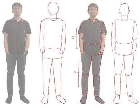
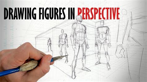
The Art of Observation and Interpretation in Drawing
When we draw, we use our mind’s eye more than anything else. We don’t copy exactly what our eyes see; we interpret it, add to it, subtract from it and then draw that. This is true whether we are drawing from life or from a photo reference. Next, I’m moving to the other side of the drawing. Looking at the model, I imagine how I would describe the pose. I imagine an invisible line connecting the model’s body with its head. This is the first step in beginning to add mass to the action line. Since I’m using reference, I go straight to rendering the form of the figure. I’m ignoring any volume or shading. Drawing is not merely a mechanical act of replication; it is a deeply interpretive process. Our "mind's eye" translates visual information into a form that can be expressed on paper or screen. We don't just see a subject; we perceive it, filter it through our understanding, and then represent our interpretation. This involves not only observing external reality but also internalizing it, adding our own conceptual understanding, and adjusting details to best convey our artistic intent. Whether working from life, imagination, or photographic references, this interpretative layer is what imbues a drawing with personality and depth. Understanding the flow of the body and the implied lines of action helps in capturing the dynamism and weight of a pose, moving beyond a flat representation to a more convincing depiction of form.
Refining Forms: From Sketch to Detailed Figure
5) Tighten the figure drawing of Casia flying. Next, I will use a new photo reference for the head. Finding the just the right angle can be tough. 6) Add costume details to the drawing of Casia flying. Drawing in the costume for flying Casia is next. For her forearm bracelets, I make sure to draw them in perspective. This helps to describe the shape of her body, of course. As the digital painting progresses, the initial loose sketch is refined into a more detailed representation. This involves tightening the linework, correcting proportions, and ensuring anatomical accuracy. When working with reference, it's crucial to accurately capture angles and forms, especially for complex elements like facial features or dynamic poses. For instance, when drawing accessories like forearm bracelets, rendering them in perspective is vital for conveying their three-dimensional form and how they conform to the body's shape. This stage is about translating the foundational sketch into a more concrete and believable depiction of the subject, laying the groundwork for subsequent color and shading.
The Power of Flat Color Blocks in Composition
The initial phase may seem the most basic when you start a digital painting. But this stage can also be the most challenging and complex to paint without it looking unfinished. Adding flat color blocks helps you set the composition and define focal points in your digital painting. It’s a great starting point because you can work very loosely and expressively. This stage is the first indication of any color. I want to show that sleeping Casia is in some room in her bed sleeping and that it is dark. Details will be evident in the final painting of sleeping Casia, but I will light that scene low. This has always been a really fun step for me in my digital painting process. It feels a bit like I’m coloring some of my own comics. Applying flat color blocks is a foundational step in digital painting that establishes the overall composition and visual hierarchy. This stage, while seemingly simple, is critical for defining focal points and setting the mood. By blocking in large areas of color, artists can quickly assess the balance of their artwork and make broad compositional decisions. This loose and expressive approach allows for experimentation without the pressure of intricate detail, serving as the initial introduction of color and narrative elements, such as establishing a dimly lit bedroom scene for a sleeping character. This phase often evokes the enjoyable feeling of coloring within the lines of a personal comic book.
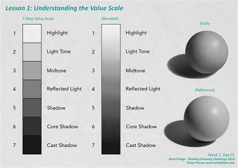
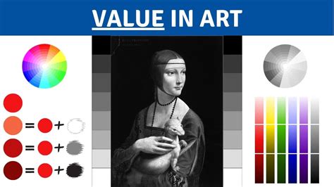
Understanding and Utilizing Values for Form and Realism
The use of values, both in terms of the application and spatial usage, is essential for creating form and a realistic illusion for the human eye. By telling a story through values, we define relationships within our painting that allow us to convey three-dimensional space and realistic forms. The value you give to the shapes and forms in your paintings defines the look and feel of your artwork. Understanding values - the relative lightness or darkness of colors - is paramount in creating a convincing illusion of three-dimensional form and space. Values dictate how light interacts with surfaces, defining contours, volume, and depth. By carefully controlling the interplay of light and shadow, artists can imbue their subjects with a sense of solidity and presence. The strategic application of value creates visual relationships within the artwork, guiding the viewer's eye and establishing the overall mood and atmosphere. The way values are used profoundly influences the viewer's perception of the artwork, shaping its emotional resonance and aesthetic impact.
Blocking In and Blending Color Values
Time to get down to the nitty gritty! I introduce a darker value to sleeping Casia’s skin tone. I do so very roughly, blocking it in. To achieve this color, I will sample the base flesh color, then add tiny amounts of red and black on the color disc in Procreate. After blocking in those darker color values, I then block in lighter color values. This is where the figure starts to pop a little more. The edges of these color values laid next to each other are still rough, but I can start to see a clearer value map of sleeping Casia. For this next step, I’m going to use a blending brush. I really like using the Nikko Rull brush for blending. There’s something about it that has a nice texture. I find I must be very careful with blending as it’s easy to get carried away when using it. When I blend, I find myself going back and forth, adding more light, dark, or base color values to reestablish good contrast. Now, I’ll go to sleeping Casia’s hair and add the darker color value. That’s because the deeper, darker values I use in her hair will affect the values I finalize in painting her skin tones. Overall, it’s for this reason I like to put down a base color for the overall painting. Even though I am painting digitally and, yes, I can make adjustments to the hue, saturation, levels, etc., I prefer not to. I like being able to adjust on the fly as I’m painting. I now repeat the process of blocking in lighter and darker values for flying Casia. The biggest difference being the contrast and temperature of the figure.
Layering Values for Depth and Definition
13) I go back to Casia sleeping, adding the darkest color values to her skin, hair, and the bad sheets. Next, I add in the darkest color values to sleeping Casia’s skin, hair, and to the bed sheets. This will create the clearest image now. At this point, I repeat the process with flying Casia: blend the dark and lighter color values. I have made other paintings where I will first render everything completely in grayscale. Then, come back. in with color using gradient maps. But with this full-color digital painting tutorial in Procreate, I am using color early. Here you can see where I am making a color palette within the canvas area. Before I do any more work on flying Casia, I turn my attention to her hair. With her hair now blocked in, I add highlights throughout the entire flying Casia figure. The stages where the flat colors are applied, then light and dark color values are blocked in, make the painting look too dark. But once those highlights are in, it makes you realize how very few highlights are actually needed. The iterative process of blocking in and blending color values is key to building depth and form in a digital painting. By starting with rough blocks of darker and lighter values, artists establish the foundational light and shadow patterns. Subsequent blending refines these transitions, creating smoother gradients and a more volumetric appearance. This technique is applied across different elements of the artwork, from skin tones and hair to fabric and background details. The careful layering of values ensures that each component contributes to the overall sense of realism and dimensionality. Even after initial blocking, the process involves continuous refinement, adding darker tones for emphasis and lighter values to highlight form, all while maintaining a cohesive visual narrative. The inclusion of highlights, often a final touch, dramatically alters the perception of light and form, revealing the true impact of the preceding value work.
Bringing Characters to Life with Color and Highlights
19) Painting Casia flying, I add the full costume plus details. Up until now, behind the flying Casia figure, there was a gray background. That was intentional as I was painting the figure. However, it’s now time to add in the real background: a starfield/outer space scene. But, it all starts with first dropping in a color flat. In this case, a very dark purple. Creating a background for your digital painting allows the viewer to understand better the story, who the people are, and where they are. Adding backgrounds to your paintings helps tell the story and give context to the characters and their actions. For example, when you are working on your art, you probably already have a theme or message that you want to convey. Using some natural paintbrushes in Procreate, I create a basic pattern of abstract shapes that will form cloudlike space matter. To further unify the colors between the foreground elements and the background, I’m adding in a lighter shade of the same purple. I decided I needed to add even more tie-in with Casia, so I added very light hints of yellow to the space scene. 23) Background space scene completed. I like to have a simple color palette when designing my paintings. By this, I mean I try to limit the overall color tones to only a few. The green is obviously using varying amounts of yellow and blue. The next dynamic part of the composition is showing a connection between sleeping Casia and flying Casia. It’s not entirely revealed what it is exactly, just that there is some kind of movement. To finalize the flying Casia figure, I add a thin, somewhat faint blue energy field around her. It was the perfect device to add even more focus on the character. These are the types of adjustments that happen as a result of working on a piece for several hours. Finally, I add some tech to the walls located in the background behind sleeping Casia. One of the nice things about Procreate’s brushes is the ability to rather easily make straight lines. This comes in handy for drawing stuff like techy items. The process of adding color and highlights is where a digital painting truly comes alive. After establishing the forms through values, carefully applied colors and strategic highlights breathe life into the characters and their environment. This involves not just filling areas with color but considering how light would interact with different surfaces, creating reflections, and defining textures. The addition of costume details, energy fields, and background elements like starfields further enhances the narrative and visual appeal. A well-crafted background provides context, grounding the characters within their world and supporting the story being told. Unifying foreground and background colors, and introducing subtle color variations like hints of yellow in a space scene, creates a cohesive and immersive experience. The final touches, such as adding technological details or subtle energy fields, serve to enhance the character's presence and the overall dynamism of the composition.
The Importance of a Cohesive Color Palette
I like to have a simple color palette when designing my paintings. By this, I mean I try to limit the overall color tones to only a few. The green is obviously using varying amounts of yellow and blue. A deliberate and cohesive color palette is fundamental to the success of any visual artwork. By limiting the overall color tones to a select few, artists can ensure harmony and visual unity across their piece. This approach prevents the artwork from becoming visually chaotic or distracting. For example, understanding that green is a combination of yellow and blue allows for a more intuitive manipulation of color relationships. A well-chosen palette guides the viewer’s eye, enhances the mood, and reinforces the intended message of the artwork. It’s about creating a visual language where colors work in concert to tell a story and evoke a specific emotional response, rather than existing as isolated elements.
Connecting Elements: Compositional Dynamics
The next dynamic part of the composition is showing a connection between sleeping Casia and flying Casia. It’s not entirely revealed what it is exactly, just that there is some kind of movement. Creating a sense of connection and movement within a composition is vital for engaging the viewer and conveying a narrative. This can be achieved through various visual cues, such as implied lines, gestures, or the flow of energy. Even if the exact nature of the connection is not explicitly shown, the suggestion of movement or interaction between elements draws the viewer into the story. This can be accomplished through subtle visual elements, like a faint energy field or a shared color palette, that link the subjects together. The goal is to create a dynamic interplay that sparks curiosity and adds depth to the overall artwork, making the viewer ponder the relationship between the depicted figures.
Final Touches and Print Considerations
I make test prints of my digital art pieces all the time. I do it because it teaches me about a printed piece’s optical readability and physical interaction, especially for this digital painting which will be part of my Realm Ethereal story/art book. As much as possible, given the nature of digital printing and the technology involved, I aim to convey the same awesome delightfulness in print as it did on my screen while I was creating the painting. Procreate is an excellent painting app and can be used with digital painting, sketching, and digital storytelling. There are many ways to paint digital artwork, and choosing which application or medium to use can be an overwhelming task. For example, newcomers may want to start with something familiar, but more advanced users may want to experiment with more complex tools. Before finalizing a digital artwork, especially if it is intended for print, conducting test prints is an essential step. This process allows artists to evaluate how their work translates from screen to physical medium, assessing aspects like color accuracy, tonal range, and overall impact. The goal is to ensure that the visual experience on screen is as closely replicated as possible in print, accounting for the inherent differences in how light interacts with digital displays versus printed surfaces. Procreate stands as a versatile and powerful application for digital painting, sketching, and storytelling, catering to a wide spectrum of users, from beginners seeking accessible tools to seasoned professionals exploring advanced functionalities. The journey of digital art creation is multifaceted, offering numerous pathways and tools to explore.