Welcome to a comprehensive exploration of integrating authentic paper textures into your digital illustrations within Procreate. This guide delves into the nuances of using specialized texture packs, like the Phantom Paper textures, to imbue your digital creations with the tangible, nostalgic feel of traditional media. For artists of all levels, understanding how to effectively layer and manipulate these textures can be a transformative "aha!" moment, elevating digital work from flat images to pieces with a rich, analog character. The allure of retro-inspired art and design often lies in its perceived materiality, and paper textures are a cornerstone of achieving this effect.
While a basic approach of layering textures and setting them to a "multiply" blend mode can be effective, a deeper understanding of how these textures interact with your artwork unlocks a far more nuanced and convincing analog aesthetic. This in-depth guide will navigate you through the process, from selecting and importing textures to fine-tuning their appearance and achieving a truly authentic, tactile finish.
Unveiling the Power of Phantom Paper Textures
Phantom Paper Textures are meticulously designed to replicate the analog feel of real ink or paint on paper. They go beyond simple overlays by capturing the subtle characteristics of physical paper, including its tooth (surface grain), highlights, and shadows. These textures are seamless, meaning they can be tiled infinitely to cover any canvas size without visible repeating patterns, offering unparalleled flexibility for your projects.
Each texture within the Phantom Paper collection is thoughtfully named to hint at its origin and characteristics. For instance, "TobaccoKraft" is a prime example, scanned directly from archival paper. This particular texture boasts a blend of cotton fibers and wood pulp, contributing to its rich, aged appearance and providing a depth that digital reproductions often lack. The intention behind these textures is to provide artists with a tool that bridges the gap between the digital realm and the tactile world of traditional art materials.
Robin Banks, an artist known for achieving an authentic analog feel in their Procreate work, utilizes Phantom Paper Textures as a key component of their workflow. The following steps outline Robin's approach, demonstrating how these textures are integrated to achieve a convincing traditional aesthetic.
A Step-by-Step Guide to Integrating Paper Textures in Procreate
Step 1: Acquiring Your Textures
The journey begins with obtaining your chosen Phantom Paper Textures. After purchasing the pack, you will be directed to a download page where you can select the specific textures you wish to use for your project. This allows for a tailored approach, ensuring you have the precise materials needed.
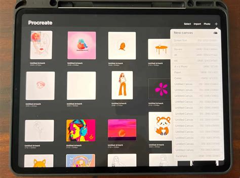
Step 2: Importing Textures into Procreate
Once downloaded, the textures need to be brought into your Procreate workspace. Open Procreate, navigate to the "Import" function, locate the texture files on your device, and select them for import. Procreate will automatically add them to your brush or texture library, ready for use.
Step 3: Setting Up Your Canvas
Before applying textures, it's crucial to establish your canvas. Adjust your canvas dimensions to suit your project's requirements. Robin often utilizes a 12x12 inch canvas, a versatile size that is well-suited for both social media platforms like Instagram and for printmaking purposes. The seamless nature of Phantom Paper textures ensures they will adapt perfectly to any canvas size you choose, eliminating the need for complicated resizing or adjustments.
Step 4: Tiling Textures for Larger Canvases
For larger canvases, such as the 12x12 inch example, you may need to tile the texture to cover the entire area seamlessly. This involves duplicating the texture layer multiple times and carefully aligning each layer edge-to-edge. With practice, this process becomes straightforward, ensuring a continuous and unbroken paper grain across your artwork. The seamless design of the textures minimizes visible repetition.
Step 5: Inking Your Artwork Over the Texture
With your canvas and texture base established, you can now begin your artwork. You can either import a pre-existing sketch into Procreate or start a new sketch directly on a layer positioned below your texture layer. To ensure better visibility of your sketch while inking, it is advisable to lower the opacity of the sketch layer. This allows the texture beneath to subtly influence the perceived line quality without obscuring your drawing.
20 INK Tips for BEGINNERS!
Step 6: Applying Color and Effects
Creating a new layer for your background color is the next step. Set this layer's blend mode to "Multiply." This blend mode allows the color to interact with the texture in a way that mimics traditional media, where pigment soaks into the paper. To effectively color your linework, set your ink or line layer to "Reference Mode." Then, create new, separate layers for each color you intend to use. Procreate's drag-and-drop functionality makes it incredibly easy to fill enclosed areas with color, much like painting on a physical surface.
Step 7: Fine-Tuning Texture Strength
The intensity of the paper texture can be adjusted to achieve the desired effect. By simply changing the opacity of the texture layer, you can subtly or dramatically alter how prominently the paper grain appears. This control allows you to dial in the perfect balance between the digital artwork and the analog texture.
Step 8: Adding Finishing Touches for Authenticity
To further enhance the authenticity of your piece, consider adding finishing effects. Elements like "glue edges" (simulating the way art is often mounted or assembled) and subtle discoloration can add a layer of realism. These types of effects are often included for free with premium texture packs like Phantom Paper, providing readily available tools for achieving a truly vintage look.
The Transformative Difference: Before and After
One of the most compelling aspects of using high-quality paper textures in Procreate is the dramatic transformation they impart to digital artwork. In its 'before' state, a piece of digital art might appear clean, crisp, and technically proficient, but it often lacks the depth, character, and tactile quality inherent in traditional media. The lines can be too perfect, and the colors might appear flat, contributing to a somewhat sterile or overly digital appearance.
However, the 'after' image, where Phantom Paper Textures have been applied, tells a different story. A rich, tactile quality immediately becomes apparent. The subtle grain of the paper, the slight imperfections that mimic the natural variations in paper manufacturing, and the warm, nuanced tones all combine to create an authentic vintage aesthetic. This transformation is not merely superficial; it deeply enhances the visual appeal by imbuing the digital piece with a nostalgic, analog feel. The difference is remarkable - what was once a flat, digital creation now possesses the depth, charm, and texture of a piece physically rendered on real paper. This effect can make digital art feel more grounded, more relatable, and more akin to the artwork we often admire from past eras.
User Testimonials and Real-World Examples
The impact of quality paper textures is widely recognized within the artistic community. As one user aptly put it, "not all paper textures are created equal!" and "I can't get enough of these textures! They're exactly what I felt some of my projects need." Such testimonials highlight the significant difference that well-crafted textures make in achieving specific artistic goals.
The appeal of these textures lies in their ability to impart a sense of history and craftsmanship to digital work. They can make a piece feel more "real," more "lived-in," and more connected to the long tradition of physical art creation. This is particularly valuable for artists aiming for a retro, vintage, or handcrafted look, where the digital medium can sometimes feel too slick or modern.
Ready to Elevate Your Procreate Workflow?
For artists looking to infuse their Procreate illustrations with an authentic analog feel, exploring premium texture resources like Phantom Paper Textures is a highly recommended step. The ability to add classic, seamless, high-resolution paper textures can make your work appear as though it was genuinely printed on physical paper. This detail can significantly enhance the perceived value and artistic merit of your digital creations.
Beyond Textures: Exploring Related Creative Avenues
The pursuit of authentic artistic expression in Procreate extends beyond paper textures. For instance, understanding how to change the paper color in Procreate is another straightforward yet impactful technique for altering the mood and feel of your work with minimal effort. This simple adjustment can shift the entire palette and atmosphere of your illustration.
Furthermore, the world of Procreate offers a vast landscape of creative exploration. Discovering the secrets of the Procreate brush panel, for example, can unlock powerful new ways to create and manipulate your artwork, often revealing functionalities that less experienced users might overlook. Many artists find that understanding these deeper features can significantly enhance their creative output and efficiency.
Mid-century art, with its characteristic simple yet charming aesthetic, is another area where paper textures play a significant role. Learning to create classic mid-century illustrations involves understanding specific design principles and applying them within Procreate. This often involves a thoughtful combination of linework, color palettes, and, of course, appropriate textural elements.
For those interested in sharing their work and engaging with a creative community, platforms like Instagram provide an excellent avenue. Sharing your projects using specific hashtags, such as #RetroSupply, can increase visibility and offer a chance to be featured. When sharing, including details about the products used and "before and after" images can provide valuable context for other artists and showcase the impact of your techniques.
Staying connected with the broader artistic community through newsletters and online forums is also a valuable practice. Signing up for newsletters from art supply companies or digital art platforms can keep you updated on the latest products, tutorials, and exclusive content. Participating in live draw sessions, like those that might feature classic comic-style illustration techniques, can offer direct learning opportunities and even provide free brushes to follow along, further enhancing your skill set.
The journey of finding one's creative voice is a continuous one. Artists often wonder how certain individuals develop a unique style that appears effortless. Researching and understanding the elements that contribute to a distinctive artistic signature can provide a roadmap for honing your own style and making the creative process more enjoyable and rewarding.
Finally, making time for side projects is often cited as crucial for creative growth. These passion projects serve as the lifeblood of creativity, allowing artists to experiment, explore new artistic fields, or simply reconnect with their initial passion for art. A well-planned side project has the power to significantly boost your craft, build your reputation, and even lead to new professional opportunities, reminding you why you embarked on this artistic journey in the first place.