Transforming typography from standard to stand-out is a key element in compelling graphic design. One of the most effective and surprisingly simple ways to achieve this is by incorporating curved text effects. Whether it's a full, elegant circle, a subtle partial arc, or a more intricate spiral, curved text can add a unique dynamism to your visuals in mere moments. This guide delves into the art of creating curved text, exploring various techniques and applications to help you craft designs that are not only aesthetically pleasing but also remarkably impactful, catering to a wide range of design needs and skill levels.
The Foundation: Understanding Curved Text Tools
At its core, creating curved text involves manipulating standard text elements to follow a specific path or shape. Many graphic design platforms offer dedicated "curved text" tools, which simplify this process significantly. These tools typically allow users to select a text box and then apply a curvature effect, often controlled by a slider or numerical input.
The fundamental principle behind these tools is the ability to define the path the text will follow. This can range from a simple arc to a full circle or even more complex, custom paths. Key parameters often include:
- Degree of Curve: This dictates how tightly the text bends. A positive value might curve the text outwards (like a smile), while a negative value could curve it inwards (like a frown). For a full circle, values typically approach 360 degrees.
- Letter Spacing (Kerning): Adjusting the space between individual letters is crucial. As text curves, letters can either bunch up or stretch apart. Fine-tuning letter spacing ensures readability and a balanced aesthetic.
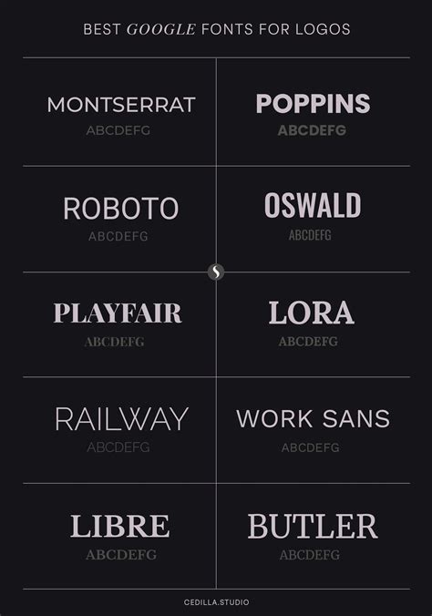
- Font Choice: The chosen font significantly impacts the final look. Some fonts are more forgiving with curvature than others. Sans-serif fonts often work well for clean, modern curves, while serif fonts can add a touch of classic elegance. Script fonts can create flowing, artistic effects but may require more careful adjustment.
- Case: For perfectly symmetrical circular text, using all uppercase letters is often recommended. This ensures that the letters maintain a consistent visual weight and orientation around the curve.
Crafting a Full Circle of Text
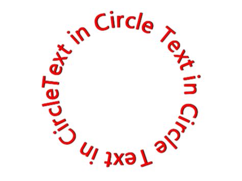
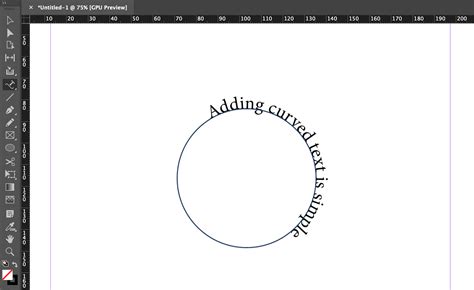
One of the most popular applications of curved text is arranging it in a complete circle. This effect is ideal for logos, emblems, badges, and circular design elements. The process generally involves typing your text, selecting the curved text tool, and then adjusting the curvature slider to its maximum positive setting (often around 350-359 degrees).
When creating a full circle, the text at the top will appear upright, while the text at the bottom will be upside down. This is a characteristic of how text follows a circular path. To maintain symmetry and visual appeal, consider the following:
- Adding More Text or Spacing: If your letters appear too large or squashed on the curve, adding more characters or increasing the letter spacing can help distribute them more evenly.
- Font and Case: As mentioned, all uppercase lettering often yields the most symmetrical and balanced results for a full text circle.
The Arc Effect: Subtlety and Emphasis
Beyond full circles, creating arcs of text offers a more versatile range of applications. An upward-curving arc can serve as a subheading or a decorative element that adds a subtle "smile" to your design. Conversely, a downward-curving arc can create a sense of enclosure or draw the eye downwards.
To achieve an arc, you typically use the same curved text tool but adjust the slider to a value less than a full circle, often somewhere between a semi-circle (180 degrees) and a full circle.
This technique is particularly effective for:
- Subheadings: Placing an arched subheading beneath a main title can create visual interest and hierarchy.
- Call-to-Action Buttons: Curved text can make buttons or calls to action more engaging.
- Decorative Borders: Arcs can be used to form partial borders or frames within a design.
Combining Text and Graphics: A Synergistic Approach
The true power of curved text often emerges when it's integrated with other graphic elements. This fusion can lead to sophisticated and eye-catching designs that feel cohesive and intentional.
Looping Text Around Icons and Graphics
One common technique is to loop text around an icon or graphic element. This can be achieved by using two separate text boxes, each with a semi-circular curve. By setting one to curve upwards and the other downwards, and ensuring they are mirrored in their curvature, you can create a wave-like effect.
To make this work seamlessly:
- Opposite Angles: Ensure the angle of curvature in each text segment is the direct opposite to achieve a perfectly even wave.
- Font Size Adjustment: You might need to enlarge or reduce the font size of one or both text segments to match the visual weight and scale of the icon they are wrapping.
Wrapping Text Around Images
Curving text around images, especially circular or semi-circular ones, can create a harmonious blend of typography and visuals. This is particularly effective for product showcases, profile images, or any design where the text needs to complement a central image.
To achieve this:
- Match the Curve: Adjust the text's curvature to match the curve of the image. A 180-degree curve is often suitable for semi-circular images.
- Letter Spacing: Add letter spacing to ensure the text doesn't feel too condensed as it wraps around the image.
- Image Cropping and Rotation: You might need to crop or rotate your image to achieve the desired alignment with the text.
Layering Text with Graphic Elements
Curved text can also be enhanced by layering it with graphic elements like shapes, banners, or rings.
- Boxed or Banner Effects: Adding a shape or banner behind or in front of curved text can help separate messaging and add visual depth. This is useful for creating distinct areas of information.
- Graphic Rings: Placing a graphic ring element behind circular text can effectively separate it from the background and add a polished look. These rings can be customized in color, opacity, and even layered for shadow effects.
- Starbursts and Decorative Shapes: Curved text can be effectively combined with decorative shapes like starbursts, often used for certificates or endorsements, to visually signify quality or accreditation.
Integrating Text with Cut-Out Images
A more advanced technique involves layering curved text with images that have had their backgrounds removed. This allows for illusions where text appears to pass through or interact with the foreground object.
To create this effect:
- Multiple Arcs: You may need to create multiple arcs of text, with some positioned behind the image and others in front.
- Layer Order: Carefully manage the layer order of your text and image elements to achieve the desired interaction.
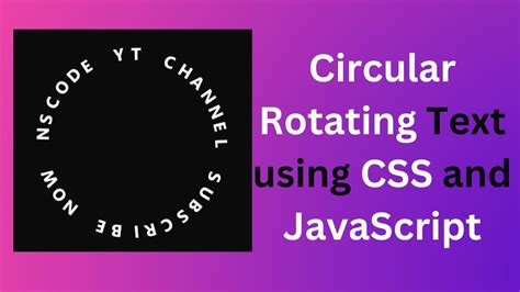
Animation with Curved Text
Curved text is not limited to static designs; it can also be animated to create dynamic and engaging visuals, particularly for GIFs and short video clips.
Animating Circular Text
To animate text in a full circle, you can duplicate your page or artboard multiple times. On each subsequent page, slightly rotate the curved text. By incrementing the rotation (e.g., by 73 degrees for five pages to complete a full 360-degree rotation), you create a smooth spinning effect when exported as a GIF.
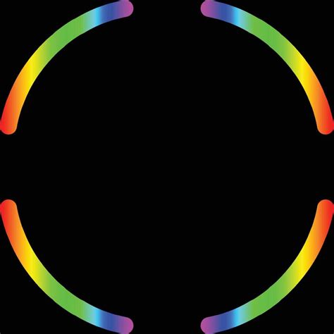
Flashing Arcs in Animated GIFs
Another animation technique involves creating four quarters of a circle using curved text. Each quarter can be rotated into position. By duplicating the page and changing the color of one quarter of text on each new page, you can create a flashing or pulsing effect as different sections of the circle highlight in sequence.
Advanced Techniques and Creative Applications
The versatility of curved text extends to more intricate and creative applications, pushing the boundaries of conventional typography.
Mixing Fonts for Dynamic Circles
Combining different font families can add significant visual interest to circular text designs. Using one font for the top semi-circle and a complementary font for the bottom semi-circle, perhaps with adjusted font sizes to accommodate varying character counts, can create a balanced yet dynamic effect. Adding a central icon or graphic can further enhance this design.
Text Around Square Corners
While curves are the primary focus, curved text can also be used to soften or accentuate geometric shapes. For instance, a quarter-circle of text can be used to transition between two straight text boxes, creating an interesting visual flow around a corner.
Incorporating Special Characters
Repeating special characters like dashes, colons, asterisks, or tildas within curved text can create unique patterns and textures. These can serve as decorative elements or dividers within a circular text layout, adding a subtle layer of detail.
Layered Rainbows of Text
For social media graphics or playful designs, layering multiple semi-circles of text in a rainbow-like fashion is a charming approach. By adjusting font sizes and colors for each layer, you can create a vibrant and cohesive visual.
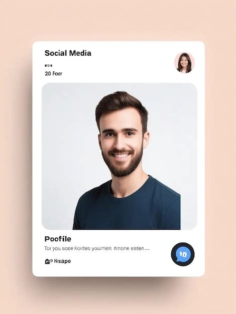
Curved Text for Profiles and Logos
Integrating curved text into profile images or logos offers a professional and branded aesthetic. Combining a central image (like a personal photo or brand logo) with curved text arcs above and below creates a balanced composition. This is particularly useful for social media profiles where space is limited but impact is desired.
Curved Text in Practice: Tools and Platforms
Several design platforms offer robust tools for creating curved text, making this effect accessible to users of all skill levels.
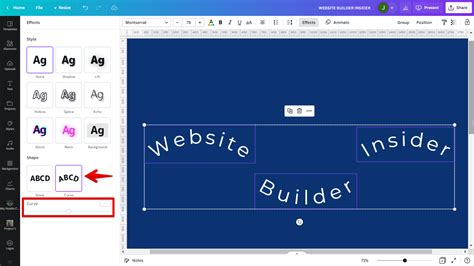
Easil
Easil provides a user-friendly interface with a dedicated "Curve Text" icon. Its intuitive slider allows for easy adjustment of curvature, and features like "Letter Spacing" help refine the final look. Easil offers numerous examples and templates to guide users in recreating complex curved text designs, from full circles to intricate arcs and spirals, even for those without prior graphic design experience.
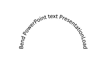
PicMonkey
PicMonkey is highlighted for its straightforward curved text tool, which is available on both desktop and mobile. The platform allows users to adjust text curvature with a simple slider and offers extensive customization options, including shadows, outlines, spacing, and even animation (for Pro subscribers). PicMonkey also provides a variety of templates and tutorials demonstrating how to effectively use curved text in different design contexts.
PicMonkey add and curve text
Canva
Canva's "Text Bend" or "Warped Text" tool allows users to easily bend, arch, and warp text. It provides control over curve direction and angle, enabling the creation of waves, swirls, and patterns. Canva's platform is known for its seamless user experience, making it easy to design everything from logos to social media posts with curved text elements.
Why Use Curved Text?
The appeal of curved text lies in its ability to:
- Enhance Visual Interest: It breaks away from the monotony of standard, straight text, immediately drawing the viewer's eye.
- Create Emphasis: Curved text can be used to highlight specific words or phrases, making them focal points within a design.
- Convey Emotion and Tone: The direction and tightness of a curve can subtly influence the perceived emotion of the text, from playful and energetic to elegant and sophisticated.
- Improve Readability in Specific Contexts: For circular designs like logos or badges, curved text ensures that all parts of the text are oriented towards the viewer at some point, improving legibility.
- Add Personality: It allows designers to inject a unique style and personality into their work, making designs more memorable.
Applications of Curved Text
The utility of curved text spans a vast array of design projects:
- Logos and Branding: Creating circular logos, emblems, and brand marks.
- Social Media Graphics: Designing eye-catching posts, banners, and profile images.
- Invitations and Announcements: Adding flair to wedding invitations, save-the-dates, party invites, and announcements for events like baby showers or graduations.
- Product Packaging and Labels: Creating unique designs for labels, stickers, and packaging.
- Web Design: Enhancing headers, buttons, and decorative elements on websites.
- Print Design: Adding visual interest to posters, flyers, business cards, and certificates.
- Personalized Gifts: Creating custom messages for cards or gifts.
By mastering the techniques and understanding the tools available, designers can leverage curved text to elevate their creations, transforming ordinary typography into dynamic, engaging visual statements.