Designing a flyer that commands attention and effectively communicates your message is an art form. Adobe Photoshop, a powerhouse in graphic design, offers unparalleled creative control to craft sharp, eye-catching flyers suitable for both print and digital distribution. While the software boasts advanced features that can seem daunting, a structured approach demystifies the process, ensuring your flyer prints cleanly, looks professional, and achieves its intended impact. This guide will walk you through the essential steps, from initial setup to final export, empowering you to create compelling flyers that stand out.
Laying the Foundation: Setting Up Your Document
The first crucial step in creating a professional flyer in Photoshop is establishing the correct document specifications. This ensures your design translates accurately from screen to print.
Choosing the Right Dimensions and Resolution
For print-ready flyers, it's imperative to set up your document with print in mind from the outset. A standard flyer size often used for tutorials is 9x12 inches. However, for a more common print size like A5, the document dimensions should be set to 216 mm by 154 mm. It's important to remember that when you make a document the right size at once, you will save time without getting an unpleasant surprise at the time of printing.
Crucially, the resolution must be set to 300 Pixels Per Inch (PPI). This high resolution is essential for ensuring crisp, detailed prints that don't appear pixelated. Furthermore, the color mode should be set to CMYK (Cyan, Magenta, Yellow, Key/Black). Unlike RGB (Red, Green, Blue), which is used for digital displays, CMYK is the standard color model for printing, ensuring that the colors you see on your screen closely match the final printed output. If you're creating a document for digital use, you would typically use RGB and a lower resolution (e.g., 72 PPI).
Configuring Your Workspace with Guides
To maintain consistency and ensure elements are properly aligned, especially when preparing for print with bleeds, setting up guides is highly recommended. Activate the rulers by pressing Ctrl+R (or Cmd+R on Mac). You can then drag guides from the rulers to mark important areas. For instance, you can place a horizontal and a vertical guide in the exact center of your document to find its midpoint.
When preparing for print, adding a bleed is vital. A bleed is an extra margin of color or imagery that extends beyond the trim edge of your document. This ensures that if the paper shifts slightly during the printing or cutting process, there won't be any unprinted white edges. For a standard A5 size with a 3 mm bleed, you'll need to create guides 3 mm in from each edge of your document. In Photoshop, you manually create these guides by dragging them from the rulers. For example, drag a horizontal guide from the top ruler and position it 3 mm down from the top edge. Repeat this for all four edges.
Understanding Color Modes: CMYK vs. RGB
The distinction between CMYK and RGB is fundamental for anyone designing for print. RGB is an additive color model where red, green, and blue light combine to create a spectrum of colors, primarily used for screens like monitors, TVs, and smartphones. CMYK, on the other hand, is a subtractive color model where inks are layered onto a white surface, absorbing light. This is the standard for professional printing. When designing a flyer intended for printing, always work in CMYK mode. If you accidentally design in RGB, Photoshop will attempt to convert the colors to CMYK upon export, but the results may not be as predictable or vibrant as designing directly in the CMYK color space.
Building the Visuals: Backgrounds and Imagery
With your document set up, you can begin constructing the visual elements of your flyer, starting with the background and incorporating images.
Creating a Background
A new document in Photoshop typically starts with a white background layer. You can change this by selecting the background layer and using the color tool to pick a color to your taste. Alternatively, you can create a new layer (Shift+Cmd+N or Shift+Ctrl+N) and fill it with your chosen background color using the Alt+Backspace (or Option+Delete on Mac) key combination, ensuring your foreground color is set correctly.
For a more dynamic background, you can use adjustment layers. A Gradient Overlay, for example, can add subtle depth. Within the Layer Style panel, select "Gradient." You can then adjust the colors, their location, and opacity. For instance, a gradient transitioning from white to a pale yellow (e.g., C=9 M=6 Y=14 K=0) with the white slider at 30% can create a soft, inviting base.
Incorporating and Masking Images
Images are often the focal point of a flyer. To add an image, go to File > Place Embedded and select your desired picture. Use the Move Tool (V) to position and scale the photo within your document.
Masking is a powerful technique to integrate images seamlessly. You can create a rectangle with the Rectangle Tool (U) and then, with the image layer selected, click the "Add vector mask" icon at the bottom of the Layers panel. This creates a mask thumbnail next to your image thumbnail. Using the Pen Tool (P) and Direct Selection Tool (A), you can manipulate the anchor points of the mask to create custom shapes, revealing or hiding parts of the image. For instance, you can create a curved edge for your image by drawing a shape on its mask.
Applying a Gaussian Blur filter (Filter > Blur > Gaussian Blur) to an image or its mask can soften its appearance or create a sense of depth. When using Smart Filters, you can adjust the filter's intensity and mask it non-destructively.
Enhancing Images with Adjustment Layers
Adjustment layers offer non-destructive ways to modify the look of your images. A Brightness/Contrast adjustment layer can fine-tune the exposure. To ensure these adjustments only affect a specific image, right-click on the adjustment layer and select "Create Clipping Mask." This links the adjustment layer to the layer directly below it.
You can also use Solid Color fill layers with clipping masks to subtly tint an image or create color overlays. For example, a Solid Color fill layer with a specific CMYK mix (e.g., C=30 M=80 Y=100 K=30) clipped to an image can give it a particular hue. By using the brush tool on the vector mask of the fill layer, you can selectively reveal parts of the original image beneath the color.
Crafting Compelling Text and Typography
Typography plays a vital role in conveying information and establishing the overall tone of your flyer. Photoshop provides robust tools for text manipulation.
Adding and Formatting Text
The Horizontal Type Tool (T) is your primary tool for adding text. You can select fonts from your system, adjust their size, leading (space between lines), tracking (overall letter-spacing), and color. For a professional look, using font families like Proxima Nova, as mentioned in the provided text, is a good practice.
When adding text, it’s often best to place each line or distinct text block on its own layer. This gives you greater control over positioning with the Move Tool (V) and allows for easier editing later. For headings, use larger, bolder fonts, while body text should be clear and legible. Adjusting tracking can improve readability, especially for longer blocks of text or when using all caps.
Creating Text-Based Logos and Titles
For a more stylized text element, like a logo or a prominent title, you can combine text with shapes. For example, creating a circle using the Ellipse Tool (U) and then wrapping text around it can create a unique circular logo.
Applying Layer Styles, such as Drop Shadow, can add depth and dimension to text and shapes. You can customize the opacity, distance, and size of the shadow to achieve the desired effect. Copying and pasting layer styles is a quick way to apply the same effects to multiple elements, ensuring visual consistency.
Utilizing Font Pairing and Hierarchy
When selecting fonts, consider font pairing - combining different fonts that complement each other. A common approach is to pair a serif font for headings with a sans-serif font for body text, or vice versa. Establishing a clear typographic hierarchy is crucial: the most important information (like the main title or event name) should be the most prominent, followed by subheadings, and then the body text. This guides the reader's eye through the information logically.
Incorporating Graphics and Logos
Beyond text and photos, graphic elements and logos can significantly enhance your flyer's visual appeal and brand recognition.
Placing and Styling Logos
If your flyer represents a business or organization, including its logo is essential. Use File > Place Embedded to import your vector logo file (preferably in a format like AI or EPS, which Photoshop can handle well). Scale and position the logo appropriately, usually in a prominent but not overpowering location, such as the upper corner.
You can apply Layer Styles, like a subtle Drop Shadow, to your logo to make it stand out from the background. Experiment with opacity and distance to ensure it integrates harmoniously with the overall design.
Using Vector Shapes and Icons
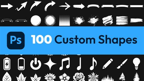
Photoshop's shape tools (Rectangle, Ellipse, Polygon, etc.) and the Pen Tool allow you to create custom vector graphics. These can be used for decorative elements, borders, or to create unique layouts. Icons are also valuable for visually representing information concisely. You can import vector icons (e.g., from an Illustrator file) or use icon sets available online. Ensure that all graphic elements and icons share a consistent visual style to maintain design coherence.
Refining the Design: Color, Layout, and Composition
The overall effectiveness of your flyer hinges on thoughtful color choices, a well-organized layout, and a balanced composition.
Strategic Color Palettes
Color evokes emotion and influences perception. When choosing colors, consider your target audience and the message you want to convey. Harmonious color schemes, often based on complementary or analogous colors, can create a pleasing aesthetic. Complementary colors (opposite on the color wheel, like blue and orange) create high contrast, while analogous colors (next to each other, like blue and green) offer a more serene feel.
Overly bright or clashing colors can be distracting. Sometimes, a sophisticated design can be achieved using a limited palette, perhaps with black and white as primary colors, accented by a single vibrant hue. Using gradients and subtle patterns can also add visual interest without overwhelming the viewer.
Principles of Layout and Composition
A well-structured layout ensures that information is easy to digest. Employing a grid system, even an informal one, can help align elements and create a sense of order. The principle of "white space" (or negative space) is also critical. Adequate spacing between elements prevents the design from feeling cluttered and improves readability.
Consider the visual hierarchy: the most important elements should be the most prominent. This can be achieved through size, color, contrast, and placement. Leading the viewer's eye through the flyer in a logical flow is key to effective communication. Sketching out ideas on paper before moving to Photoshop can be a highly beneficial step in visualizing your layout.
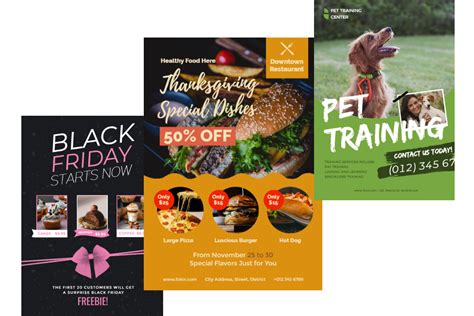
Ideas for Simple and Elegant Flyer Handbills
For a clean and minimalist design, focus on strong typography and a limited color palette. This approach is suitable for various purposes, from startups to established businesses. A vintage-inspired design can be achieved through specific font choices, color schemes, and textured backgrounds. For events like food festivals, a flyer with vector shapes can bring color while keeping the focus on essential information. Modern flyers often feature high contrast, bold text, and dynamic layouts.
Finalizing and Exporting Your Flyer
Once your design is complete, the final steps involve saving and exporting your flyer in the appropriate format for its intended use.
Saving Your Photoshop File
As you work, it’s essential to save your progress frequently. Save your file as a Photoshop Document (.PSD). This preserves all your layers, masks, and effects, allowing you to make further edits in the future.
Exporting for Print and Digital Use
When you're ready to share your flyer, you'll need to export it in the correct format.
- For Professional Printing: Save your file as a PDF (Portable Document Format). PDFs are ideal for printing as they embed fonts and maintain vector information, ensuring the highest quality. When exporting to PDF, ensure you select the correct color profile (CMYK) and include the bleed area.
- For Digital Use: For online sharing (websites, social media, email), export your flyer as a JPEG (.JPG) or PNG (.PNG). JPEGs are suitable for photographs and complex images, offering good compression for smaller file sizes. PNGs are better for graphics with sharp lines, text, or transparent backgrounds, as they offer lossless compression. Remember to work in RGB color mode for digital use and set your resolution to 72 PPI.
Understanding the Importance of Print-Ready Files
Creating a print-ready file involves more than just setting the correct dimensions and resolution. It also means ensuring that all elements are at least 3 mm from the trim edge (the bleed area) and that the color mode is CMYK. If you're unsure, many professional printing services offer guidelines on how to prepare your files.
Adobe Photoshop: How To Save in High Resolution (BEST Settings)
Beyond Photoshop: Alternative Tools and Resources
While Photoshop is a professional-grade tool, it's not the only option for flyer design. For those seeking simpler or more cost-effective solutions, alternative software and online platforms exist.
Exploring User-Friendly Alternatives
Software like Edraw Max is presented as a more affordable alternative to Photoshop, with a significantly lower annual cost and availability across multiple operating systems (Linux, Mac OS, Microsoft Windows). It offers various saving and export options, including cloud storage integration with Google Drive and Dropbox.
Adobe Express is another accessible tool, particularly for users who want to create flyers quickly without extensive design experience. It offers thousands of professionally designed templates that can be customized with fonts, icons, and images. Its drag-and-drop interface and free plan make it a viable option for creating shareable content for business promotion, fundraisers, or events.
Leveraging Templates for Efficiency
Using pre-designed flyer templates can significantly speed up the design process. Many platforms, including Photoshop itself, Adobe Express, and services like Placeit, offer a wide array of templates categorized by purpose (events, business, real estate, etc.). These templates provide a solid starting point, allowing you to focus on customizing the content, colors, and imagery to match your specific needs.
When to Use Professional Printing Services
Once your design is finalized, professional printing services can bring your flyer to life with high-quality results. Companies like Flyer Studios offer full-color, edge-to-edge prints with various finishes (glossy, matte, UV) and turnaround times, including same-day and next-day options. They also provide multiple sizes and paper options, with nationwide shipping. This ensures that your meticulously designed flyer is produced to the highest standard, ready to make a strong impression.