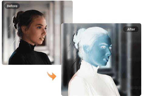
Color inversion, a technique that flips an image's palette to its spectral opposite, offers a gateway to a world of creative possibilities. While its origins can be traced back to the chemical processes of analog photography, its modern application in digital software like Adobe Photoshop has unlocked an entirely new dimension of artistic expression. This process, often employed for its unique aesthetic appeal, transforms familiar imagery into something entirely unexpected, making it a powerful tool for abstract art, intricate photo collages, and captivating fine art pieces. Beyond its artistic applications, color inversion also serves a practical purpose, allowing photographers to convert black-and-white film negatives into viewable positives, mimicking the traditional darkroom process without the need for hazardous chemicals.
Understanding the Mechanics of Color Inversion
At its core, color inversion works by reversing the value of each color channel within an image. In the context of digital imaging, this typically refers to the RGB (Red, Green, Blue) or CMYK (Cyan, Magenta, Yellow, Key/Black) color models. When a black-and-white photograph is inverted, the white pixels are transformed into black, and conversely, black pixels become white, effectively creating a photographic negative. The magic truly unfolds when applying this to a color image. Photoshop meticulously flips every color to its direct opposite on the chosen color wheel. For instance, red becomes cyan, green becomes magenta, and blue becomes yellow. This results in a photograph that, while still recognizable as an image of the world, presents it in a profoundly altered and unanticipated manner. This "flipped" color scheme is what lends inverted photos their distinct and often surreal quality.
Practical Application: Transforming Negatives into Positives
One of the most direct and practical uses of the Invert tool in Photoshop is the transformation of black-and-white film negatives into recognizable positive images. This process is akin to the traditional darkroom technique where light-sensitive paper is exposed to a projected image from a negative, and then developed. In Photoshop, however, the inversion is achieved digitally. By applying the Invert adjustment, the dark areas of the negative (which represent light areas in the original scene) become light, and the light areas of the negative (representing dark areas) become dark. This digital darkroom process allows for precise control over the tonal range and contrast, offering a chemical-free alternative to traditional photographic development.
Creative Techniques for Color Inversion in Photoshop
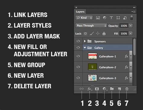
The journey into color inversion in Photoshop begins with a straightforward application of the Invert command. To initiate this process, one navigates to the Layers Panel and selects "Invert" from the drop-down menu after adding a new layer. Alternatively, the same functionality can be accessed through the top menu bar by choosing Layer › New Adjustment Layer › Invert.
However, a direct inversion can sometimes result in an image where the colors appear somewhat flat, lacking depth and vibrancy. To counteract this, a subsequent adjustment layer is often employed. By going to Layer › New Adjustment Layer › Levels, users gain access to the Levels sliders. These sliders are instrumental in adding dimension and correcting the tonal range of the inverted image.
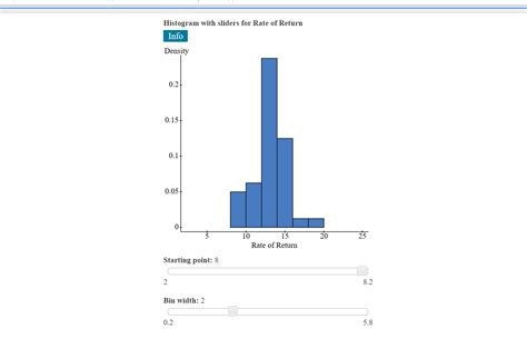
The histogram, a visual representation of the tonal distribution within an image, becomes a crucial tool at this stage. By observing the histogram, one can gain a clear understanding of the full tonal range present in the inverted photograph. Manipulating the Shadows, Midtones, and Highlights sliders allows for fine-tuning, bringing back contrast and detail that might have been lost in the initial inversion. This step is vital for achieving a polished and impactful final image.
Expanding the Creative Horizon: Combining Inversion with Other Effects
The power of color inversion is not limited to a single application. It serves as a fertile ground for experimentation, especially when combined with other creative effects. For instance, one can explore swapping colors within a photograph before inverting the image. This two-step process can lead to even more mysterious and unexpected color palettes, pushing the boundaries of visual perception. Imagine taking a vibrant landscape and swapping its dominant blues and greens for oranges and purples, only to then invert the entire image. The resulting visuals can be strikingly alien yet captivating.
Advanced Color Matching Process in Photoshop
Furthermore, the concept of inversion can be applied not just to the entire image but to specific color ranges or selections. This selective inversion allows for targeted transformations, creating surreal juxtapositions where certain elements of an image are flipped while others remain untouched. This level of control opens up avenues for highly stylized and conceptual artwork.
The Philosophical Underpinnings of Inverted Imagery
Beyond the technical execution, color inversion taps into a fascinating aspect of human perception and cognition. By presenting the world in its chromatic opposite, inverted images challenge our ingrained understanding of color relationships. We are accustomed to seeing the sky as blue, grass as green, and fire as red. When these colors are flipped, our brains are forced to re-evaluate these associations. This disruption can evoke a sense of the uncanny, a feeling of familiarity mixed with strangeness, which is often a hallmark of compelling artistic expression.
The inverted image can be seen as a visual metaphor for looking at the world from a different perspective. It encourages us to question our assumptions and to appreciate the subjective nature of perception. What we perceive as "normal" is, in part, a construct of our learned associations and biological wiring. Color inversion offers a playful yet profound way to explore these constructs, revealing the underlying structure of color and light in a novel way. It’s akin to viewing a familiar object under an entirely different set of conditions, forcing a reconsideration of its form and essence.
Iterative Refinement and Tonal Balance
The process of achieving a successful inverted image often involves an iterative approach. Initial inversions might appear jarring or incomplete. This is where the understanding of tonal balance becomes paramount. The Levels adjustment, as previously mentioned, is a critical tool for this. By carefully adjusting the black, white, and gray points, one can restore the perceived depth and contrast. For instance, if an inverted image appears too bright overall, the black point slider can be moved to the right to deepen the shadows. Conversely, if it seems too dark, the white point slider can be moved to the left to brighten the highlights. The midtones slider offers a way to adjust the overall luminosity of the image without drastically affecting the shadows and highlights, allowing for nuanced control.
Beyond Levels, other adjustment layers can be employed to further refine the inverted image. Curves, for example, offer even more granular control over the tonal range, allowing for complex S-curves to be applied to increase contrast or specific color channels to be manipulated independently. Hue/Saturation adjustments can also be used to further tweak the color balance, perhaps to enhance the surreal quality or to bring out specific color relationships that emerge from the inversion. The goal is to move beyond a simple flip and to craft an image that is not only visually striking but also tonally cohesive and aesthetically pleasing, even in its inverted state.
Exploring the Spectrum of Inversion: Beyond RGB
While the RGB color model is the most common for digital image editing, Photoshop’s inversion capabilities can also extend to other color spaces, particularly CMYK, which is used in print media. Inverting a CMYK image involves flipping the values of Cyan, Magenta, Yellow, and Black. This can lead to significantly different results compared to RGB inversion, often producing more muted or earthy tones due to the subtractive nature of CMYK. Understanding the target output-whether for screen display (RGB) or print (CMYK)-is crucial when deciding which color model to work with for inversion.
The concept of inversion can also be conceptualized in terms of light and pigment. In additive color mixing (like RGB light), combining all colors produces white. In subtractive color mixing (like CMYK pigments), combining all colors ideally produces black. Inverting in RGB essentially means moving from a color towards its absence (white), while inverting in CMYK can be thought of as moving from a pigment towards its opposite, or a clearer state. This fundamental difference in color theory significantly impacts the visual outcome of the inversion process.
The Psychological Impact of Inverted Colors
The human visual system is remarkably adept at recognizing patterns and associations. We learn from a very young age that certain colors are linked to specific objects or phenomena. When these associations are broken through color inversion, it can trigger a unique psychological response. The familiar world rendered in unfamiliar colors can evoke a sense of wonder, curiosity, or even unease. This can be a powerful tool for artists seeking to provoke an emotional response from their audience. An inverted portrait, for example, can feel both intimate and alien, forcing the viewer to look beyond the surface and consider the subject in a new light.
The use of inverted colors can also be seen as a form of visual disruption, designed to break through the visual noise of everyday life. In a world saturated with predictable imagery, an inverted photograph stands out by its sheer unexpectedness. It commands attention and encourages deeper engagement with the artwork. This deliberate deviation from the norm is a key characteristic of many avant-garde and experimental art movements.
Advanced Techniques and Creative Combinations
The true artistic potential of color inversion is realized when it is combined with other sophisticated Photoshop techniques. Beyond simple layer adjustments, one can explore:
- Selective Color Inversion: Using layer masks to invert only specific areas or colors within an image. This allows for highly controlled and nuanced effects, such as inverting the sky while leaving the landscape untouched, or flipping the colors of a particular object.
- Blending Modes: Experimenting with different layer blending modes (e.g., Multiply, Screen, Overlay) after applying the Invert adjustment can create a vast array of unique textures and color interactions. Combining an inverted layer with the original layer using a blend mode can yield results that are far more complex and aesthetically rich than a simple inversion.
- Gradient Maps: Applying a Gradient Map adjustment layer after inverting can further manipulate the color palette, mapping the inverted tones to a custom gradient for an even more stylized look. This allows for a complete reimagining of the image's color scheme.
- Channel Mixing: Advanced users might even consider inverting individual color channels (Red, Green, or Blue) separately before combining them, leading to highly experimental and abstract results.
The exploration of these advanced techniques demonstrates that color inversion is not merely a one-click effect but a versatile tool that can be integrated into a comprehensive digital art workflow. The ability to combine inversion with other powerful editing features in Photoshop allows for an almost limitless creative output, transforming ordinary photographs into extraordinary works of art. The journey from understanding the basic mechanics of inversion to mastering its advanced applications is a testament to the evolving landscape of digital creativity.