Selective color is a powerful technique in Adobe Photoshop that allows for dramatic visual storytelling by isolating and manipulating specific hues within an image. This effect, often seen as a staple in a commercial post-production person's must-have bag of tricks, offers a unique way to draw attention, enhance mood, and convey a specific message. While its classic application-a single color popping against a black-and-white background-can sometimes be perceived as overused or clichéd, understanding the underlying principles of selective color opens up a vast array of creative possibilities that go far beyond this basic application. It's an essential tool for any photographer or digital artist looking to refine their image editing skills and achieve a more polished and impactful final product.
The Core Concept: Isolating and Manipulating Color
At its heart, selective color is about controlling the color components within an image. It allows you to target specific colors and alter their intensity, hue, or saturation, while leaving other colors untouched. This precision is what makes the technique so compelling. For instance, you might want to emphasize the vibrant red of a flower against a muted background, or perhaps tone down an overpowering yellow in a sunset to create a more serene atmosphere. The ability to isolate and manipulate these individual color components in an image is fundamental to achieving nuanced and sophisticated edits.
Understanding Color Components and Interactions
To effectively utilize selective color, it's crucial to understand how colors are represented and how they interact within an image. Photoshop, like many digital imaging tools, often works with color models such as RGB (Red, Green, Blue) or CMYK (Cyan, Magenta, Yellow, Black). When you adjust a specific color, you are essentially influencing its contribution to these underlying color components.
For example, if you are adjusting red tones in an image, you are affecting the red component. By adding cyan to the red component, you can effectively mute it, resulting in a cooler, less intense red. Conversely, reducing cyan in the red component can make the red appear more vibrant. This understanding of how colors can be influenced by their complementary or opposing color components is key to achieving precise control.
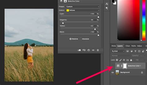
The Selective Color Adjustment Layer: Your Primary Tool
In Photoshop, the Selective Color adjustment layer is the primary tool for this type of editing. This non-destructive method allows you to make adjustments that can be easily modified or removed later without permanently altering the original image data.
When you create a Selective Color adjustment layer, you'll find a Properties panel that offers a range of controls. The most important of these is the "Colors" menu. Here, you can choose the specific color range you want to target - such as Reds, Yellows, Greens, Cyans, Blues, Magentas, Whites, Neutrals, or Blacks.
Once you've selected a color, you can then manipulate four sliders: Cyan, Magenta, Yellow, and Black. These sliders allow you to add or subtract percentages of these CMYK components from the selected color range.
- Cyan: Adjusting cyan affects the blue-green tones. Adding cyan to a color will make it cooler, while subtracting it will make it warmer.
- Magenta: Adjusting magenta influences the pinkish-red tones. Adding magenta pushes the color towards red, while subtracting it moves it towards green.
- Yellow: Adjusting yellow impacts the yellow and orange tones. Adding yellow enhances these hues, while subtracting it mutes them.
- Black: The black slider controls the overall darkness or lightness of the selected color range. Adding black will deepen the color, while subtracting it will lighten it.
It's important to note how these sliders work in conjunction with the selected color. For instance, if you select "Reds" and increase the Cyan slider, you are essentially adding cyan to the red areas of your image, which will desaturate or cool down those reds.
Understanding "Relative" vs. "Absolute" Adjustments
A crucial aspect of the Selective Color tool, as highlighted by experts like Blake Rudis of f64 Academy, is the distinction between "Relative" and "Absolute" adjustments. This setting significantly impacts how your edits are applied.
Relative: In "Relative" mode, the adjustments are made as a percentage of the existing color values. This means the changes are more subtle and tend to preserve the overall color balance of the image. For example, if you have a red that is 50% magenta, and you add 10% magenta in relative mode, the final magenta value will be 55% (50% + 10% of 50%). This is a gentler approach, often preferred for fine-tuning.
Absolute: In "Absolute" mode, the adjustments are made based on a fixed percentage of the total color. This results in more drastic and intense shifts. For example, if you add 10% magenta in absolute mode, it adds a fixed 10% magenta regardless of the original magenta value. This mode is useful for making bolder statements or correcting significant color casts.
Understanding the difference between these two modes allows you to control the intensity and impact of your selective color adjustments, ensuring they align with your artistic vision.
Beyond Basic Desaturation: Advanced Applications
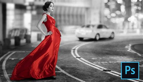
While the most common use of selective color is to make a single object or area stand out in an otherwise black-and-white image, its potential extends much further. This technique is invaluable for:
- Enhancing Mood and Atmosphere: By subtly adjusting the color balance of certain elements, you can evoke specific emotions. For instance, cooling down blues and greens can create a sense of tranquility or melancholy, while warming up reds and oranges can convey energy and passion.
- Correcting Color Casts: Sometimes, an image might have an unwanted color cast, such as a greenish tint from fluorescent lighting. Selective color can be used to precisely counteract these casts by adjusting the offending color components.
- Refining Skin Tones: Achieving natural-looking skin tones can be challenging. Selective color allows for delicate adjustments to the reds, yellows, and magentas within skin tones to ensure they appear realistic and pleasing.
- Adding Depth and Focus: As demonstrated by Blake Rudis, manipulating selective color in highlights, midtones, and shadows can add significant depth and draw the viewer's eye to the most important areas of a photograph. This is achieved by refining each hue within these tonal ranges, rather than simply boosting overall saturation.
- Creating Harmonious Color Palettes: In images with multiple competing colors, selective color allows you to bring them into harmony. You can gently mute less important colors or slightly enhance dominant ones to create a more cohesive and visually appealing composition.
Practical Techniques for Selective Color
Here are some practical ways to implement selective color effects in Photoshop:
1. The Classic Selective Desaturation
This is the most recognizable form of selective color.
- Step 1: Isolate Your Subject. Use your preferred masking technique to select the area you want to remain in color. This could involve the Quick Selection Tool, Object Selection Tool, Pen Tool, or even Select > Color Range if the color is distinct enough, as suggested for selecting blue jeans.
- Step 2: Refine Your Mask. Once you have an initial selection, it's often beneficial to refine it. Entering QuickMask mode allows you to paint directly on the mask with black and white to precisely define the edges of your selection, ensuring areas like feet or intricate details are properly handled.
- Step 3: Desaturate the Background. With your subject selected and masked, invert the selection (Select > Inverse) to select everything else. Then, create a Hue/Saturation adjustment layer. In the Properties panel, reduce the "Saturation" slider to -100. This will turn the background black and white while leaving your selected subject in color.
2. Using the Selective Color Adjustment Layer for Finer Control
This method offers more nuanced control over specific colors.
- Step 1: Create a Selective Color Adjustment Layer. Go to Layer > New Adjustment Layer > Selective Color. This layer will affect all layers below it.
- Step 2: Choose Your Target Color. From the "Colors" dropdown menu in the Properties panel, select the color you wish to adjust (e.g., Blues, Reds, Yellows).
- Step 3: Manipulate the Sliders. Use the Cyan, Magenta, Yellow, and Black sliders to alter the chosen color. Remember the difference between "Relative" and "Absolute" modes for the desired intensity of your adjustment. For example, to make blues richer, you might decrease Yellow and increase Cyan. To mute reds, you could add Cyan.
- Step 4: Refine with Layer Masks. If you only want to apply the selective color adjustment to a specific part of the image, you can use a layer mask on the adjustment layer itself. Paint with black on the mask to hide the effect in certain areas, or with white to reveal it.
Selective colour in Photoshop - Quick Shots 7
3. Manipulating Color Components in Channels
For even more granular control, you can work directly with the color channels.
- Step 1: Open the Channels Panel. Go to Window > Channels. You will see the individual Red, Green, and Blue (or Cyan, Magenta, Yellow, Black) channels that make up your image.
- Step 2: Duplicate a Channel. Select the channel corresponding to the color you want to adjust (e.g., the Blue channel if you want to affect blues). Duplicate this channel by dragging it to the "New Channel" icon at the bottom of the panel.
- Step 3: Adjust the Duplicated Channel. With the duplicated channel selected, you can use tools like Levels or Curves to modify its tonal range. For instance, increasing the contrast in a duplicated Blue channel can enhance the blues in your image.
- Step 4: Load the Channel as a Selection. Once you've made your adjustments to the channel, you can load it as a selection by holding down Ctrl (Windows) or Cmd (Mac) and clicking on the channel's thumbnail. This selection can then be used to create masks or apply adjustments to specific color ranges.
Considerations for Effective Selective Color Use
While selective color is a potent tool, its effectiveness hinges on thoughtful application:
- Subtlety is Key: Overuse or overly aggressive selective color can quickly make an image look unnatural or dated. Often, subtle adjustments are far more impactful than dramatic ones. Gently dialing back saturation in less important areas, for instance, can guide the viewer's eye without being overtly obvious.
- Color Theory Matters: Understanding color relationships-complementary, analogous, and triadic colors-can significantly enhance your selective color work. Knowing how colors interact on the digital color wheel allows you to create more balanced and aesthetically pleasing compositions.
- Context is Crucial: Consider the overall mood and message you want to convey. Does the selective color enhance the story of the photograph, or does it distract from it?
- Beyond the Cliché: Resist the temptation to always rely on the single-color-on-black-and-white effect. Explore how selective color can be used to refine existing colors, create unique color harmonies, and add depth to the entire image, not just a single element.
- Practice with Practice Files: Resources like the Selections and Masking Mastery course, which includes downloadable practice files, are invaluable for honing your skills. Practicing with these files allows you to experiment with different techniques and understand how they apply to various image types.
By mastering the techniques of selective color in Photoshop, you gain a powerful ability to control the visual narrative of your images, transforming ordinary photographs into compelling works of art.