Color is an indispensable element in print design, capable of evoking emotions, highlighting details, and adding emphasis and interest to documents. Adobe InDesign, a powerful desktop publishing program, provides designers with robust tools to manage and apply color effectively. At the heart of this color management lies the Swatches panel, a central hub for all your document's color needs. This tutorial will guide you through the intricacies of the Swatches panel, from creating new colors to importing libraries, ensuring consistent and accurate color application across your print projects.
Understanding the Swatches Panel
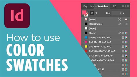
The Swatches panel serves as the primary location for all the colors, gradients, and tints within your InDesign document. It allows for the quick and consistent application of these color elements to objects and text. When a swatch is applied to the fill or stroke of a selected object or text, that swatch will be highlighted within the Swatches panel, providing immediate visual feedback. Swatches created within a document are intrinsically linked to that specific document, ensuring that your color choices remain consistent from creation to final output.
The Swatches panel can be accessed by navigating to Window > Color > Swatches. Within this panel, you'll find a menu in the upper-right corner, which opens up a range of options for managing your colors.
Creating New Color Swatches
One of the most fundamental uses of the Swatches panel is the creation of new color swatches. Before creating a new swatch, it's advisable to deselect all objects on your page by clicking on the pasteboard or an empty area. This ensures that the new swatch isn't immediately applied to an existing object, allowing for deliberate application later.
To create a new color swatch, open the Swatches panel menu and select "New Color Swatch." This action opens the "New Color Swatch" dialog box. Here, you'll first decide on the color type: Process or Spot.
Process Colors vs. Spot Colors
Understanding the difference between process and spot colors is crucial for print production.
- Process Colors: These colors are created using a specific combination of four primary inks: Cyan (C), Magenta (M), Yellow (Y), and Black (K). When these inks are mixed in varying percentages, they can reproduce a wide spectrum of colors. Process colors are ideal for documents with numerous colors where exact color matching isn't paramount, and cost-effectiveness is a consideration.
- Spot Colors: These are premixed inks that are applied directly to the paper. Spot colors are used when a document contains only a few specific colors, and the accuracy of those colors is critically important, such as for branding or corporate identity. Using spot colors requires that your printer has the specific ink available. If you are printing on a printing press and know your printer is using special Pantone inks, spot colors are the way to go.
In the "New Color Swatch" dialog box, you can choose your desired color mode (e.g., CMYK, RGB, HSB). For CMYK, you'll enter the percentage values for cyan, magenta, yellow, and black. For instance, to create a specific shade of blue, you might enter 51% cyan, 64% magenta, 42% yellow, and 14% black.
You also have the option to name your swatch. By default, InDesign names process color swatches based on their component values (e.g., C=51 M=64 Y=42 K=14). If you uncheck "Name with Color Value," you can enter a unique, descriptive name for your swatch, which can be incredibly helpful for organization and clarity, especially in complex documents. Once you've set your color values and name, click "Add" to incorporate the new swatch into your Swatches panel.
Editing and Managing Existing Swatches
The Swatches panel isn't just for creating new colors; it's also a powerful tool for managing and refining existing ones.
Swatch Options
To modify an existing swatch, double-click on it within the Swatches panel. This opens the "Swatch Options" dialog box, where you can adjust its color mode, values, and name. This is particularly useful for fine-tuning colors or making slight variations of an existing hue.
Duplicating Swatches
Duplicating a swatch is a common practice when you want to create a warmer or cooler variation of an existing color without starting from scratch. Select the swatch you wish to duplicate and choose "Duplicate Swatch" from the Swatches panel menu. You can then edit the duplicated swatch as needed.
Deleting Swatches
When you decide to remove a swatch, select it and choose "Delete Swatch" from the panel menu. However, if the swatch has been applied to an object in your document, InDesign will prompt you to designate a replacement swatch. You can choose an existing swatch or even an unnamed swatch to take its place. This ensures that no objects are left with an orphaned color.
It's important to note that you cannot delete spot colors that are used by placed graphics within your document. To remove such spot colors, you must first delete the associated graphic. In rare instances, a spot color might persist even after the graphic has been removed, requiring further investigation.
Adding Unnamed Colors
Sometimes, colors are applied to objects without being formally added to the Swatches panel, resulting in "unnamed" colors. To find and manage these, use the "Add Unnamed Colors" option from the Swatches panel menu. This command searches your document for any unnamed colors applied to objects and adds them to the Swatches panel, allowing you to name them and use them consistently.
Sorting Swatches
As your document grows, so too can the number of swatches. To keep things organized, you can sort your swatches by name or by their color values. This makes it easier to locate specific colors quickly.
Built-in Swatches and Their Functions
InDesign comes with several essential built-in swatches that serve specific purposes:
- None: This swatch is used to remove the stroke or fill from an object. Applying "None" to a fill or stroke effectively makes that attribute transparent.
- Registration: This is a special swatch that causes objects to print on every separation from a PostScript printer. It's commonly used for crop marks and registration marks that need to appear on all color plates.
- Black: This is a 100% process color black defined using the CMYK color model. It's a fundamental color and cannot be edited or removed. By default, all occurrences of this "Black" swatch overprint underlying inks, meaning it prints on top of any colors beneath it.
- Paper: This built-in swatch simulates the color of the paper on which your document will be printed. Objects behind a "Paper" colored object will not print where they overlap; instead, the color of your actual paper will show through. You can edit the "Paper" color to match your specific paper stock by double-clicking it in the Swatches panel. However, this swatch is for preview purposes only and will not print on a composite printer or in color separations. You cannot remove this swatch, nor should it be applied to an object to remove its color.
How to Work with Color Swatches in Adobe InDesign | Kate Danielle, Design Digital Products
Importing and Exporting Swatches
The ability to import and export swatches significantly enhances workflow efficiency and consistency, especially when collaborating with others or working across multiple projects.
Importing Swatches
Adobe InDesign allows you to import swatches from various sources:
- Other InDesign Documents (.indd, .indt): You can bring in all or a selection of swatches from another InDesign document or template.
- Adobe Illustrator Files (.ai, .eps): Swatches from Illustrator files can also be incorporated.
- Adobe Swatch Exchange Files (.ase): These files can be created by InDesign, Illustrator, or Photoshop and are a universal way to share color palettes.
- Pre-loaded Color Libraries: InDesign includes several pre-loaded color libraries, such as ANPA, DIC Process Color Note, Focoltone, PANTONE, and Toyo Color Finder. These libraries offer standardized color sets that are useful for various printing scenarios.
To import swatches, navigate to the Swatches panel menu and choose "Load Swatches." Then, select the file or library you wish to import. You can then choose to add all swatches or select specific ones to add to your current document's Swatches panel.
Copying Swatches Between Documents
A quick way to transfer swatches is by copying or dragging them (or objects with swatches applied) directly from one open InDesign document to another. When you do this, the swatch is automatically added to the Swatches panel of the destination document.
Saving Swatches for Exchange
To save your custom swatches for use in other documents or applications, you can save them as an Adobe Swatch Exchange (.ase) file. This is done through the Swatches panel menu.
Swatch Compatibility and Limitations
It's important to be aware that not all swatch types can be shared between applications. Patterns, gradients, mixed inks, tints, and the Registration swatch cannot be shared. Additionally, specific swatches like book color references, HSB, XYZ, duotone, monitorRGB, opacity, total ink, and webRGB from Photoshop, as well as the Registration swatch from Illustrator or InDesign, have limitations in cross-application sharing.
Working with Color Libraries
InDesign provides access to several industry-standard color libraries, which are invaluable for ensuring color consistency and managing print-related issues.
ANPA
Consists of 300 colors selected by the American Newspaper Publishers Association. This library is useful for publications intended for newspaper printing.
DIC Process Color Note
Provides 1280 CMYK spot colors from the DIC Process Color system, widely used in Japan.
Focoltone
This library consists of 763 CMYK colors. Using Focoltone colors can help avoid prepress trapping and registration problems, as the Focoltone charts show the overprints that make up the colors.
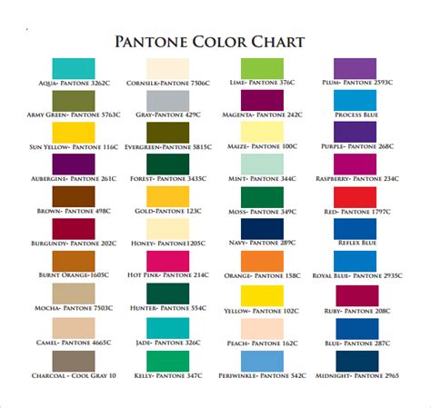
PANTONE
The PANTONE Matching System is a globally recognized standard for color communication. You can use PANTONE spot colors for precise color reproduction. InDesign allows you to print a solid PANTONE color and compare it to its closest process color match using the PANTONE solid to process guide. PANTONE process guides also offer a selection of over 3,000 process color combinations.
Toyo Color Finder
This library provides samples of Toyo Ink colors, which are commonly used in Japan and other regions.
These libraries offer a structured approach to color selection, ensuring that the colors you choose are reproducible by commercial printing processes and that you can effectively communicate your color intentions to your print provider.
Advanced Swatch Management and Best Practices
Beyond the basic creation and application of swatches, several advanced techniques and best practices can significantly improve your workflow and the quality of your print output.
Using Swatches for Prepress
When working with a prepress service provider, swatches play a vital role in identifying spot colors. This ensures that the printer knows precisely which inks to use for specific elements, guaranteeing brand color consistency. Clear naming conventions for your swatches are essential in this context.
Synchronizing Swatches in Book Documents
If you're working on a large project divided into multiple InDesign documents (like chapters of a book), you might encounter conflicting swatches. InDesign offers the ability to synchronize settings with a master document, which can include synchronizing swatches. This ensures that all chapters use a consistent set of colors.
Controlling Swatch Display
Within the Swatches panel, you can control the appearance of the swatches. You can adjust the size of the swatch thumbnails and choose whether the swatch name is displayed alongside the color. This visual customization can make the panel more efficient for your personal workflow.
Handling Spot Colors in Placed Images
When you place an image file that contains spot colors into your InDesign document, those spot colors are automatically added as swatches to your Swatches panel. This is a convenient way to incorporate colors from existing artwork, but it also means you'll need to manage these imported spot colors just like any others.
Understanding Color Modes
The choice of color mode (CMYK, RGB, etc.) is critical depending on your output destination. For print, CMYK is the standard. RGB is primarily for digital displays. When defining a new swatch, selecting the correct color mode from the outset will prevent color shifts and ensure accurate representation.
Saving Swatch Libraries for Reuse
By saving your custom swatches in an Adobe Swatch Exchange (.ase) file, you create a reusable library. This is invaluable for maintaining brand consistency across different projects or for sharing color palettes with colleagues. You can load these .ase files into InDesign, Illustrator, or Photoshop.
The Importance of Naming
While InDesign can automatically name process color swatches based on their CMYK values, giving them descriptive names is a far better practice. For example, instead of "C=10 M=75 Y=100 K=0," a name like "BrandRedPrimary" is infinitely more understandable and useful, especially in team environments or when revisiting a project later. The "Name with Color Value" option in the Swatch Options dialog box allows you to toggle this automatic renaming behavior.
Avoiding Unnamed Colors
As mentioned earlier, unnamed colors can lead to inconsistencies and make editing more difficult. Regularly using the "Add Unnamed Colors" feature and then assigning meaningful names to these colors will contribute to a cleaner and more manageable document.
Duplicates and Consolidation
When importing swatches or copying elements between documents, you might inadvertently create duplicate swatches. These duplicates can appear with slightly different names or values, leading to confusion. InDesign provides tools to help consolidate these duplicate swatches, allowing you to merge them into a single, definitive swatch. This process ensures that you're using a unified set of colors throughout your project.
By diligently managing your swatches, understanding the nuances of color modes, and leveraging the various tools and libraries available in Adobe InDesign, you can achieve professional and consistent color results in all your print publications. The Swatches panel is not merely a collection of colors; it's a powerful control center that underpins the visual integrity and emotional impact of your designs.