The world of color is rich and nuanced, but when it comes to bringing designs to life on paper, a specific set of inks and a corresponding color model reign supreme: CMYK. This acronym, standing for Cyan, Magenta, Yellow, and Key (Black), is the bedrock of all print design. Understanding this model is not just a technicality; it's essential for designers to ensure color accuracy and achieve high-quality resolution in printed materials. Whether you're designing a logo for business cards, a striking poster, or intricate product packaging, a firm grasp of CMYK is paramount.
What is the CMYK Color Model?
The CMYK color model is a subtractive color model fundamentally used in color printing. In this system, inks are applied to a substrate, typically white or light-colored paper, and they work by absorbing (subtracting) certain wavelengths of light, reflecting the rest. White is the color of the substrate itself, meaning no ink is applied. Conversely, black is achieved by combining all four inks, though a pure black ink is also used for depth and definition. This is in stark contrast to additive color models, such as RGB (Red, Green, Blue), which are used for digital displays. In additive models, colors are created by emitting light, where combining all primary colors results in white, and the absence of light is black.
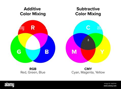
The CMYK model is an evolution of the CMY model, which initially omitted black ink. The addition of black ink, represented by "K," significantly enhances the depth, contrast, and detail in printed images. Pairwise combinations of cyan, magenta, and yellow inks can produce red, green, and blue, but the inclusion of black ink allows for a much broader and more nuanced color spectrum, especially for darker tones and fine details.
The Role of Each Component: Cyan, Magenta, Yellow, and Key
Each of the four components in the CMYK model plays a distinct role in the printing process:
- Cyan (C): A bluish-green color. Cyan ink absorbs red light.
- Magenta (M): A purplish-red color. Magenta ink absorbs green light.
- Yellow (Y): A bright yellow color. Yellow ink absorbs blue light.
- Key (K): Black. The "K" stands for "key."
The term "key" for black has its roots in traditional printing processes. In these older methods, a "key plate" was used to carry the most detailed and important information of an image, often in black ink. This plate was crucial for aligning the other color plates and ensuring sharp details and dark areas were accurately represented. Over time, "key" became synonymous with the black ink plate in the printing industry. Using "K" also serves to avoid confusion with "B" for blue, which is already a primary color in the RGB model.
Designers layer different amounts of cyan, magenta, and yellow inks to create a vast spectrum of colors. For instance, a combination like C=0%, M=50%, Y=100%, K=0% can produce a bright orange. However, to achieve a true, deep black, printers often rely on the Key (K) ink alone, or a combination of all four inks for a "rich black." A typical rich black might be C=60%, M=60%, Y=60%, K=100%, providing a deeper, more solid black for large areas of coverage and enhancing overall contrast.

Halftoning: Creating Continuous Tones from Dots
A critical technique that enables the CMYK model to produce continuous tones and a wide range of perceived colors is halftoning, also known as screening. This process involves breaking down continuous-tone images into a series of small dots of varying sizes and spacing. When viewed from a distance, the human eye blends these dots, creating the illusion of intermediate colors and shades between the primary CMYK inks. The density and arrangement of these dots determine the final color and tone.
CMYK vs. RGB: A Fundamental Difference
The most significant distinction between CMYK and RGB lies in their application and how they create color. As mentioned, CMYK is a subtractive model for printing, while RGB is an additive model for digital displays.
RGB (Red, Green, Blue): Used for screens (monitors, TVs, smartphones). Colors are created by emitting light. Combining red, green, and blue light at full intensity produces white. Black is the absence of light. RGB generally has a wider color gamut, meaning it can display more vibrant and saturated colors, making it ideal for digital content.
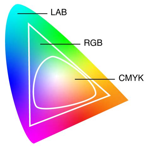
CMYK (Cyan, Magenta, Yellow, Key/Black): Used for printing. Colors are created by subtracting light reflected from a surface. Combining cyan, magenta, and yellow inks theoretically produces black, but in practice, a separate black ink is essential for true blacks and detail. CMYK's color gamut is typically more limited than RGB's, and this is a crucial consideration when preparing designs for print.
This difference means that colors viewed on a screen (RGB) may not translate perfectly to print (CMYK). Understanding this discrepancy is vital for designers to manage expectations and ensure their printed materials accurately reflect their vision.
What is the difference between RGB and CMYK?
Why CMYK is Crucial for Printing
The importance of the CMYK color model for printing cannot be overstated. It provides the framework for accurate color reproduction across a multitude of printed materials, from the smallest business card to the largest billboard.
Color Consistency: CMYK's subtractive nature, when properly managed, ensures uniform results across different printing runs and on various substrates like paper and fabric. This consistency is critical for brand integrity, ensuring that marketing materials, packaging, and other printed collateral maintain a cohesive visual identity.
Achieving Specific Colors: While pairwise combinations of C, M, and Y can create a range of colors, the addition of K allows for the nuanced rendering of shadows, fine details, and text. This is particularly important for professional printing where precise color matching is often a requirement.
Device Independence (with caveats): While CMYK is a standardized model, the actual inks and printing processes can vary between manufacturers. This is why color management systems and ICC profiles are essential. These systems help to map colors accurately between different devices and ensure that the CMYK values in a design file translate as closely as possible to the final printed output.
When to Use CMYK
The fundamental rule for using CMYK is simple: if it's going to be printed, use CMYK. This encompasses a vast array of applications:
- Business cards
- Posters and flyers
- Billboards and banners
- Stationery (letterheads, envelopes)
- Promotional items (swag like T-shirts, mugs, pens)
- Brochures and leaflets
- Product packaging
- Menus
- Magazines and books
For brands that operate in both the digital and print realms, it's crucial to have tools and workflows that facilitate seamless color translation. Graphic design software often allows designers to work in either RGB or CMYK, and understanding when to switch is key.
Converting RGB to CMYK: Navigating the Transition
Designs created for digital screens are typically in RGB. Before sending these designs to a professional printer, conversion to CMYK is a mandatory step. This conversion process, however, is not always a simple one-to-one translation.
Color Gamut Differences: As noted, RGB generally has a wider color gamut than CMYK. This means that some of the vibrant, saturated colors achievable in RGB might be outside the reproducible range of CMYK inks. During conversion, these colors may appear duller or shift in hue.
Fine-Tuning: It's essential to review and fine-tune colors after an RGB to CMYK conversion. Designers may need to adjust specific hues, saturation, and brightness levels to compensate for the changes and ensure the printed colors are as close as possible to the original intent.
Software Tools: Most professional graphic design software, such as Adobe Photoshop, Illustrator, and InDesign, have built-in functions for converting RGB to CMYK. These tools often allow for the selection of specific CMYK color profiles that correspond to different printing conditions (e.g., coated vs. uncoated paper).
Maintaining Color Consistency Across Platforms
For designers working with platforms like Figma, which are primarily used for UI design (and thus RGB-based), maintaining color consistency for print projects requires a conscious effort. This often involves:
- Understanding CMYK Values: Even when designing in RGB, having an awareness of CMYK color values and how they translate can be beneficial.
- Using Plugins: Tools and plugins are available for platforms like Figma that can help visualize or convert designs to CMYK, offering a preview of how colors might appear in print.
- Consulting Print Providers: The most reliable way to ensure color consistency is to work closely with your print service provider. They can offer guidance on color profiles, acceptable color variations, and provide proofs for review before a large print run.
Common File Formats for CMYK Printing
When preparing files for professional printing, using the correct file formats is crucial to preserve CMYK color information and ensure accurate reproduction. Some of the most common and recommended file types include:
- PDF (Portable Document Format): Widely considered the industry standard for print. PDFs are versatile and can embed fonts, images, and color profiles, ensuring that the file looks the same on any system and is ready for professional printing workflows. PDFs are ideal for CMYK files because they work with a wide range of programs and are excellent for packaging final print-ready artwork.
- AI (Adobe Illustrator): Native Adobe Illustrator files are vector-based and fully support CMYK color mode. They are ideal for creating logos, illustrations, and graphics that require scalability without loss of quality.
- EPS (Encapsulated PostScript): Another vector-based format that supports CMYK color mode. EPS files are often used for logos and graphics that need to be placed in page layout programs.
- TIFF (Tagged Image File Format): A raster image format that supports CMYK color and high-resolution images. TIFF is often used for photographs and complex raster artwork intended for print.
It's important to note that while CMYK is for printing, it does not inherently support transparency. Transparency effects in designs are typically handled using an alpha channel, often associated with RGBA color models, and need to be managed carefully during the CMYK conversion process.
Beyond CMYK: Spot Colors and Color Gamuts
While CMYK is the workhorse of process printing, it's not the only color system used.
Spot Colors: In contrast to CMYK's process printing (where colors are built from combinations of four inks), spot color printing uses pre-mixed inks, each with a specific formulation. The most well-known system for spot colors is Pantone Matching System (PMS). Spot colors are often used for branding, where precise color matching is critical, or for achieving colors that are difficult or impossible to reproduce with CMYK inks. While CMYK uses a combination of four colors for printing, Pantone colors are pre-mixed ink colors with specific formulations. Pantone colors offer consistency and accuracy, but they can be more expensive and are often used for specific branding requirements.
Color Gamut: The color gamut refers to the range of colors that a particular device or color model can reproduce. The CMYK color gamut represents the limitations of the CMYK ink set in capturing certain colors. Designers must be aware of the CMYK color gamut to ensure their designs remain achievable in print and to avoid disappointment when colors don't translate as expected. Working within the CMYK gamut from the outset, or carefully managing conversions, is key to successful print design.
Ensuring Color Accuracy in CMYK Printing
Achieving accurate and consistent color in CMYK printing involves a multi-faceted approach:
- Monitor Calibration: Calibrating your computer monitor regularly ensures that the colors you see on screen are as accurate as possible. This involves using calibration hardware and software to adjust your monitor's brightness, contrast, and color balance to a specific standard.
- Color Management Systems (CMS): CMS, often utilizing ICC (International Color Consortium) profiles, are essential for mapping colors between different devices (monitor, printer, scanner) and ensuring consistency. An ICC profile is a set of data that characterizes a color input or output device.
- Print Profiles: Using CMYK color profiles that are specific to your chosen printing method and paper type is crucial. For instance, "Coated" profiles are used for glossy or coated paper, while "Uncoated" profiles are for matte or uncoated paper. These profiles help the software accurately simulate how CMYK inks will appear on that particular substrate.
- Working with Reputable Printers: Partnering with a professional print service provider who understands color management and maintains high-quality standards is paramount. They can provide valuable insights, manage the printing process effectively, and offer color proofs for your approval.
- Test Prints and Proofs: Before committing to a large print run, it's highly recommended to obtain a physical proof or a digital contract proof. This allows you to see how the colors will actually appear on the printed material and make any necessary adjustments.
By understanding the nuances of the CMYK color model, its relationship with RGB, and the importance of proper preparation and management, designers can effectively bridge the gap between digital concepts and tangible, high-quality printed outputs. The "K" in CMYK, representing the vital black plate, is more than just a letter; it's a key component that unlocks depth, detail, and the full potential of color in the world of print.