Bitmap images, often referred to as raster images, form the very foundation of most digital visuals we encounter daily. At their core, these images are constructed from a meticulous grid of individual pixels, where each pixel is a tiny block of color. When these pixels are arranged and colored in a specific way, they coalesce to form a complete picture. This pixel-by-pixel composition is what enables bitmap images to capture an astonishing range of subtle color variations and smooth gradients, resulting in the lifelike, photographic effects that are so prevalent in our digital world. From the snapshots captured by digital cameras to images scanned into computers, the majority of what we perceive digitally falls under the umbrella of bitmap graphics. However, this ability to render intricate detail and smooth transitions comes with a trade-off: file size. Understanding the fundamental differences between bitmap and vector graphics is crucial for effective image creation and editing. While Photoshop is a remarkably versatile tool capable of handling both types of graphics, it is primarily recognized as a powerhouse for editing these pixel-based images.
Understanding the Bitmap Color Mode in Photoshop
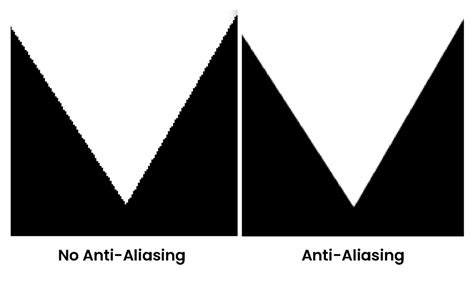
Within Adobe Photoshop, the Bitmap color mode represents a distinct and specialized way of handling images, differing significantly from modes like Grayscale. It is often described as a "true" black-and-white mode, exclusively utilizing only black and white pixels to construct the image. This means that any shades of gray or color information present in an image are converted into either pure black or pure white. When a Photoshop raster image is saved or converted into the Bitmap color mode, the result is effectively hard-edged line art. This process actively removes anti-aliasing from artwork, which is a technique used to smooth the edges of digital images by blending colors at pixel boundaries. Without anti-aliasing, the edges of the image appear rough and jagged.
The effect of anti-aliasing is best understood visually. An image with no anti-aliasing will display a stark, unsoftened edge. Conversely, anti-aliasing creates a subtle transition, making the edges appear smoother and more integrated into the background. When you create a bitmap image, it's important to distinguish this from the Windows BMP file format, although the latter is a common file type for bitmap images. By converting an image to the Bitmap color mode, you are essentially creating a sharp, press-ready image, but one that comes with severe restrictions.
A significant limitation of the Bitmap color mode is that it can only ever appear as a single color within a document. Furthermore, to achieve an appearance of smoothness in print, such an image needs to be of extremely high resolution, typically 1200 DPI (dots per inch) at its actual print size. The Bitmap color mode is often employed when a vector graphic alternative is not readily available or practical. For instance, if you are provided with a single-color logo on a letterhead, it might be quicker to scan the logo and create a Bitmap TIFF file rather than meticulously recreating the graphic in vector-based software like Adobe Illustrator.
Preparing and Converting Images to Bitmap Mode
The process of preparing and converting an image to Bitmap mode in Photoshop can be approached with the goal of enhancing organic elements like signatures. This often involves manipulating tools such as Median and Levels. Let's consider an example: opening a file in Photoshop, perhaps a scanned signature. If you double-click the magnifying glass tool, the view will default to "Actual Pixels," which is the smoothest view available on screen. While the signature might look acceptable on screen, it will likely not suffice for print. If such an image is placed directly into page layout software like QuarkXPress or InDesign, it will often appear with a solid white background block and a fuzzy outline.
Suppose the physical size of this signature image is 4.78cm x 5.08cm with a resolution of 300 DPI. The objective might be to increase its size to 10cm wide while simultaneously increasing the resolution to 1200 DPI, and then finally convert it to line art in Bitmap mode. To begin, ensure you are viewing the image at "Actual Pixels" by double-clicking the magnifying glass or navigating to VIEW > ACTUAL PIXELS.
The image will likely require some cleanup before conversion. Accessing the LAYERS palette is crucial. Click on the ADJUSTMENT LAYERS submenu, often indicated by an icon, and select LEVELS. It is generally advisable to use adjustment layers instead of applying the LEVELS option directly from IMAGE > ADJUSTMENTS > LEVELS. This approach is preferred because it allows for non-destructive editing. Non-destructive editing means that any changes made to the image can be undone or modified later without permanently affecting the original image data. This is considered good practice for virtually all image retouching work.
So, selecting LEVELS from the adjustment layers submenu, you can begin to refine the tonal range. Slide the white triangle slider to the left, and the black triangle slider to the right. At this stage, however, the edges of the signature might still appear quite "jittery" or rough. To address this, it's often beneficial to apply a filter first. Since many filters are "destructive" (meaning they alter the image data permanently), it's wise to duplicate the background layer before applying any filter. This ensures that the original image data remains intact. You can create a copy of the background layer by dragging it over the "New Layer" icon at the bottom of the palette.
Once the layer is duplicated, navigate to FILTERS > NOISE > MEDIAN. The Median filter can help to smooth out rough edges by averaging the colors of neighboring pixels. After applying the Median filter, reopen the LEVELS adjustment layer. Now, slide the white and black sliders together again, observing the effect. You should notice that the edges of the signature are beginning to look crisper and smoother.
The next crucial step is to remove any remaining anti-aliasing to achieve the desired hard-edged line art. While you could convert the image to Bitmap mode at this point, applying one more adjustment layer can often lead to a superior final product. Through the Adjustment Layer submenu, select THRESHOLD. Leaving it at its default value will typically cause all anti-aliasing to disappear, leaving only pure black and white pixels.
10 Advanced Photoshop Tricks Used By TOP JAPANESE ILLUSTRATORS | Rolua Study
This is also the opportune moment to save your work as a layered PSD file. This preserves all your adjustment layers and allows for future modifications.
Implementing Bitmap Images in Page Layout Software
Once the image has been prepared and converted to Bitmap mode in Photoshop, it's ready to be incorporated into page layout software such as QuarkXPress or Adobe InDesign. The process in both applications shares similarities.
QuarkXPress Implementation
To implement a bitmap image in QuarkXPress, start by creating a new A4 document (FILE > NEW > PROJECT). Ensure the default settings are appropriate, or adjust them as needed, deselecting options like "FACING PAGES" and "AUTOMATIC TEXT BOX" if they are not required for your layout.
Next, you'll need to define custom colors. Since you'll be working in CMYK (Cyan, Magenta, Yellow, Key/Black) rather than Spot color, navigate to EDIT > COLORS. Click "NEW" to create your first custom color. Name it "Dark Blue" and enter the following CMYK values: C 100%, M 50%, Y 0%, K 50%. Create a second new color, perhaps named "Light Green," following the same process. It can be helpful to refer to a color wheel to understand the relationships between these color values.
With your colors defined, create a large rectangle on your page using the PICTURE BOX icon in the toolbar. Fill this rectangle with the "Dark Blue" color. Then, select the CONTENT tool from the toolbar. Go to FILE > GET PICTURE and browse to the location where you saved your Bitmap image. Place the image within the picture box. With both the rectangle and content tools still selected, display the color palette and select the middle PICTURE color icon at the top. Clicking on the "Light Green" swatch will then change the color of your placed signature to light green.
Adobe InDesign Implementation
The process in Adobe InDesign is very similar. Begin by going to FILE > NEW > DOCUMENT. Select A4 as the PAGE SIZE and deselect "FACING PAGES" and "MASTER TEXT FRAME" as necessary.
Create your two custom colors with the same CMYK values as defined for QuarkXPress. In InDesign, you can create new color swatches by selecting an existing color swatch and clicking the "NEW SWATCH" button at the bottom of the COLOR palette.
Create a rectangle on your page and fill it with your "Dark Blue" color. Ensure you remove any default outline that might be applied. Select the white pointer, which is the DIRECT SELECTION TOOL (analogous to Quark's CONTENT tool). Go to FILE > PLACE, browse for your Bitmap image, and place it. Click on the image with the DIRECT SELECTION tool to make an orange bounding box appear around the image itself. Then, select your "Light Green" swatch from the color palette, and the signature will change to the desired color.
Bitmap vs. Vector: A Fundamental Distinction
Understanding the difference between bitmap and vector graphics is fundamental to working effectively with digital images. Bitmap images, also known as raster images, are composed of pixels. Each pixel is a discrete unit that holds color information and contributes to the overall image. When working with bitmap images in Photoshop, you have a wide array of tools at your disposal for creating and editing images intended for both print and web applications. However, it's crucial to recognize that Photoshop is primarily a bitmap image editor.
Vector graphics, in contrast, are created using mathematical calculations that define lines, curves, and shapes. The significant advantage of vector graphics is their scalability: they can be enlarged or reduced to any size without any loss of sharpness or quality. This is because the image is not made up of a fixed number of pixels but rather a set of instructions that the software interprets.
When editing vector graphics within Photoshop, different tools are employed, such as the Pen Tool or Shape Tools, which allow for the creation and manipulation of these mathematically defined elements. In summary, a clear understanding of the differences between bitmap and vector graphics, along with their respective tools and applications within Photoshop, is essential for proficient digital image creation and editing.
The Technicalities of Bitmap Graphics
Bitmap graphics, or raster graphics, are digital images constructed from a grid of individual pixels. Each pixel within this grid represents a specific color, and when collectively arranged, they form the complete image. Common file formats associated with bitmap graphics include JPEG, PNG, GIF, and BMP. These formats are widely used for digital photographs and web images due to their ability to represent intricate details and a broad spectrum of colors.
A key characteristic of bitmap graphics is their resolution dependency. The quality of a bitmap image is intrinsically tied to its resolution, which is typically measured in pixels per inch (PPI) or dots per inch (DPI). A higher resolution signifies a greater number of pixels within a given area, resulting in a sharper and more detailed image. This is particularly important when preparing images for print. For instance, a resolution of 300 DPI is generally considered sufficient for high-quality print output, ensuring that the printed image appears crisp and clear. Conversely, for web usage, resolution is often considered in relation to the display size and the ability of the image to be viewed effectively on various devices. Web browsers automatically scale bitmap images based on the user's screen size and resolution.
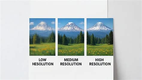
The pixel-based structure of bitmap images means that when they are enlarged beyond their original size, the individual pixels become more apparent, leading to a phenomenon known as pixelation. This results in a loss of detail and clarity, with the image appearing blocky or jagged. Conversely, vector graphics, built on mathematical equations, do not suffer from this degradation when scaled.
Color Depth and File Formats
The range of colors that can be displayed in a bitmap graphic is determined by its color depth, which is expressed in bits per pixel. Higher color depths allow for a more extensive palette of colors, leading to more vibrant and nuanced images. For example:
- 1-bit: Allows for 2 colors (black and white).
- 8-bit: Can display 256 colors, commonly used in GIF images.
- 16-bit: Supports 65,536 colors, offering a more vibrant range.
- 24-bit: Can produce over 16 million colors, commonly used in high-quality images and photographs.
While higher color depths enhance visual quality, they also result in larger file sizes. This necessitates an understanding of image compression techniques to balance quality and file size, especially for web applications where faster loading times are crucial. Common compression methods include lossy compression (like JPEG), where some image data is sacrificed for smaller file sizes, and lossless compression (like PNG), which reduces file size without any loss of data.
Different file formats serve distinct purposes. JPEG is widely used for photographs due to its efficient compression. PNG supports lossless compression and transparency, making it suitable for web graphics. GIF is popular for animations and simple graphics with transparency. TIFF is a versatile format supported by many applications and is often used for print. BMP files, while a type of raster image format, are typically uncompressed, leading to larger file sizes but also preserving maximum image data.
Techniques for Enhancing Bitmap Graphics
Several techniques are employed to enhance and manipulate bitmap graphics effectively. Image resampling involves changing the size of a bitmap image, with various methods like nearest neighbor or bilinear interpolation attempting to maintain quality. Color correction is crucial for adjusting colors to achieve desired tonal values and overall aesthetic. Layering, a core feature in Photoshop, allows for the creation of complex effects by working with multiple image layers independently.
When resizing a bitmap image, it's always advisable to work with a backup of the original to avoid irreversible quality loss. Understanding how different resampling methods affect the image is key; for instance, bilinear interpolation generally yields smoother transitions in pixel colors compared to the nearest neighbor method.
Mastering these techniques, alongside an understanding of color modes (such as RGB for digital displays and CMYK for printing), enables users to optimize bitmap graphics for various applications. Software tools like Adobe Photoshop and GIMP offer extensive functionalities for manipulating bitmap graphics, including cropping, resizing, and color adjustments, allowing users to refine images to meet specific project requirements.
The Role of Bitmap Mode in Specific Applications
The Bitmap color mode in Photoshop, with its exclusive use of black and white pixels, offers unique advantages in specific scenarios. It significantly reduces file size, sometimes to a fraction of the original color or grayscale version, as it only stores two colors. This can be particularly useful for designing for devices or platforms that have limited color output capabilities or for applications where extreme file size reduction is paramount.
While it won't display color, the detail and simulated gray shades that can be achieved in Bitmap mode, especially with methods like Diffusion Dither, can appear remarkably close to a true grayscale image, and importantly, they can take considerably less time to print. This makes it a viable option for certain types of line art, logos, or graphics intended for high-contrast reproduction. Furthermore, images in Bitmap mode will generally look decent on any printer, regardless of whether it's a color or monochrome device.
The "Method" options within the Bitmap conversion dialog box offer different approaches to converting grayscale to black and white:
- 50% Threshold: This method examines each pixel's brightness. If the brightness is 128 or less (on a scale of 0 to 255), the pixel becomes black; if it's 129 or more, it becomes white. This is a straightforward, binary conversion.
- Pattern Dither: This method attempts to distribute black and white pixels in a more even pattern, which can result in a more "readable" image, especially if the resolution is sufficiently high.
- Diffusion Dither: Generally considered a better choice for a more realistic-looking result, Diffusion Dither scatters pixels semi-randomly, creating a smoother tonal transition.
- Halftone Screen: This method is more specialized. Historically used in printing to simulate grayscale images, it remakes the image as a regularly spaced pattern of dots of varying sizes. While effective for certain print media, it's less commonly used for on-screen or conventional computer printing today.
It's important to note that editing bitmap images directly in Photoshop has limited capabilities. If you need to make significant adjustments to an image that has been converted to Bitmap mode, you will typically need to switch back to Grayscale or another color mode, perform your edits, and then reconvert to Bitmap mode if necessary. When copying and pasting parts of a bitmap image, be mindful that you can only copy and paste between images that are in the same color mode. Finally, while Bitmap mode is excellent for creating sharp, high-contrast visuals, it's essential to remember that the paths and edges might not be as smooth as those found in vector graphics.