Leading, a term that might sound technical but is essential for anyone working with typography, refers to the vertical space between lines of text. In the realm of design software like InDesign, understanding and manipulating leading is a fundamental skill for creating visually appealing and highly readable documents. The word ‘leading’ itself originates from the strips of lead that hand-typesetters used to place between lines of type to ensure even spacing. When you type more than one line of text in InDesign, the program automatically applies a default leading value. However, this default is not always optimal and can often result in paragraphs that appear squashed, lacking the necessary visual breathing room.
Understanding the Fundamentals of Leading
At its core, leading is defined as the distance between the baselines of two consecutive lines of type. The baseline is an invisible guide upon which most letters sit, with characters like 'a', 'e', and 'x' resting on it, while those with descenders (like 'p' or 'g') extend below it. In InDesign, leading is precisely measured from the baseline of one line of type to the baseline of the line immediately above it.
By default, InDesign employs an "auto-leading" setting, which is typically set at 120% of your type size. For instance, if you are working with a 10-point font, InDesign will automatically apply a 12-point leading. This auto-leading serves as a minimum value, ensuring a basic level of separation between lines. However, the true power of typesetting lies in the ability to customize this spacing to achieve specific aesthetic and legibility goals.
Why Leading Matters: Aesthetics and Readability
The amount of leading applied has a direct impact on the overall appearance and readability of your text. Generous leading allows text to "breathe," making paragraphs instantly more attractive and easier on the eyes. When leading is too tight, paragraphs can appear as a solid, dense block of ink, making it difficult for the reader to distinguish individual lines. This is particularly problematic as the ascenders (the parts of letters like 'h' or 'l' that extend upwards) and descenders (the parts of letters like 'p' or 'g' that extend downwards) can crash into each other, creating visual clutter and hindering comprehension.
Conversely, while generous leading can improve the look of paragraphs, making the leading overly generous can disrupt the flow of the text. If the space between lines becomes too large, the reader can lose the continuity of the lines of text, making it harder to follow the narrative or argument. The right amount of leading, therefore, is crucial. It not only results in an aesthetically pleasing page but also significantly aids the reader in comfortably consuming the content.
Adjusting Leading in InDesign: Practical Steps
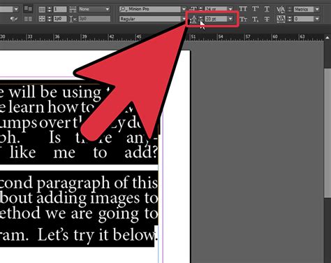
Adjusting leading in InDesign is a straightforward process, accessible through two primary panels: the Controls panel and the Character panel.
Using the Type Tool: Begin by selecting the Type Tool (T) from the InDesign toolbar. Create a text box or select existing text you wish to modify.
Accessing Leading Controls:
- Controls Panel: This panel typically runs along the top of your InDesign workspace. Once text is selected, you will see options for font size, leading, and other character-related settings. The leading option is usually positioned directly below or next to the font size setting.
- Character Panel: For more detailed control, navigate to
Window > Type & Tables > Character. This panel provides a comprehensive set of typography options, including leading.
Applying Leading Values:
- Auto Leading: Setting the leading to "Auto" will apply InDesign’s default leading for the font size you currently have applied. As mentioned, this is usually 120% of the type size.
- Manual Leading: To apply a specific leading value, simply highlight the desired text and choose a new value from the Leading menu in either the Controls or Character panel. For instance, if you have 10-point text and find the default leading too tight, you might increase it to 12 points, 14 points, or more, depending on the desired effect. A common rule of thumb in traditional typesetting was to add 2 points to the type size for a balanced leading, so for 12pt type, 14pt leading would be a good starting point.
Advanced Considerations and Potential Conflicts
It's important to note that leading is a character attribute. This means that different parts of a single paragraph can, in fact, have varying leadings, offering a high degree of typographic control. However, this flexibility can sometimes lead to unexpected results if other settings are enabled that might override manual adjustments.
Vertical Justification: If you have applied vertical justification to your text frame (which distributes text evenly within the frame's height) or have set the text to "Align to Baseline Grid" (which aligns text baselines to a predefined grid), InDesign may override your manual leading adjustments. To ensure your manual leading is respected, you may need to disable these options or adjust them accordingly. The baseline grid is a fundamental tool for maintaining consistent vertical rhythm, especially in multi-column layouts, but it can interact with manual leading settings.
Font Characteristics: Different fonts have varying designs, and this includes their x-height (the height of lowercase letters like 'x'). Fonts with larger x-heights may require more leading to achieve similar legibility to fonts with smaller x-heights, even at the same point size. When setting text against a colored or dark background, the perceived density of the text can also influence how leading appears.
Context Matters: The ideal leading setting is not universal. It depends on the font, the font size, the line length, the surrounding design elements, and the intended audience. For example, text designed for a large poster might benefit from more generous leading than text in a densely packed annual report.
Generate a Table of Contents in InDesign
Creating Paragraph Styles for Consistent Leading
For projects involving extensive text, such as books or long reports, maintaining consistent leading across entire sections is vital. InDesign's Paragraph Styles feature is invaluable for this purpose. By creating a paragraph style, you can define a set of formatting attributes, including font, size, leading, kerning, and tracking, which can then be applied to any paragraph with a single click. This ensures uniformity and allows for easy global changes if adjustments are needed later. When setting up a paragraph style, you can specify the leading value, whether it’s auto or a fixed amount, ensuring that all text formatted with that style adheres to your desired vertical spacing.
Beyond the Basics: Saving Space and Enhancing Design
Mastering leading is not just about aesthetics; it's also a practical tool for design efficiency. By judiciously adjusting leading, designers can sometimes save valuable space within a layout without sacrificing readability. This can be particularly important in print design, where page count can impact production costs, or in web design, where optimizing for screen real estate is often a priority. Knowing how to control leading is an essential skill for any designer aiming to create readable blocks of text that are also visually engaging and space-efficient. This very essential skill is important to create readable blocks of text that can also help save space in book design and even money.
In conclusion, leading is a fundamental typographic element that significantly influences the readability and aesthetic appeal of text. InDesign provides robust tools for controlling leading, from automatic settings to precise manual adjustments. By understanding the principles of leading and utilizing InDesign's features effectively, designers can elevate their typesetting skills, creating documents that are not only functional but also visually compelling.