Achieving a polished, consistent, and easily readable InDesign document often hinges on the subtle yet powerful application of the Baseline Grid. This feature, though sometimes overlooked, is a fundamental tool for any designer aiming for professional-quality typography. By ensuring that text aligns consistently across a page or spread, the baseline grid establishes a vertical rhythm that enhances legibility and visual harmony.
Setting Up Your Baseline Grid
Once the text and its containers are sized and positioned, the baseline grid can be configured within InDesign's preferences. The exact location of these preferences differs slightly between Windows and Mac operating systems, but the dialog box itself remains consistent. The default color for the baseline grid is typically a light blue, a choice that likely echoes the color of ruled paper used in binders, aiding in visual clarity.
The "Relative To" option is generally most effective when set to "Top Margin." For most conventional business documents, text is confined within the page margins, making this setting a practical starting point. The "Increment Every" measurement is crucial and should precisely match the leading, or line-spacing, of your body text. For instance, if your body text is set at 10pt with 12pt leading, the "Increment Every" value should also be 12pt.
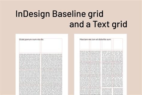
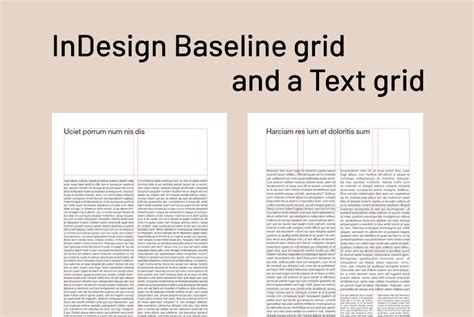
To make the baseline grid visible, navigate to the View menu, then Grids and Guides, and select "Show Baseline Grid." The "View Threshold" setting is also important; it determines at what zoom level the grid becomes visible. Setting this appropriately prevents the grid from cluttering the screen when the text is too small to discern individual lines.
Applying the Baseline Grid to Text
For the baseline grid to function, text objects must be instructed to align with it. This is achieved by selecting the text within a text box. Using the Type tool, click into the text box. It's essential to work with the text itself, not just the container. The simplest method to apply the alignment is through the Paragraph panel. With the desired text selected, locate the "Align to Baseline Grid" button in the bottom-right corner of the Paragraph panel. Clicking this button will snap each line of text to the nearest baseline grid line.
Can this process be automated or set up in advance? Yes, it can. Styles, such as Paragraph Styles, can be configured to include the "Align to Baseline Grid" option. This is particularly useful for documents with extensive text, ensuring consistency and saving significant manual effort.
Understanding the Fundamentals of Typography
Before diving deeper into grid systems, it's vital to grasp the foundational elements of good typography. Good clean typography is a fundamental skill of any designer. Many designers believe they possess this skill, but in my experience, it is something that is developed through time and experience. Early in our design careers, there's often a desire for outrageous creativity. However, as we mature, we begin to realize that simplicity and structure are just as, if not more, important.
The first step in any typographic endeavor is to choose your typeface. For example, a simple, standard font like Helvetica Neue, set at 10pt size with 12pt leading, can be an excellent starting point. Legibility is paramount at this stage. For printed materials, it's advisable not to go below 9pt. If the document is intended for digital viewing, such as a PDF, a larger font size might be more appropriate.
Structuring Your Document with Grids
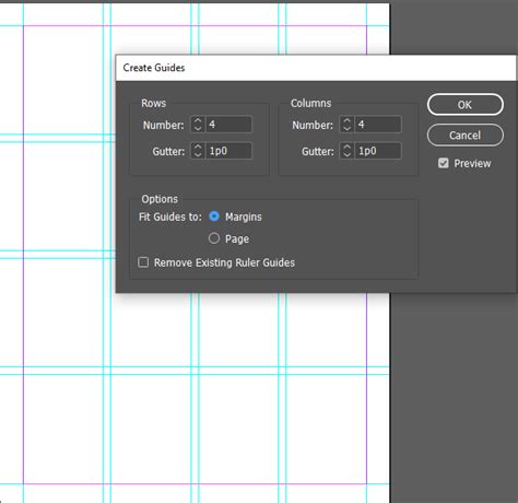
The next consideration is the number of columns your page will utilize. This decision involves balancing aesthetics with legibility. Columns provide structure to a page and make printed documents easier to read. Studies suggest that 8-10 words per line offer the highest legibility. A four-column layout, for instance, can effectively reflect this by breaking text into manageable line lengths.
When setting up columns, also consider the dimensions of the borders and the space between the columns. A common practice is to set the space between columns to half the length of the border. For example, a 10mm border with 5mm between columns creates a well-defined structure. This initial setup already begins to shape the page, establishing a visual framework for the entire document. For a brochure, this consistent structure is key to a cohesive design.
The Vertical Rhythm: Aligning to the Baseline Grid
Having established a vertical grid, the next critical step is setting up a horizontal or baseline grid, to which all text will adhere. This is a key factor in achieving good typography, and InDesign excels with its tools for simplifying this process. Since the leading for the body text has been chosen (e.g., 12pt), the baseline grid should be configured to match this.
To set up the baseline grid, go to InDesign's Preferences, then select Grids. Set the "Start" position, perhaps at 10mm, aligning with your document's top margin. In the "Increment Every" box, input your chosen leading value (e.g., 12pt). Once configured, make the grid visible by going to View > Grids and Guides > Show Baseline Grid. You will now see horizontal guides across the page, spaced according to your type's leading.
To make your text snap to this grid, bring up the Paragraph panel (Window > Type and Tables > Paragraph). Select the text box and click the "Align to baseline grid" button. All lines of text should now align perfectly with the grid lines, creating a consistent vertical rhythm.
Incorporating Headings and Introductions
When adding headings, it's crucial to set their leading in a way that aligns harmoniously with the baseline grid. For example, a title set at 95pt with a leading of 72pt, where 72 is a multiple of the 12pt baseline grid, will naturally align with the body text lines. This ensures that the heading sits well without overlapping or creating awkward visual gaps. The size of the title should also be considered to prevent elements like the ascenders of one line from interfering with the descenders of another, which can reduce legibility and aesthetic appeal. Remember to also click the "Align to baseline grid" button for heading text if it's in its own text frame. Applying a text wrap can also be beneficial, ensuring that subsequent text flows around the heading gracefully.
Similarly, an introduction paragraph can be set with a leading that is a multiple of the baseline grid, such as 24pt leading with a 12pt grid. This meticulous attention to alignment ensures that every element on the page adheres to the established grid, contributing to a neat, structured, and professional feel.
Addressing Challenges and Misconceptions
While the baseline grid offers significant benefits, it's not without its potential frustrations, especially for newcomers. One common issue arises when applying "space after" to paragraphs. When "Align to Baseline Grid" is active, this spacing can sometimes be overridden, leading to paragraphs that are too far apart for the designer's liking.
A key to managing this is understanding that the baseline grid's primary function is to ensure that the lines of text align. If the "space after" for a paragraph is too large, it can push subsequent lines off the grid. The secret, as some experienced designers put it, is "keeping everything on even lines." For instance, with 14pt leading, adding space above and below a heading that totals 14pt (e.g., 10pt above, 4pt below) ensures that the text following the heading will still align to the baseline grid. The heading itself might not perfectly align, but the text that follows will maintain the document's vertical rhythm.
This leads to a crucial point: the baseline grid is a tool, not an absolute dictator. It's not always a necessity for every single paragraph, especially in simpler documents like novels. For extensive reference works with single, large text frames per page, the decision to use the baseline grid might require careful consideration of its impact on paragraph spacing. Some designers might opt to use it only for the first paragraph on each page to establish a starting point.
How and why to use a Baseline Grid in InDesign - Tutorial
The Scope and Versatility of the Baseline Grid
A prevalent misconception is that the baseline grid is exclusively suited for multi-page documents like brochures or publications. While it is indeed ideal for such designs, single-page documents can also benefit immensely from its application. From posters to brochures, employing the baseline grid can elevate the overall design.
To illustrate, consider a scenario where you're working with 11pt text and a 28pt baseline grid. If the leading of the typography is too large, it might not align well. Adjusting the "Increment Every" setting to a value that harmonizes better, such as a 16pt or 8pt baseline, can resolve this. This highlights that designers are not slaves to the grid; they are in control and can adapt their grids and typography to achieve the desired outcome.
For example, if you're using 11pt text with a 15pt baseline, headings of 20pt with the same 15pt baseline might result in overly tight leading. In such cases, selecting smaller baseline increments can offer greater flexibility. A 5pt baseline, for instance, scales easily to 10, 15, and 20pt, while a 6pt baseline accommodates 6, 12, and 18pt increments.
Baseline Grids in Other Adobe Applications
While InDesign offers robust baseline grid functionality, other Adobe applications have their own approaches. Adobe XD, for instance, is more fluid and manual. To set up a grid in XD, open the artboard, click the file name at the top, and access grid options on the right. Choosing a "Square" grid with a default of 8 is a common starting point. When selecting typography line height and size, ensure they are divisible by the square size. For an 8pt square grid, a body text size of 16pt with a line height of 32pt would align. Position the text so it rests on the horizontal grid lines. Similarly, headings like h2 (40pt size, 56pt line height) and h1 (80pt size, 96pt line height) should also be divisible by the square grid increment. Always zoom in to verify that all typography, including paragraph spacing, sits correctly on the baseline grid.
Conclusion: A Powerful Tool for Refined Design
The baseline grid, though initially appearing complex, is a revolutionary tool for anyone serious about typography. It might present a learning curve, and initial frustration is not uncommon. However, persevering with its application in Adobe InDesign can transform a document from amateurish to professional. By ensuring that every line of text aligns consistently, the baseline grid establishes a visual order that significantly boosts readability and creates a polished, confident aesthetic. It removes guesswork, instills confidence in the designer, and ultimately, makes the design look better. Embracing this tool can be a significant step in refining one's typographic and design skills.