The quest for a truly deep, saturated black in printed materials is a common challenge for designers, particularly those creating custom trading cards, tarot decks, or comic books. While on-screen, black might appear as a uniform absence of light, the reality of print is far more complex. The interaction of ink on paper, the limitations of printing processes, and the very nature of color reproduction mean that a simple 100% black (K) often results in a less-than-satisfying flat, washed-out charcoal gray. This phenomenon, known as the Rich Black CMYK conversion, is a critical concept for achieving professional-quality printed outputs.
The Problem with Standard Black
In the realm of digital displays, black is achieved by turning off all the lights, resulting in R:0 G:0 B:0. However, in print, the situation is reversed. Paper is inherently white, and the goal is to cover that white with ink. Standard black ink, represented by K:100, is not entirely opaque. When printed alone, microscopic fibers of the white paper can still show through, and light can reflect off the paper surface, passing through the black ink. The consequence is a muddy, flat dark gray instead of the deep, rich black that designers often envision. This is not a printer error but a fundamental aspect of how black ink behaves on paper.
The Solution: Rich Black CMYK
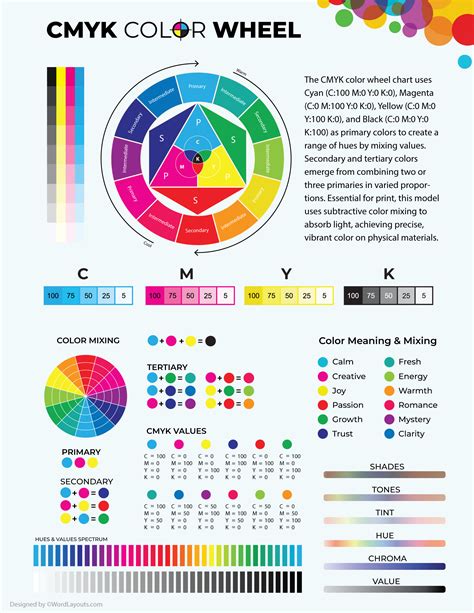
To combat the limitations of standard black, the printing industry employs "Rich Black." This technique involves using a combination of CMYK inks - Cyan, Magenta, Yellow, and Black - to create a much deeper and more saturated black. By strategically layering these colors, the white of the paper is more effectively masked, and the resulting black appears significantly darker and more robust.
The exact CMYK values for a "Rich Black" can vary, leading to much discussion among designers. However, several formulas have emerged as industry standards for achieving a desirable depth without causing printing issues.
One widely recommended and versatile formula for Rich Black is:
- C:60 M:40 Y:40 K:100
This combination is favored for custom trading card backgrounds and large art areas. It produces a "glossy obsidian" look rather than a "charcoal sketch" appearance, providing a neutral black that is essential for maintaining a professional aesthetic, especially in designs like TCG borders.
Another commonly cited formula, often considered the "richest" by some, is:
- C:40 M:30 Y:20 K:100
This formula has also proven to be effective for most projects, delivering a nice, deep black.
A slightly more conservative approach, often recommended to avoid potential issues while still achieving a deep black, is:
- C:30 M:30 Y:30 K:100
This formula is particularly effective in preventing white text and thin white lines from filling in, even with slight misregistration on the press. It allows printing to proceed at normal speeds, ensuring ink dries sufficiently and jobs remain on schedule.
When to Use Rich Black and When to Avoid It
The power of Rich Black lies in its ability to create depth and contrast. It is best utilized for:
- Large art areas and backgrounds: This is where the added density truly shines, creating an immersive and impactful visual.
- Custom trading cards, tarot decks, and comic book art: These applications demand a high level of visual fidelity, and Rich Black helps achieve a professional, polished look.
- Logos and branding material: A deep, consistent black can significantly enhance brand recognition and perceived quality.
- Posters, banners, and brochures: For large-format prints, Rich Black contributes to a more striking and professional appearance.
However, it is crucial to understand the limitations of Rich Black and when to steer clear of it. The primary concern is its impact on fine details.
The "Text Trap": Never use Rich Black for text smaller than 12pt or fine lines.
This is a critical rule. Printing presses apply one color at a time. If there is even a microscopic shift (misregistration) of 0.1mm between the ink plates, the different color layers of Rich Black can become misaligned. This misalignment will cause the Cyan, Magenta, and Yellow layers to print slightly offset from the Black layer, resulting in blurry edges, color fringes, or "ghosting" around small text and fine lines. To avoid this, always use Standard Black (0/0/0/100) for text under 12pt and fine line art. This ensures that only the black ink is applied, eliminating the risk of color misregistration.
Similarly, when printing black and white photographs in CMYK, using Rich Black can sometimes introduce unwanted color casts - slight, unintentional hues of cyan, magenta, or yellow. For true black and white images, it's often best to work in grayscale and use standard black, or carefully manage the CMYK values to ensure neutrality.
The Danger of "Registration Black"
While the goal is a richer black, there's a point of diminishing returns and potential disaster. "Full Black" or "Registration Black" is achieved by setting all CMYK values to 100% (C:100 M:100 Y:100 K:100). Theoretically, this sounds like the ultimate black. However, this equates to 400% total ink coverage.
⚠️ The Danger Zone: Registration Black (100/100/100/100) should never be used within your artwork for standard printing.
Most papers can only handle a maximum of around 300% ink saturation. Using Registration Black leads to several critical problems:
- Ink will not dry properly: The excessive ink density prevents quick and even drying, leading to smudging and scuffing during the finishing process.
- Ink smearing: The wet ink can easily smear, ruining the print.
- Paper issues: High ink density can cause paper to ripple or warp, making binding and finishing more challenging.
- "Fill-in" of fine details: Even more so than standard Rich Black, Registration Black can cause thin white text or lines to fill in completely due to ink spread.
Registration Black (100/100/100/100) is reserved for specific printer's marks, such as crop, fold, and trim marks, which sit outside the final trim edge of the artwork. These marks are used by printers to align the ink plates and for the finishing team to precisely trim the paper.
How to Get Brighter Prints for Your Print on Demand Products - RGB vs CMYK
Rich Black for Digital Prints?
The question of whether to use Rich Black for digital prints is nuanced. While "digital print" can encompass a wide range of technologies, the principles of ink on paper generally apply. For high-quality digital printing that aims for deep blacks, Rich Black CMYK can indeed be beneficial. However, it's essential to consider the specific capabilities of the digital press and the chosen paper stock.
Different paper finishes absorb ink differently. A Rich Black that appears glossy on a coated card stock might look flatter on an uncoated or linen-finish paper due to increased ink absorption. Therefore, understanding the substrate is half the battle.
The Importance of Soft Proofing and Printer Profiles
To ensure your Rich Black appears as intended, soft proofing is a vital step. In Adobe Illustrator or Photoshop, you can simulate how your colors will appear in print. This is typically done by going to View > Proof Setup > Working CMYK and then selecting an appropriate CMYK profile. For modern digital presses, profiles like GRACoL 2006 or FOGRA39 are often recommended. This allows you to preview the effect of Rich Black on your screen before sending the files to print.
When exporting your final print files, it's crucial to use a print-ready format. Instead of simply selecting "High Quality Print," choose PDF/X-1a from the standard dropdown. This format flattens transparency and "locks in" your CMYK values, preventing unexpected color shifts during the printing process.

Consistency is Key: The Role of Printer Calibration
The effectiveness of Rich Black is also dependent on the calibration of the printing press. Reputable printing services, such as those operating under G7® Master Qualification, ensure their machines are rigorously tested for neutral grays and consistent, rich blacks. If your file is set to a specific Rich Black formula (e.g., C:60 M:40 Y:40 K:100), a well-calibrated press will output that exact density consistently.
Susanna, a Creator Strategy Advocate at QP Market Network, emphasizes that technical errors like muddy blacks can signal amateurism to customers, impacting brand perception. She notes that their system uses automated ICC Profiling to detect files that are too dark, providing a technical advantage. Correct CMYK usage is what separates a generic novelty from a retail-ready collectible.
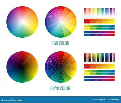
RGB vs. CMYK for Different Applications
It's important to distinguish between CMYK and RGB color modes. As mentioned, RGB (Red, Green, Blue) is used for digital displays, where black is the absence of light. CMYK (Cyan, Magenta, Yellow, Black) is used for print, where colors are created by applying inks to a substrate.
You are asking a trick question if you search for "Rich Black RGB." RGB is a light-based color model, while CMYK is a pigment-based color model. They are fundamentally different and cannot be directly translated without conversion, which can alter the appearance of colors, especially blacks. For web-based projects, always use RGB. For print, always use CMYK.
Conclusion: Mastering the Nuances of Black
Achieving the perfect black in print is an art and a science. While the temptation might be to simply use 100% black, understanding the principles of CMYK and the concept of Rich Black is essential for professional results. By carefully selecting Rich Black formulas, avoiding them for small text and fine lines, and steering clear of Registration Black, designers can ensure their printed materials have the depth, saturation, and professional finish they deserve. Always consult with your print provider and utilize soft proofing to guarantee consistency and avoid the heartbreak of a muddy, washed-out black.