Digital art offers unparalleled flexibility, and a significant part of this power lies in the ability to work with layers and blending modes. ibisPaint, a popular digital illustration application, provides a rich array of Blending Modes that allow artists to control how colors from different layers interact. Understanding and effectively utilizing these modes is crucial for achieving sophisticated lighting, shadow, and color effects. This tutorial delves deep into the world of ibisPaint's Blending Modes, explaining their functionalities and offering practical applications to elevate your digital artwork.
Understanding the Foundation: Layers and Blending Modes
At its core, digital art relies on the concept of layers, where each element of an artwork can exist independently. This is a unique advantage over traditional mediums. Blending Modes dictate the mathematical relationship between the colors of an upper layer and the colors of a lower layer. In essence, they determine how these colors are combined to produce the final visual output.
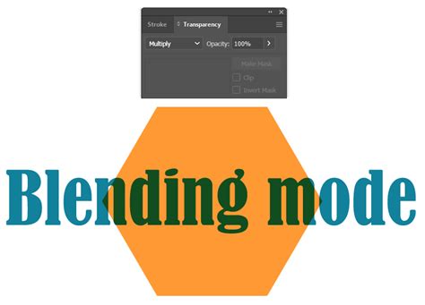
To access and change the Blending Mode of a layer in ibisPaint, navigate to the Layer Window by tapping the ①[Layer Button]. Within this window, you will find the ②[Blending Mode list], where you can select from a wide variety of options. When considering how these modes function, it's helpful to visualize the upper layer as a semi-transparent sheet placed over the lower layer; the resulting effect is akin to looking through cellophane.
Digital colors are managed and displayed numerically, often represented by RGB (Red, Green, Blue) values. In ibisPaint, color brightness is typically represented by values ranging from 0.0 to 1.0. Blending Modes leverage these numerical values to create their distinct effects, making them ideal tools for expressing light and shadow with precision. While the concept of Blending Modes is straightforward, their effective implementation requires practice and experimentation. Simply reading about them may not fully convey their dynamic capabilities.
Darkening Effects: Multiply, Color Burn, and Linear Burn
Several Blending Modes are designed to darken the resulting image, making them invaluable for rendering shadows, adding depth, and intensifying the overall impression of an artwork.
Multiply
The [Multiply] Blending Mode is perhaps one of the most frequently used for creating darker areas. It functions by multiplying the color values of the upper layer with the color values of the lower layer for each RGB channel. This process inherently results in darker colors.
How it Works: If you paint on the upper layer with a brightness value of 0.5, and it is blended with the lower layer, the resulting brightness will be half of the lower layer's original brightness (effectively multiplied by 0.5). Similarly, if the upper layer has a brightness of 0.33, the blended result will be one-third of the lower layer's brightness.
Practical Applications:
- Shadows: [Multiply] is exceptionally effective for painting shadows on skin, hair, or any other surface. By layering a darker color with the [Multiply] mode, you can achieve realistic and natural-looking shading.
- Color Adjustments: To darken a photo or illustration while simultaneously strengthening its impression, you can duplicate the layer, set its Blending Mode to [Multiply], and overlay it on top of the original.
- RGB Channel Separation: A unique application of [Multiply] is its ability to isolate color channels. To extract only the Red channel of an RGB image, place a layer filled with pure red (R=255, G=0, B=0) above the target layer and set its Blending Mode to [Multiply]. The same principle applies to isolating Green and Blue channels using pure green and pure blue, respectively.
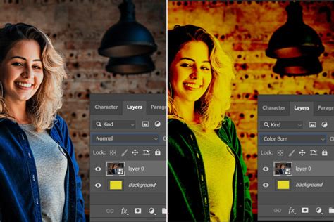
Color Burn
[Color Burn] also darkens the image, but it does so by increasing the contrast between the base color and the blend color, resulting in a richer, darker appearance. It achieves this by increasing the saturation of the darker areas.
How it Works: This mode burns the black into the lower layer, increasing the saturation and darkening the image. It essentially increases the contrast between the colors.
Practical Applications:
- Intensifying Colors: Similar to [Multiply], duplicating an image and applying [Color Burn] to the top layer can darken and strengthen its overall impression, adding a sense of drama or intensity.
Linear Burn
[Linear Burn] is another darkening mode, but it differs from [Color Burn] in its approach. Instead of selectively increasing contrast, it darkens the entire image evenly across both dark and light areas.
How it Works: This mode compares the total RGB values of the lower and upper layers and displays the color with the lower (darker) value. It's a more uniform darkening effect.
Potential Drawbacks: While effective for darkening, [Linear Burn] can sometimes lead to a loss of detail in the darker areas, potentially turning them black.
Brightening Effects: Screen, Color Dodge, and Linear Dodge
Conversely, several Blending Modes are designed to brighten the image, allowing for the creation of highlights, glowing effects, and overall lighter tones.
Screen
The [Screen] Blending Mode brightens the image by multiplying the inverse of the colors. It's the opposite of [Multiply] and is excellent for creating lighter effects.
How it Works: It compares the RGB values of the lower and upper layers and displays the color with the higher (lighter) value for each channel. This process effectively brightens the image while preserving the original ratio of light and dark tones.
Practical Applications:
- Light Effects: [Screen] is a go-to for adding subtle light effects, glows, or atmospheric lighting.
- Color Correction: It can be used to lighten an image or to create a softer, more ethereal look.
Color Dodge
[Color Dodge] brightens the bright areas of an image, often increasing contrast and vibrancy. It's a powerful tool for creating strong highlights and luminous effects.
How it Works: This mode brightens the image by decreasing contrast. It is effective when you want to brighten the image while increasing contrast. Unlike simply brightening the entire image, which can lead to whiteout in bright areas, [Color Dodge] allows for controlled brightening and contrast enhancement.
Practical Applications:
- Highlights and Glows: Ideal for rendering specular highlights on metallic surfaces, glowing magical effects, or the intensity of light sources.
- Enhancing Vibrancy: Duplicating an image and applying [Color Dodge] to the top layer can significantly brighten and increase the contrast, making the image more vivid and impactful.
Linear Dodge (Add)
[Linear Dodge], also known as [Add] in some contexts, brightens the entire image evenly across both dark and light areas. It's a more intense brightening effect than [Screen].
How it Works: This mode brightens the image by increasing the brightness value. Unlike [Color Dodge], which can sometimes lead to blown-out highlights, [Linear Dodge] applies a more uniform brightening. When the opacity is set to 100%, [Linear Dodge] and [Add] behave identically. However, at lower opacities, [Add] becomes significantly brighter, making it particularly effective for rendering glowing elements.
Practical Applications:
- Light Sources and Highlights: [Add] is excellent for creating the appearance of light sources, such as the sun, lamps, or magical energy, as well as intense highlights.
- Glowing Effects: When you need to depict objects that emit light, [Add] is your mode of choice.
RGB Channel Recombination: An interesting application of [Linear Dodge] is in reconstructing RGB channels. If you have previously separated RGB channels using [Multiply] (as described earlier), combining them using [Linear Dodge] will return them to their original state.
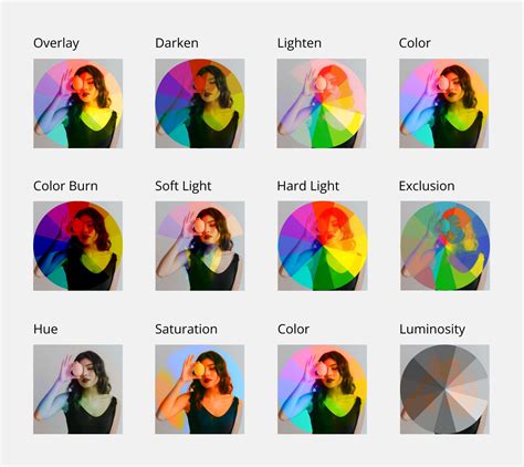
Manipulating Contrast and Tone: Overlay, Soft Light, and Hard Light
These Blending Modes offer nuanced ways to adjust contrast and tone, affecting both dark and light areas in distinct ways.
Overlay
[Overlay] is a versatile mode that darkens dark areas and brightens light areas simultaneously, effectively increasing the overall contrast and vibrancy of the image.
How it Works: It acts as a combination of [Multiply] and [Screen]. If the lower layer is dark, it gets darker; if it's light, it gets lighter. Pure black and pure white areas on the lower layer remain unaffected by the overlaying color.
Practical Applications:
- Color Toning: [Overlay] is frequently used to change the overall color tone of an image. For instance, it can transform a daytime sky to nighttime or alter hair color from brown to blue by overlaying a colored layer.
- Increasing Vibrancy: Overlaying an image onto itself with the [Overlay] mode can significantly boost its vibrancy.
- Hue and Saturation Adjustments: Even if the lower layer is colored, overlaying another layer with [Overlay] can alter the hue, offering creative color manipulation possibilities.
Soft Light
[Soft Light] provides a gentler version of the [Overlay] effect. It slightly darkens dark areas and slightly brightens light areas, resulting in a softer, more subtle increase in contrast.
How it Works: It's akin to shining a diffused spotlight on the image. If the overlaying color is lighter than 50% gray, the image will be lightened; if it's darker than 50% gray, the image will be darkened.
Practical Applications:
- Subtle Enhancements: Use [Soft Light] when the effect of [Overlay] is too strong or when you desire a more delicate adjustment of light and shadow. It's excellent for subtle mood setting or gentle color shifts.
Hard Light
[Hard Light] offers a more intense version of the [Overlay] effect. It makes dark areas very dark and light areas very light, significantly increasing saturation and contrast.
How it Works: This mode is similar to shining a harsh spotlight. If the overlaying color is lighter than 50% gray, the image is lightened with increased contrast; if it's darker than 50% gray, the image is darkened with increased contrast. It's as if the color of the upper layer is directly shining onto the lower layer.
Practical Applications:
- Dramatic Effects: Use [Hard Light] for creating dramatic lighting, strong contrasts, and highly saturated visuals. It can add a punchy, impactful look to your artwork.
Advanced Contrast and Saturation: Vivid Light, Linear Light, Pin Light, and Hard Mix
These modes offer more extreme manipulations of color and contrast, pushing the boundaries of what's possible with Blending Modes.
Vivid Light
[Vivid Light] intensifies the effects of [Hard Light] by further darkening dark areas, lightening light areas, and significantly increasing contrast.
How it Works: It's essentially a more aggressive version of [Hard Light], pushing the tonal range to its extremes.
Linear Light
[Linear Light] takes the concept of [Vivid Light] even further, dramatically darkening dark areas and lightening light areas, resulting in a very high-contrast image.
How it Works: This mode applies a combination of [Linear Burn] and [Linear Dodge] based on the brightness of the overlaying color. It aggressively manipulates brightness and contrast.
Pin Light
[Pin Light] selectively brightens or darkens pixels based on the brightness of the overlaying color, comparing the lower and upper layers.
How it Works: If the color of the upper layer is bright, it results in the lighter of the two colors between the upper and lower layers. If the upper layer color is dark, it results in the darker of the two colors. This selective blending can create interesting textural effects.
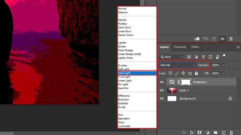
Hard Mix
[Hard Mix] is the most extreme Blending Mode. It forces each RGB channel to either 0 or 255, resulting in only eight possible colors: black, red, green, yellow, blue, magenta, cyan, and white.
How it Works: If the sum of the RGB values of the upper and lower layers is less than 255, it is set to 0. If it is 255 or more, it is set to 255. This creates a posterized, highly simplified color palette.
Practical Applications:
- Stylized Effects: [Hard Mix] can be used to achieve a graphic, posterized look or to create abstract color combinations.
Color Manipulation: Invert, Exclusion, Hue, Saturation, Color, and Luminosity
Beyond darkening and brightening, certain Blending Modes are designed to alter the colors themselves, offering powerful tools for color correction and creative effects.
Invert
[Invert] flips the colors of the painted area, creating an effect similar to a photographic negative.
How it Works: This mode subtracts each RGB value of the lower layer color from 255. For example, combining light blue (R=114, G=210, B=255) and gray (R=127, G=127, B=127) with [Invert] can result in dark blue (R=13, G=83, B=128). If the upper layer is black, there will be no change.
Practical Applications:
- Negative Effects: Create photographic negative aesthetics.
- Color Comparisons: Useful for comparing two images or for specific color manipulation techniques.
Exclusion
[Exclusion] produces a result similar to [Difference] but with lower contrast. Areas where the lower and upper layers have the same color become darker, while areas with greater color differences become brighter.
How it Works: For each RGB channel, the value of the upper layer is subtracted from the value of the lower layer. This subtraction process generally leads to darker colors.
Hue
This Blending Mode changes the hue of the lower layer according to the hue of the upper layer, while preserving the original saturation and luminosity.
Saturation
[Saturation] changes the saturation of the lower layer according to the saturation of the upper layer, while preserving the original hue and luminosity.
Practical Applications:
- Black and White Conversion: To turn a picture into black and white, create a layer filled with pure white (or pure black) and set its Blending Mode to [Saturation].
Color
[Color] changes both the hue and saturation of the lower layer according to the hue and saturation of the upper layer, while preserving the original luminosity.
Practical Applications:
- Color Tinting: This mode is excellent for recoloring objects or areas while maintaining their original shading and highlights. For example, you can change the color of a character's clothing or hair.
Luminosity
[Luminosity] changes the lightness of the lower layer according to the lightness of the upper layer, while preserving the original hue and saturation. Luminosity refers to the lightness of a color when converted to grayscale.
Practical Applications:
- Subtle Tone Adjustments: Useful for fine-tuning the light and dark values of an image without affecting its colors.
Common Blending Modes and Their Uses
While ibisPaint offers a vast array of Blending Modes, a few stand out for their frequent use and versatility:
- [Normal]: The default mode, where the upper layer simply covers the lower layer.
- [Multiply]: Widely used for adding shadows and darkening areas.
- [Add]: Ideal for creating light sources, highlights, and glowing effects.
- [Overlay]: Perfect for adjusting color tones, enhancing vibrancy, and creating atmospheric effects.
- [Screen]: Useful for adding soft light effects and brightening images.
THE COMPLETE BLENDING MODE GUIDE IN PROCREATE (Procreate Tutorial)
Advanced Techniques: Clipping and Custom Brushes
Clipping Masks
To apply a Blending Mode to a specific layer without affecting other layers, you can use clipping masks. By clipping a layer to the layer below it, any effects applied to the clipped layer will only be visible within the boundaries of the layer it's clipped to. This is incredibly useful for applying textures, color overlays, or specific lighting effects to a particular element of your artwork.
Custom Brush Creation with Blending Modes
The power of Blending Modes extends to custom brush creation in ibisPaint, allowing for highly personalized artistic tools.
Brush Components:
- ① Brush Pattern: Defines the shape of the brush tip, repeated along the stroke.
- ② Texture: Adds a paper-like texture to brush strokes.
- ③ Blurring Shape: Controls the fade or softness of the brush tip.
- ④ [Type]: Selects the type of brush pattern.
Brush Pattern Types:
- [Brush Pattern (Mono)]: Creates monochrome brush patterns.
- [Brush Pattern (Color)]: Allows for multi-colored brush patterns. The color of the brush pattern image is transformed based on the ②[Color Currently Selected] when the brush is used.
Creating Color Brush Patterns:When creating a [Brush Pattern (Color)], the ①[Color of Brush Pattern Image] is modified by the ②[Color Currently Selected]. You can also set a ③[Base Color] for your color brush pattern using the ⑤[Base Color Button] in Pattern Editing Mode. This base color is crucial as it influences how the colors in your brush pattern appear when you use the brush. For instance, if your brush pattern is predominantly red, setting the base color to red will ensure that when you select red as your drawing color, the pattern appears as intended. Changing the brush color from the base color will shift the hue accordingly. The difference in hue between red, green, and blue is 120 and 240 degrees, respectively.
Troubleshooting Brush Patterns:If your brush pattern isn't appearing correctly and you only see a simple line, the brush Thickness might be too thin, or the Spacing might be too small. Try increasing the Thickness. The maximum brush thickness can be adjusted in the Max Thickness setting within [Settings].
Using Existing Brushes:Creating brush patterns from scratch can be challenging. A more accessible approach is to customize an existing favorite brush to your liking and then register it as a custom brush in the ⑯[Custom] tab.
By mastering these Blending Modes and understanding their underlying principles, artists can unlock a new level of expressiveness and control in their digital illustrations within ibisPaint. Experimentation is key, so don't hesitate to try different modes and settings to discover their full potential.