Bronze, a color that evokes a sense of warmth, strength, and timeless elegance, holds a significant place in the designer's palette. Its unique character is not only perceived visually but also defined by precise color codes that ensure consistency across various platforms. Understanding these codes, particularly the CMYK values, is crucial for achieving accurate and impactful designs.
Defining Bronze: Color Codes and Values
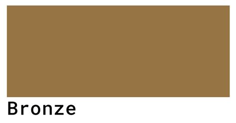
Bronze is a warm brown color, infused with orange undertones, which imbues it with qualities of calm and strength. It resides in the dark orange section of the color wheel, inherently suggesting stability and power. For digital and print applications, precise definitions are necessary.
The primary hexadecimal code for a quintessential bronze is #CE8946. This translates into RGB values of approximately 80.8% red, 53.7% green, and 27.5% blue. However, it's important to note that color representation can vary. Another commonly cited hexadecimal color for bronze, #cd7f32, presents slightly different RGB values: 80.4% red, 49.8% green, and 19.6% blue.
When it comes to print design, the CMYK (Cyan, Magenta, Yellow, Black) color model is paramount. The CMYK values for bronze are typically represented as (0 18 66 34). This signifies the proportional mix of cyan, magenta, yellow, and black inks required to reproduce the color on paper. In practice, there can be more than one way to achieve the bronze color using the four-color process. This is because CMYK colors do not have a universally strict cross-reference chart with specific named variations. Many CMYK color names are designated by manufacturers or the general public. For the CMYK color space, the hexadecimal color #cd7f32 is composed of 0% cyan, 38% magenta, 75.6% yellow, and 19.6% black. This specific mix results in a hue angle of 29.8 degrees, a saturation of 60.8%, and a lightness of 50%.
Understanding Color Variations: Shades, Tints, and Tones
To fully appreciate the versatility of bronze, it’s helpful to understand how variations are created:
- Shades: Achieved by adding black to a pure hue. A shade of bronze will be darker and more muted.
- Tints: Created by mixing white with a pure color. A tint of bronze will be lighter and softer.
- Tones: Produced by adding gray to a pure hue. A tone of bronze will be less saturated and more subdued.
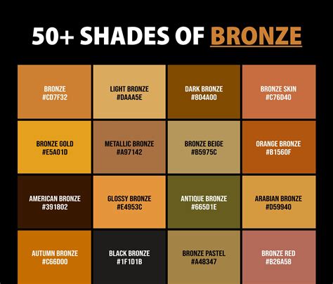
Exploring the Bronze Spectrum: Related Colors
Beyond the core bronze color, several related hues offer variations within the same warm spectrum:
- Dark Orange (#C76E00): This is a brighter cousin to bronze, possessing greater warmth and vibrancy.
- Copper (#C68346): Often considered the base tone of bronze, copper has a more pronounced red undertone.
- Cinnamon (#D47E30): A vibrant combination of brown, orange, and red, cinnamon evokes feelings of comfort.
- Terracotta (#E35336): This shade leans towards an orangey-red, almost pink, and is frequently associated with desert landscapes.
Designing with Bronze: Palettes and Pairings
Bronze's inherent warmth and richness make it a powerful tool in design. Its successful integration often depends on thoughtful color pairings.
Complementary Colors for Bronze
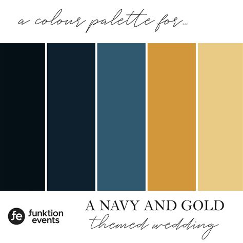
To highlight bronze's warmth, consider pairing it with contrasting cool tones:
- Cornflower Blue (#6395EE): This bright blue provides a striking contrast, making the warmth of bronze stand out.
- Navy Blue: For a darker, more sophisticated contrast, navy blue complements bronze beautifully, creating an earthy yet refined look.
- Dark Green: This pairing evokes a sense of nature and tranquility, offering an earthy and grounded aesthetic.
- Shades of Gray: Grays provide a neutral backdrop that allows bronze's warm undertones to be emphasized without competing.
Harmonious Color Schemes
Beyond direct complements, other color harmonies can be effectively employed with bronze:
- Complementary: Directly opposite on the color wheel, offering maximum contrast.
- Split-Complementary: Two colors adjacent to the complement, providing strong contrast with less tension.
- Monochromatic: Variations of bronze itself, using different shades, tints, and tones to create a cohesive and sophisticated look.
- Analogous: Colors adjacent to bronze on the color wheel, such as warm browns and deep oranges, creating a harmonious and unified feel.
- Triadic: Three colors evenly spaced on the color wheel, offering vibrant and balanced palettes.
- Square: Four colors evenly spaced on the color wheel, providing a rich and diverse palette.
Colors that Combine Well with Bronze
- Crimson Red (#B22222): When combined with bronze, crimson red creates a comforting and inviting palette, often associated with a sense of opulence.
- Beige (#EDE8D0): Beige offers a neutral complement, allowing bronze's orange undertones to be more prominent and creating a soft, sophisticated look.
- Green Sage (#98A869): This muted green creates a tranquil, soothing, and nature-inspired combination with bronze, perfect for organic or wellness brands.
Colors to Avoid with Bronze
While bronze is versatile, certain colors can create disharmony or visual discomfort:
- Bright Yellow (#FFED29): The high contrast can lead to eye fatigue and a jarring visual experience.
- Periwinkle (#CCCCFF): Its cool tone can feel unbalanced and detract from bronze's inherent warmth.
- Bright Orange (#FF991C): While warm, its intensity is too similar yet clashes with bronze, creating a sense of visual discord.
- Pastel Green (#80EF80): This light, cool-toned green can drain the warmth and richness from bronze, making it appear dull.
- Hot Pink (#FF46A2): The extreme contrast can feel overwhelming and detract from the sophisticated qualities of bronze.
Bronze in Design and Symbolism
Bronze carries a wealth of symbolic meaning, deeply rooted in history and psychology, making it a potent choice for branding and design.
Historical Significance: The Bronze Age
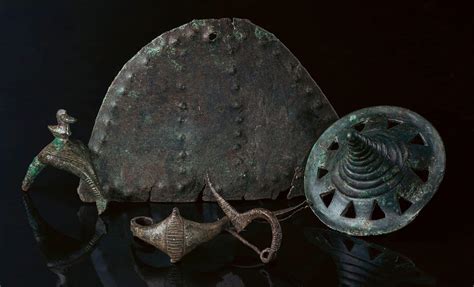
Bronze is most famously associated with the Bronze Age, a prehistoric period spanning from approximately 3300 BCE to 1200 BCE. This era is defined by humanity's discovery of bronze, a metal alloy created by mixing copper and tin. This innovation was revolutionary, leading to the creation of stronger tools, weapons, and artifacts, which in turn facilitated significant advancements in civilization. The term "bronze" itself was first used to describe the metal's color in 1753. Due to its pivotal role in human development, bronze has become synonymous with strength, power, and achievement.
Psychological and Symbolic Meanings
In color psychology, bronze's warm, earthy tones resonate with our innate connection to nature, fostering a sense of groundedness and stability. This warmth can also evoke feelings of comfort, familiarity, and security. Depending on the specific shade, bronze can also convey a more serious, sophisticated, or even luxurious feel.
- Wealth and Luxury: Bronze is often associated with high-end products and exclusive brands, projecting an image of affluence and sophistication.
- Strength and Stability: Its historical connection to durable metal and its visual weight lend it an aura of power, reliability, and endurance.
- Achievement and Excellence: Similar to gold and silver, bronze is a medal awarded for third place in many competitions, symbolizing accomplishment and recognition.
Applications in UI/UX Design
In user interface (UI) and user experience (UX) design, bronze commands attention subtly. It excels as an accent color, drawing the eye to important elements like buttons, icons, or interactive features without being overwhelming. This subtle emphasis, combined with its luxurious connotations, creates an association with quality and premium experiences.
- Accent and Highlight: Bronze can be used effectively to add warmth and richness to UI designs, highlighting key interactive elements.
- Emphasizing Themes: Its rich associations can convey luxury and wealth for high-end brands or create warm, inviting campaigns, particularly for autumn themes.
- Establishing Trust and Security: Bronze’s inherent connection to strength and stability makes it an excellent choice for brands in finance, e-commerce, and app development, aiming to build user confidence.
- Timeless Appeal: Bronze's classic and enduring quality makes it suitable for historical content, educational platforms, or interfaces that aim for a lasting aesthetic.
How To Use Color Psychology In Marketing And Branding (Choose Your Brand Colors)
Accessibility Considerations
When incorporating bronze into digital designs, accessibility must be a priority. Designers should ensure sufficient contrast ratios between text and background colors to meet Web Content Accessibility Guidelines (WCAG). Tools and plugins within design software like Figma can assist in checking these ratios. For instance, #CE8946 text on a #FFFFFF background has a contrast ratio of 2.88:1, which is generally considered insufficient for normal text. However, on a darker background, the contrast can be improved. For example, #CE8946 text on a #000000 background yields a contrast ratio of 7.29:1, which is excellent for both large and normal text.
Cultural Considerations
It is crucial to remember that color perception and meaning can vary significantly across cultures and can evolve over time. If designing for a global audience, thorough research into regional color considerations is essential to avoid misinterpretations and ensure the intended message is conveyed effectively.
Exploring Bronze Variations
Beyond the primary bronze, designers can explore a range of variations to achieve different effects:
- Shades: Darker versions of bronze can evoke a sense of depth, mystery, and gravitas.
- Tints: Lighter, softer versions can convey a more delicate, ethereal, or antique feel.
- Tones: Muted, desaturated versions can offer a sophisticated and understated elegance.
Color Harmonies and Palettes
- Bronze Age Palette: This palette might draw inspiration from ancient artifacts, combining bronze with earthy tones like ochre, terracotta, and deep browns.
- Solstice Palette: Evoking the warmth of the sun, this palette could feature bronze alongside golden yellows, warm oranges, and deep reds.
- Golden Hour Palette: Inspired by the soft, warm light of sunset, this palette might combine bronze with muted golds, soft pinks, and warm grays.
The contrast ratio of #CE8946 against #FFFFFF is 2.88:1, which fails WCAG AA and AAA for normal text.The contrast ratio of #CE8946 against #000000 is 7.29:1, which passes WCAG AA and AAA for normal text.
Color Vision Deficiency Considerations
It is also important to consider how colors are perceived by individuals with color vision deficiencies. Tools are available to simulate how colors appear to those with conditions like deuteranopia, protanopia, or tritanopia, ensuring designs are accessible to a wider audience.
The hexadecimal color #cd7f32 has RGB values of R:205, G:127, B:50 and CMYK values of C:0, M:0.38, Y:0.76, K:0.2. It has a hue angle of 29.8 degrees, a saturation of 60.8% and a lightness of 50%. This specific shade of bronze can be achieved by blending #fffe64 with #9b0000.
In conclusion, bronze is a color rich in history, symbolism, and design potential. By understanding its precise CMYK values, exploring its related hues, and thoughtfully considering its pairings and applications, designers can harness its unique qualities to create impactful, memorable, and resonant visual experiences.