Creating intricate designs in InDesign often involves incorporating specific elements, and sometimes, the simplest of graphics can present the most unexpected challenges. One such element is the humble tick mark, a symbol frequently required for book covers, checklists, or other design collateral. While seemingly straightforward, its implementation in InDesign can lead users down a rabbit hole of discovery, revealing less conventional methods and highlighting the program's depth. This tutorial delves into various techniques for achieving a tick mark, from simple character insertion to advanced paragraph styling, and also addresses common InDesign import and export issues.
The Unexpected Origin: Finding Tick Marks in Character Map
The journey to a perfect tick mark often begins with a need, and for some designers, that need has led to the most unlikely of resources. As one designer discovered, the answer to creating a tick mark for a book cover design was found not within InDesign's extensive toolset, but in a Microsoft Excel help document. This anecdote underscores a valuable lesson: sometimes, the most effective solutions lie in understanding the broader digital landscape and the common character sets available across different applications.
To access these characters, the process involves navigating to a built-in operating system utility: the Character Map. This tool, often tucked away in the "Accessories" or "System Tools" folder, provides access to a vast array of special characters and symbols embedded within various fonts.

The key to unlocking tick marks lies in selecting the appropriate font. The Wingdings font family, a collection of dingbats and symbols, is particularly rich in these useful icons. By selecting Wingdings from the font dropdown menu in Character Map, users can browse through a multitude of symbols, with the tick marks typically found towards the end of the character set.
Once the desired tick mark is located, the process is simple: click "Select" to add it to the selection, then "Copy." This places the character onto the system clipboard. Returning to InDesign, the tick mark can then be pasted directly into the text frame.
It's important to note that the pasted character may initially appear as a placeholder box. This occurs when the default font applied to the text frame does not contain the specific character. The solution is to simply change the font of that text to Wingdings, or any other font that supports the desired symbol.
Integrating Tick Marks as Bullet Points
Beyond simply inserting a tick mark as a standalone character, designers may wish to leverage its visual appeal within lists. InDesign's robust paragraph styling capabilities allow for the customization of bullet points, making it possible to use a tick mark as a list marker.
To achieve this, a new paragraph style should be created specifically for the list that requires tick marks. Within the paragraph style settings, navigate to the "Bullets and Numbering" tab. Here, the "Bullet Character" option can be customized.
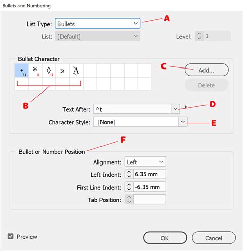
Clicking "Add" in the Bullet Character box opens a character selection interface. Similar to using the Character Map, users can choose "Wingdings" from the "Font Family" dropdown and then select the desired tick mark symbol. This action assigns the chosen tick mark as the bullet point for any text formatted with this specific paragraph style. This method offers a dynamic and editable way to incorporate tick marks into lists, ensuring consistency and ease of modification throughout a document.
Understanding InDesign's Unique Spacing and Font Handling
When transitioning designs between different software, particularly from platforms like Marq (as suggested by the provided text, likely a web-based design tool) to InDesign, understanding their distinct handling of spacing and fonts is crucial. InDesign's approach to line spacing, for instance, differs from many other applications. While some platforms might count line spacing in increments of three, InDesign operates on a system of five. This discrepancy can lead to unexpected text reflow and overflow issues.
The Red Triangle and Red Plus Symbols: Decoding InDesign's Warnings
InDesign employs visual cues to alert users to potential problems within their layouts. The "red triangle warning sign" often appears next to an object that is missing information. This could pertain to a missing font, an unlinked text frame, or other data-related issues. Clicking on this red triangle can provide specific options, such as "Keep Default Font," which forces the text into a fallback font, or reveal more detailed error messages.
The "red plus symbol" is a common indicator of text overflow. When text exceeds the boundaries of its text frame, this symbol appears, signifying that there is not enough room for the content. To resolve this, the text box needs to be expanded. This can be done by selecting one of its corner handles and dragging it outwards until the red plus symbol disappears. In some cases, if text boxes are linked, the overflow will automatically continue into the subsequent linked box, a feature that should generally transfer when importing from or exporting to compatible formats.
Font Management: Importing, Substituting, and Customization
Managing fonts is a critical aspect of design work, and InDesign offers several ways to handle font files. When a font is missing, InDesign will flag it. The provided text suggests a workaround involving uploading fonts to a platform like Marq, which supports OTF (OpenType Font) and TTF (TrueType Font) file types. If a specific font used in InDesign is unavailable or requires a license, designers can search for free alternatives online by searching for "[FONT NAME] free."
Once a substitute font is found, it can be uploaded and applied. Within InDesign's "Custom Fonts" or "Team Fonts" (for templates) sections, users can manage their uploaded fonts. For those with advanced technical skills, editing font metadata using software like Robofont can influence how a font file imports, allowing for adjustments to names, weights, and other properties. This is a complex process, however, and often unnecessary for standard design tasks.
If an Adobe Typekit font was used and licensing is an issue, searching for a visually similar free font is a practical solution. The new font can then be uploaded and manually applied to the text.
Navigating Image and Shape Import/Export Challenges
The transfer of graphical elements between InDesign and other platforms, such as Marq, can also present challenges. InDesign supports a wide range of image formats, but some platforms may have limitations. For instance, while InDesign can import EPS and PSP files, these might need to be converted to more widely supported formats like PNG or JPEG for seamless import into other software.
Replacing Missing Images and Handling Format Conversions
When an image is missing after an import, InDesign will typically indicate this with a warning. Replacing missing images can be done directly within the software. If an EPS or PSP image was replaced with a PNG or JPEG, options like "Replace Missing Image" or dragging the new image file directly over the placeholder are available.
Custom Shapes and Complex Elements
Custom shapes created in InDesign might not always translate perfectly to other platforms. If a shape's lines become skewed or the shape reverts to a standard form, the most reliable method is often to export the custom shape as a PNG from InDesign. This ensures that the shape's unique characteristics are preserved as a raster image, which can then be imported into the target software.
Similarly, complex backgrounds, intricate series of shapes, or unique formatting elements might be best handled by exporting them as a single image from InDesign. This approach simplifies the import process and maintains the visual integrity of these complex elements.
Understanding InDesign's Feature Support in Other Platforms
The provided information highlights several InDesign features that may not be directly supported or may import differently into other design tools. This is crucial for designers to be aware of to set realistic expectations and plan workarounds.
Unsupported Features and Their Workarounds
- Anchored Objects: While InDesign allows objects to be anchored to text, this functionality is not directly replicated in many other platforms. Workarounds include using text wrapping or locking objects to the page.
- Drop Caps: Drop caps, the enlarged first letter of a paragraph, often require manual recreation in other software. This typically involves creating a separate text box for the larger letter, formatting it, and then applying text wrapping.
- Text on a Path: Text that follows a curved or custom path in InDesign may not import correctly. While some platforms offer limited path effects, complex text-on-path designs might need to be rendered as an image.
- Master Pages: InDesign's Master Pages, used for recurring elements like headers and footers, do not have a direct equivalent in all software. However, the concept of page templates in other programs can often serve a similar purpose.
- Data Merge and Editorial Notes: Features like Data Merge (for populating documents with variable data) and editorial notes are often not supported for direct import.
- Footnotes and Glyphs: Footnotes do not automatically transfer, and while Glyphs (special characters) can be accessed through dedicated panels, their transferability can vary.
- Hyperlinks and Image Captions: Hyperlinks and image captions may require manual reapplication after import.
- Tables Spanning Multiple Pages: Tables that extend across multiple pages in InDesign might not import correctly and may require adjustments, such as disabling certain characteristics before import.
- Clipping Paths and Split Columns: Advanced features like clipping paths and paragraph split columns are often not supported.
- Table and Cell Styles: While InDesign allows for the creation and application of styles for tables and cells, these might not be directly transferable.
Line Spacing and Text Positioning
The difference in line spacing measurement between InDesign (five units) and other software (often three units) is a significant point of consideration. This can impact the overall layout and spacing of text. Similarly, text positioning within table cells might require adjustment after import, with options for alignment (left, center, right, justified) typically available in the target software.
Advanced Techniques: Baseline Shift, Case Changes, and Ligatures
InDesign offers granular control over typography, enabling sophisticated text formatting. Two key features for fine-tuning character placement and appearance are Baseline Shift and the Change Case command.
Baseline Shift for Precise Character Placement
Baseline Shift allows a selected character to be moved up or down relative to the baseline of the surrounding text. This is particularly useful for superscript or subscript text, or for aligning special characters that might not sit perfectly on the text line. Values can be entered numerically in the Character panel or Control panel, with up and down arrow keys providing incremental adjustments.
Mastering Text Case with the Change Case Command
The "Change Case" command in InDesign provides a powerful way to modify the capitalization of selected text. Options include Uppercase, Lowercase, Sentence case, Title Case, and Small Caps. Using "Change Case" is generally preferred over manually typing in all caps, as it maintains an underlying distinction that is important for searching and spell-checking. OpenType fonts can also offer "All Small Caps" for a more elegant typographical solution.
Leveraging Ligatures for Enhanced Typography
Ligatures are special character combinations, such as "fi" or "fl," that are designed to flow together more harmoniously than their individual letterforms. In InDesign, when working with OpenType fonts that support ligatures, they can be enabled through the Character panel menu or the Control panel. This feature, when available, adds a subtle touch of professional polish to typography.
How to Use Ligatures in Adobe InDesign?
Working with Special Characters and Glyphs
The Glyphs panel in InDesign is an indispensable tool for accessing and inserting special characters, symbols, and alternative glyphs that are not readily available on a standard keyboard.
Exploring the Glyphs Panel
The Glyphs panel provides a comprehensive view of all characters available within a selected font. Users can filter the view to see specific subsets of glyphs, such as OpenType features, or search for characters by their Unicode value or name. Recently used glyphs are also conveniently listed, allowing for quick access.
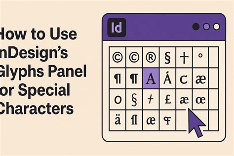
The Glyphs panel allows for resizing and customization of the view. Users can double-click a glyph to insert it into their text or select it from the "Recently Used" section. Furthermore, custom glyph sets can be created and managed, allowing designers to organize frequently used special characters for easy retrieval. This is particularly useful for maintaining consistency in projects that utilize a specific set of symbols or dingbats.
Special Characters for Text Formatting and Spacing
Beyond standard punctuation, InDesign offers a range of special characters that serve specific formatting purposes. These include:
- Non-breaking Space: Prevents a line break from occurring at a space character, useful for keeping words like "Mr. Smith" together.
- Em Space and En Space: These are fixed-width spaces, with an em space typically being the width of the current point size and an en space being half that. They are useful for precise typographic justification.
- Hyphens and Dashes: InDesign offers various types of hyphens and dashes, including en dash and em dash, which have different lengths and uses in typography.
- Quotation Marks: The software can be configured to use different styles of quotation marks for various languages, ensuring linguistic accuracy.
Prime Marks and Other Symbols
Prime marks (single and double), often used in technical notation, can also be accessed and inserted via the Glyphs panel. These symbols, along with others like ellipses and various punctuation marks, contribute to the professional polish and accuracy of a document.
Conclusion: Embracing InDesign's Nuances for Design Excellence
The process of incorporating even a simple tick mark into an InDesign project can reveal the software's intricate functionalities and the potential complexities of digital design workflows. From discovering hidden character sets in unexpected places to mastering advanced typographic controls and navigating import/export challenges, InDesign offers a deep and rewarding experience for designers. By understanding its unique spacing parameters, font handling capabilities, and the nuances of its feature support, designers can overcome obstacles and leverage InDesign's full potential to create polished, professional, and visually compelling work. The ability to adapt and explore unconventional solutions, as exemplified by the character map discovery, is a hallmark of effective design practice.