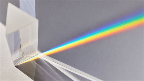
Chromatic aberration, also known as 'colour fringing' or color distortion, is a common optical problem that manifests as an outline of unwanted color along the edges of objects within an image. This distortion arises from the failure of a camera lens to focus each of white light’s different wavelengths onto the same focal point, leading to various fringing colors such as blue-yellow, red-green, or magenta-purple. It is often noticeable along metallic surfaces or in areas with a stark contrast between light and dark elements, for instance, a black wall against a bright blue sky. While photographers typically strive to eliminate chromatic aberration from their work, deeming it an optical flaw, there are creative applications for this effect, particularly in digital art and post-production. When intentionally introduced and used judiciously, chromatic aberration can enhance an image, making it "pop" and appear more realistic, especially in motion. This tutorial delves into how to manually achieve this effect in Adobe Photoshop, transforming an average image into something more artistic.
Understanding the Nature of Chromatic Aberration
At its core, chromatic aberration is an optical phenomenon. White light, as we perceive it, is a composite of various colors, each with a different wavelength. When light passes through a lens, these different wavelengths bend at slightly different angles. A perfect lens would refocus all these wavelengths at the exact same point, creating a sharp image. However, most lenses are not perfect. This slight deviation in focusing different wavelengths results in color separation, most notably appearing as fringes of color around high-contrast edges.
Axial chromatic aberration, also referred to as longitudinal chromatic aberration, is a specific type that often occurs in images captured with wide apertures, indicated by low f-stop numbers. This is because at very wide apertures, the depth of field is shallow, and different wavelengths might focus at different distances from the lens.
While it's possible to prevent chromatic aberration during the shooting process by using high-quality lenses, avoiding extreme wide-angle lenses, and shooting at narrower apertures when feasible, it's also a common post-production task to correct it. Tools within software like Adobe Lightroom can automatically remove chromatic aberration by checking a box under the Lens Corrections panel and then fine-tuning with Defringe controls. However, this tutorial focuses on the inverse: adding it for artistic effect.
Spherical Aberration and Lenses
Preparing Your Image in Photoshop
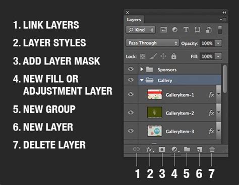
Before diving into the chromatic aberration effect itself, it's crucial to have your image composition finalized. Chromatic aberration is best applied as a final touch. Therefore, the first step is to ensure your entire composition is merged down to a single layer. It is also a good practice to keep a copy of your original layers in a separate folder or group for safekeeping, providing a fallback option if needed. Once your composition is consolidated into a single layer, duplicate this layer twice. These duplicates will serve as the foundation for creating the chromatic aberration effect. Set these duplicate layers to the "Lighten" blend mode. This blend mode will ensure that only the lighter pixels from these layers contribute to the final image, which is essential for the color fringing effect.
Isolating Color Channels for Fringing
The next critical step involves isolating the color channels to selectively manipulate the red, green, and blue components that will form the aberration. Decide which colors you want to use to create the fringing effect; green and blue are often effective choices.
Take the first duplicate layer. Navigate to the "Levels" adjustment. Within the Levels properties, you will adjust the output levels. To isolate the green channel for this layer, set the Red and Blue output levels to 0. Leave the Green levels untouched. This effectively makes this layer primarily contribute green hues to the final image.
Now, select the second duplicate layer. For this layer, you will isolate the blue channel. Go to "Levels" and set the Red and Green output levels to 0. Leave the Blue levels as they are. This layer will primarily contribute blue hues.
It is highly recommended to rename these layers descriptively, for instance, "Green Channel" and "Blue Channel," to keep your workflow organized and easily identifiable. This precise control over individual color channels is what allows for the deliberate creation of the chromatic aberration effect.
Applying and Adjusting the Aberration
With the color channels isolated, the next phase is to introduce the visual separation that defines chromatic aberration. This is achieved by subtly shifting the position of the manipulated color layers.
Select the "Green Channel" layer. Activate the "Move Tool" (V). Using the left arrow key on your keyboard, shift this layer slightly to the left. Typically, pressing the left arrow key twice is sufficient to create a noticeable but not overpowering effect. The exact number of clicks will depend on the resolution and content of your image.
Next, select the "Blue Channel" layer. Using the Move Tool, shift this layer slightly to the right. Again, a small adjustment is key. Avoid shifting them by too many clicks, as this will result in an exaggerated distortion. An excessive shift will make the aberration too prominent, leading to a painful-to-look-at, overly distorted image. The goal is subtlety; the fringing should enhance, not detract from, the overall image.
The key to a convincing chromatic aberration effect lies in restraint. Overdoing the effect will undoubtedly result in an image that looks artificial and unappealing. The subtle separation of the red, green, and blue channels, when shifted minimally, mimics the natural optical imperfections of a lens in a way that can add depth and a touch of realism to your digital artwork. This technique is particularly effective when applied to 3D renders, where it can bridge the gap between a rendered image and a photograph.
Enhancing Detail with Embossing (Optional)
For those looking to further enhance the details and visual impact of their image, a subtle embossing effect can be applied as a final layer. This step is optional and should be used with discretion, as it can also be overdone.
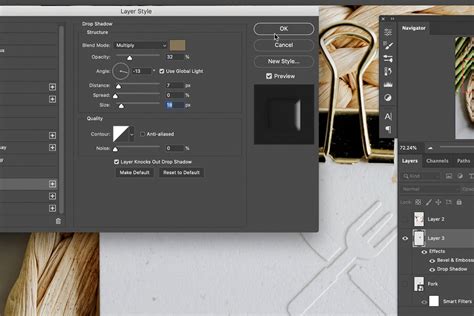
To add this effect, create a new layer on top of all your other layers. Go to the "Filter" menu, then select "Stylize," and choose "Emboss." You will need to experiment with the "Angle," "Height," and "Amount" settings of the Emboss filter. The ideal settings will depend heavily on the specific lighting and textures within your scene. The "Angle" should generally correspond to the primary light source in your image. The "Height" controls the intensity of the raised effect, and the "Amount" dictates the overall strength of the embossing.
The purpose of this optional embossing layer is to subtly boost the perceived detail and texture in your image. When used sparingly, it can add a tactile quality and further contribute to the overall realism or artistic appeal. It's a good idea to set this Emboss layer to a blend mode like "Overlay" or "Soft Light" and adjust its opacity to achieve the desired subtle effect.
Real-World Applications and Artistic Intent
While photographers often work to remove chromatic aberration, its intentional use in digital art, visual effects, and even some films highlights its potential as a creative tool. In motion pictures, a controlled amount of chromatic aberration can sometimes be intentionally incorporated to add a specific aesthetic or even, paradoxically, to subtly sharpen the perceived image in movement. This is because the slight color separation can create a sense of depth and detail when the image is not static.
In the realm of 3D art, adding chromatic aberration can serve several purposes. It can be used to emulate the look of specific camera lenses, adding a layer of photographic realism to renders. It can also be employed to draw the viewer's eye to certain areas of the image by creating subtle visual interest around key elements. Furthermore, it can contribute to a stylized, vintage, or even a slightly surreal aesthetic, depending on how it's applied.
The key takeaway is that understanding how to create and control optical effects like chromatic aberration in post-production provides artists with a more comprehensive toolkit. It allows for greater creative control, enabling them to not only fix imperfections but also to deliberately introduce them to achieve a desired artistic outcome. As 3D artist Maya notes, "Unless you’re going for a stylized mood with intentional RGB splitting, removing chromatic aberration is a simple way to improve your image quality and eliminate an unrealistic edge of color that some beginner photographers may not even notice." This sentiment underscores the duality of chromatic aberration: a flaw to be corrected in its purest form, but a stylistic element when wielded with intent. The process of adding chromatic aberration in Photoshop, as outlined above, empowers artists to harness this optical phenomenon for creative enhancement, transforming their work from merely rendered to truly artistic.
tags: #chromatic #abberation #photoshop