Creating a visually striking chrome text effect in Photoshop can elevate your designs, adding a touch of metallic sheen and professional polish. This tutorial will guide you through a straightforward process, utilizing a few key textures and layer styles to achieve a shiny, reflective chrome appearance. While the core technique involves specific Photoshop manipulations, understanding the underlying principles of light, reflection, and material properties can further enhance your creative output. This guide aims to be accessible to beginners while offering insights that even experienced users might find valuable, breaking down the process into manageable steps and exploring related resources.
Setting the Stage: Image Preparation and Font Selection
The journey to a perfect chrome text effect begins with selecting the right foundational elements. While this tutorial focuses on a specific image and font, remember that experimentation with different source images and typography can yield unique results.
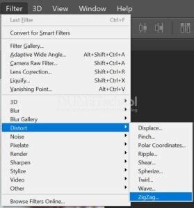
For this particular demonstration, we will be working with an image referred to as "Bus Seats." The initial step involves applying a distortion filter to this image. Navigate to the Photoshop menu and select Filter > Distort > ZigZag. This filter introduces a wave-like distortion, which can serve as a base for creating interesting metallic patterns. The intensity and style of the ZigZag filter can be adjusted to achieve different levels of texture complexity. While this specific filter is used here, other distortion filters like Wave or Twirl could also be explored for varied base textures.
Following the filter application, the next crucial step is defining the text itself. We will be using the font "Bebas Neue Bold." This font is chosen for its clean, strong lines, which are ideal for showcasing metallic effects. When setting the text, ensure the Size is set to approximately 220 pt. Equally important is the Kerning, set to Optical. Kerning adjusts the space between specific pairs of letters to create a visually pleasing and uniform appearance, a critical detail for polished typography.
Crafting the Chrome Effect: Textures and Layer Styles
The heart of the chrome text effect lies in the strategic application of textures and layer styles. These elements work in concert to simulate the reflective and lustrous qualities of polished metal.
First, we need to prepare a texture that will be used to define our chrome pattern. This often involves taking an existing image, or in this case, the modified "Bus Seats" image, and defining it as a pattern. To do this, after applying filters like ZigZag, you would typically go to Edit > Define Pattern. This action saves the current state of the image as a reusable pattern within Photoshop, ready to be applied to other layers. The nature of the initial image and the filters applied will dictate the subtle nuances of the resulting chrome texture. For instance, a smoother initial texture with subtle distortions will lead to a more uniform, polished chrome, while a more complex or rough texture might result in a brushed or weathered metallic look.
Once the pattern is defined, we create a new layer and draw our text onto it using the chosen font and size as described previously. This text layer will be the canvas for our chrome effect.
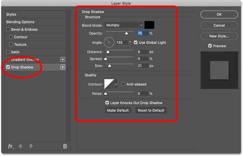
The magic truly happens within the Layer Styles dialog box, accessible by double-clicking on the text layer. Here, we will apply a series of styles:
Gradient Overlay: This is fundamental to creating the metallic sheen. A gradient that transitions from light grey to dark grey, and perhaps back to a lighter grey, can simulate the way light reflects off a curved metallic surface. The angle and scale of the gradient are crucial for controlling the direction and intensity of the shine. Experimenting with different gradient presets or creating custom ones is key. A common approach involves a subtle diagonal gradient to mimic a light source hitting the text from an angle.
Bevel and Emboss: This style adds depth and dimension, making the text appear to have a raised, three-dimensional form. Settings like
Style: Inner Bevel,Technique: Smooth,Depth,Size, andSoftenneed careful adjustment. TheShadingsection, particularly theGloss Contour, plays a vital role in defining the highlight and shadow shapes, which are essential for the realistic metallic look. A sharp, defined contour can create a harder, more modern chrome, while a softer contour can lend a more rounded, classic feel.Inner Shadow: This adds a subtle shadow within the edges of the text, enhancing the sense of depth and separation from the background. It helps to define the outline of the metal form.
Inner Glow: A subtle inner glow, often in a light grey or white, can simulate the bright highlights that appear on the sharpest edges of metallic objects where light is most intensely reflected.
Drop Shadow: While not always necessary for a purely chrome effect, a subtle drop shadow can help the text stand out from its background, especially if the background is also metallic or very light.
Pattern Overlay: This is where the previously defined "Bus Seats" pattern comes into play. Applying the pattern overlay allows the texture to fill the shape of the text, providing the intricate surface detail that makes the chrome look realistic. The
Blend Modeshould typically be set toNormal, and theScaleadjusted to ensure the pattern appears at the desired level of detail.
By meticulously adjusting the parameters within each of these layer styles, you can sculpt the appearance of the chrome, controlling everything from the harshness of the reflections to the depth of the shadows.
3D Chrome Photoshop Tutorial (+ FREE TEMPLATE)
Building a Complementary Background
While the chrome text is the focal point, a well-designed background is essential for making it pop. A simple yet effective background can be created using a combination of textures and gradient effects, ensuring it complements rather than competes with the metallic text.
One approach is to use a subtle texture for the background. This could be a concrete texture, a brushed metal texture, or even a dark, slightly noisy background. The key is to keep it understated so that the chrome text remains the hero of the composition.
To add depth and visual interest to the background, a Gradient Overlay effect can be applied. Unlike the gradient used for the text, the background gradient might be softer and more diffused, perhaps transitioning from a dark grey to a slightly lighter grey, or even incorporating a subtle color tint that complements the overall color scheme of the design. This gradient can create a sense of ambient light or a subtle spotlight effect, drawing attention towards the center of the composition where the text is likely placed.
Alternatively, a simple solid color background can also work effectively, especially if the chrome effect on the text is particularly intricate and detailed. The contrast between a clean background and a highly reflective text can be very powerful.
Leveraging Pre-made Resources and Further Exploration
For those looking to achieve chrome effects quickly or explore variations beyond the manual method, a wealth of pre-made resources is available. These can significantly speed up the design process and offer professional-quality results with minimal effort.
Several bundles and packs are specifically designed for creating chrome text effects in Photoshop and Adobe Illustrator. These often include a group of actions or layer styles that can be applied with just a few clicks. For instance, some action sets are ideal for creating a chrome text effect for Photoshop with just a few clicks. These bundles might feature a variety of metallic effects, such as steel, copper, and bronze text effects, all bundled together for convenience.
Another type of resource is a text effect pack that might include a diverse range of styles within a single PSD file. These could feature not only chrome metal effects but also other finishes like gold and red foil, or even unexpected materials like wood, all presented in a layered Photoshop document for easy customization.
For users who prefer Adobe Illustrator, there are also dedicated text effect packs available. These packs often include a collection of different high-quality metal text styles specifically made for Illustrator, allowing for vector-based scalability and flexibility. Similarly, sets of metallic layer styles for Illustrator can be found, designed for one-click application.
These pre-made resources are invaluable for designers who need to produce high-quality chrome effects rapidly or who wish to explore a wider range of metallic styles without investing significant time in manual creation. They often serve as excellent learning tools as well, allowing users to deconstruct the layer styles and understand how complex effects are built.
Understanding how to create a chrome gradient in Photoshop from scratch, as outlined in this tutorial, provides a solid foundation. However, exploring these pre-made resources can unlock even more creative possibilities and streamline your workflow. The availability of such tools underscores the popularity and demand for sophisticated metallic text effects in graphic design.