The Tone Curve is an indispensable tool within Adobe Lightroom, offering photographers granular control over the tonal range of their images. While seemingly technical, understanding its principles unlocks the ability to dramatically enhance an image's impact, from subtle refinements to bold stylistic transformations. This tutorial delves into the functionality of the Tone Curve, guiding you through its application to achieve professional-looking results, including the coveted "cinematic tone."
What Is the Tone Curve?
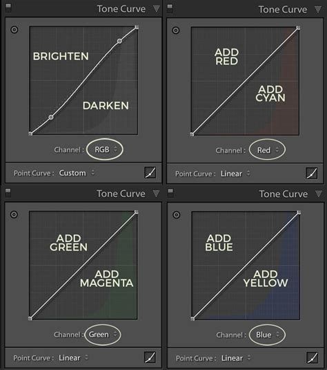
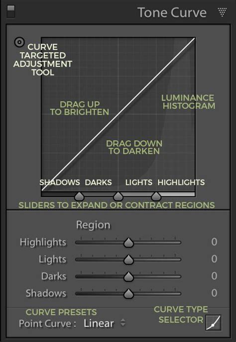
At its core, the Tone Curve represents all the tonal values present in a photograph. The horizontal axis, or X-axis, is known as the Tone axis. It progresses from the darkest areas, the Shadows, on the far left, to the brightest areas, the Highlights, on the far right. In between these extremes lie the Midtones, which are further subdivided into darker Midtones (referred to as Darks in Lightroom) and brighter Midtones (Lights). Thus, moving from left to right along the Tone axis, we encounter Shadows, Darks, Lights, and finally Highlights. When you hover over specific sliders within the Tone Curve's Region section, Lightroom conveniently displays the corresponding tonal range that each slider affects.
The vertical axis, or Y-axis, represents the lightness of these tones. Moving upwards on this axis brightens the tones, while moving downwards darkens them. This fundamental relationship between the X and Y axes is key to manipulating an image's overall brightness and contrast.
Region Curve vs. Point Curve: Choosing Your Approach
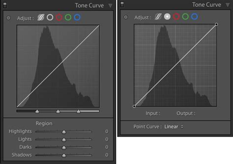
Lightroom offers two distinct modes for interacting with the Tone Curve: Region Curve and Point Curve.
The Region Curve: Simplicity for Beginners
The Region Curve, which is typically the default and most prominently displayed, is designed for ease of use, particularly for those new to tone manipulation. In this mode, Lightroom actively assists in maintaining smooth tonal transitions, preventing accidental distortions that could degrade image quality. You can adjust the curve directly by clicking and dragging on its lines, or by utilizing the sliders located beneath the curve. These sliders correspond to the tonal ranges (Shadows, Darks, Lights, Highlights) and offer precise control.
Furthermore, an automated tool simplifies adjustments. Located as a small dot at the top left of the Tone Curve panel, clicking this icon activates a mode where you can click and drag directly on specific tonal areas within your image. Lightroom intelligently interprets these actions to modify the curve. The Region Curve's inherent smoothing prevents the creation of overly aggressive shapes, such as an "N" shape, ensuring a more natural progression of tones.
The Point Curve: Unleashing Creative Control
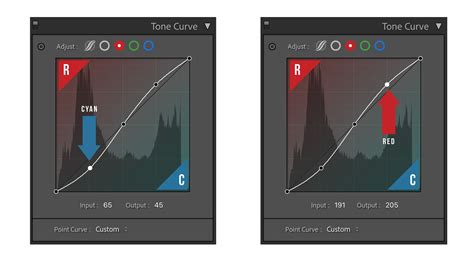
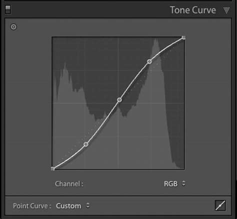
For more advanced or specific adjustments, the Point Curve offers unparalleled flexibility. Activated by clicking a small square button at the bottom right of the Tone Curve panel, this mode removes the intuitive sliders and presents a single "Channel" control. This allows you to target specific color channels-Red, Green, or Blue-for independent manipulation. While altering individual color channels opens up a vast realm of creative possibilities, including film emulation techniques like cross-processing, this tutorial will focus on the RGB (all colors) mode for broader tonal adjustments.
The Point Curve allows for virtually any shape, offering complete freedom to sculpt the image's tonal response. This makes it an excellent tool for intricate black and white conversions and advanced color grading. It can also serve as a powerful starting point for subsequent Region Curve adjustments. Lightroom even provides default Point Curve settings, accessible via a dropdown list at the bottom left of the panel, which can mimic the tone curves used in camera processing.
For the purposes of this tutorial, we will primarily focus on the more accessible Region Curve, referring to it simply as the Tone Curve to avoid confusion.
The Easy Part: Making Your Image Pop with the Tone Curve
The primary goal when employing the Tone Curve is often to imbue an image with greater impact and visual appeal. Sometimes, even after meticulous adjustments in the Basic Panel, a photograph might feel technically correct but lacking that certain "wow" factor. The Tone Curve is where you can often find that missing element.
Achieving Contrast with an "S" Curve
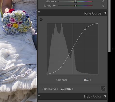
A highly effective technique for adding punch and depth to an image is to create a subtle "S" curve. This involves gently dragging the lower third of the curve downwards and the upper third slightly upwards. This action selectively darkens the shadows and brightens the highlights, thereby increasing the overall contrast of the image.
Consider the example of a photograph that, while well-exposed, appears somewhat flat. By applying an "S" curve, we can enhance its dimensionality. For instance, adjusting the Lights slider to a positive value (e.g., +29) boosts the brighter areas without causing them to blow out. Simultaneously, moving the Darks slider to a negative value (e.g., -39) deepens the shadows without rendering them completely black. The result is a more dynamic image with increased visual separation between tones.
This adjustment can also subtly influence color saturation. While this might be desirable in some cases, it's important to note that the Tone Curve's primary function is tonal manipulation. If excessive color saturation becomes an issue, it can be mitigated using the Vibrance or Saturation sliders in the Basic Panel.
Reducing Contrast with a Reverse "S" Curve
Conversely, there are times when an image may appear too contrasty, or a softer, more subdued aesthetic is desired. In such scenarios, a reverse "S" curve can be employed. This involves slightly lowering the upper half of the curve (reducing Lights) and gently raising the lower half (increasing Darks). This action flattens the image, bringing highlights and shadows closer in tonality.
This technique is particularly useful for images with blown-out highlights that need to be recovered, or for achieving a dreamy, moody look, often seen in black and white photography. By flattening the contrast, the colors also tend to appear less vibrant, contributing to a more subdued mood.
The Cinematic Tone: Fading Blacks and Whites
Achieving a "cinematic tone" often involves emulating the look of film, which typically exhibits less stark contrast than digital photography. A key element of this aesthetic is the "fading of blacks and whites." This is accomplished by slightly lifting the far-left end of the Tone Curve (making the deepest shadows appear a dark gray rather than pure black) and gently lowering the far-right end (preventing the brightest highlights from being pure white). This creates a softer, more diffused contrast, characteristic of many film stocks.
To further enhance the cinematic feel, consider introducing complementary colors using the Point Curve's color channels. By selectively adjusting the Red, Green, or Blue channels, you can subtly shift the color balance, adding a unique character to your images. For instance, a slight green tint in the shadows and a magenta tint in the highlights can contribute to a vintage or stylized cinematic look.
Don't Overcook It: The Perils of Excessive Adjustment
While the Tone Curve is a powerful tool, it's crucial to exercise restraint. Over-manipulating the curve can easily lead to undesirable artifacts, such as clipped highlights (blown-out whites) and crushed blacks (completely black shadows with no detail). Unless these extreme effects are intentionally sought, it is best to make subtle adjustments and to use the Tone Curve in conjunction with other Lightroom tools, such as the Basic Panel sliders, to achieve a balanced and pleasing result. Remember, the Tone Curve can enhance an image just as easily as it can degrade it if used without care.
Experimentation is Key
The true power of the Tone Curve lies in its versatility. Don't limit yourself to just the "S" curve or its reverse. Experiment with different points on the curve, selectively adjusting specific tonal ranges. You might find that only the Lights or Highlights need attention, or that creating a more complex, non-linear curve yields the desired effect.
The Tone Curve is fundamental to many Lightroom presets, and understanding its mechanics will empower you to develop your own unique editing style. The ability to apply these adjustments precisely, even to specific areas of an image using tools like the Lightroom brush, further expands its creative potential. Mastering the Tone Curve is a significant step towards unlocking the full creative capabilities of Lightroom and achieving professional-grade photographic results.
The Tone Curve is a tool in Lightroom used for adjusting tones to make images brighter or darker, and to adjust colors. Tones in photos, from shadows, to darks, midtones, lights and highlights are adjusted using the RGB curve. The tone curve tool is a panel on the right of the Develop Module. You can anchor the midtones so that they’re not affected, then adjust highlights, lights, darks and shadows.
The final aspect of setting a custom tone curve in Lightroom is the color curves. Because black and whites in film aren’t as stark as in digital photography, the starting point for a cinematic look is to fade the blacks and the whites. An easy way to introduce complementary colors to photos in post production is to use the color channels. Each channel can be adjusted for its complementary color. Whatever you do, make sure that your adjustments are small so that your photo doesn’t look over processed. As you can see from the before and after images below, it was a subtle adjustment, but was highly effective at making the background whiter. It’s really easy to apply your tone curve settings to multiple photos at once using Lightroom batch editing. As soon as you understand how the tone curve works, you’ll see that it’s not difficult and it offers so many great opportunities for different edits. To develop your own photo editing style in Lightroom, you need to get to know the tone curve tool.