The quest to imbue digital artwork with the tactile quality of traditional media has long been a pursuit for artists. Clip Studio Paint, a powerful program favored by illustrators and comic artists, offers a robust suite of tools to achieve this, with paper textures being a particularly effective method. This article delves into the intricacies of utilizing and creating paper textures within Clip Studio Paint, transforming digital creations from flat images into pieces with a tangible, organic feel.
Understanding the Foundation: What are Paper Textures in Digital Art?
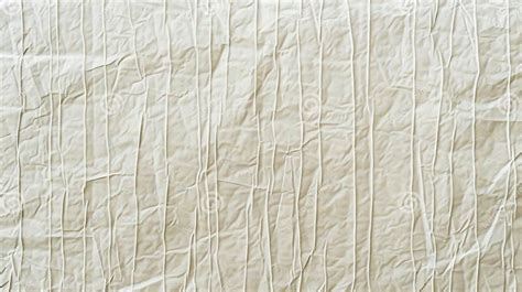
At its core, a paper texture overlay in digital art mimics the surface of physical paper. This can range from the subtle grain of drawing paper to the pronounced weave of canvas or the rougher feel of newsprint. When applied digitally, these textures serve to break up the smooth, often sterile, appearance of digital rendering. They can introduce subtle variations in color, affect how light interacts with the artwork, and generally lend a more "handmade" aesthetic. This is particularly valuable for artists who have traditionally worked with physical media and wish to retain some of that character in their digital workflow, or for those aiming for a specific retro or vintage look.
Integrating Pre-made Textures: A Step-by-Step Guide
Clip Studio Paint comes equipped with a variety of built-in materials that can serve as paper textures. For those new to the concept or seeking a quick enhancement, leveraging these existing resources is an excellent starting point.
Accessing and Applying Texture Materials
The first step is to open the Materials Palette, usually found within the Window menu. Within this palette, navigate to the "Basic Materials" folder, and then to the "Dot" and "Sand Pattern" sub-folders. Here, you will find a selection of halftone dot screens and noise patterns.
To apply a texture, simply drag and drop your chosen material onto your canvas. For optimal integration, it is recommended to place this texture layer below any existing paper texture folders and effects you might be using, and crucially, below your artwork itself.
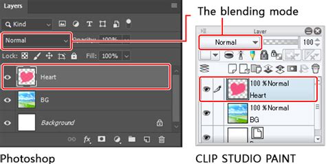
Layer Organization and Blending Modes
Once a texture material is applied, it will appear as a new layer in your Layer palette. It's important to understand that by default, these materials are often applied as a solid layer that obscures your artwork. To reveal your artwork while retaining the texture's influence, you need to adjust the blending mode of the texture layer.
The blending mode drop-down menu is located at the top of the Layer palette, typically set to "Normal" by default. Experimenting with different blending modes is key to achieving the desired effect. Options such as "Multiply," "Overlay," "Soft Light," and "Hard Light" can dramatically alter how the texture interacts with the colors and values of your artwork. Some modes, like "Vivid Light" or "Screen," can significantly shift the color palette, so careful selection is paramount.
Rasterizing and Converting Brightness to Opacity
To gain finer control over the texture, especially when working with scanned textures or complex patterns, rasterizing the layer is often necessary. Right-clicking on the texture layer and selecting "Rasterize" transforms it from a special material layer into a standard pixel-based layer. This unlocks further editing capabilities.
A powerful technique for refining texture application is the "Convert brightness to opacity" option, found under the Edit menu. When applied to a rasterized texture layer, this function makes all white pixels completely transparent, black pixels fully opaque, and shades of gray transparent to a degree corresponding to their lightness or darkness. This effectively uses the texture's tonal values to control its transparency, allowing for a more nuanced integration with your artwork.
Creating Custom Paper Textures: A Deeper Dive
While pre-made textures offer convenience, creating your own custom paper textures provides unparalleled control and allows for truly unique results. This process often involves scanning real-world materials or generating patterns digitally.
Scanning Real-World Textures
One of the most effective ways to create an authentic paper texture is by scanning a physical piece of material. This could be a sheet of watercolor paper, canvas, textured cardstock, or even a rougher surface like sandpaper.
The Process:
- Preparation: Place your chosen material flat on a scanner.
- Scanning: Scan the material at a high resolution, ensuring the "color" setting is active to capture subtle tonal variations.
- Adjustment: Open the scanned image in Clip Studio Paint. Use adjustment layers (such as "Brightness/Contrast" or "Level Correction") to enhance the texture's visibility. The "Preview" box is crucial here, allowing you to see changes in real-time. You might need to be "aggressive" with these adjustments to make the subtle details of the texture pop.
- Saving as a Material: Once satisfied, save the adjusted scan as a material. Go to "Edit" > "Register Material" > "Picture." In the "Material Property" window, give it a descriptive title (e.g., "Canvas Texture Custom"). Critically, check the "Use for paper texture" box. Also, enable "Scale up/down" and set it to "Adjust after pasting" for flexibility. Choose an appropriate folder in your Material Library and add keywords (like "custom") for easy retrieval.
Generating Textures from Patterns
Clip Studio Paint also allows for the creation of textures by combining and manipulating basic patterns. This is particularly useful for generating halftone or noise effects that can mimic certain print styles.
The Process:
- Open Basic Materials: Access the Materials Palette and navigate to "Basic Materials" > "Dot." Select a halftone dot pattern (circle patterns are often recommended). Drag this onto your canvas.
- Add Noise: Repeat the process, but this time drag a noise pattern from the "Sand Pattern" sub-folder onto the canvas, layering it over the dots.
- Adjust Screen Properties: Select each of these layers (dots and noise) and use the "Layer Property" palette to adjust their settings. Specifically, focus on "Screen Frequency" and "Density." Increasing these values results in smaller, more compact dots. The "Angle" setting can also be adjusted to prevent tiling artifacts. For example, setting Screen Frequency to 59 and Density to 40 can create fine, closely spaced dots. Adjusting the angle to a diagonal can further enhance the natural look and reduce noticeable tiling.
- Color Adjustment: By default, these patterns are black. To make them interact with the colors below, you can adjust their color. A common method is to select the layer and go to "Edit" > "Convert brightness to opacity." This ensures that the texture's opacity is determined by its grayscale values, allowing the underlying colors to show through where the texture is lighter.
- Opacity Control: After applying these patterned layers, their opacity will likely need to be reduced. Lowering the opacity of both the dot and noise layers allows the texture to be present but subtle, avoiding overpowering the artwork's colors.
Texture Tutorial (Clip Studio Paint)
Advanced Techniques and Applications
Beyond basic application, paper textures can be manipulated further to achieve sophisticated visual effects.
Halftones and Comic Color Kits
For artists working in comic and manga styles, halftones are an indispensable tool. Clip Studio Paint's "ColorLab Comic Color Kit" and various halftone brushes allow for the creation of authentic-looking color and shading reminiscent of traditional printing presses. Halftones, which are patterns of dots of varying size and spacing to create tonal gradients, are powerful for achieving retro aesthetics. The ability to customize these brushes means that artists can create halftone patterns as unique as their artwork. A quick demonstration of the "DupliTone" swatch set can showcase the effectiveness of these tools.
Texture Depth and Ink Effects
Clip Studio Paint offers specific tools to fine-tune the appearance of textures and inks. The "Adjust Texture" layer allows for direct manipulation of the texture's depth, making it more or less pronounced. Similarly, the "Adjust Ink Effects" layer provides control over how the "ink" of the texture interacts with the artwork, offering further refinement.
When applying your artwork, it's essential to remember the layer order. New artwork layers should always be placed below the paper and effects folder to ensure the texture is applied over the artwork, not beneath it.
Addressing the "Digital" Feel
A common challenge in digital art is its tendency to look too "digital" or "clean." Textured brushes, akin to those offered by renowned creators like Kyle T. Webster, Ray Frenden, or Paolo Limoncelli (DAUB Brushes), can help. However, paper texture overlays offer a distinct approach. By layering subtle textures, artists can break up the smooth digital surfaces, adding a layer of visual interest that makes the artwork feel more grounded and less artificial. This is particularly effective when coloring scans of traditional art, where the texture can complement the existing organic qualities.
Considerations for Different Styles
The application of paper textures is not a one-size-fits-all solution. The type of texture, its intensity, and the blending mode used should all be dictated by the artistic style and the desired outcome. A subtle canvas weave might suit a painterly digital piece, while a bold halftone pattern could be perfect for a retro comic. The key is experimentation.
For instance, when applying a scanned canvas texture, the initial result might be an opaque layer that completely hides the artwork. Converting this layer's brightness to opacity, or experimenting with blending modes like "Overlay" or "Soft Light," will reveal the underlying artwork while allowing the canvas weave to subtly influence the image's tonality and surface quality. The "Scale up/down" setting during material registration ensures that the texture can be resized appropriately for different canvas dimensions without losing its integrity.
Beyond Simple Overlays: The Nuances of "Use for Paper Texture"
When registering a material in Clip Studio Paint, the option "Use for paper texture" has a specific function. When checked, it allows the texture to be loaded as a base layer for a new canvas. This means that when you create a new document, the selected texture will automatically be applied as the default background layer, providing an immediate textured foundation for your work. This is distinct from simply pasting a texture material onto an existing canvas, offering a more integrated approach to starting a project with a specific paper feel in mind.
The "Material Property" window is central to this. Beyond naming and selecting the "Use for paper texture" option, the "Search tag" box is vital for organization. Adding keywords like "custom," "canvas," or "newsprint" allows for rapid retrieval from the Material Library later on, preventing the need to search through folders or re-import files.
The Role of Moderators and Community Support
While Celsys, the developer of Clip Studio Paint, provides official support, it's important to understand the nature of that assistance. Moderators are often multilingual staff members who manage community forums. They are not typically software or illustration experts and therefore cannot provide direct technical advice on complex software functions or artistic techniques. However, they play a crucial role in community management, ensuring a helpful environment. The community itself, including highly engaged users and "MVPs" (Most Valuable Professionals), often becomes a primary source of shared knowledge, tips, and workflows, especially concerning nuanced features like paper texture application. It is these community contributions, often shared through detailed posts and tutorials, that significantly aid users in mastering the software's capabilities.
The information provided by users, such as Liz Staley, a long-time user and author of several books and courses on Clip Studio Paint (formerly Manga Studio), highlights the practical application of these features. Her experience, dating back to Manga Studio 4, underscores the evolution of the software and the enduring relevance of techniques like texture layering. Such insights, gleaned from extensive practical use, are invaluable for understanding how to best leverage Clip Studio Paint's tools for artistic expression.
Ultimately, mastering Clip Studio Paint's paper textures is an iterative process. It involves understanding the available tools, experimenting with different materials and settings, and leveraging the collective knowledge of the user community. By thoughtfully applying these techniques, artists can imbue their digital creations with a depth and character that resonates with the tangible quality of traditional art.