In the dynamic world of print and design, color is not merely an aesthetic element; it is a powerful communicator, a cornerstone of brand identity, and a critical factor in consumer perception. Ensuring that these colors remain consistent and true across various mediums, from a business card to a large-format banner, presents a unique challenge. This is where understanding the nuances of different color systems becomes paramount. This guide will demystify the transition from the subtractive color model of CMYK to the standardized precision of the Pantone Matching System (PMS), exploring the benefits, inherent challenges, and key considerations for achieving unparalleled color consistency in your projects.
Understanding the Foundations: CMYK Explained
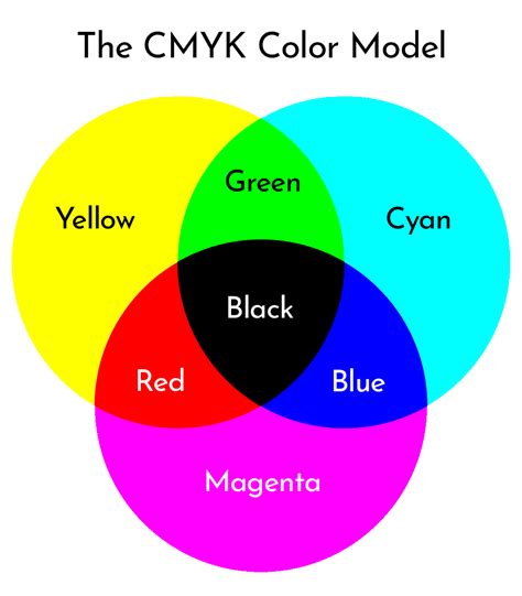
At its core, the CMYK color model is a subtractive color system, meaning it works by subtracting light. When light hits a surface, certain wavelengths are absorbed, and others are reflected. In printing, this process is reversed. The inks themselves absorb certain wavelengths of light, and the remaining wavelengths are reflected back to our eyes, creating the colors we perceive. The acronym CMYK stands for its constituent inks: Cyan, Magenta, Yellow, and Key (which is black).
- Cyan: A greenish-blue color.
- Magenta: A purplish-red color.
- Yellow: A bright yellow color.
- Key (Black): Black ink provides depth, contrast, and is crucial for text and fine details.
These four inks are combined in varying percentages to create a wide spectrum of colors. For instance, mixing equal parts of Cyan and Magenta can produce a deep blue, while combining Yellow and Magenta results in red. The "K" in CMYK, representing black, is essential because mixing C, M, and Y alone often produces a muddy, unsaturated brown rather than a true black. Black ink adds richness and definition to images and text.
CMYK is the standard for most commercial printing processes, particularly for full-color photographs and designs that involve a broad range of hues. This is because the four-color process allows for the reproduction of millions of colors by varying the dot patterns and percentages of each ink. When you see a vibrant, full-color image in a magazine, brochure, or on packaging, it has almost certainly been printed using the CMYK color model. The inks are applied in tiny dots (halftones), and the human eye blends these dots from a distance to perceive a continuous tone image. The density and arrangement of these dots determine the final color.
The Precision of PMS: Pantone Matching System
In contrast to the process-based nature of CMYK, the Pantone Matching System (PMS) is a proprietary, standardized color system designed for unparalleled precision and consistency. It is a library of pre-mixed colors, each with a unique identification number. When a designer specifies a PMS color, they are referring to a specific, pre-defined ink formulation that the printer will use.
The primary advantage of PMS is its ability to ensure exact color reproduction, regardless of the printing process or the batch of ink used. This is achieved through meticulously developed ink formulations. Each PMS color is a unique ink, mixed according to a precise recipe. This eliminates the guesswork and potential variations inherent in mixing CMYK inks on the press.
For example, if a brand specifies "Pantone 185 C" for its logo, the printer will use the exact Pantone ink formulation for that color. This guarantees that the logo will appear consistently across all printed materials, whether it's a business card printed today or a banner printed next year, and regardless of whether it's printed in one location or another. This level of predictability is invaluable for maintaining brand identity and recognition.
When to Choose Which: CMYK vs. PMS
The decision between using CMYK and PMS is not a matter of one being inherently superior to the other, but rather about selecting the right tool for the specific job. Understanding the strengths and weaknesses of each system is crucial for making an informed choice.
CMYK is generally the preferred choice for:
- Full-Color Photographs: CMYK excels at reproducing the subtle gradations and wide color gamut required for realistic photographic images. The ability to create millions of colors through ink mixing makes it ideal for images with complex tonal variations.
- Designs with a Broad Color Palette: If your design incorporates a vast array of colors, especially those that are not critical brand identifiers, CMYK offers a cost-effective solution.
- Projects with Budget Constraints: For many standard printing jobs where absolute color exactness is not the primary concern, CMYK is more economical. The inks are standard, and the printing process is widely accessible.
- Digital Applications: While CMYK is a print model, it's also the standard for preparing images for print. For web design and digital displays, RGB (Red, Green, Blue) is typically used, which has a different gamut and behavior.
PMS is the superior choice for:
- Critical Brand Colors: This is where PMS truly shines. Logos, specific brand colors, and any element that defines a company's visual identity demand the precision that PMS offers. This ensures that a brand's signature color looks the same everywhere, from a brochure to a product package.
- Spot Color Printing: In some cases, especially for simpler designs or when very specific, vibrant colors are needed, a project might be printed using only PMS inks. This is known as spot color printing.
- Materials Where Color Uniformity is Vital: For marketing materials, packaging, and signage where consistent brand representation is paramount, PMS eliminates the risk of color drift between print runs.
- Metallic and Fluorescent Colors: CMYK cannot reproduce the brilliance of metallic inks or the vibrancy of fluorescent colors. These special effects are exclusively achievable with specific PMS inks.
The Transition from CMYK to PMS: Benefits and Challenges
Transitioning from CMYK to PMS is often a pivotal step for businesses aiming to solidify and maintain their brand consistency across all printed materials. The core benefit of this shift lies in achieving precise color reproduction. PMS ensures that a specific brand color, like the vibrant red of a well-known soft drink or the distinct blue of a tech company, will appear identical on a business card, a flyer, a billboard, and any other printed collateral. This uniformity builds brand recognition and trust, as consumers come to associate that exact color with the brand.
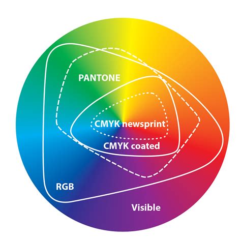
However, this transition is not without its challenges. One of the primary hurdles is the inherent difference in color ranges between the two systems. CMYK, with its subtractive mixing of four process inks, has a certain gamut or range of colors it can reproduce. PMS, with its vast library of pre-mixed inks, often extends beyond the CMYK gamut, particularly in terms of vibrancy and certain shades.
Key Challenges in Transitioning:
- Color Gamut Differences: Not every PMS color can be accurately replicated using CMYK inks. When a PMS color falls outside the CMYK gamut, designers and printers must find the closest CMYK approximation. This can sometimes lead to slight, though often imperceptible, color variations. Conversely, when converting CMYK to PMS, a CMYK mix might correspond to a very specific PMS shade, but the conversion process isn't always a perfect one-to-one match, requiring careful calibration.
- Environmental Factors: The perception of color is subjective and can be significantly influenced by external factors. Lighting conditions are a prime example. A color viewed under fluorescent office lighting might appear different than when viewed under natural daylight or warm incandescent light. This is why color matching often involves viewing samples under standardized lighting conditions (e.g., D50 or D65).
- Material Selection and Ink Absorption: Different printing materials possess unique surface properties and absorb inks differently. A glossy coated paper will reflect more light and make colors appear brighter and more saturated than an uncoated, absorbent paper. This means that the same PMS ink printed on two different substrates can look noticeably different. Understanding the substrate's impact on ink appearance is crucial for accurate color matching.
- Budget Constraints: PMS inks are typically more expensive than standard CMYK inks. This is because they are specialized, pre-mixed formulations that often require separate handling and application on the printing press. For projects with tight budgets, the added cost of PMS inks might be a significant consideration.
- Technical Expertise and Calibration: Achieving accurate PMS color reproduction requires a certain level of technical expertise from both the designer and the printer. Proper calibration of monitors, printers, and a deep understanding of ink properties are essential.
Tools and Techniques for Accurate Color Conversion
Successfully navigating the transition from CMYK to PMS, or ensuring accurate color representation within either system, relies heavily on the right tools and methodologies.
Design Software Capabilities:Modern design software, such as Adobe Illustrator and Adobe Photoshop, provides essential tools for color management. These programs allow designers to:
- Assign Color Profiles: Designers can specify whether a document is intended for CMYK, RGB, or other color spaces.
- Convert Colors: Software can convert colors between different models. For example, it can suggest the closest PMS equivalent for a given CMYK color, or vice-versa. However, it's crucial to remember that these are often digital approximations.
- Simulate Print Output: Tools like Photoshop's "Proof Colors" feature can simulate how colors will appear when printed with a specific CMYK profile, helping to identify potential out-of-gamut colors.
Convert CMYK or RGB to Pantone Colors | Illustrator 2024
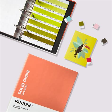
The Indispensable Swatch Book:Despite the advancements in digital tools, physical Pantone swatch books remain indispensable for accurate color matching. These books contain actual printed samples of each PMS color on different paper types (coated, uncoated, matte). They provide a tangible, real-world reference that digital screens cannot perfectly replicate due to variations in monitor calibration, backlighting, and viewing conditions. Designers and printers use these swatch books to:
- Select Brand Colors: To choose the precise PMS color that best represents a brand.
- Verify Conversions: To compare a CMYK-simulated color on screen or a printed CMYK proof against the actual PMS swatch to assess the accuracy of the conversion.
- Communicate with Stakeholders: To show clients exactly what a specific color will look like in print.
Collaboration with Printers:A close working relationship with your printing partner is paramount for achieving optimal color accuracy. Printers have extensive knowledge of their equipment, ink capabilities, and the behavior of inks on various substrates. They can:
- Advise on Feasibility: Help determine if a desired PMS color can be accurately reproduced on the chosen material with the available printing process.
- Perform Color Checks: Conduct press checks or provide color proofs (e.g., digital proofs, contract proofs, or press proofs) to allow you to review the colors before the full print run.
- Address Discrepancies: Work with you to resolve any color issues that arise during the printing process.
Digital Tools and Proofing:Beyond design software, digital proofing services can offer high-fidelity simulations of the final printed output. These proofs aim to accurately represent the color, trapping, and imposition of the design. However, it is essential to understand that even the most advanced digital proofs are still a representation, and a physical proof or a press check might be necessary for critical color applications.
The Broader Impact: Color in Branding and Perception
Color plays a profoundly pivotal role in branding. It is often the first and most memorable aspect of a brand's visual identity, capable of conveying a brand's personality, values, and even evoking specific emotions. A vibrant, energetic color palette might suggest innovation and dynamism, while a muted, sophisticated palette could communicate elegance and trustworthiness.
Transitioning from CMYK to PMS for critical branding elements is therefore not merely a technical adjustment; it's a strategic decision to enhance brand integrity. When a brand's color is consistently and accurately reproduced across all touchpoints, it reinforces recognition and builds a stronger, more cohesive brand image. This uniformity across various media, from digital platforms (though digital uses RGB, the intention is to match brand colors) to printed materials, ensures that the brand's visual message is never diluted or misinterpreted.
The choice between CMYK and PMS can significantly influence how a brand is perceived. While CMYK offers versatility and is cost-effective for a broad range of applications, PMS delivers an exactitude that is often synonymous with professionalism and meticulous attention to detail. For brands where visual identity is a key differentiator, the investment in PMS is often a worthwhile one.
Ultimately, selecting the right color system involves careful consideration of project scope, budget, and the specific requirements of the brand. Both CMYK and PMS offer unique benefits, and understanding these distinctions is the first step towards making well-informed decisions. Collaborating with experienced designers and printers is crucial; their expertise can guide you through the complexities of color theory, ink properties, and printing processes, ensuring that your final printed materials not only look good but also effectively communicate your brand's intended message. Successful projects, particularly those where brand consistency is paramount, often stem from these well-informed decisions about color systems.
Do you have an upcoming print marketing project where color accuracy is essential? Reach out to us at 866-938-3757 or submit a quote request form to discuss how we can help you achieve your desired color outcome.