The vibrant world of digital design and the tangible reality of print often speak in different color languages. Understanding the fundamental distinctions between RGB and CMYK is not merely a technicality; it's the cornerstone of professional design, ensuring that the vivid hues envisioned on screen translate accurately to the printed page. This guide delves into the intricacies of the CMYK color model, exploring its mechanics, its crucial role in printing, and how to navigate the conversion process to achieve impactful and consistent results.
The Core of Color: Understanding Color Models
At its heart, a color model is a mathematical system designed to define how different colors are created and displayed. The divergence in how we perceive and reproduce color stems from the very mediums we use. Digital screens, from your smartphone to your television, are emissive; they generate light. This is the domain of the RGB (Red, Green, Blue) color model. By blending these three primary colors of light, screens can produce an incredibly wide spectrum of colors, a gamut that closely mirrors how our eyes perceive the world. When you mix red light, green light, and blue light at full intensity, they create white light. The RGB space is the native language of the internet, powering everything digital. Its most notable feature is its inherent brightness, a direct consequence of screens emitting light.
In stark contrast, printed items are not light sources; they can only reflect the light that hits them. This fundamental difference necessitates a different approach to color reproduction, leading us to the CMYK color model. Printed materials use a subtractive color model, where colors are created by layering inks that absorb certain wavelengths of light and reflect others.
CMYK: The Science of Subtractive Color
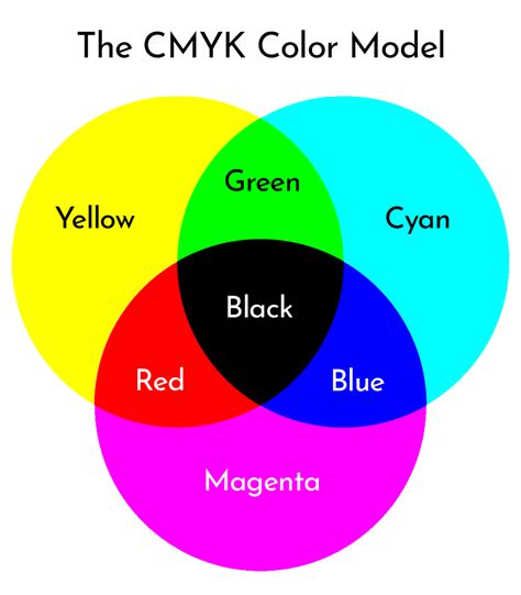
CMYK stands for Cyan, Magenta, Yellow, and blacK (often referred to as Key). These four inks are the standard in the printing industry because they create a wide range of colors through a subtractive process. When these four pigments are layered on a white surface, they mask the brightness of the paper. Cyan ink absorbs red light, magenta absorbs green light, and yellow absorbs blue light. By blending these inks in varying percentages, a vast array of colors can be achieved.
The addition of black ink, denoted by "K" for "Key," is crucial. While theoretically, combining cyan, magenta, and yellow inks should produce black, in practice, this often results in a muddy, dark brown rather than a true, deep black. The black ink plate provides depth, detail, and the ability to create rich, solid blacks that are essential for text and defining darker areas of an image. This is why CMYK is a subtractive model: the inks subtract wavelengths from the white light reflected by the paper.
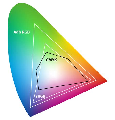
The CMYK color spectrum is smaller than the RGB range. This is known as the printable range. Because the CMYK profile is forced to subtract light instead of generate it, it cannot produce anywhere near as wide a spectrum of colors as RGB. This contrast impacts the CMYK gamut, which is the range of colors a system can produce. Consequently, some colors you see on a monitor, especially bright, saturated, or "neon" colors, are considered "out of gamut" for a printer.
The Gamut Gap: Why Colors Look Different
The primary reason your brand colors might look different in print versus on screen is the inherent difference between the RGB and CMYK color models and their respective gamuts. RGB has a very wide color gamut, meaning it can produce many colors, because RGB is actually how our eyes perceive color and screens emit light. CMYK, on the other hand, is limited by the physical properties of inks and the printing process.
When you use a color that doesn't exist within the CMYK gamut, the printer will select the closest available match. This often results in "muddy" or duller tones compared to their on-screen RGB counterparts. Screen brightness also plays a role; monitors are backlit, making colors appear more vivid than they do when relying on reflected light from ink on paper.
For example, a bright, glowing magenta on your screen might translate to a darker, more subdued plum color when printed. Even when viewing a CMYK proof as a PDF file, your monitor is still RGB-based, translating ink colors into light colors as best it can. This means what you see in digital work isn't always a perfect preview of the printed result.

Navigating the Conversion: From Screen to Print
For any design project intended for print, understanding and executing the conversion from RGB to CMYK is a critical step. While you should design your digital assets in RGB for the widest color range and vibrancy, it's imperative to convert them to CMYK before sending them to print.
If you are using professional design software like Adobe Photoshop or InDesign, you can switch your document color mode to CMYK to preview how your printed ink will actually look. Look out for the ‘out-of-gamut’ warning icon (a triangle with an exclamation point) that pops up in your color picker tool. This icon alerts you when a selected color falls outside the printable CMYK range. Sometimes, the program will suggest the closest color within the gamut.
When exporting your final files for print, ensure you are using appropriate file types that support CMYK color mode, such as PDFs, Adobe Illustrator (AI) files, or Encapsulated PostScript (EPS) files. For web projects, you should design in RGB and export with an embedded sRGB profile.
A common misconception is that a simple conversion will always yield identical results. However, the gap between RGB and CMYK gamuts means that some colors simply cannot be perfectly replicated. Professional print providers often recommend specific CMYK profiles based on their printing equipment and paper stock. For instance, Web Coated (SWOP) v2 is commonly used for coated paper in North America, while Coated FOGRA39 is a standard for European printing. Always check with your print provider for their recommended profile.
Achieving Color Consistency: Beyond Basic Conversion
Color management is the broader practice of ensuring your brand colors remain consistent across all media. Every device interprets color differently; your laptop, phone, scanner, and even the paper stock used for printing each have their own "profile" that defines how they display or print color.
To achieve accurate color reproduction, designers employ several strategies:
- ICC Profiles: An ICC profile is a set of data that tells the printer how to represent colors. Using the correct color spaces and profiles is vital to avoid unexpected shifts.
- LAB Color Space: Thankfully, there's a universal color system that sits above device-specific profiles: LAB. This device-independent model acts as a translator, allowing designers to convert colors between different device profiles while maintaining color accuracy. The formula is essentially: LAB + device profile = accurate color match.
- Pantone Matching System (PMS): For critical brand elements like logos, where exact color reproduction is paramount, the Pantone Matching System is the industry standard. Pantone assigns a unique reference number to every shade, ensuring reliable and consistent color reproduction across different print providers, regions, and materials. Many brands consider Pantone the ultimate benchmark for color consistency.
Best Practices for Print Design
When preparing your designs for print, consider these key practices:
- Design in the Correct Color Mode: For print-ready files, start with your document set to CMYK color mode. If you began in RGB, convert it using "Edit > Convert to Profile" in Photoshop, ensuring you select the correct CMYK profile.
- Understand "Rich Black": To achieve a deep, solid black for large areas of text or backgrounds, avoid using just 100% black ink (C=0, M=0, Y=0, K=100). Instead, use a "rich black" mix, such as C=60, M=40, Y=40, K=100. This combination of inks creates a more opaque and visually richer black.
- Consider Paper and Finish: The type of paper and its finish (glossy, matte, uncoated) can significantly impact how colors appear. A glossy paper can make colors look more vibrant, while uncoated paper tends to absorb ink, resulting in a more muted appearance.
- Proofing is Essential: Before committing to a large print run, always order a physical proof. This allows you to see exactly how your colors will appear on the chosen paper stock and make any necessary adjustments.
- Collaborate with Your Printer: Open communication with your print provider is invaluable. They can offer expert advice on color profiles, file preparation, and potential issues to avoid, ensuring the best possible outcome for your printed materials.
CMYK in Practice: Design Ideas That Shine
The CMYK color model offers a robust foundation for a wide range of print projects, enabling designers to achieve both subtle nuances and bold, impactful visuals.
- Flyers and Brochures: These are prime candidates for vibrant CMYK printing. The ability to blend cyan, magenta, and yellow inks allows for a broad spectrum of hues, ensuring your promotional materials are eye-catching and engaging. Careful conversion from RGB files to CMYK is crucial for accurate color reproduction.
- Business Cards: Brand consistency is paramount for business cards. Using CMYK ensures that your brand's specific colors are reproduced with precision, providing an exact match every time. This reliability is vital for presenting a polished and professional brand image.
- Invitations: Whether for weddings, parties, or corporate events, the nuances of CMYK can elevate invitations. Achieving rich blacks for text and vibrant hues for graphics can make each detail stand out, capturing the essence of the occasion.
- T-Shirts and Apparel: For custom apparel, understanding the difference between CMYK and RGB is crucial for stunning color reproduction. High-quality inks and printing techniques, combined with a solid understanding of CMYK color translation, will make your designs pop.
- Greeting Cards: Creating custom greeting cards offers complete creative control. CMYK allows for beautiful color gradients, vibrant illustrations, and crisp photographs. The use of "rich black" can make text appear deeper and more solid, while combining CMYK with spot colors can add metallic or fluorescent accents for a truly unique finish.
What Is The Difference Between RGB and CMYK? Color Models and Print
Conclusion: Mastering the CMYK Landscape
Understanding the CMYK color model is not just about knowing acronyms; it's about mastering the technical requirements of print production. By grasping the subtractive nature of CMYK, the limitations of its gamut compared to RGB, and the importance of proper conversion and color management, designers can bridge the gap between their digital creations and their physical manifestations. The right colors evoke emotions, convey messages effectively, and ensure your brand's visual identity remains consistent and impactful, whether viewed on a screen or held in hand. As you continue to explore the world of color printing, don't hesitate to experiment with different CMYK combinations and consult with experts to achieve the best possible results for your projects.
tags: #cmyk #color #conversion