If you’ve ever designed a logo that would be printed on business cards, flyers, or other marketing materials, then you know just how important a role the CMYK color model plays. CMYK is a color model system that’s the foundation for all print design. Understanding this model is essential for designers because it ensures color accuracy and high-quality resolution in printed materials. This article delves into the intricacies of the CMYK color model, explaining its mechanics, its critical role in printing, and how to effectively utilize it for your design projects.
What the CMYK Color Model Is
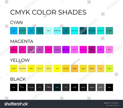
CMYK is a color model used in printing to create a wide range of colors by combining four different colors: Cyan (C), Magenta (M), Yellow (Y), and Key (K), which represents black. This system is also known as process color, full color, or four-color printing. It’s based on the CMY model but incorporates black for enhanced depth and contrast.
The letter "K" stands for "key," a term used for the black plate in traditional printing. This key plate provided the sharpest details and defined the darkest areas of the image. As a result, the term "key" became associated with black in the printing industry. It also helps avoid any confusion with other colors or terms like blue.
These four colors play specific roles in the printing process. Designers layer different amounts of cyan, magenta, and yellow to create a range of colors. Black is used to achieve depth and contrast in printed materials.
For instance, a combination like C = 0, M = 50, Y = 100, K = 0 produces a bright orange color. To produce regular black (also known as "true black”), only the key (black) color is applied at full intensity (C = 0, M = 0, Y = 0, K = 100). For a deeper black, cyan, magenta, and yellow combine with key. This “rich black” is used for large areas of solid black in printing, with a typical combination of C = 60, M = 60, Y = 60, K = 100.
Understanding Subtractive Color Mixing in CMYK
In printing, the CMYK model creates colors by mixing cyan, magenta, and yellow inks-a process known as subtractive color mixing. This method works by subtracting (absorbing) certain wavelengths of white light, reflecting only the desired color. For example, a magenta surface absorbs green light but reflects red and blue, giving it a magenta appearance. Similarly, cyan and yellow inks filter out specific wavelengths to display their respective colors.
The subtractive color model also defines relationships between primary, secondary, and tertiary colors:
- Primary Colors: Cyan, magenta, and yellow form the foundation.
- Secondary Colors: Mixing two primary colors creates secondary colors-cyan and magenta form blue, magenta and yellow form red, while yellow and cyan create green.
- Tertiary Colors: Combining all three primary colors theoretically produces black, but in practice, the result often appears as a dark brownish hue due to ink impurities.
The CMYK system defines colors based on the percentages of each ink used, like C=0%, M=100%, Y=100%, K=0% for a vivid red. Selecting colors based on printed color guides rather than digital screens ensures accurate color reproduction, as the final appearance can vary due to different printing conditions and substrates.
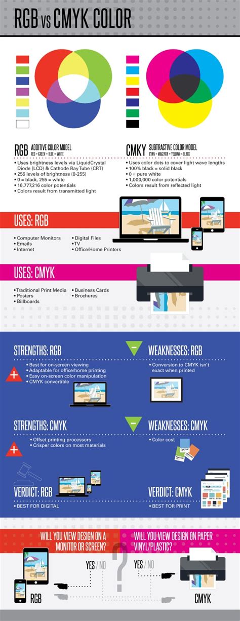
The Difference Between RGB and CMYK
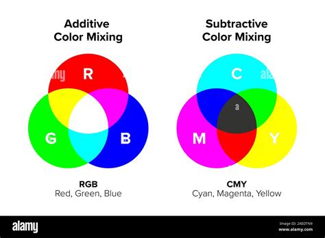
While CMYK is for printed materials, the RGB color model is for screens and digital content. RGB colors (red, green, and blue) add light to create color, making it an additive color model. CMYK colors (cyan, magenta, yellow, and key) produce color by subtracting light, making it a subtractive color model.
RGB colors combine to create a wide array of vibrant hues, making them ideal for screens and phones. CMYK colors subtract light to produce colors best for physical materials like paper and fabric.
RGB vs. CMYK: Additive vs. Subtractive
RGB is an additive color model, meaning all colors start as black, and are changed as red, green, or blue light is added on top to layer. When layers of these colors of light are mixed together at full intensity, the result is white. In RGB color, you can change saturation and shades by changing any of the three colors. Since these changes are controlled digitally, they result in differences in the way light is seen on a screen.
CMYK is a subtractive color model. In a subtractive color model, colors are created by subtracting certain wavelengths of light. When any of these four colors are combined, together they subtract various parts of the light spectrum. In printing, the four colors can be applied to a white surface to produce a very wide range of colors. For example, Cyan absorbs red light, so blue and green light is reflected. Each of these four colors absorbs and subtracts different colors and thus reflects different colors.
Gamut Considerations: When Colors Don't Translate
The collection of colors that can be coded in a color space is called a "gamut." The gamut of CMYK is different from RGB's. Part of the RGB colors cannot be printed using standard CMYK inks. For instance, if you set RGB to 255,0,0 (full red) in software like Photoshop, you might see an exclamation mark indicating that this color is "out of gamut for printing." This means that the vibrant red you see on your screen cannot be perfectly reproduced with CMYK inks. Photoshop will then suggest the closest possible CMYK equivalent, which will appear less saturated than the original RGB red.
This difference arises because RGB colors are created by emitting light, allowing for very bright and saturated hues. CMYK inks, on the other hand, work by absorbing light, and the physical properties of inks limit the range of colors that can be achieved. Understanding this "gamut warning" is crucial for designers to manage expectations and ensure their designs are optimized for print.
Why CMYK is Important for Printing?
CMYK is important for printing because it provides color consistency in, for example, posters and packaging. CMYK's subtractive color model provides uniform results. This guarantees that prints on paper, fabric, and other materials look consistent-critical to protect the integrity of your brand’s style and ensuring prints match the original design.
The Best Choice for Physical Media
CMYK, unlike RGB, operates on a subtractive color model where inks absorb light instead of emitting it. This makes it ideal for physical printing on surfaces like paper and fabric. While RGB excels at producing vibrant colors on screens, CMYK offers rich, deep tones that are unmatched in print. This subtractive process ensures precise and practical color reproduction for high-quality printed materials.
Ensuring Color Consistency Across Prints
One of CMYK’s greatest strengths is its ability to produce consistent color results across multiple print runs and materials. By using four standard inks, CMYK establishes a controlled color environment that maintains uniformity in every print-from small batches of business cards to large-scale brochures. This reliability is vital for maintaining brand integrity and ensuring that colors effectively communicate your message.
Advantages of CMYK in Printing
Despite the availability of other color models like RGB for digital work or Pantone for branding, CMYK remains the most practical and widely used for print.
- Cost-Effectiveness: Ideal for large print runs, CMYK’s simplicity keeps costs low while delivering reliable results.
- Versatility: CMYK can produce a wide range of colors by mixing its four base inks, meeting most printing needs.
- Accessibility: Standardized by the printing industry, CMYK is supported by nearly all commercial printers, making it the go-to model for reliable results.
When to Use CMYK
You should use CMYK colors for designs you plan to print, including:
- Business cards
- Posters
- Billboards
- Stationary
- Swag (T-shirts, mugs, pens)
- Flyers
- Brochures
- Product packaging
- Menus
- Banners
For brands that focus on both print and web design, having the right tools to ensure colors translate correctly is essential. Platforms like Figma excel in UI design, while plugins can convert projects and marketing materials to CMYK for printing purposes.
How CMYK Printing Works
The CMYK printing process transforms digital designs into tangible printed materials. Unlike the RGB color model used for digital screens, CMYK adapts designs to the physical constraints of inks and substrates, ensuring accurate and consistent reproduction.
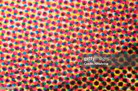
Introduction to Halftone Dots
Colors in print are created by combining halftone dots of cyan, magenta, yellow, and black in various sizes and spacings. Halftone dots are the fundamental building blocks of color reproduction in printing. By adjusting the size, shape, and distribution of dots, printers can replicate the tonal variations of an original image on a physical substrate. This process controls the intensity, brightness, and saturation of colors, enabling the creation of detailed and vibrant prints.
In offset printing, halftone dots serve as the smallest functional units, translating continuous-tone images into printable patterns. Their role extends beyond tonal control to include defining contours, organizing colors, and balancing visual layers in the final output.
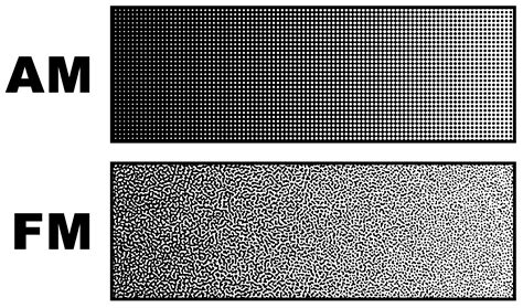
Types of Halftone Dots
To effectively reproduce tonal variations in printing, halftone dots are categorized into two primary types: amplitude-modulated (AM) and frequency-modulated (FM) dots.
- Amplitude-Modulated (AM) Dots: In AM screening, the dot area coverage varies with the tonal intensity of the image, while the spatial frequency of the dots remains fixed, with dots arranged in a regular grid pattern. This is the most widely used type in conventional printing.
- Frequency-Modulated (FM) Dots: Also known as stochastic dots, FM dots have a fixed dot size, but their spatial frequency varies based on the tonal intensity of the image. On a microscopic level, FM dots are randomly distributed. Compared to AM dots, FM dots can achieve reproduction quality that closely resembles continuous-tone images, resulting in sharper image details and more vibrant, saturated colors, while eliminating moiré patterns.
Principles of Color Reproduction
The color reproduction process using halftone dots relies on two main principles: overlapping and juxtaposed dots.
- Overlapping Halftone Dots: Overlapping dots of different colors-cyan, magenta, yellow, and black-create subtractive color mixing. For instance, layering cyan and magenta dots produces blue, while adding yellow creates green. However, factors such as ink transparency, layer sequence, and dot alignment can influence the final output.
- Juxtaposed Halftone Dots: Juxtaposed dots place different colors side by side, relying on optical blending to achieve the perception of new colors. This method is particularly effective for maintaining brightness and avoiding over-saturation but may result in lower color depth compared to overlapping dots.
Key Factors in Halftone Printing
Several factors influence the effectiveness and quality of halftone printing:
- Dot Size: Dot size, expressed as a percentage of coverage in a given area, directly affects tonal intensity. Larger dots absorb more light, appearing darker, while smaller dots reflect more light, appearing lighter.
- Dot Shape: Common dot shapes include circular, elliptical, and square patterns. The shape affects how tones blend and how the image appears to the eye.
- Dot Line Frequency: Measured in lines per inch (LPI), this determines the density of dots in a given area. Higher LPI produces finer details and smoother gradients.
- Dot Angles: The angles at which dots are arranged ensure proper color separation and prevent interference patterns. In CMYK printing, standard angles are used to achieve optimal results.
How to Convert RGB to CMYK
While RGB colors look great on digital screens, their appearance can change when translated to print. Before you bring your digital designs to life on paper, converting them to CMYK is crucial.
Transitioning from RGB to CMYK can involve subtle adjustments because some hues might shift slightly during conversion. It's important to fine-tune these colors to preserve the vibrancy and accuracy of your original design. Many design software programs, like Adobe Photoshop and Illustrator, have built-in functions to convert RGB to CMYK. It's often recommended to perform this conversion as one of the final steps in your design process.
How to Change Color Modes in InDesign
Maintaining Color Consistency with Figma
Color consistency is crucial in design, and Figma makes it easier than ever. While Figma primarily operates in an RGB color space for its digital UI design focus, it offers ways to manage color for print. Designers can use plugins that help convert their Figma designs to CMYK, allowing for a more accurate preview of how colors will appear in print. It's also good practice to be aware of CMYK color values and limitations while designing, even within an RGB-based tool, to anticipate potential color shifts. For critical print projects, using CMYK color charts and working with print-ready files in CMYK-compatible software is essential.
Beyond CMYK: Spot Colors and Pantone
As accurate as CMYK colors can be in printing, there are instances where an exact match is needed in print and it cannot be achieved by mixing the four colors. In these cases, printers use what is called “spot colors” or Pantone colors. Pantone offers a standardized color matching system, so artists can select and specify precise colors, regardless of the printing method. By incorporating Pantone colors into the CMYK workflow, designers can achieve higher color accuracy and maintain consistency.
In conclusion, a solid understanding of CMYK printing is essential for artists and designers to be able to produce high-quality printed products from their creations. Using CMYK color mode for printing offers several advantages, especially the ability to reproduce colors more accurately and consistently, making it the industry standard for color printing. To ensure an exact color match, even beyond the capabilities of CMYK, Pantone colors, or spot colors, are another valuable tool. CMYK printing is a designer's dream as it creates exceptional prints that can be vibrant, have depth, and provide accurate color matches. Believe it or not, the combination of these four inks can create every tone and shade in the design rainbow.