The world of color reproduction in printing can often feel like navigating a maze. While digital screens and physical prints operate on fundamentally different principles, understanding the CMYK color model is paramount for designers aiming for predictable and pleasing results. A CMYK color swatch book serves as an invaluable tool in this endeavor, offering a tangible representation of how colors will translate from the digital realm to the printed page. This guide delves into the intricacies of the CMYK color model, its challenges, and how swatch books like "Design Swatch" can empower designers and businesses to achieve greater color accuracy and consistency in their printed materials.
Understanding the CMYK Color Model: A Subtractive Approach
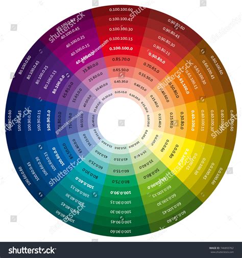
The CMYK color model, standing for Cyan, Magenta, Yellow, and Key (Black), is the cornerstone of four-color printing. Unlike additive color models like RGB (Red, Green, Blue) used for screens, where colors are created by emitting light, CMYK is a subtractive model. In this process, inks are applied to a white or light-colored substrate, and they absorb certain wavelengths of light while reflecting others. The colors we perceive are the light that is reflected back to our eyes.
White, in the CMYK model, is the color of the paper or substrate itself. Black is ideally achieved by combining all four inks, though in practice, mixing just Cyan, Magenta, and Yellow doesn't produce a true, deep black but rather a dark brown. This is where the "Key" or black ink comes into play, providing richer blacks and enhancing contrast.
The fundamental principle of CMYK is that each ink absorbs a specific primary color:
- Cyan absorbs Red light.
- Magenta absorbs Green light.
- Yellow absorbs Blue light.
By varying the percentages of these four inks, a vast spectrum of colors can be created. For instance, combining Cyan and Yellow inks in equal, dense proportions will produce a vibrant Green. This subtractive mixing is the basis for creating all the colors seen in printed materials, from the most subtle pastels to the most saturated hues.
The Challenges of CMYK Reproduction: When Colors Don't Quite Match
Despite the systematic nature of the CMYK model, achieving perfect color reproduction can be challenging. Several factors contribute to this:
- Ink Limitations: The pigments used in CMYK inks have inherent limitations. They cannot perfectly absorb or reflect all wavelengths of light, leading to a finite color gamut (the range of reproducible colors).
- Substrate Variations: Different paper types absorb ink differently. Coated papers tend to hold ink on the surface, resulting in brighter and more saturated colors, while uncoated papers absorb ink, leading to a duller appearance.
- Printer Calibration: The calibration of the printing press and the individual printer's settings significantly impact the final output. Even with the same CMYK values, different printers can produce slightly different results.
- Monitor vs. Print Discrepancies: This is a common pitfall for designers. Monitors display colors using RGB, which has a wider gamut than CMYK. When a design created in RGB is converted to CMYK, colors outside the CMYK gamut will be shifted, often resulting in less vibrant or altered hues. Furthermore, monitor settings themselves can vary, affecting what you see on your screen compared to your physical prints.
These challenges highlight why exact color matching in CMYK printing is often not possible without resorting to specialized systems like Pantone spot colors. However, for many applications, understanding and working within the CMYK gamut is sufficient.
Navigating Specific Color Challenges in CMYK
Certain colors present more difficulties than others in CMYK printing. Awareness of these common issues can help designers adjust their expectations and their designs:
Black: Standard vs. Rich Black
While black ink (K) is a primary component, simply using 100% black can sometimes result in a flat or dull appearance, especially on uncoated paper. To achieve a richer, more saturated black, designers often employ "Rich Black." This is created by blending all the CMYK colors. A common Rich Black mix involves percentages like C:60, M:40, Y:40, K:100. This combination results in a deeper, more impactful black that truly "pops."
Red: The Orange and Pink Predicament
Red is a color that frequently causes printing woes. When red appears too orange or rusty, it often indicates an imbalance in the Cyan and Yellow levels. To correct this, one needs to adjust these values. Conversely, if red leans too pinkish, it suggests an overabundance of Magenta. Achieving a true, vibrant red requires careful calibration of Cyan and Magenta.
Green: The Cyan and Yellow Dance
Green is produced by mixing Cyan and Yellow. To achieve vibrant green results, it's recommended to use equal parts of Cyan and Yellow and ensure these inks are applied densely. This creates a strong, pure green.
Yellow: The Darkening Dilemma
While mixing Cyan and Yellow creates green, and Magenta and Yellow create red, working with yellow itself, especially when trying to darken it, requires caution. As yellow is darkened, it can easily shift towards a more muted, less desirable sage or mustard color. Careful adjustments to Cyan and Black are needed to maintain the desired hue.
Blue: A Historically Tricky Hue
Historically, blue has been one of the most challenging colors to reproduce accurately in CMYK printing. Achieving a consistent and vibrant blue often necessitates using even and balanced mixtures of the CMYK inks. A commonly suggested formula for a good blue is 100% Cyan, 50% Magenta, 0% Yellow, and 0% Black (100-50-0-0). This provides a strong, reliable blue.
Purple: A CMYK-Friendly Choice
Regal purple tones are generally considered CMYK friendly. Their reproduction tends to be more predictable and less prone to dramatic shifts compared to reds or blues, making them a good choice for designers seeking reliable color representation.
Pink: The Power of Magenta
In CMYK printing, pinks are primarily dictated by the amount of Magenta ink used. For stand-out pink colors, designers should aim for high Magenta levels while keeping Cyan, Yellow, and Black at low percentages. This ensures a vibrant and clear pink.
Metallics: The Limits of CMYK
It's crucial to understand that CMYK printing cannot produce true metallic finishes. While a realistic metallic gold or silver effect is not achievable, printers can create flat or non-metallic metal (NMM) representations. These are essentially flat color simulations that look like metallic colors but lack the reflective sheen of actual metallic inks or foils.
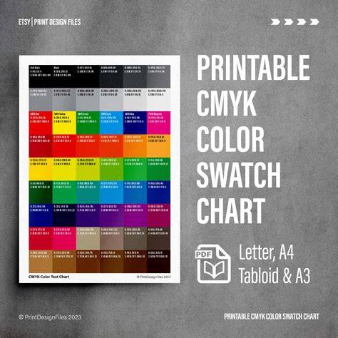
The Role of a CMYK Color Swatch Book: "Design Swatch" as a Case Study
Tools like "Design Swatch" aim to bridge the gap between digital design and the realities of CMYK printing. These swatch books offer a practical, tangible reference for designers, providing a realistic representation of straight CMYK industrial printing.
Key features of such a tool include:
- Realistic CMYK Representation: They provide a visual guide to colors that can be reliably produced using CMYK offset printing, offering predictable color outcomes.
- Design-Focused Palette: A curated selection of colors, often numbering in the hundreds (e.g., 350 design-focused CMYK colors), specifically chosen for their usability in graphic design and business applications.
- CMYK-Hex Conversion: The inclusion of Hex codes alongside CMYK values on each card facilitates easy conversion between these two color systems. This is invaluable for web designers who need to translate print colors for digital use or vice versa.
- Color Palette Planner: The physical cards can serve as a practical tool for planning color palettes for various design or web projects, allowing designers to visualize combinations.
- Complimentary Digital Assets: Often, these swatch books come with downloadable assets, such as ASE (Adobe Swatch Exchange) files. These files can be imported directly into design software like Adobe Illustrator and Affinity Designer, allowing designers to work with the swatch colors digitally.
Design Swatch: More Than Just a Deck
"Design Swatch" is presented as more than just a deck for color matching; it's a versatile design tool. Its purpose is to close the color accuracy gap in the early stages of graphic design and business. By offering high-quality graphic design tools at a more accessible price point than professional color matching systems, it makes industrial-level color accuracy attainable for a wider audience. The promise is "true-to-print CMYK colors every time," ensuring designs translate seamlessly from screen to print without unexpected color shifts.
Is "Design Swatch" a Replacement for Pantone?
The question of whether a CMYK swatch book can replace Pantone is nuanced.
- No, if absolute color accuracy from suppliers is paramount: Pantone spot colors are specific, pre-mixed inks designed for precise color matching. Manufacturers and suppliers are accustomed to working with Pantone codes and will strive to match them exactly, often regardless of cost. While even Pantone matching can have slight variations depending on the printer's certification (e.g., GMI certification), it offers a higher degree of guaranteed color fidelity for critical brand applications.
- Yes, for color consistency and reference: If the goal is to achieve color consistency and have a reliable reference from your computer screen to the final printed product, then a CMYK swatch book like "Design Swatch" is an excellent alternative. While CMYK colors can vary slightly from printer to printer, the variations are often palatable and not noticeable for most applications. In this context, "Design Swatch" serves as a great, inexpensive tool for ensuring your designs look as intended within the CMYK printing environment.
Adding Color Swatch ASE Files to Adobe Illustrator
Practical Application: Using a CMYK Swatch Book and ASE Files
To effectively use a CMYK swatch book and its associated digital assets:
- Select Your Color: Choose a color from the physical swatch cards that best represents your desired hue.
- Reference in Design Software:
- Using the ASE File: Import the provided ASE file into your design software (e.g., Adobe Illustrator, Affinity Designer). This will populate your swatches panel with the colors from the swatch book. You can then select these colors directly in your artwork.
- Manual Input: If an ASE file isn't available or preferred, you can manually input the CMYK values for the selected color into your design software.
- Call Out Important Colors: Not every color in your design needs to come from the swatch book. Focus on using the swatch colors for elements that are critical to your brand identity or where specific color accuracy is desired. Clearly label these important colors in your artwork specifications for the printer.
Installing ASE Color Libraries
For seamless integration into design software, installing an ASE color library is straightforward:
On Adobe Illustrator:
- Open the Swatches panel.
- Click the hamburger menu (three horizontal lines) in the top right corner of the panel.
- Select "Open Swatch Library."
- Choose "Other Library."
- Navigate to and select your .ase file.
- Click "Open." The library will appear as a separate panel, and you can add individual colors to your document's swatches.
On Affinity Designer 2:
- Go to the Swatches panel.
- Click the hamburger menu in the top right corner.
- Select "Import Paletteâ¦"
- Choose "As Application Palette" (or "As Document Palette" if preferred).
- Choose your .ase file.
Your ASE color library will now be installed and accessible within your design software.
Conclusion: Empowering Designers with CMYK Knowledge
The CMYK color model, while complex, is fundamental to achieving successful print results. Understanding its subtractive nature, the limitations of inks, and common color reproduction challenges is the first step. Tools like CMYK color swatch books, exemplified by "Design Swatch," empower designers and businesses by providing a realistic, tangible guide to what can be achieved in industrial printing. By bridging the gap between digital intent and print reality, these resources help ensure that creative visions are translated accurately, leading to more predictable, professional, and impactful printed materials. While not a replacement for the absolute precision of spot colors, they offer an accessible and effective means of achieving consistent and high-quality CMYK color outcomes.