The vibrant world of visual communication relies heavily on color, but the way colors are perceived and reproduced can differ significantly between digital screens and printed materials. This disparity often leads to frustration for designers and clients alike when a brilliant on-screen design transforms into a muted or altered version when printed. The key to bridging this gap lies in understanding the CMYK color model, the fundamental system that governs color reproduction in printing.
What is CMYK?
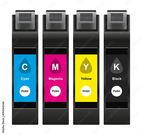
CMYK is an acronym representing the four primary ink colors used in subtractive color printing: Cyan, Magenta, Yellow, and Key (Black). This model is the industry standard for producing full-color printed materials, from business cards and brochures to magazines and packaging.
Unlike RGB (Red, Green, Blue), which is an additive color model used for digital displays and works by emitting light, CMYK is a subtractive model. It functions by layering inks onto a white surface, such as paper. Each ink absorbs specific wavelengths of light, and the light that is reflected is what the human eye perceives as color.
The Subtractive Color Process in CMYK
Imagine starting with a blank, white sheet of paper. This white paper represents the absence of ink and the full reflection of light. When inks are applied, they selectively absorb certain colors from the white light that hits the paper.
- Cyan (C) ink absorbs red light and reflects blue and green.
- Magenta (M) ink absorbs green light and reflects red and blue.
- Yellow (Y) ink absorbs blue light and reflects red and green.
By combining these three primary inks in varying percentages, a wide spectrum of colors can be created. For instance, mixing cyan and magenta inks theoretically produces blue, magenta and yellow create red, and yellow and cyan produce green.
However, mixing equal, full percentages of cyan, magenta, and yellow inks doesn't result in a pure, deep black. Instead, due to impurities in the inks, the theoretical black often appears as a muddy, dark brown. This is where the "Key" component comes into play.
The Essential Role of Black (K)
The "K" in CMYK stands for "Key," referring to the key plate in traditional printing processes, which was often the plate used for the black ink due to its importance in providing detail and contrast. The addition of black ink is crucial for several reasons:
- Achieving True Black: Black ink is essential for creating deep, rich blacks and dark tones that cannot be adequately reproduced by mixing only cyan, magenta, and yellow.
- Enhancing Contrast and Detail: Black ink sharpens text, outlines, and fine details, making images and graphics appear crisper and more defined.
- Improving Efficiency and Cost-Effectiveness: Using black ink for dark areas reduces the amount of cyan, magenta, and yellow ink needed, which can save on ink costs and reduce drying times.
- Creating Neutral Grays: Achieving neutral grays and muted tones often requires a specific balance of CMY inks, with cyan generally needing to be present in a slightly higher proportion than magenta and yellow to compensate for their relative strengths. The addition of black ink further refines these neutral tones.
CMYK vs. RGB: A Fundamental Difference
The most significant distinction between CMYK and RGB lies in their application and how they produce color:
- RGB (Red, Green, Blue): This is an additive color model. It starts with black (the absence of light) and adds red, green, and blue light to create colors. When all three lights are at their maximum intensity (255, 255, 255), it produces white. RGB is used for digital displays like monitors, smartphones, and televisions because these devices emit light.
- CMYK (Cyan, Magenta, Yellow, Black): This is a subtractive color model. It starts with white (the paper) and subtracts light by applying inks. When all CMYK inks are at their minimum (0, 0, 0, 0), the paper remains white. The presence of ink absorbs light, making colors darker.
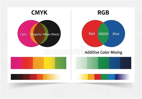
This fundamental difference means that the range of colors that can be accurately reproduced by each model, known as their gamut, is different.
Gamut Considerations: What You See vs. What You Print
The gamut refers to the complete range of colors that a particular color space or device can represent. The CMYK gamut is generally smaller than the RGB gamut. This means that some vibrant colors that can be displayed on an RGB screen simply cannot be replicated using standard CMYK printing inks.
For example, a brilliant, saturated red (like RGB 255,0,0) might be outside the CMYK gamut. When such a color is converted for printing, design software like Photoshop will often display a warning (an exclamation mark) and adjust the color to the closest achievable CMYK equivalent. This is why a design that looks stunning on screen might appear less vibrant or slightly different when printed.
Understanding Color Space And Color Profiles: A Comprehensive Guide
CMYK Values and Percentages
Unlike RGB values, which are typically represented as 8-bit numbers ranging from 0 to 255 for each channel, CMYK values are expressed as percentages, ranging from 0% to 100%.
- 0% indicates no ink of that color is used.
- 100% indicates the maximum amount of that color ink is used.
As observed in practice:
- White: Represented by 0% Cyan, 0% Magenta, 0% Yellow, and 0% Black (0,0,0,0). This means no ink is applied, and the white of the paper shows through.
- Black: Achieving black is more nuanced. While 100% Cyan, 100% Magenta, and 100% Yellow theoretically produce black, in reality, a combination like 75% Cyan, 68% Magenta, 67% Yellow, and 90% Black (values can vary by software and profiles) might be used. This highlights that not all components need to be at 100% to achieve black, and various combinations can yield black.
- Neutral Grays: To create neutral grays, the values of cyan, magenta, and yellow often need to be adjusted. It's not uncommon for cyan to be slightly higher than magenta and yellow to achieve a true neutral gray, suggesting that cyan ink can be perceived as "weaker" or less dominant in certain mixing scenarios.
The Non-Uniqueness of CMYK Colors
A peculiar characteristic of the CMYK model is that color values are not always unique. This means that different combinations of CMYK percentages can result in the same perceived color. This is particularly true for less saturated colors. The black (K) component plays a significant role in this, allowing for flexibility in achieving a desired hue. For instance, a certain shade of gray might be achievable with a combination of CMY inks, or with a smaller amount of CMY inks supplemented by a larger amount of black ink.
Choosing the Right CMYK Color Profile for Printing
The exact appearance of CMYK colors can also depend on the specific color profile used. Different profiles are designed for different printing conditions, paper types, and printing technologies. For example, "Web Coated (SWOP) v2" is a common profile for coated paper in press printing, while other profiles might be used for newsprint or different regions.
When preparing a design for print, it is crucial to:
- Consult Your Printer: Always ask your print provider for their recommended CMYK color profile.
- Set Up Your Document Correctly: In design software (like Adobe Photoshop or Illustrator), ensure your document is set to the correct CMYK profile from the start or convert it accurately before final output.
- Understand the Gamut Warning: Pay attention to gamut warnings in your software, which indicate colors that will not reproduce accurately in print.
- Consider Test Prints: Always perform a test print (proof) before a large production run to ensure the colors meet your expectations.
Design Ideas That Shine in CMYK
The versatility of CMYK printing allows for a vast range of creative possibilities:
- Flyers and Brochures: Vibrant colors and sharp text can effectively convey messages and promotions.
- Business Cards: Ensuring brand color consistency is vital for professional branding.
- Invitations: Rich blacks and vibrant hues can add elegance and impact to special occasion announcements.
- T-Shirts and Apparel: High-quality inks and printing techniques can bring graphic designs to life.
- Greeting Cards: Intricate designs, gradients, and crisp photographs can be reproduced with stunning accuracy.
The Art of Halftoning
To create continuous-tone images from solid ink colors, printers use a technique called halftoning. This involves breaking down the image into tiny dots of varying sizes and spacing. These halftone dots of cyan, magenta, yellow, and black are printed in close proximity or overlapping. From a normal viewing distance, the human eye blends these dots, perceiving a smooth gradient of color and tone.
There are two main types of halftone screening:
- Amplitude-Modulated (AM) Screening: Dots vary in size but are placed at a fixed frequency in a grid pattern. This is traditional and effective for text and graphics but can sometimes lead to moiré patterns.
- Frequency-Modulated (FM) Screening (Stochastic Screening): Dots are of a fixed size but vary in frequency and are randomly distributed. This can produce sharper details, more vibrant colors, and avoid moiré patterns, but it requires precise printing conditions.
CMYK in Practice: From Screen to Print
The transition from a digital design to a printed product involves a workflow that ensures color accuracy:
- Design Preparation: Designers work within the CMYK color model, or convert RGB files to CMYK, paying attention to gamut limitations.
- Color Separation: The digital file is separated into four distinct layers, one for each CMYK ink.
- Plate Making: Each color layer is used to create a printing plate.
- Printing: The plates are used to apply the inks sequentially onto the substrate (paper, etc.), building the final image.
- Finishing: The printed material is dried, inspected, and prepared for delivery.
For any project intended for print, understanding and correctly implementing the CMYK color model is not just a technical requirement but a crucial step in ensuring that your vision is realized with fidelity and impact. It is the language that translates your digital creativity into a tangible, colorful reality.