Brown, a color often associated with the earth, warmth, and reliability, is a surprisingly complex hue to define and reproduce accurately, especially within the CMYK color model used for printing. While it might seem straightforward, achieving the precise shade of brown required for a design project can involve navigating a spectrum of values and understanding how different color systems interact. This exploration delves into the CMYK color codes for brown, its presence in digital and print design, and the subtle variations that make this seemingly simple color so versatile.
Defining Brown: From Pixels to Print
In the digital realm, colors are typically represented using the RGB (Red, Green, Blue) color space, where each component is assigned a value. For instance, a common representation of brown is #964B00, which translates to RGB values of R: 150, G: 75, B: 0. This means a significant amount of red, a moderate amount of green, and no blue are combined to create this specific brown. Another example is #654321, also known as Dark brown or Otter brown, which in RGB is composed of 39.6% red, 26.3% green, and 12.9% blue. This highlights how the same perceived color can be achieved through different combinations of primary lights.
When it comes to print projects, the CMYK (Cyan, Magenta, Yellow, Key/Black) color space is the standard. This model uses subtractive color mixing, where inks are applied to a white surface, and light is absorbed. The CMYK code for the initial brown example (#964B00) is C: 0%, M: 50%, Y: 100%, K: 41%. This indicates a strong presence of yellow and black, with a significant amount of magenta and no cyan. For the darker brown #654321, the CMYK composition is C: 0%, M: 33.7%, Y: 67.3%, K: 60.4%. Here, yellow and black are dominant, with a moderate level of magenta and no cyan.
The percentage representation of brown in RGB for digital use, when the project requires it, can be seen with the example of #964B00 being made of 58.8% red, 29.4% green, and 0% blue. In contrast, for print projects using CMYK, this same brown is 0% cyan, 50% magenta, 100% yellow, and 41% black. This stark difference underscores the fundamental divergence between additive and subtractive color models.
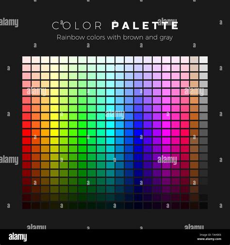
The Color Brown in Design Palettes
Brown is a foundational color that can be incorporated into various design palettes, each offering a distinct mood and aesthetic. Understanding these relationships can elevate a design from ordinary to exceptional.
Complementary Colors
While brown itself is a composite color, its conceptual complementary color would lie in the blue-green spectrum, aiming to create high contrast. However, in practical design, brown is often paired with colors that offer a natural contrast, such as sky blues or vibrant greens, evoking natural landscapes.
Split Complementary Colors
A split complementary palette for brown would involve selecting colors adjacent to its direct complement. This offers a more nuanced contrast than a direct complementary pairing, allowing for richer and more complex color interactions. For example, if brown’s conceptual complement is in the blue-green range, a split complementary palette might include a teal and a blue-violet.
Triadic Colors
A triadic color scheme involves three colors evenly spaced on the color wheel. For brown, this would mean selecting two other colors that, along with a representative brown, form an equilateral triangle on the wheel. This typically results in vibrant and bold designs. For instance, a warm brown might be part of a triad with a mid-blue and a muted orange.
Tetradic Colors
A tetradic, or rectangular, color scheme uses four colors arranged into two complementary pairs. This offers a wealth of options but requires careful balancing to avoid visual clutter. A brown-centric tetradic palette might pair it with a contrasting color like a deep teal, and then find complementary colors to those, such as a muted coral and a soft gold.
Analogous Colors
Analogous colors are those that sit next to each other on the color wheel. For brown, this would include colors like warm yellows, oranges, and muted reds. These palettes create a harmonious and cohesive feel, often found in nature, such as autumn foliage.
Monochromatic Colors
A monochromatic scheme uses variations of a single color. For brown, this means exploring different shades, tints, and tones of brown itself. This can range from very light, sandy beiges to deep, almost black chocolates, creating a sophisticated and understated look.
Exploring the Spectrum of Brown Hues
The term "brown" encompasses a vast array of specific shades, each with its own character and application. These can be categorized by their undertones, lightness, and common associations.
- Almond: A cool, light brown with a semi-grayish hue.
- Auburn: A rich, reddish-brown color leaning towards the red family.
- Beaver: A medium, grayish-brown with a cool undertone.
- Beige: A very pale, tannish shade of brown.
- Bisque: A pale, creamy shade of brown similar to sand.
- Bole: A medium to dark brown shade with a cool, reddish-purple undertone.
- Brass: A medium, warm brown with a strong yellowish tone and hints of green.
- Bronze: A medium, warm shade of brown with an orange tone.
- Burnt Umber: A medium to dark shade of brown leaning towards a rich, dark red.
- Cafe au Lait: A light to medium brown shade similar to a dark beige or tan.
- Cafe Noir: A dark shade of brown similar to dark brown and coffee.
- Champagne: A light shade of brown that can also be classified as a shade of white.
- Chestnut: A medium shade of brown with a pinky-red tone.
- Chicory: A brown shade derived from the roasted roots of the chicory plant, often used as a coffee substitute.
- Chocolate: Encompasses the warm brown of milk chocolate to the deep, rich color of dark chocolate.
- Cinnamon: A medium, warm shade of brown with hints of yellowy orange.
- Coffee: A dark, cool shade of brown with a somewhat grayish undertone.
- Copper: A medium, warm shade of brown with hints of soft orange.
- Cotton: Refers to the pale tan or beige color that cotton fabric can take on after processing.
- Dark Brown: A deep and rich shade, often approaching black.
- Dark Vanilla: A light, grayish shade of brown similar to taupe and sand.
- Deep Brown: One of the darkest shades of brown, with low red, green, and blue values.
- Deer: A light to medium brown with a strong similarity to tan.
- Desert Sand: A very pale, warm shade of brown.
- Dirt: A medium, cool shade of brown.
- Dull Brown: A brown shade that, despite its name, can be quite lively.
- Ecru: A light shade of brown with a cool, pale yellow undertone.
- Fall Harvest: A shade of brown that skews more towards the yellow or orange side.
- Fawn: A light, warm shade of brown with a bright, peachy orange tone.
- Firewood Brown: Specifically refers to the color of dried wood.
- French Beige: A shade of beige noted for its popularity in France.
- Ginger: A warm, medium brown with a rich gold tone.
- Golden Brown: A medium to dark warm shade of brown with a hint of cool, natural gold.
- Gray Brown: A deep shade of brown with a gray undertone.
- Grayish Brown: A shade very similar to Gray Brown, but slightly darker.
- Hardwood: Refers to the varied colors of different types of hard woods.
- Henna: A reddish-brown dye derived from plants.
- Khaki: A pale brown shade of cloth with a subtle yellow undertone.
- Light Brown: A medium shade of brown with a soft, warm undertone.
- Linen: The pale tan or beige color of older linen fabric.
- Mahogany: A deep, rich shade of medium brown with a warm, reddish tone.
- Maple Sugar: A light brown shade reminiscent of maple sugar.
- Maple Syrup: A rich, golden-brown shade associated with maple syrup.
- Medium Brown: A versatile mid-range brown.
- Ochre: A warm, medium shade of brown with a soft, yellowish undertone.
- Otter Brown: A dark brown shade.
- Peru: A light to medium brown with a warm tone.
- Reddish Brown: A brown with prominent red undertones.
- Russet: A dark shade of brown with similarities to saddle brown, but a little darker and cooler.
- Rust: A medium, warm reddish shade of brown, similar to the color of rusted metal.
- Saddle Brown: A dark, warm shade of brown.
- Sand: A light, cool shade of brown, similar to bisque but cooler in tone.
- Sepia: A dark shade of brown representing the color of ink used in old sepia photographs.
- Sienna: A dark, reddish shade of brown similar to russet and mahogany.
- Tannish Brown: A brown with a noticeable tan hue.
- Taupe: A light to medium brown with a gray, earthy hue, named after the French word for mole.
- Tan: A light shade of brown with similarities to beige and sand.
- Toast: A light brown shade reminiscent of toasted bread.
- Tumbleweed: A light shade of brown similar to beige or bisque.
- Tuscan Brown: A dark shade of brown with a cool tone.
- Wheat: A light shade of brown that can also be classified as white, similar to bisque but darker and warmer.
- Wood Brown: A light to medium shade of brown similar to light-colored hardwood floors.
The specific CMYK code for brown can vary significantly, with examples like CMYK(0 32 39 29) and CMYK(0 50 100 41) illustrating this point. The former suggests a composition of 0% cyan, 32% magenta, 39% yellow, and 29% black, while the latter is 0% cyan, 50% magenta, 100% yellow, and 41% black. This variation arises because CMYK colors do not have a strict cross-reference chart with names; many CMYK color names are designated by the general public or specific manufacturers.
The Psychology and Symbolism of Brown
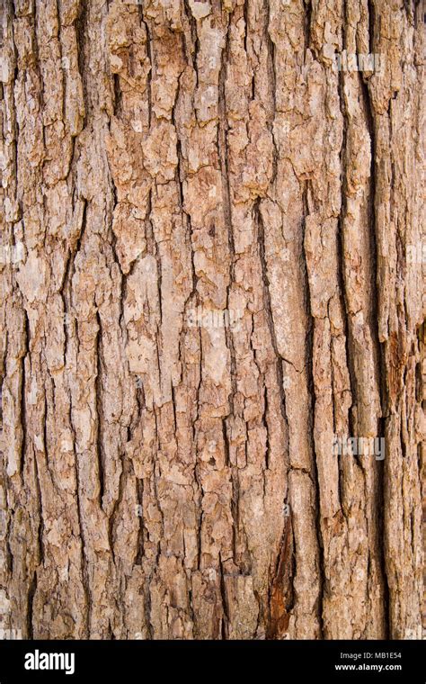
Despite a survey suggesting that most people dislike brown, it remains a pervasive and significant color in both nature and human experience. The warmth of brown is often associated with reliability, healing, and strength. Many find comfort in its perceived plainness, as brown is considered all-natural and earthy. From the bark of trees to the soil beneath our feet, brown predominates the landscape, grounding us and connecting us to the physical world.
Brown pairs well with almost every color, demonstrating its versatility. It is frequently used as an accessory color to more dominant hues, adding depth and sophistication. Its earthy tones can complement vibrant colors, preventing them from becoming overwhelming, or they can be used monochromatically to create a sense of calm and stability.
Challenges and Considerations in CMYK Color Reproduction
Reproducing colors accurately in print, especially specific shades of brown, can present challenges.
- Red Tones: Red can often appear orange or rusty when printing. To achieve a desired red or reddish-brown, careful adjustment of magenta and yellow levels is crucial. If red appears too pinkish, it indicates an excess of magenta.
- Green Tones: Cyan and yellow combine to produce green. Setting these values to equal parts and ensuring density can yield vibrant green results.
- Yellow Tones: Darkening yellow requires caution, as it can easily shift towards a sage or mustard color.
- Blue Tones: In CMYK, blue is one of the most challenging colors to reproduce accurately. Even and balanced mixtures, such as 100-50-0-0 (Cyan-Magenta-Yellow-Black), are often suggested.
- Rich Black: While standard black is simply the "K" in CMYK, "rich black" is created by blending all CMYK colors. This results in a deeper, more saturated black that can be beneficial for text and solid areas, preventing the flat appearance of 100% black alone. This technique can also be used to deepen browns.
- Metallic Finishes: CMYK printing cannot produce realistic metallic gold or silver finishes. Instead, flat or non-metallic metal (NMM) representations are the achievable options.
When aiming for specific brown shades, especially those with subtle undertones, designers must be aware that monitor settings can affect how colors appear on screen compared to physical prints. What looks like a perfect brown on a calibrated monitor might render differently on a printed page due to the inherent differences between RGB and CMYK, as well as the specific ink and paper used.
Practical Applications and Design Tools
For those working on digital designs, understanding RGB and Hex codes is paramount. Tools like PicMonkey offer an intuitive platform for creating designs, with a minimal learning curve and an extensive feature set. They provide professionally designed templates and powerful tools for custom image creation, making professional-level design accessible at an affordable price.
When preparing designs for print, a thorough understanding of CMYK values is essential. This allows for more accurate color matching and reduces the likelihood of unexpected color shifts during the printing process. Designers often work with color charts and proofs to ensure the final printed product aligns with their vision.
What Is The Difference Between RGB and CMYK? Color Models and Print
In essence, while brown might appear simple, its accurate representation and effective use in design, particularly within the CMYK color space, requires a nuanced understanding of color theory, specific color codes, and the technical limitations and capabilities of different printing processes. The journey from a digital concept to a tangible printed piece is one that demands attention to detail, a keen eye for color, and an appreciation for the intricate interplay of pigments.