The world of printing, especially when aiming for vibrant, continuous-tone images, often relies on a clever technique known as CMYK halftone. This method allows for the reproduction of complex photographs and graphics by breaking them down into a series of tiny dots of four primary colors: Cyan (a blue-green), Magenta (a hot pink), Yellow, and Black (often referred to as Key). These dots, varying in size and density, are then printed in layers, creating the illusion of a full spectrum of colors and shades that our eyes perceive as a smooth, continuous image. While traditional halftone uses dots, a related technique, particularly useful for crafting and stencil-making, employs lines of varying width, known as a linear halftone. This approach simplifies the cutting process, making it more accessible for both manual craft and automated laser cutting.
Understanding the CMYK Color Model
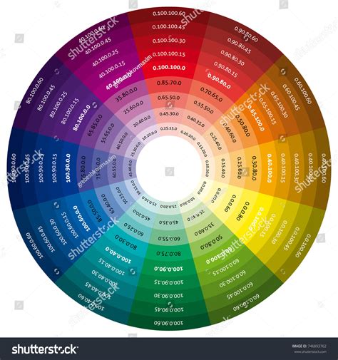
At its core, CMYK is a subtractive color model, meaning it works by absorbing or "subtracting" light from a white or light background. Unlike additive models like RGB (Red, Green, Blue) used for screens, where colors are created by emitting light, CMYK utilizes inks to reduce the amount of light reflected. White is the color of the substrate (like paper) itself, and black is achieved by combining all four inks. The pairwise combinations of Cyan, Magenta, and Yellow inks are crucial for generating secondary colors: Cyan and Magenta produce blue, Cyan and Yellow create green, and Magenta and Yellow yield red. The addition of Black ink, the "Key" color, provides depth, shadows, and enhances contrast, allowing for richer and more nuanced reproductions. This model is particularly important in printing because the RGB spectrum, which is broader and displays more colors on screens, cannot always be accurately replicated in print. CMYK offers a more reliable color match and greater stability, ensuring consistency across multiple prints, making it the preferred choice for professional printing.
The Evolution of Halftone Printing
The concept of halftone printing has a rich history, dating back to the mid-1800s. William Henry Fox Talbot is credited with the initial idea in 1852, but it was Frederic Eugene Ives who developed the first truly successful commercial method in 1880. His technique involved photographing an image through a ruled glass screen, which broke the image into dots of different sizes. This innovation, along with subsequent developments by others like Georg Meisenbach who patented the "autotype" process, revolutionized print media. Before halftone, reproducing photographs in print was either prohibitively expensive or relied on hand-carved woodcuts that could never capture the subtlety of a real photograph. Halftone printing made realistic photographic reproduction accessible and affordable, transforming newspapers and magazines.
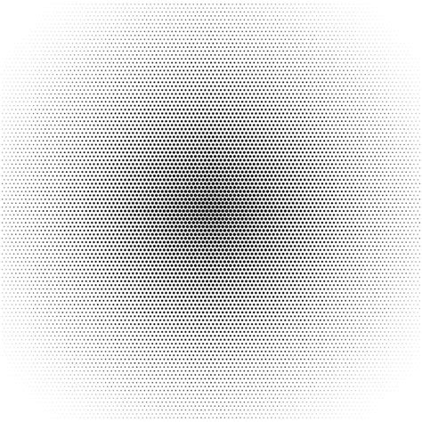
The science behind halftone relies on a fundamental optical principle: the human eye’s limited ability to resolve fine details at a distance. When dots are small and close together, our brains blend them, perceiving smooth tones and gradients. This is akin to how pixelated screens on our devices create the illusion of continuous images. In traditional halftone, darker areas of an image are represented by larger dots, while lighter areas are depicted by smaller dots.
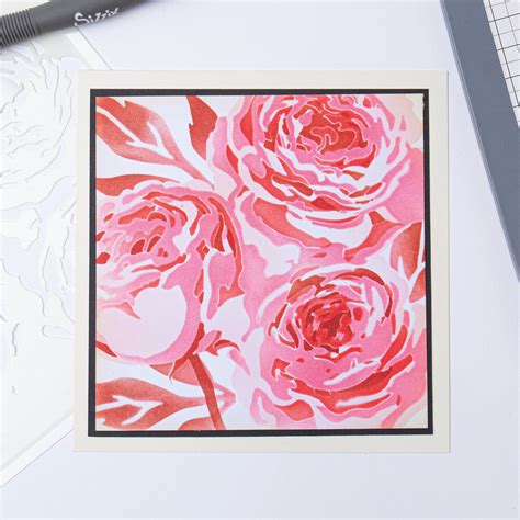
Linear Halftones: A Stencil Maker's Approach
While traditional halftone uses dots, the creation of stencils for crafts or laser cutting often employs a variation called a linear halftone. Instead of dots, this technique utilizes lines of varying width. This modification is practical because lines are generally easier to cut than individual dots, especially for intricate designs. When creating linear halftone stencils, each color layer (Cyan, Magenta, Yellow, Black) consists of lines that all run in the same direction, though each layer's lines will be oriented differently relative to the others. This directional consistency simplifies the cutting process for machines like Cricut or laser cutters, leading to more predictable results.
Crafting CMYK Halftone Stencils: A Step-by-Step Guide
Creating your own CMYK halftone stencils involves a few key steps, starting with selecting the right image.
Step 1: Choosing Your Image
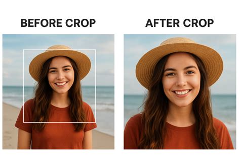
The halftone technique is quite forgiving, meaning many images can be successfully translated into stencils. However, some images lend themselves better to this process than others. It's helpful to understand the difference between images ideal for traditional color separation and those that work well with halftones. Cropping your image to focus on the essential elements is crucial; there's no need to include extraneous details. For instance, if the subject is a flying saucer against a night sky, cropping to just the saucer can enhance the stencil's impact. Images with good contrast and distinct shapes tend to translate well.
Step 2: Generating Halftone Vectors
Once you have your chosen image, the next step is to convert it into a format suitable for cutting machines. This typically involves uploading your image to specialized software or online tools, such as Bay Stencil, which can generate vector files (like SVGs) for each CMYK color separation. These tools break down the image into the characteristic line patterns of a linear halftone.
When working with these generated vector files, particularly in design software like Cricut Design Space, a few important considerations arise:
- Attaching Elements: After loading all four SVG files (one for each color), it's essential to "Attach" each one. This ensures that registration marks, which are critical for aligning the stencils during the painting process, remain with their corresponding line patterns.
- Resizing: If you need to resize your stencils, always select all four SVGs together before resizing. This maintains the correct proportions and relationships between the different color layers, ensuring they align properly when applied.
When preparing to cut, design software like Cricut Design Space will often automatically separate the stencils onto oversized mats and may orient them on their sides, a common practice for efficient cutting of these intricate patterns.
Create Vector Halftone Portraits with Inkscape
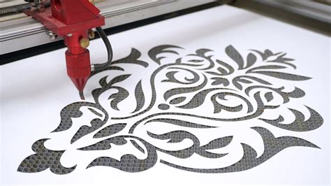
Step 3: Cutting the Halftone Stencils
Cutting intricate halftone stencils can seem daunting, especially if you're using a craft cutter like a Cricut. However, modern cutting machines are capable of handling these detailed patterns, provided they have sufficient time. The primary challenge often lies in removing the delicate stencils from the cutting mat without tearing them.
- Cutting Material: Cardstock is a good starting material for practicing. If you encounter issues with clean removal, consider using a thicker cardstock or a material like 5 mil mylar, which offers more durability.
- Mat Stickiness: The level of stickiness on your cutting mat is important. A mat that is not brand new, but still has a good amount of grip, is often ideal. You want the stencil to stay in place during the potentially lengthy cutting process (which can sometimes exceed 15 minutes per stencil), but not be so sticky that the stencil tears upon removal.
- Removal Technique: When peeling the stencil off the mat, pay close attention to the direction of the lines. Gently peel the stencil away in the same direction as the lines. Peeling perpendicular to the lines can put excessive stress on the fine "bridges" connecting the lines, leading to tears. Using a plastic spatula can help lift cut-out pieces from the mat cleanly after the stencil itself has been removed.
- Sizing Considerations: It's advisable to size your halftone stencils up, rather than trying to size them down. The intricate spacing of the lines and bridges is often optimized for a specific size (e.g., around 12 inches wide for Cricut-sized projects) to balance detail with cutting stability and handling ease. Sizing down too much can make the lines too thin and fragile.
Step 4: Painting with CMYK Halftone Stencils
With your stencils cut, the creative process of painting begins. You'll need paints in Cyan (blue-green), Magenta (hot pink), Yellow, and Black. While the color model is CMYK, the optimal painting order, especially with spray paint on white paper, is often found to be Yellow, then Magenta, then Cyan, and finally Black (Y-M-C-K).
- Layering Colors: Each stencil is used to apply one color of paint. The varying density and width of the lines in each stencil layer will determine how much of that color appears in the final image.
- Adjusting for Color Balance: Be prepared to adjust your technique based on the results. If a particular color appears too dominant, you can modify your application. For example, if Ringo's face in a Beatles stencil (an example image mentioned) turns out too yellow, you can reduce the amount of yellow paint applied to that specific area and allow more of the underlying magenta to show through. This involves a degree of artistic control, bending the stencil's application to achieve a better color match.
The process involves carefully aligning each stencil over the previous layer of paint, ensuring the registration marks guide precise placement. The overlapping and blending of these four colors, through the halftone line patterns, will gradually build the complete image.
Beyond CMYK: Expanding Halftone Possibilities
The versatility of halftone stencils extends beyond the standard CMYK color model. Experimenting with different color separations can lead to unique and diverse artistic effects. For instance, combining a grayscale halftone layer with color layers from a traditional color-separated stencil can produce striking portraits that "pop."
Understanding when to use a halftone stencil versus a traditional stencil is also key. Traditional stencils often feature larger, solid shapes and are connected by broader "bridges," making them ideal for simpler graphics or solid color applications. Halftone stencils, with their intricate line patterns, excel at reproducing gradients, subtle tonal variations, and photographic elements.
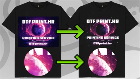
Halftone in Digital Printing: Considerations for DTF
In the realm of digital printing, particularly with Direct-to-Film (DTF) transfers, halftone printing plays a significant role, though it comes with its own set of considerations. DTF printers cannot produce true transparency or semi-transparent ink; every ink dot is opaque, and a layer of white ink is often applied behind the design for vibrancy on dark fabrics. Furthermore, the adhesive powder used in DTF transfers requires a minimum dot size to adhere properly.
These limitations mean that very small dots, common in high-resolution halftones, can fail to transfer cleanly, leading to missing spots or dusty edges. For DTF, the recommended halftone frequency is typically in the 25-35 LPI (Lines Per Inch) range, with dot sizes at or above 0.5mm being crucial for reliable adhesion. Higher LPI (45-65 LPI) can be used for more photorealistic designs, but careful attention must be paid to dot size.
The gaps between halftone dots in DTF prints offer several advantages:
- Better Breathability: The air channels created by the dots allow the fabric to breathe, improving comfort, especially in warm conditions.
- Softer Feel: Less ink coverage results in a less rigid print, contributing to a softer feel on the garment.
- Natural Blending: On dark-colored shirts, the fabric's background color can show through the dot gaps, allowing the design to integrate more naturally with the garment.
Halftone Screening Methods
There are three primary screening methods used in halftone printing, each producing a distinct visual outcome:
- Amplitude Modulation (AM) Halftone: This is the traditional method where dots are arranged in a fixed grid, and their size varies to create different tones. Larger dots for darker areas, smaller dots for lighter areas. This is what you typically see in newspapers and comic books.
- Frequency Modulation (FM) Halftone: In FM halftone, dots are all the same size, but their spacing varies. Densely packed dots create darker areas, while widely spaced dots create lighter areas. This method generally produces smoother transitions and less visible patterning.
- Hybrid Screening: This technique combines elements of both AM and FM screening. It often uses AM-style dots for midtones, where patterning is most noticeable, and FM-style fine dots for highlights and shadows, aiming for the best of both worlds. For many DTF applications, FM or hybrid screening yields cleaner results.
Optimizing Halftone for Print
Achieving successful halftone prints requires careful preparation and understanding of how different settings interact.
- Source Artwork Resolution: Start with high-resolution source artwork (300 DPI or higher). Using low-resolution web images (like 72 DPI) will result in blurry and uneven halftone dots before printing even begins.
- LPI and Dot Size: Pushing the LPI too high in an attempt to achieve smoother gradients can lead to dots falling below the critical 0.5mm threshold for DTF transfers, compromising adhesion and transfer quality.
- Dot Gain: Printers often experience "dot gain," where printed dots end up slightly larger than intended due to ink spread during the printing or pressing process. This can make midtones appear darker than expected. Accounting for typical dot gain (around 30% in DTF) in your preparation is crucial for accurate color representation.
- Design Elements: Halftone is most beneficial at the edges of a design for smooth fades into the garment color, and in areas with gradients or shadows. Solid, high-contrast areas like bold text or flat logos generally print better without halftone.
Create Vector Halftone Portraits with Inkscape
Inverse Halftoning and Descreening
In some scenarios, it's necessary to reverse the halftone process, a technique known as inverse halftoning or descreening. This is often done to reconstruct high-quality continuous-tone images from their halftone versions, for example, when editing halftone images or when scanning printed materials. However, inverse halftoning is a complex problem because information is lost during the original halftoning process, and multiple continuous-tone images could potentially produce the same halftone. Methods for descreening include applying low-pass filters, using wavelet representations, and employing machine learning algorithms like convolutional neural networks and generative adversarial networks.
Conclusion: The Enduring Power of Halftone
From its historical roots in revolutionizing print to its modern applications in digital printing and stencil art, halftone remains a fundamental technique. Whether you're creating intricate stencils for a craft project or optimizing designs for DTF transfers, understanding the principles of CMYK halftone printing allows for greater control, creativity, and ultimately, more impressive results. The ability to simulate continuous tones using discrete elements-whether dots or lines-is a testament to both the ingenuity of printing technology and the perceptual capabilities of the human eye.