In the realm of visual design, understanding color models is fundamental to achieving accurate and impactful results, whether your work is destined for the digital world or the tangible realm of print. Two of the most prevalent color models encountered by designers are RGB and CMYK. While both are used to create a spectrum of colors, they operate on entirely different principles and are suited for distinct applications. Grasping the core differences between these two systems is not merely an academic exercise; it's a practical necessity that enhances efficiency and significantly mitigates unwelcome surprises in final products. This exploration will delve into the intricacies of RGB and CMYK, illuminating their fundamental distinctions, their respective use cases, and the implications for designers working across digital and print media.
The Science of Color: Additive vs. Subtractive Models
At the heart of the RGB versus CMYK debate lies the fundamental difference between additive and subtractive color models. This distinction is crucial for understanding why a color appears one way on a screen and potentially different when printed.
RGB: The Additive Approach for Digital Displays
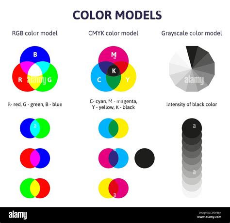
RGB, an acronym for Red, Green, and Blue, is an additive color system. This means that the colors are created by adding light together. Digital displays, such as those found on computer monitors, televisions, tablets, and smartphones, rely on this principle. On these screens, individual pixels emit light in varying intensities of red, green, and blue. When these primary colors of light are combined, they produce a wider range of colors. As you add more light, the colors get lighter. In fact, when all three primary colors-red, green, and blue-are combined at their full intensity, they produce white light. Conversely, the absence of all light results in black. This is why RGB is considered a light-based color system; they require a light source to exist. The RGB color system is deeply rooted in the way human vision functions. Our eyes possess three types of cone photoreceptors, each sensitive to different wavelengths of light: primarily red, green, and blue. This inherent biological mechanism is why RGB is so effective for digital displays, as it directly mirrors how we perceive color on screens. The historical roots of RGB trace back to 1861 when James Clerk Maxwell, a mathematical physicist, first employed it in his pioneering efforts to create color photographs.

CMYK: The Subtractive Method for Print
CMYK, on the other hand, stands for Cyan, Magenta, Yellow, and Key (which is black). This is a subtractive color system. Unlike RGB, which adds light, CMYK works by subtracting light from a white background. When designing for print, the process typically begins with a white surface, such as paper. Inks of cyan, magenta, and yellow are then applied in varying percentages. These inks absorb certain wavelengths of light and reflect others. For instance, cyan ink absorbs red light and reflects green and blue. Magenta absorbs green light and reflects red and blue. Yellow absorbs blue light and reflects red and green. By layering these transparent inks, designers can block out parts of the white light, thereby creating a vast array of colors.
Traditionally, the subtractive color system was based on the RYB (Red, Yellow, Blue) model, which is familiar from elementary school art classes where students learn that red, yellow, and blue are the primary colors for mixing pigments. While the RYB model can create many colors when combined, the CMY (Cyan, Magenta, Yellow) model, which forms the basis of CMYK, is even more versatile for printing purposes. The addition of 'K' for black is crucial because mixing pure cyan, magenta, and yellow inks rarely produces a true, deep black. Instead, it often results in a muddled, blackish tone. Using a dedicated black ink ensures richer blacks and sharper details in printed materials. Most commercial printers do not use white ink; instead, they rely on the white of the paper as their base. In the printing process, CMYK colors are printed on top of each other using different percentages of transparent inks to create the desired hues and colors called for in the design.
When to Use Which: Application-Specific Color Choices
The choice between RGB and CMYK is not a matter of preference but a critical decision dictated by the intended final medium for your design. Employing the correct color model from the outset is paramount to achieving predictable and satisfactory results.
RGB for Digital Platforms
When designing for digital products-this includes web designs, social media graphics, mobile application interfaces, and any visual content intended to be viewed on a screen-you will invariably work in the RGB color space. This is because digital displays are emissive, meaning they generate their own light. The RGB model is optimized to translate the full spectrum of colors that these screens can produce, ensuring that your designs appear vibrant and accurate on computers, tablets, and smartphones. Using RGB for digital applications ensures that the colors you see on your monitor are the colors that your audience will see on their devices.
CMYK for Print Media
Conversely, when your design work is intended for print media-such as flyers, brochures, business cards, signage, or any material that will be physically printed-you must use the CMYK color space. This is essential for accurate color reproduction in the printing process. Forgetting to account for the print color models in your editing program will lead to printing your work on paper using digital settings, which can result in drastic and disappointing color shifts. To help prevent this drastic difference in the final product, make sure that you’ve set your file’s color space to CMYK before sending it to print.

The Challenge of Conversion: RGB to CMYK
One of the most significant issues that graphic designers may encounter is the conversion of RGB images to CMYK. Because the two color models operate on fundamentally different principles, a direct conversion can sometimes lead to a loss of vibrancy or a shift in hue. The gamut, or the range of colors that a color model can represent, differs between RGB and CMYK. RGB generally has a wider gamut, meaning it can display a broader range of colors, especially bright, saturated ones, than CMYK.
When converting from RGB to CMYK, colors that fall outside the CMYK gamut will be approximated, which can lead to a duller appearance. This is particularly noticeable with very bright or neon colors. To mitigate these issues, designers often need to perform manual color correction after the initial conversion. This involves adjusting the CMYK values to recapture as much of the original vibrancy and intended hue as possible. Understanding the limitations of CMYK and proactively adjusting designs can save considerable time and prevent costly reprints.
Beyond RGB and CMYK: Other Important Color Models
While RGB and CMYK are the most commonly discussed color models for digital and print design respectively, other systems are also vital to understand, especially for ensuring brand consistency and precise color matching.
Pantone Matching System (PMS)
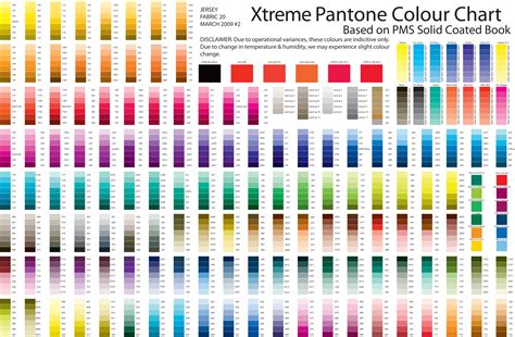
The Pantone Matching System, often abbreviated as PMS, is a standardized color matching system used by printers worldwide. It's regarded as the industry standard for color printing. The primary benefit of PMS is its ability to ensure color consistency across different printing processes and locations. Each Pantone color is assigned a unique number and name (e.g., Pantone 204C). This allows designers and printers to communicate specific color requirements with absolute certainty. When a designer specifies a Pantone color, the printer knows precisely which ink to use or how to mix inks to achieve that exact shade. This is particularly crucial for branding, where maintaining a consistent brand color across all marketing materials is essential for recognition and trust. The use of color codes, such as Pantone 204C, allows printers to know the specific color needed and thus replicate the print project exactly.
HEX Codes
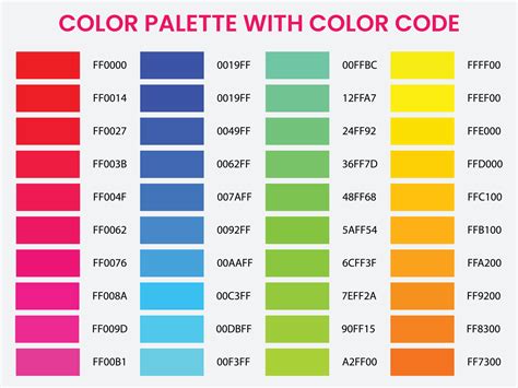
HEX codes, also known as hexadecimal color codes, are six-symbol, alphanumeric codes that define specific colors and shades. They are predominantly used in web design and digital media. For example, #FFFFFF represents white, and #000000 represents black. These codes are excellent for use in digital media, allowing you to specify incredibly precise colors for web pages, user interfaces, and digital graphics. They are directly interpretable by web browsers and are the standard for defining colors in HTML and CSS. Because they are based on the RGB color model, HEX codes are inherently tied to digital displays.
The Interplay: Designing for Both Print and Digital
In today's integrated marketing landscape, it's common for a single design project to appear in both print and digital forms. For instance, a company might launch a new product with a website, social media campaign, and printed brochures. In such cases, it's imperative to create two distinct versions of the design: one optimized for digital (using RGB or HEX codes) and another for print (using CMYK or PMS).
Maintaining consistency across these different mediums requires careful planning. Designers must be aware that colors specified in RGB or HEX might not translate perfectly to CMYK, and vice versa. When a design will appear in both print and digital forms, you need two versions - one in CMYK or PMS for print and one in HEX or RGB for digital. This dual approach ensures that the visual integrity of the brand is preserved, regardless of how the audience encounters it.
Considerations for Professionals and Businesses
For small business owners or marketing professionals, navigating the nuances of color models can seem daunting. However, understanding these basic differences can lead to significant savings and improved marketing material effectiveness. Choosing the correct color mode ensures that your marketing materials are impactful and achieve the best results. Professional printing services often offer guidance and tips to help clients select the right color settings and avoid common pitfalls, saving both time and money. Furthermore, creative teams can assist in designing projects that are produced in the correct colors for their intended medium, ensuring a polished and professional outcome.
Ultimately, the choice of color model depends on your desired final product and how you want it displayed to your audiences. Whether you are creating a vibrant website or a sophisticated brochure, selecting the appropriate color system-RGB for screens and CMYK for print-is a foundational step towards a successful design.