When embarking on the journey of designing your brand's visual identity, you'll inevitably encounter terms like CMYK, HEX, and Pantone. These color models are fundamental to how colors are represented and reproduced, but their distinct methodologies can lead to a common point of confusion: why do colors sometimes appear different in print than they do on your screen? Understanding these differences is crucial for maintaining brand consistency and achieving desired visual outcomes across all media.
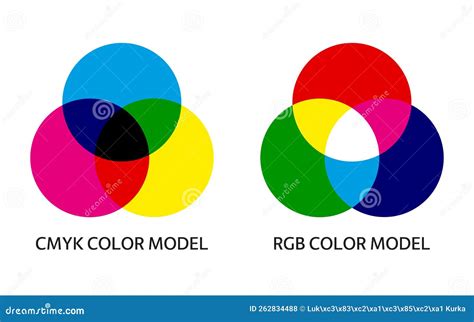
The core of this discrepancy lies in the fundamental difference between how digital screens and printed materials create color. Digital displays, utilizing screens, employ the RGB (Red, Green, Blue) color model. RGB colors are additive, meaning they are created with light. Screens emit light directly, allowing for the reproduction of incredibly vibrant and luminous hues. In contrast, print media, whether using CMYK (Cyan, Magenta, Yellow, and Black) or Pantone inks, relies on subtractive color mixing with physical pigments. These pigments absorb light rather than emit it, which inherently limits their ability to replicate the backlit vibrancy of a digital screen. Consequently, a perfect one-to-one match between what you see on your screen and what appears in print is rarely achievable.
Understanding CMYK: The Workhorse of Process Printing
CMYK, standing for Cyan, Magenta, Yellow, and Black (often referred to as "Key"), is the foundation of process printing. This method involves using four separate ink plates, each applying a specific amount of its respective color onto the printing surface. By combining these four inks in varying percentages, a vast spectrum of hues can be created. This sophisticated layering of minuscule dots of color, when viewed together, forms the illusion of continuous tones and the final image.
CMYK is the most common and generally the most cost-effective method for full-color printing. It is widely available and perfectly suited for a broad range of print projects, including business cards, brochures, magazines, newspapers, and marketing collateral featuring photorealistic imagery and multicolor graphics. Home and commercial printers alike predominantly use the CMYK process.
Advantages of CMYK
The primary advantage of CMYK lies in its affordability and accessibility. For high-volume print jobs, it offers a practical solution for reproducing a wide array of colors without the need for custom ink mixing. Its ability to render detailed graphics and photographic images makes it a versatile choice for diverse design needs.
Limitations of CMYK
Despite its widespread use and cost-effectiveness, CMYK has its limitations. The "dots" approach, known as half-toning, can lead to slight variations in color consistency between different print runs. Furthermore, the CMYK gamut, the range of colors it can reproduce, is inherently smaller than that of the RGB model or many Pantone colors. This means that some vibrant blues, greens, purples, and other luminous shades seen on screen in RGB can be challenging, if not impossible, to replicate accurately in CMYK, often appearing less saturated or muted in print.
A more advanced variation, the seven-color process, enhances CMYK by adding Orange, Green, and Violet (OGV) inks. This expanded palette allows for even better and more accurate color reproduction, particularly for challenging hues. However, this process is significantly more expensive and is not commonly used for standard packaging or general print runs due to its increased cost.
How a Color Laser Printer Works -- Inside an HP® 2600 Toner Cartridge
Exploring Pantone: The Standard for Spot Color Precision
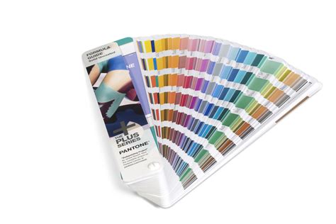
The Pantone Matching System (PMS) offers a universal language for color, ensuring unparalleled consistency across different materials and printing processes. Unlike CMYK, which relies on mixing four base inks, Pantone utilizes pre-mixed, exact ink colors, known as spot colors. Each Pantone color is a unique, standardized ink formulation that produces a specific shade with remarkable accuracy.
This system is invaluable for brands that require precise color matching, especially for unique brand colors that are critical to their identity. Think of the distinct Coca-Cola red or Tiffany blue; these are often specified using Pantone to guarantee that the color appears exactly as intended, regardless of where or when it is printed. Designers and printers often invest in Pantone swatch books, which are physical guides showcasing how each ink will look when printed on different surfaces.
Advantages of Pantone
The paramount advantage of Pantone is its guarantee of exact color matching. This provides a level of consistency that is often unattainable with CMYK, making it ideal for logos, branding elements, and packaging where brand recognition and integrity are paramount. Pantone colors can also achieve greater vibrancy and depth, especially for unique or specialty finishes like fluorescents and metallics, and can reproduce shades outside the CMYK gamut.
Limitations of Pantone
The primary drawback of Pantone is its cost. Each Pantone color used in a design typically requires a separate printing plate and a dedicated ink. If a project utilizes three different Pantone colors, it will necessitate three distinct printing plates and inks, significantly increasing the overall printing cost compared to a CMYK process. This makes Pantone a more expensive option, especially for small print runs or projects that don't necessitate absolute color precision. Consequently, Pantone is generally reserved for specialty items, premium materials, or critical brand assets rather than for printing extensive photographic images or full-color graphics where CMYK would be more practical.
CMYK vs. Pantone: Making the Right Choice for Your Project
The decision between CMYK and Pantone is not about which system is inherently "better," but rather which is more appropriate for the specific needs of your project, budget, and desired outcome.
Budgetary Considerations
For most small businesses and general print applications, CMYK presents a more practical and budget-friendly choice. Its widespread availability and cost-effectiveness make it ideal for high-volume print jobs where minor color variations are acceptable. Pantone, on the other hand, is a more expensive option due to the specialized ink mixing and plate requirements. It is typically reserved for projects where precise color fidelity is non-negotiable and the budget allows for the additional cost.
Application and Consistency
When absolute color consistency is paramount, such as for logos, branding guidelines, or packaging that must precisely match a brand's established identity, Pantone is the superior choice. It ensures that a specific shade of red, for example, will look the same on a business card, a brochure, and product packaging, regardless of the printing location. For projects that involve intricate full-color images, photorealistic graphics, or where cost is a primary concern, CMYK is the more suitable option.
Digital vs. Print Translation
It's important to note that printers do not typically use HEX codes directly. HEX codes are primarily for digital applications (web design, screen graphics). However, most professional printers can translate HEX codes into their closest CMYK or Pantone equivalents. This is why providing HEX codes for your brand colors is essential for digital assets and serves as a helpful starting point for print translation.
The Nuances of Print Color: Beyond CMYK and Pantone
Even when using the appropriate color model and working with professional printers, achieving a perfect color match between screen and print can be challenging due to several influencing factors:
Paper Type
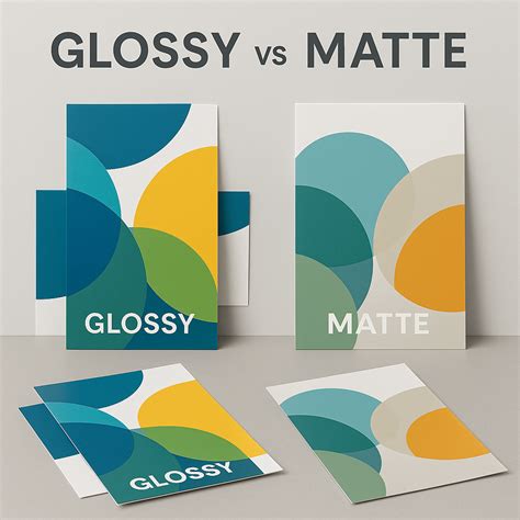
The surface of the paper significantly impacts how colors appear. Glossy paper, with its reflective surface, tends to make colors appear more vibrant and saturated. Conversely, matte paper absorbs more light, which can result in colors appearing more muted or desaturated.
Printing Method
Different printing techniques handle color reproduction in distinct ways. Offset printing, digital printing, and screen printing all have their own characteristics that can affect the final color output.
Lighting Conditions
The perception of color is also subjective and can be altered by lighting. Colors will look different under natural daylight compared to artificial indoor lighting.
Achieving Consistent Printing Results
To mitigate color discrepancies and ensure your brand's colors are represented as accurately as possible in print, consider the following tips:
Start with the Right Color Profile
When designing anything intended for print, ensure your designer creates files using CMYK or Pantone color profiles from the outset. Designing in RGB for print can lead to unexpected color shifts during the conversion process.
Partner with a Professional Printer
Reputable professional printers possess the expertise and equipment to manage color conversions and matching effectively. They can advise on the best color strategies for your specific project and printing method.
Request Color Proofs
Before committing to a full print run, always request a color proof from your printer. This allows you to visually inspect how the colors will appear on the actual stock and provides an opportunity to make adjustments if necessary.
Consider Pantone for Critical Brand Elements
If a specific logo color is absolutely critical to your brand identity and must be reproduced with absolute fidelity, consider using Pantone for those particular elements, especially for high-visibility applications or premium materials.
The Interplay of Substrates and Color
The material onto which ink is applied, known as the substrate, plays a crucial role in the final color appearance. This is particularly evident when printing on colored or textured papers, such as kraft paper.
Coated vs. Uncoated Surfaces
Pantone codes often include designations for coated (C) and uncoated (U) papers. Coated papers have a smoother, less absorbent surface, allowing inks to sit on top and appear richer and more vibrant. Uncoated papers are more porous and absorbent, causing inks to sink in and appear more muted. When selecting a Pantone color, it's essential to reference the appropriate swatch book (coated or uncoated) that matches your intended printing substrate.
Printing on Kraft Paper
Kraft paper presents a unique challenge for color matching. Since Pantone swatch books are typically displayed on a white background, the colors shown are not an exact representation of how they will appear on a brown kraft surface. Inks are not entirely opaque, meaning the color of the paper will influence the final printed color. Pantone colors printed on kraft paper will generally appear darker and may have a "browner" cast than when printed on white. This effect is even more pronounced with CMYK printing, which inherently "assumes" a white substrate when mixing its four colors. Consequently, a CMYK print on kraft will be darker than on white paper, and certain colors like browns, greens, and oranges can look quite different from their on-screen or white-paper counterparts.
Ink Absorption and Printing Processes
Different ink types and printing processes also affect color absorption and appearance. Flexographic, inkjet, and toner inks are absorbed differently by various materials. For instance, inkjet inks tend to be absorbed more than toner inks.
For custom printed packaging, especially on kraft substrates, requesting a "drawdown" is highly recommended. A drawdown is a sample of the ink applied directly to your chosen printing surface, allowing you to see precisely how the color will render before a full production run. This is a small investment that can prevent costly surprises and ensure your brand colors shine as intended.
When working with a printer, always clarify their process for color matching, especially on non-white substrates. Most printers will aim to match the color in your digital file, but they may not be attuned to how that color will render differently on a porous or colored substrate. Requesting physical proofs or drawdowns is the most reliable way to ensure accurate color matching.
How a Color Laser Printer Works -- Inside an HP® 2600 Toner Cartridge
Bridging the Gap: Setting Realistic Expectations
Ultimately, while the goal is to achieve the closest possible match, it's important to set realistic expectations. Print colors will never look identical to digital colors due to the fundamental differences in how they are created. However, by understanding the distinctions between CMYK and Pantone, considering the impact of substrates and printing methods, and employing best practices for color management, you can significantly improve the accuracy and consistency of your brand's visual representation across all platforms. This informed approach ensures your brand communicates its identity effectively, both online and in print.