If you’ve ever designed a logo that would be printed on business cards, flyers, or other marketing materials, then you know just how important a role the CMYK color model plays. CMYK is a color model system that’s the foundation for all print design. Understanding this model is essential for designers because it ensures color accuracy and high-quality resolution in printed materials. This guide will delve into the intricacies of CMYK, from its fundamental definition to practical applications and conversion strategies, ensuring your printed designs achieve the vibrant and accurate results you envision.
What is the CMYK Color Model?
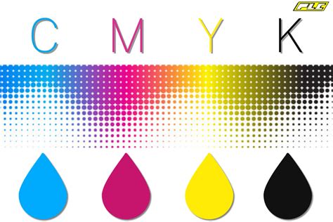
The CMYK color model is a cornerstone of the printing industry, a system used to create a wide spectrum of colors by combining four primary inks: Cyan (C), Magenta (M), Yellow (Y), and Key (K). These four colors, when layered in varying densities, form the basis for virtually all printed imagery and graphics.
- Cyan (C): A bluish-green color.
- Magenta (M): A purplish-red color.
- Yellow (Y): A bright yellow.
- Key (K): Black. The letter "K" stands for "key," a term historically used in traditional printing to refer to the black plate. This key plate was crucial for providing sharp details and defining the darkest areas of an image. Consequently, "key" became synonymous with black in the printing industry, also serving to prevent confusion with other colors or terms like "blue."
These four inks work in concert to produce the colors we see in print. Designers manipulate the percentages of cyan, magenta, and yellow inks to generate a vast array of hues. Black ink is indispensable for achieving depth, contrast, and true black tones within printed materials.
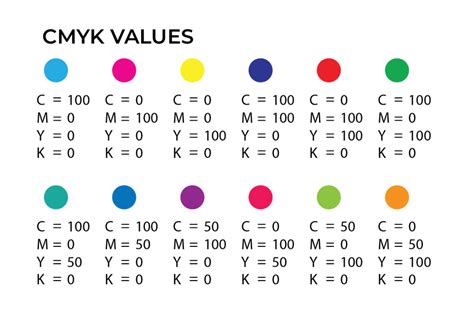
For instance, a specific combination like C = 0, M = 50, Y = 100, K = 0 will produce a vibrant orange color. To achieve a standard black, often referred to as "true black," only the key (black) color is applied at full intensity: C = 0, M = 0, Y = 0, K = 100. For a deeper, richer black, a combination of cyan, magenta, and yellow is layered with key black. This technique, known as "rich black," is particularly effective for large areas of solid black in printing, with a typical composition of C = 60, M = 60, Y = 60, K = 100. This richer black provides a more visually impactful and less "washed out" appearance compared to using black ink alone.
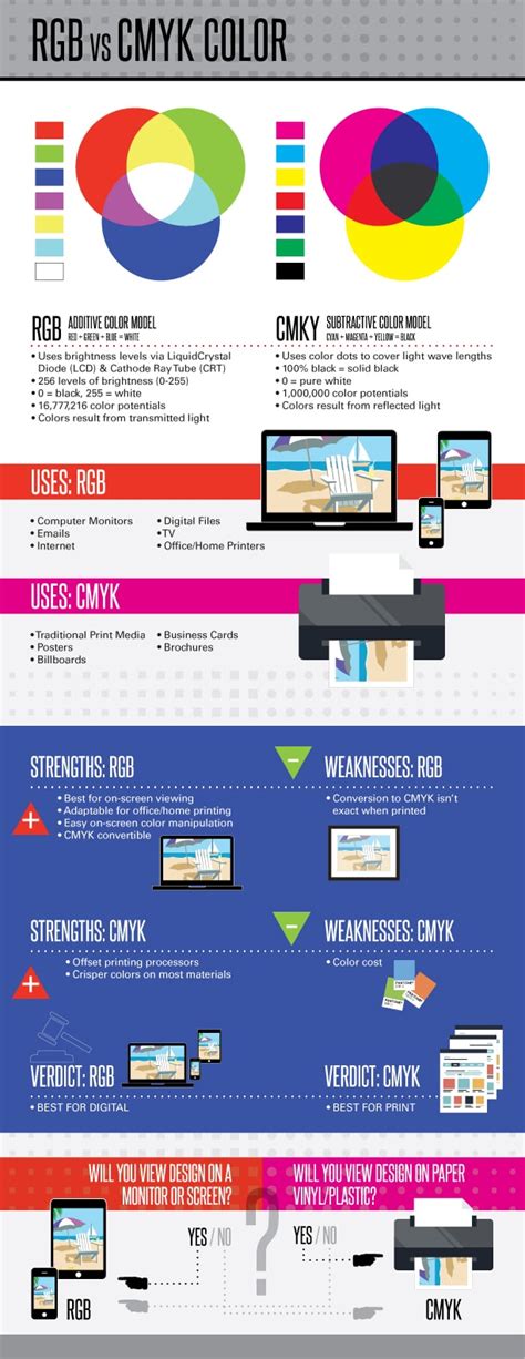
The CMYK color model operates on the principle of subtractive color mixing. In this model, inks are applied to a white or light-colored substrate (like paper), and these inks absorb certain wavelengths of light while reflecting others. White is the color of the substrate itself, and black is theoretically produced by combining all the inks, effectively absorbing all light. This is in direct contrast to additive color models, such as RGB, where colors are created by emitting light.
RGB vs. CMYK: Understanding the Fundamental Differences
The distinction between the RGB and CMYK color models is fundamental to understanding digital design versus print production. While CMYK is the standard for printed materials, the RGB color model is exclusively for screens and digital content.
RGB (Red, Green, Blue): This is an additive color model. Colors are created by adding light. When red, green, and blue light are combined at full intensity, they produce white light. Black, in this model, represents the absence of light. RGB colors are ideal for digital displays like monitors, smartphones, and televisions because these devices emit light. The wide array of vibrant hues possible with RGB makes it perfect for on-screen experiences.
CMYK (Cyan, Magenta, Yellow, Key/Black): This is a subtractive color model. Colors are created by subtracting light. In CMYK, inks are used to absorb certain wavelengths of light. White is the color of the paper or substrate, and black is created by combining the inks. CMYK colors are best suited for physical materials like paper, fabric, and packaging because they work by reflecting light off a surface.
The key difference lies in their operational principles: RGB adds light to create color, while CMYK subtracts light. This fundamental divergence means that colors that appear vibrant on an RGB screen may not translate directly to print when using CMYK, and vice versa.
Why is CMYK Important for Printing?
CMYK is critically important for printing because it ensures color consistency and accuracy across various print runs and materials. The subtractive color model, when implemented correctly, provides uniform results, guaranteeing that prints on paper, fabric, or other substrates look consistent. This consistency is vital for protecting the integrity of a brand's visual identity and ensuring that printed materials precisely match the original design intent.
The CMYK model is governed by industry standards that aim to ensure consistent color output in printing processes. This is achieved through careful calibration of printing devices and the use of standardized ink formulations. When a designer specifies CMYK values, they are providing a set of instructions for the printer to mix inks in precise proportions to achieve a specific color. Without this standardized approach, colors could vary wildly from one print job to another, or even from one printer to another, leading to brand confusion and a less professional appearance.
File types that are best suited to support CMYK colors include:
- Portable Document Formats (PDFs): PDFs are highly versatile and work with a wide range of design and printing software, making them an ideal choice for CMYK files. They preserve layout, fonts, and image data, ensuring that the file can be reliably printed.
- Adobe Illustrator (AI) files: AI files are vector-based, meaning they are resolution-independent and can be scaled infinitely without losing quality. They inherently support the CMYK color mode, making them excellent for creating logos, illustrations, and other graphics intended for print.
- Encapsulated PostScript (EPS): Similar to AI files, EPS files are vector-based and support CMYK color mode. They are a common format for exchanging graphics between different design applications and are widely accepted by printers.
When to Use CMYK
The decision to use CMYK colors is straightforward: you should use CMYK for any design that you plan to print. This encompasses a broad range of marketing and branding materials.
Here are some common examples of when to use CMYK:
- Business cards: A fundamental piece of professional collateral that requires crisp text and accurate logo colors.
- Posters: From advertising to event promotion, posters need to make a visual impact with accurate color reproduction.
- Billboards: Large-format prints where color fidelity is crucial for brand recognition from a distance.
- Stationery: Letterheads, envelopes, and other branded office supplies.
- Swag: T-shirts, mugs, pens, and other promotional merchandise.
- Flyers: Used for advertising events, products, or services, flyers rely on eye-catching and accurate colors.
- Brochures: Informational documents that present a brand's offerings, where color consistency is key.
- Product packaging: The visual presentation of a product on store shelves is heavily reliant on accurate CMYK colors.
- Menus: In restaurants and cafes, menus need to be appealing and reflect the brand's aesthetic.
- Banners: Whether for events, retail displays, or online advertising (though digital banners often use RGB, print banners are CMYK).
For brands that operate in both the digital and print realms, having the right tools and understanding to ensure colors translate correctly between these mediums is essential. While platforms like Figma excel in UI design within the RGB color space, plugins are available that can convert projects and marketing materials to CMYK for printing purposes. This ensures that the brand's visual identity remains consistent, regardless of the medium.

Converting RGB to CMYK: Navigating the Color Shift
While RGB colors can look stunning on digital screens, their appearance can change significantly when translated to print. Before bringing your digital designs to life on paper, converting them to CMYK is a crucial step. This conversion process is not always a direct one-to-one mapping, as the color gamuts of RGB and CMYK differ.
Transitioning from RGB to CMYK can involve subtle, and sometimes not-so-subtle, adjustments. This is because some hues that are achievable in RGB, particularly vibrant blues and greens, might fall outside the printable CMYK color space. When these colors are converted, they may shift slightly, appearing less saturated or changing hue altogether. It's important to fine-tune these colors after conversion to preserve the vibrancy and accuracy of your original design as much as possible.
Tools like Adobe Photoshop offer a CMYK preview mode, which is invaluable for visualizing how colors from your RGB workspace will look once printed in CMYK. This allows designers to make necessary adjustments before sending the file to print, saving time and resources. Online conversion tools can also assist in this process, but they should be used with an understanding that they are approximations and may require further manual refinement.
Maintaining Color Consistency with Figma
Color consistency is paramount in design, and modern design tools are increasingly making it easier to manage. Figma, predominantly an interface design tool that operates within the RGB color space, can be utilized for print design with the right approach.
When designing for print in Figma, it's advisable to work with mockups or external tools that allow for CMYK preview. While Figma itself doesn't natively support CMYK color values in its primary interface, designers can use plugins or export designs to software that does handle CMYK. For example, plugins like "Print for Figma" are designed to help convert projects and marketing materials to CMYK for printing purposes. This ensures that the colors you've carefully selected will translate as accurately as possible to the printed output.
Understanding color representation in CMYK is vital for consistent usage across your projects. White is represented as 0% of all CMYK ink colors (0,0,0,0), and shades of grey are created by balancing the CMYK values, typically by using equal amounts of cyan, magenta, and yellow with varying key (black) values.
CMYK Color Codes and Their Applications
CMYK color codes are fundamental in various industries where precise color representation is necessary. In graphic design, CMYK is the standard color model used to produce full-color documents, images, and artwork. By adjusting the percentage values of Cyan, Magenta, Yellow, and Key (black), you can achieve a broad spectrum of colors.
When you create marketing materials such as brochures, flyers, or business cards, using CMYK color codes is crucial for consistency across all prints. These materials serve as the first impression of your brand; hence, color consistency ensures a professional look and aids in brand recognition.
For instance, in the context of invitations, cards, and banners, specific CMYK codes are used to match printed goods to particular paper types. However, it's important to note that "every printer is different." There is no single, universally guaranteed CMYK code for every paper or every print job. A number of factors affect printed color, including the brand and age of your printer, the brand and age of your ink cartridges, the cleanliness of your print heads, and the type of paper you are printing on. Therefore, the provided CMYK codes should be used as a starting point, with adjustments made as necessary based on test prints.
Some colors are inherently more challenging to reproduce accurately in CMYK than others.
- Red: Red can often appear orange or rusty when printed. To achieve a more accurate red, you need to carefully adjust the levels of magenta and yellow. If your red looks too pinkish, it indicates too much magenta has been mixed.
- Green: Cyan and yellow are the primary components for creating green. Setting these values to equal parts and ensuring they are dense will result in vibrant green colors.
- Yellow: Be cautious when trying to make yellow darker. It can easily shift towards a sage or mustard color.
- Blue: In CMYK printing, blue is one of the most challenging colors to reproduce accurately. It is often suggested to use even and balanced mixtures, such as C=100, M=50, Y=0, K=0.
- Purple: Regal purple tones are generally CMYK friendly.
- Pink: Pinks in CMYK printing are heavily reliant on the magenta ink. For stand-out pink colors, magenta levels should be high, with low levels of yellow, cyan, and black.
- Metallic Colors: It's important to understand that CMYK printing cannot produce a realistic metallic gold or silver finish. Instead, it can create a flat or non-metallic metal (NMM) representation of these colors. For true metallic effects, special inks or printing processes are required.
Rich Black and Standard Black
A common point of discussion in CMYK printing is the distinction between standard black and "rich black." Standard black is achieved by using only black ink (K=100). However, this can sometimes result in a less intense black, especially on large solid areas.
Rich black is created by blending all the CMYK colors (typically C=60, M=60, Y=60, K=100). This combination results in a richer, more saturated tone that appears deeper and more impactful on the printed page. It's particularly useful for backgrounds, large text blocks, or any area where a deep, solid black is desired.
Halftoning: Creating Continuous Tones
Halftoning, also known as screening, is a technique used in CMYK printing to simulate varying shades of colors and create the perception of continuous tones. This is achieved by printing small dots of ink. The size and spacing of these dots are varied to create the illusion of intermediate colors and gradients.
In CMYK printing, dots of cyan, magenta, yellow, and black ink are strategically placed on the paper. Your ability to manage dot size and spacing during the screening process will directly affect the print's final appearance. This process allows for the reproduction of complex images with smooth transitions and a wide tonal range, even though only four inks are being used.
Beyond CMYK: Expanded Color Gamuts
While the standard CMYK model is widely used, there are also expanded versions that go beyond the traditional four inks. These systems, such as CMYKOGV (Cyan, Magenta, Yellow, Key, Orange, Green, Violet), incorporate additional ink colors. This expansion can produce a wider color gamut, resulting in more vibrant and nuanced prints. By adding specific colors like orange, green, and violet, printers can achieve colors that are difficult or impossible to reproduce with the standard CMYK set. This is particularly beneficial for applications requiring highly saturated colors or specific brand hues.
Color Management and Calibration
Your command over color calibration is crucial for maintaining color consistency across different devices and print runs. This process ensures that the colors you see on a monitor are as close as possible to those that emerge in print, addressing discrepancies that can arise due to different media or ambient lighting conditions. A calibrated color space respects the limitations and characteristics of black ink and primaries, adjusting outputs to match original design intentions accurately.
Color management systems, often utilizing ICC profiles, are required to accurately map colors between different devices. These profiles describe the color characteristics of a specific device (like a monitor or a printer) and help ensure that colors are reproduced consistently.
Converting Between Color Spaces
When dealing with web design and digital platforms, you often work within the RGB color space. However, there are instances where understanding CMYK is beneficial, such as when brand guidelines provide CMYK values for specific colors. While web browsers inherently use RGB, it's possible to convert CMYK codes to their closest RGB equivalents for web use.
A number of online tools can help you convert CMYK values to RGB or hexadecimal formats. These color lookup tools allow you to input CMYK values and obtain the corresponding code needed for digital use. Conversely, to convert RGB values to CMYK color codes, you can use design software like Adobe Photoshop or online conversion tools by inputting the RGB values.
Generating a CMYK color code involves defining the percentages of cyan, magenta, yellow, and black inks needed to achieve the desired color when printed. To find the CMYK code for a specific color, you can use a color picker tool within design software by selecting the color on your design file. The numbers in a CMYK color code represent the percentages of each ink (cyan, magenta, yellow, black) used.
For example, to achieve a specific shade of red, you might input RGB values and the software will calculate the CMYK equivalents. Remember, accurate CMYK codes and proper conversion from RGB or Hexadecimal (Hex) formats are crucial for the final quality of your printed materials.
Understanding Color Theory in CMYK
Within the CMYK model, understanding concepts like hue, saturation, and lightness is still important, though their practical application differs from RGB.
- Hue: Refers to the actual color visible in the spectrum.
- Saturation: Refers to the intensity of a color, with higher saturation equaling greater purity.
- Lightness/Value: Refers to how light or dark a color is.
When selecting CMYK colors for a project, consider the context in which the design will be used and how different shades will interact with each other and the white canvas. Utilizing CMYK swatches and digital tools can help achieve precise color representation.
CMYK printing is often less expensive compared to other printing techniques, making it a suitable option for large-volume printing. However, you should consider the paper type and finish, as these can affect the final appearance and cost. For instance, glossy paper can make colors look more vibrant, but it’s typically more costly.
Ultimately, understanding CMYK codes is essential for anyone involved in design work that requires printing. Whether you’re creating brochures, posters, or packaging, familiarity with CMYK will help you ensure that your designs maintain color fidelity from screen to print, leading to professional and impactful results.